
Responsive Tables: CSS Only, No JavaScript
Responsive web design has established itself as the way of modern web development for a while now. The increasing mobile internet usage makes it necessary for a website to be recognizable even on small displays. This is always a challenge for web designers and developers. Where do I put the complex navigation? How do I provide photos and graphics? What do I do with wide, multi-column tables? To the latter question, there are multiple answers. There is not just one correct solution for all responsive tables.
 Scrollable Table
Additionally, you should either assign set width to the table columns or prevent an automatic wrap via "white-space".
Scrollable Table
Additionally, you should either assign set width to the table columns or prevent an automatic wrap via "white-space".
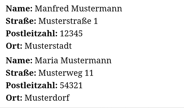 Table Rows Displayed Underneath Each Other
Afterwards, the rows and cells need to be displayed as block elements, and the headline mustn't be visible anymore.
Table Rows Displayed Underneath Each Other
Afterwards, the rows and cells need to be displayed as block elements, and the headline mustn't be visible anymore.
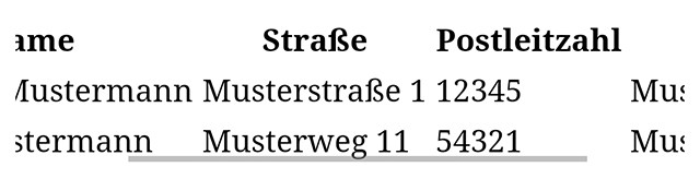
Making Tables Scrollable
A relatively easy way out would be making tables vertically scrollable. Here, the table is unaffected in its width. With a little CSS, it's secured that the table doesn't mess with the width of the layout, and instead, the visible area is cut down to the display width, or the layout width. You can use your finger to slide the table to the left or right.table {
display: block;
overflow: scroll;
}
To make a table scrollable, all it takes are two CSS attributes. For one, you need to turn the table into a block element via "display". Then, via "overflow", you need to make sure that everything that exceeds the width of the web layout is not displayed. This area will still be accessible via vertical scrolling, however.
Scrollable Table
Additionally, you should either assign set width to the table columns or prevent an automatic wrap via "white-space".
table th, table td {
  white-space: nowrap;
}
Otherwise, the table will always be cut down to fit the width of the layout, causing many ugly word wraps.
Displaying Table Columns Below Each Other
The first variant has the advantage, that it's easy to execute, and that you'll always end up with one entire column in the visible area. However, depending on the displayed data, it can make more sense to have the entire content visible in one row instead. For this, there's also a solution, which is a little harder, but still works without JavaScript. The second variant will completely break up a table to display each line with the respective column labels as a block below each other. For this, it's necessary to add a line to each of a row's cells via data attributes.<table>
<tr>
<th>Name</th>
<th>Street</th>
…
</tr>
<tr>
<td data-th="Name">Manfred Mustermann</td>
<td data-th="Straße">Examplestreet 1</td>
…
</tr>
…
In the example, the label of the first column is assigned to a row's first cell via "data-th", and the second column's label is assigned to the second cell. This has to be repeated for all table cells.
Table Rows Displayed Underneath Each Other
Afterwards, the rows and cells need to be displayed as block elements, and the headline mustn't be visible anymore.
table td, table tr {
  display: block;
}
table th {
  display: none;
}
Then, integrate the pseudo element "::before" to place the value of the attribute "data-th" in front of each cell's content.
table td::before {
  content: attr(data-th)":";
  display: inline-block;
  font-weight: bold;
  margin-right: 0.25em;
}
Via "content", the value of the data attribute as well as a colon are assigned to the pseudo element. Then, you have to display the whole thing as an inline block element.
You should also place all of the CSS definitions within a media query so that they are only given out for certain resolutions. The second solution works in all modern browsers. Only the Internet Explorer 9 and older versions struggle with it.
Wow for some reason I never thought to block the tr and td like that! Thanks!
The second method was very interesting…