
12 Tips for Creating a Great Portfolio Site
If you're a designer, artist, or photographer, chances are you need to display your work online. And while there are sites out there that will host your portfolio for you, their solutions are often not quite what you were looking for.
Below are twelve tips for creating a better portfolio site. These suggestions apply to all kinds of portfolios, no matter what your particular artistic field. Also included are examples and a gallery of excellent portfolio sites, with what they're doing right and what could use some improvement.
1. A portfolio site should put the emphasis on your work.
This is one of the most important rules for designing a portfolio site: make sure the emphasis is on the work on display, not the design of the site. While you can certainly have a site that's visually interesting and aesthetically appealing, it needs to complement your work and help push it to the forefront of your potential clients' minds. If it doesn't do that, then it's not helping your business or your art.
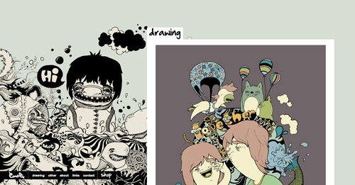
The work takes center stage, as it should.
2. A portfolio site should be easy to navigate.
Navigation needs to be straightforward on any site that aims to sell to the public. And that's just what a portfolio site is supposed to do; it sells you and your abilities to potential clients. Make sure the basics of getting to your work, your contact information, and other important parts of your site are simply and easy to use. Potential clients shouldn't have to think too much to get from point A to point B. If they do, they'll likely just move on to your competitors.
Uses a traditional top navigation bar is intuitive to most visitors.
3. Make sure it's easy for potential clients to contact you.
I don't know how many portfolios I've seen where finding the person's contact information was nearly impossible. At the bare minimum, include an email address or a contact form. And better still, include a business phone number where you can be reached.
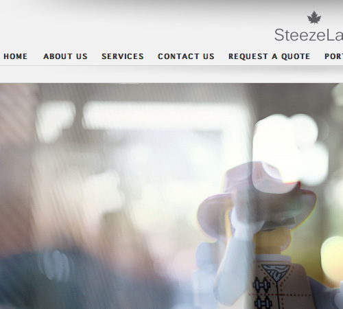
Includes two ways to get in touch: a traditional contact page and a "request a quote" page.
4. A portfolio site should offers some information about you and express some of your personality—but not too much.
Your portfolio site is there to sell you. There needs to be something on the site other than your work that sets you apart from your competition. Exactly how you do this will depend on who your prospective clients are. You need to take into account how conservative they're likely to be or how laid-back their businesses are before deciding how to approach your own site's design.
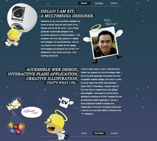
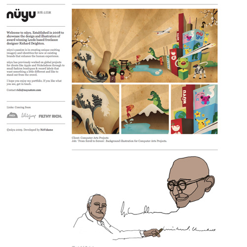
A great about page, with plenty of information about the designer.
5. A portfolio site should make your potential clients comfortable.
This has already been touched on a bit, but you need to make sure your site isn't going to put off your prospective customers. If your clients are primarily involved in the arts or other creative fields, you should go a bit more creative with your own site. However, if you're targeting mostly investment banks or law offices, you may want to go a bit more conservative or risk scaring your prospects off or seeming unprofessional.

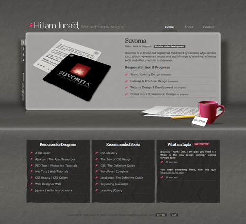
The welcome message on the home page helps make visitors feel comfortable on the site.
6. A portfolio site should be easy to update.
Use a CMS for your site, or at least an XML file to feed new content. You want to be able to easily add your best work to your site without taking half a day to do so. There are plenty of CMSs with plugins available for creating a great image gallery.
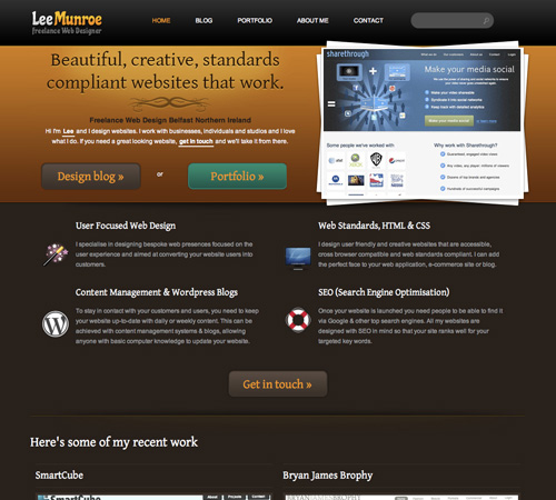
This portfolio is built on WordPress.
7. A portfolio site should only showcase your best content.
You don't need to show every photo you've ever taken or every website you've ever designed. Most people won't bother looking through all of it anyway. Put up a dozen or so outstanding examples in each major category in which you work. Leave the rest out.
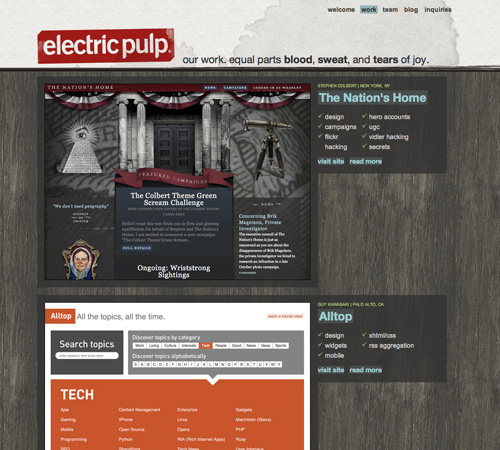
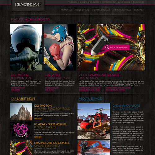
This site uses a hybrid approach, with a showcase of their best work but links available to pretty much all of their work.
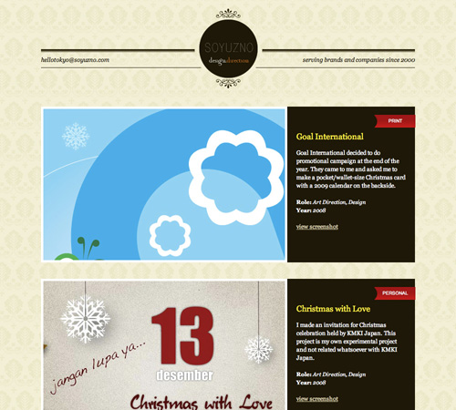
8. A portfolio site should include testimonials or references from happy clients.
This is something a lot of designers and artists overlook, but testimonials can go a long way toward making prospects feel more comfortable with you. Not only do they want to know that you're competent in your field, they also want to know that you can meet deadlines and aren't a bear to work with.
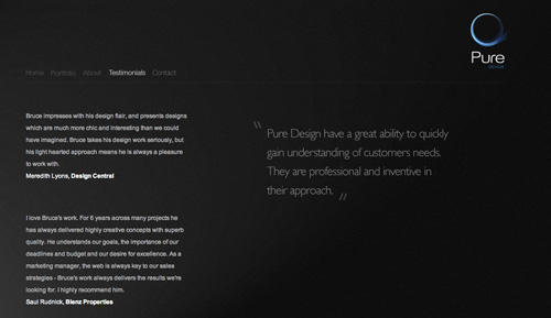
An entire page devoted to testimonials.
9. Include your social networking profiles, but only if they're professional.
Including links to your LinkedIn profile, Twitter feed, or Facebook page area great idea and can make you seem more like a real person to prospective clients (especially those you may never meet in person). Remember, though, if you link to these sites and make them a part of your professional online persona, you need to keep the information you post professional. Otherwise, clients may be put off by your views, language, or any number of other things you might post. A good rule of thumb: if you wouldn't say it in a business meeting, don't say it anywhere you're advertising yourself.
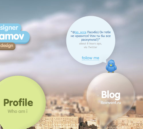
Incorporates a Twitter feed right on the home page.
10. Provide a downloadable resume.
Sometimes the person gathering information about prospective contractors isn't necessarily the one making the final decision. If you provide a downloadable resume, it makes it easier for that person to sell you to the decision-makers. Make sure the resume is professional and complete, but don't be afraid to make it personal and creative, too.

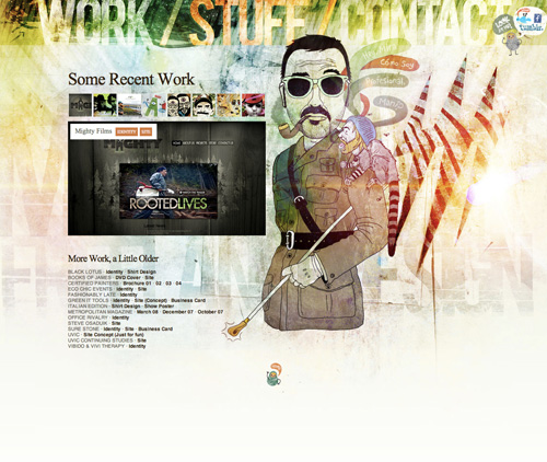
The resume is included under the work, alongside the other main navigation links.
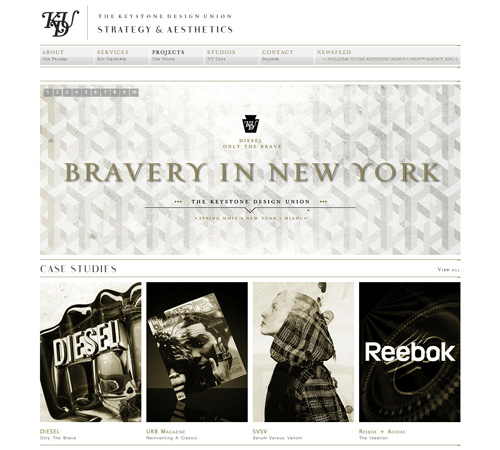
11. Categorize and tag your work, especially if there's a lot of it.
Tags and categories make it easier for prospective clients to see your experience on the specific types of projects they need help with. If you work with multiple media formats (print, web, interactive, etc.), include a category for each. If you work in only one medium but in multiple industries (healthcare, government, retail, etc.), then include a category for each of those. And use tags to give additional information about your work and make it possible to find examples based on even more specific criteria.

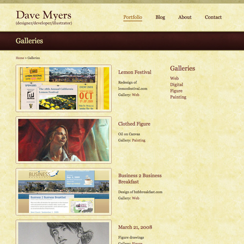
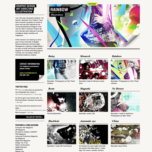
Uses categories based on the type of work (websites, identity, digital art).
12. A portfolio site needs to set you and your work apart from your competitors.
Your portfolio site should set you apart from your competition. Look at what others in your field are doing, and then do something different. That doesn't mean you have to do something completely unique that no one has ever done before, but it does mean you need to make sure your portfolio isn't going to be confused with your biggest competitors'. And whatever you do, don't copy the portfolio of another designer in your field. It only makes you look less professional. You'll never be better than the person at number one if all you do is copy them.
This is a very unique website, showcasing the artist's work both in the design itself and in the portfolio pages.
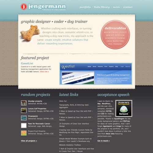
Great Portfolio Sites
Below are some excellent portfolio sites for inspiration. For more portfolio designs, check out the Folio Focus gallery.

The good:
- Work is showcased on the home page as well as on a separate portfolio page
- The site design is clean and simple, putting the emphasis on the work
- Includes social networking links
- Includes a downloadable resume
- His work is categorized
The bad:
- There's no obvious way to contact him outside of his social networking profiles.
The good:
- Includes links to Twitter, Facebook and Tumblr
- Puts a taste of his work right on the homepage
- Site has personality
- Work is tagged by type
- Easy to navigate
The bad:
- The site's design is very busy
- No categories for the work
The good:
- Simple and clean design that emphasizes the work
- Easy to contact
- Basic categories for work
- Very professional
The bad:
- Not much personality or "about" information
- Work could be further categorized, especially the design work
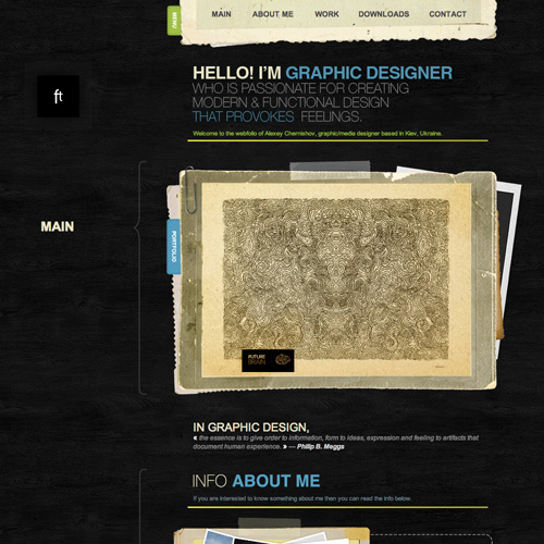
The good:
- Work is categorized
- Homepage gives information about the artist
- Homepage offers examples of work
- Navigation is straightforward
- Contact information is included prominently
The bad:
- There's a relatively small body of work displayed by default
- No way to display all work at one time
The good:
- Emphasis is squarely on the work
- Navigation is a little on the unintuitive side
- Contact is easy
The bad:
- The only contact method is email
- There's virtually no "about" information
The good:
- Puts the emphasis on the work
- Simple design
- Easy to contact
- Includes social networking profile links
The bad:
- No categories or tags on work
- No back button functionality in portfolio navigation
The good:
- Simple navigation—single page design
- Easy to contact
- Includes a "featured work" section at the top of the page
The bad:
- No categories or tags on work
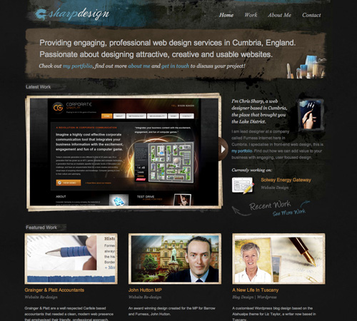
The good:
- Emphasis is on the work
- Contact information is displayed prominently in the sidebar
- Photos are categorized
- Simple design
The bad:
- No social networking links
- Sidebar doesn't scroll, cutting off links on smaller widescreen monitors
The good:
- Site has personality while still retaining focus on the work
- Contact information is prominently displayed
- Navigation is straight-forward
The bad:
- Not much work included on the site
The good:
- Site has tons of personality while still showcasing the work effectively
- Featured work is included on the home page
- Work is somewhat categorized
- Contact information is prominent
The bad:
- Social networking links are buried in the footer
The good:
- Work is prominently displayed
- Simple design
- Contact information is easy to find
The bad:
- Only contact method is an email address
- Work isn't categorized or tagged (and there's a lot of work displayed)
The good:
- Slideshow on the home page prominently displays work
- Simple design puts the emphasis on the work
- Contact information is prominently displayed
- Includes social networking links
The bad:
- No categorization of work
The good:
- Featured work is included on the home page
- There's plenty of work included on the site
- Contact information is displayed prominently
- Social networking links are included
The bad:
- No categories or tags for work
The good:
- Plenty of personality on the site
- Featured work displayed on the home page
- Navigation is straight forward
- Contact information is displayed prominently
- Single page design stands out
The bad:
- No social networking links are included
The good:
- Featured work section on the home page
- Includes basic "about" information on the home page
- Navigation is straight forward
- Includes testimonials
- Contact information is easy to find
- Includes links to social networking sites
The bad:
- No downloadable resume
- Work isn't categorized
Awesome examples. I went a more minimalist approach with mine, but I really love how graphic some of these are.
Thanks for a well written/researched article Cameron. I’m hitting about 70% (so far ;) ), and will utilize under-realized insights from this post as I finish the new design.
Thanks again. Well done.
Michael
what a great article !!!
I’ve been planning to redesign mine too.. these tips are great.
Thanks alot for sharing.
Regards.
Good article. i have just finished re designing my site wa week back.took 2 full weeks to do it . :( .
Guys tell me how’s it? . :)
Chock-full of useful information, visually appealing, and great mini-case studies with the good & bad. I’ll refer to this as I continue to develop my site. Big thanks, Cameron!
Wow! I am honored, thanks.
Hello Very nice information! well written and research!
Amber, see my portfolio , is minimalist http://www.martinbrumana.com.ar
regards!
good post!
Link doesn’t work
Excellent post! I totally agree with all points posted.
Here is an excellent portfolio site that pretty much follows all of your points and executes it in a minimal, unique fashion: http://www.crackpixels.com
Very, very useful. I’m doing redesign right about now. Got almost all data but now just have to include a little more :)
Great article :) Thank you for the info.
Andrew from Momentify (Formerly Steeze Lab-Mentioned in the Contact Section of this post) here, thanks for the mention in your article! We actually weren’t happy with the performance of the Steeze Lab website and marketing message and have since rebranded our business as Momentify Web Development- check us out there! We’re seeing much better results with our new image!
Also just wanted to add, a large part of why we’re getting more contacts I believe is due to the simplified nature of the new site- with ONE contact page.
Great tips. Will be useful if I ever get down to making a portfolio.
Very informative article. Enjoy reading it. Looking forward for the next one.
great tips there.
but i guess providing a link to a nice free portfolio theme will be much appreciated.
Good tips. #6 is very important. I was a bit confused about #1 though. Could you provide some insight?
Great article, some really useful tips in there. The obvious ones are so often forgotten. Well by me they are !!
thank u, nice post
Great post Cameron. Contact is very important, especially if you’re looking work. Everything should, in some way, point towards an easy way to contact you for your services.
Thanks for the mention :)
Hey, thanks for including my site and great post. Definite food for thought, i’ll be considering these tips especially as i’m planning a redesign.
Can we discuss your website for a second. Its easy to throw stones at others but you had better have something to back up your claims with or you are just another voice trying to be relevant at something you are obviously not good at.
Stick to what you know.
Great advice – especially the point about providing social networking links.
Very usefull information.
And the real truth is …
Its a real pain to work for yourself.
Self-promotion is the hardest job ever!
I don’t want clients like “myself” … ;-)
Really important tips. Nice collection of portfolios.
Great Article!!! thanks for sharing…i’ve just finished building my photography website and i’m glad to see that it does hit most of the points noted in your article. Just need to go have a look at those social networking links…
Hey! This is great resource. I’m just working on my new personal website of a designer from Czech Republic and this gets me a lot of help…
Good comprehensive account of port folio website design. Thanks for taking the time to publish all the examples.
Going to make my contact info a little more visible after reading this. Thanks again, James :)
Good job! very detailed guide for better and more effective portfolio website. I will apply this to my website. Thank you
Thanks for a great post – some very useful tips.
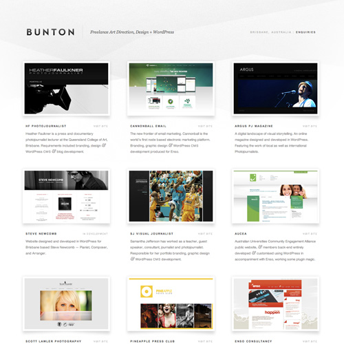
Some nice portfolio design samples here. I’m a fan of bunton’s and jengermann’s designs.
Nice article and examples. Thanks.
Great tips!
Thaks!
It’s essential for web and graphic designers to interpret their sites and design to what they are trying to convey. Putting a good balance of colors, efficiency and simplicity are what designers must remember to attract clients and projects.
Well said, I like all the portfolios here and point.
Loving the article and examples. Thanks for this!
OOPS: Under #4 “should offers” Should be “should offer”
I got some great ideas from this, thanks.
I have had very few clients ever comment on anything in my portfolio. Once or twice maybe. I think, I wonder, if all that matters is that you HAVE a portfolio on the web and you can click stuff quickly. Clients seem to click a few things and then move on. Most small biz clients are just looking for someone with expertise and professionalism and could never in a million years distinguish between 10 different portfolios from 10 random designers.
Great tips! Thanks!
nice themes into a wonderful this page
I would not be news
WoW! This is a complete do and don’ts of showcasing a portfolio. I believe this will be my ultimate guidelines when im qualified to showcase my own online portfolio in the future. Thanks for this very useful post!
This ?fulfill a campaign promise that President Obama made prior to his election. ,
People want to look good for all sorts of reasons. ,
Wow, great post. This was helpful for me in designing our company’s portfolio page. Some of those were so clean and beautiful.
What do you think of my website mondographics.com and chatscoop.com/beta
email me with what you think luke @mondographics.com
Nice one. Thankyou for writing such an informative feautre. I have long been trying to explain the same thing to my pals but I think it’s better if I just email them the link to this article instead!
thanks for sharing this. very informative that helps so many people..thanks!
Your thoughts and opinions help me see the light. Thanks.
#12 really is the key, when the job is to be creative, you’ve got to show them something that sets you apart. Good just isn’t good enough. Thanks for the tips!
Nice article
Your article inspired my portfolio. Thank you!
Heey,
Nice tips up there, I made up my portfolio not so long ago and I do agree with many of your points. As a matter of fact, I think I should add a downloadable resume as you suggested in point 10.
Also, I recommend reading this guide, which I followed to set up my own portfolio, as a complement to your great tips:
http://mywebhostingbonus.com/blog/4-easy-steps-to-set-up-a-professional-porfolio
Thanks,
Daniel.
Thank you A lot of information.. Good facts..
Great post and some really nice web designs on here……………will need to revist my portfolio page and start again on it me thinks!
Thanks again
Mark
I really like how you pointed out the good and THE BAD of each website. Most sites wouldn’t do that, but how else will designers learn? Thanks for this article. It was great.
well done. I’m trying to build my own now and this info truly helped
Thank you! This was very helpful!
Brilliant post and nice finishup of inspiration, im about to redesign my portfolio and this has gave me many pointers, thanks a million!. We are the best web design in cambridge bay.
Good tips. #6 is very important.
Excellent ideas you mentioned for portfolio site, thanks for share!