
Beautiful Button Design in Action: Examples & Tips for Creating Effective Buttons
Designing beautiful buttons for the web is an art form in and of itself. The best buttons often appear simple and easy to design, yet are deceptively difficult, and are often comprised of many subtle design elements, backed by solid marketing theories. Today we're going to look at some of the principles behind great button design, and give you some practical tips to improve your own website's buttons, and boost your conversions/click-through rates.
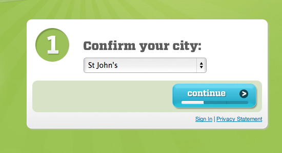
Groupon has one of the most unique button designs around. The button combines with a progress bar that entices people to see what lies ahead if they sign up for the site. The forward arrow and bold blue button are equally enticing.
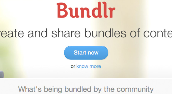
Bundlr uses a very simple, but effective call to action button on their site that works for several reasons. It is clearly very bold and colorful against the plainer background, which helps it stand out. The imperative text 'start now' also pushes users in the right direction. Finally, the subtle design touches such as the drop shadow, 1px border and inner highlight all help the button pop and appear more professional.
Status Board's button is everything I love about effective button design. It's bright, it's bold and it makes you want to click it! The bevel effect really makes the button stand out and feel more 'pushable', which must help their conversions. The text choice is also interesting, shying away from standard web fonts and opting for something more creative.
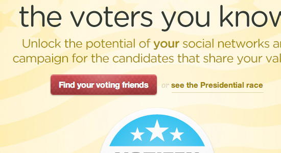
Votizen uses a bold red button design to attract visitor's attention, and also overlay a pixelated pattern to make the button more eye catching. Importantly, the red of the button ties in with the other primary colors in the design, which allude to the US flag.
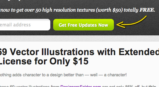
My Design Deals uses an effective button design to help get subscribers to their newsletter. The bright, lime green button design contrasts the dark gray backdrop really well, whilst the accompanying yellow arrow helps draw further attention to the area. The imperative 'get free updates now' encourages users to sign up by giving them a direct action to take.
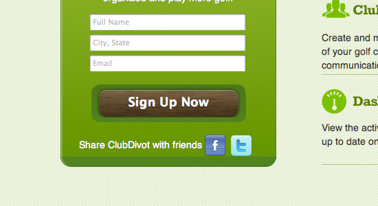
Club Divot shows how button design doesn't have to be boring! Their charming wooden button fits perfectly with the site's golfing theme, and gives a very natural feel for the site. The embedded design with a sharp white highlight across the top also gives depth.
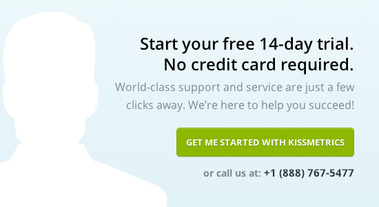
You would hope that a company dealing with online metrics and testing had an effective button design, and Kissmetrics don't disappoint! Their understated button is professional and sleek, and fits perfectly with the surrounding clean website. The copy 'get me started with Kissmetrics' is effective as it's fairly casual, yet entirely relevant to their company.
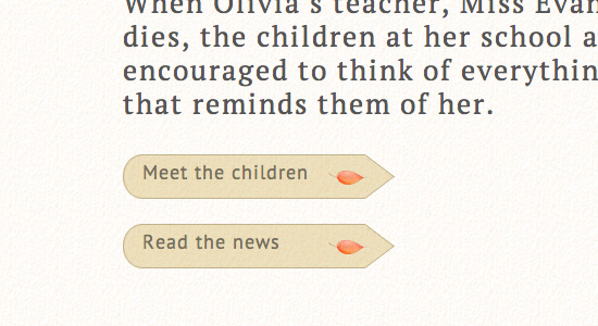
The Copper Tree uses some charming button designs that complement the surrounding web design nicely. The red leaves fit well with the surrounding graphics, and also act as graphical arrows which encourage users to click the buttons.
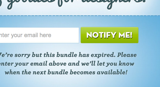
Zero Bundle is a classic example of a bold, bright button that converts very well. The green call to action button is paired with some creative, bold text to draw extra attention. The white text is given a bold drop shadow to help it stand out.
App Sumo started as a 'get it live, not perfect' kind of business, but as they've grown to a giant in the online deals market they began rigorously testing each element of their page. It's safe to say that their current buttons are the best converting they've ever had. The current deal button is incredibly bright, and uses a very tall font to take up most of the button.
Pixeno uses a fairly standard button design with some lovely touches to help draw attention to it. The green button uses a subtle highlight effect, faint border and stylish arrow to stand out. The text also uses an elegant drop shadow to give it extra depth.
Hot Sauce Fever has a really interesting grungy button design on their website to encourage action from their visitors. The button has a rough texture overlay, as well as a unique, relevant icon. Overall it's large, eye catching and well designed.
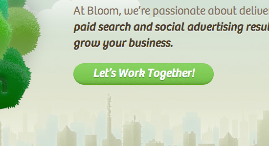
Another great example of a simple, effective button design. Make it Bloom uses a bold green button that fits with the nature theme of their site. The subtle gradient and bevel effect makes the button appear more 3D and add depth.
Mighty Deals uses a very clever button that fits well with their design deals site. The button is in the shape of a sales tag and therefore is really unique to their website. The bold text combined with bright orange button gradient is very eye catching.
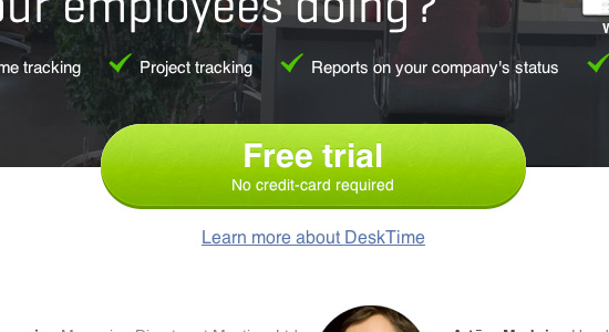
Desk Time uses the principle of 'bigger is better' by using a HUGE call to action button that encourages users to sign up for their free trial. The button is very clean and colorful and uses the additional tagline 'no credit-card required' to boost conversions.
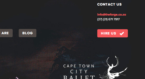
The Forge have an interesting choice of button. Their 'hire us' button is the same size and shape as the main menu buttons. This should help increase click through rate on the button. The button also establishes positive connotations by including a tick icon, which should further help engagement.
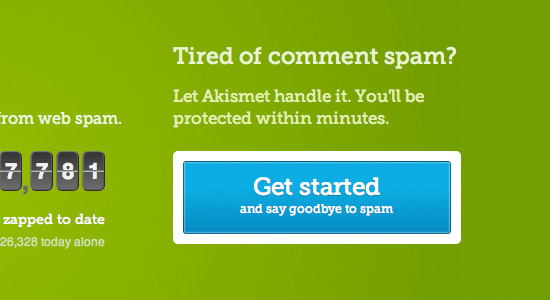
The call to action button at Akismet could easily be just another button. However, it's incredibly eye catching for a couple of reasons. Other than the bright blue design, the bold white border adds far more contrast against the green background. The text provides an instant reason for signing up 'say goodbye to spam' which gives people more incentive to click.
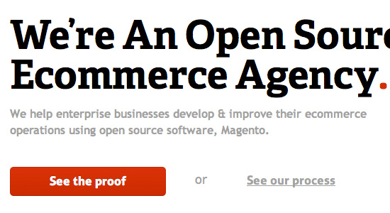
Ampersand Commerce is a classic example of a button effectively contrasting the surrounding design. The button is bold, colorful and 'solid', whilst the surrounding area is fairly sparse, monotone and plainer. This contrast ensures that your eye is drawn to the button straight away.
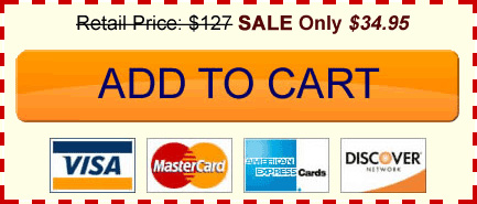
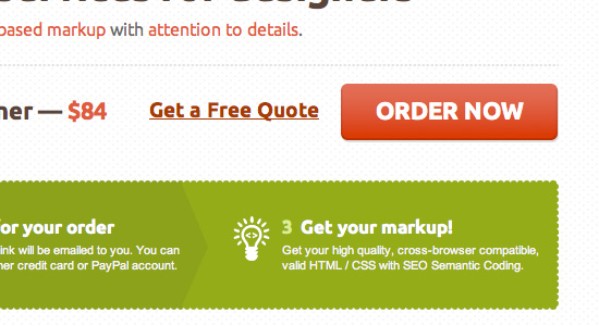
A very clean and professional button design that is classically 'clickable'. The 'ORDER NOW' text stands out by being all in caps and bolder than all the surrounding website text. The red button color complements the shades of lighter red and green in the rest of the site, whilst standing out against the plain background.
Tips and Techniques for Designing Effective Buttons
Below are some applicable tips for improving your web buttons and boosting their click through rates.1. Make Your Buttons Bold and Bright
Whilst a bold/bright button will clearly not fit with every web layout, as a rule of thumb these are the buttons that receive the most clicks. A bolder/brighter button naturally attracts more attention from your visitors, as the human eye is drawn to color and solid hues. If you're into split testing your designs then try increasing the saturation of your buttons (within a tasteful level) and watch your click through rates go up slightly.2. Larger Buttons Attract More Attention
This is another common sense part of button theory, but one ignored by many website owners. Generally speaking, larger buttons will naturally attract more attention. It's been proven time and time again that by increasing the size of your call to action buttons more people will notice them, and by extension click them. The trend of HUGE web 2.0 buttons may be over, but by integrating a tasteful, large button into your design you will definitely be prompting action on the part of your visitors.3. Buttons Should Fit With Your Site's Theme
Whilst contrast is good (we'll get to that in the next step) you should remember to integrate your buttons well with the surrounding website design. If you run a nature themed website then it would look pretty weird to have an industrial steel textured button. Even if it did attract attention it would be the wrong type of attention, as the button would appear awkward and visually clash. Try to find common themes, moods and motifs in your website design and then artfully integrate these into your button design. Taking elements from the surrounding website (be it icons, textures, lighting etc...) can add a lot to a strong button design.4. Contrast is Good!
Another staple of button design theory is that contrast will get you more click through rates. If you have a plain white background for your website then don't make your button light gray or cream, make it black, or a solid, bold color! Contrast is one of the most powerful techniques for getting your buttons noticed. It also applies to the text, which should contrast well against the button color. Don't make your buttons something that people can skim over, make them noticeable.5. Small Details Make a Big Difference
As with all design, the small details can take your work from 'good' to 'great'. A website button may be a fairly simple visual element, but don't forget to pay attention to the subtle details. A thin border, subtle gradient, faint pattern, or lighting effect can make a world of difference. Not only do these kinds of visual touches show professionalism and an attention to detail, but they often add depth to your buttons, making them stand out and 'pop' from the surrounding page more.6. Don't Forget the Text!
Probably the main element people overlook in their button design is the text, yet it can have the biggest impact. In this sense your button text or 'copy' is crucial to it's success. Gone are the days when 'buy now' or 'join' were sufficient. People like a bit of creativity in their button copy, and they also appreciate getting a hint at the benefits of your service/website. Try some of the following techniques for making your button copy more interesting:- Instead of just having 'buy now' use 'Try (Your Service)'
- Going one step further have 'Try (Your Service) for (Low Price)' by 'Try (Your Service) and (Give Brief Benefit)'
- Another variation is '(Common Problem)? Try (Your Service)'
7. Think About the Surrounding Details
A successful button design doesn't end with the button, you need to also consider the details of the surrounding website. Think about how this surrounding area can point people towards your call to action button, and help accentuate it. Here are some practical ideas:- If your web design has a common light source make sure that this is reflected in your button design (i.e.: ensure that your buttons highlights/shadows relate to the wider light source on the page)
- Use shapes such as arrows to direct attention to your button. These have been proven to vastly increase click through rates.
- Think about establishing trust/credibility if you're offering a service. Using 'secure payment' signs, major credit card logos, or testimonials near your button can make people more likely to click it.
- Consider the amount of padding around your button. Generally speaking if a button has more padding then it will seem more isolated and will draw more attention, as there is less competing content around it.
8. The Magic Button Example
On his blog Smart Passive Income, Pat Flynn wrote an article about how he increased his earnings for an ebook in 5 minutes by simply updating his 'buy now' button to a 'Magic Button' invented by marketer Ryan Deiss. You can read the article here: How to Increase Your Earnings in 5 Minutes or Less. We won't repeat the details of Pat's entire post, but essentially Ryan Deiss came up with the button design by split testing 43 variations to find the one that converted best. Now you'll probably agree that the final button isn't the most attractive, or elegant. However, it undeniably gets the job done! Whether you opt for something this in your face or not, you should take away some of the principles that this button utilizes (it's large, bold, uses surrounding details like the border/credit cards/discounted price to draw more attention etc...).
Beautiful Button Design in Action
GrouponGroupon has one of the most unique button designs around. The button combines with a progress bar that entices people to see what lies ahead if they sign up for the site. The forward arrow and bold blue button are equally enticing.
Bundlr uses a very simple, but effective call to action button on their site that works for several reasons. It is clearly very bold and colorful against the plainer background, which helps it stand out. The imperative text 'start now' also pushes users in the right direction. Finally, the subtle design touches such as the drop shadow, 1px border and inner highlight all help the button pop and appear more professional.
Status Board's button is everything I love about effective button design. It's bright, it's bold and it makes you want to click it! The bevel effect really makes the button stand out and feel more 'pushable', which must help their conversions. The text choice is also interesting, shying away from standard web fonts and opting for something more creative.

Votizen uses a bold red button design to attract visitor's attention, and also overlay a pixelated pattern to make the button more eye catching. Importantly, the red of the button ties in with the other primary colors in the design, which allude to the US flag.
My Design Deals uses an effective button design to help get subscribers to their newsletter. The bright, lime green button design contrasts the dark gray backdrop really well, whilst the accompanying yellow arrow helps draw further attention to the area. The imperative 'get free updates now' encourages users to sign up by giving them a direct action to take.
Club Divot shows how button design doesn't have to be boring! Their charming wooden button fits perfectly with the site's golfing theme, and gives a very natural feel for the site. The embedded design with a sharp white highlight across the top also gives depth.
You would hope that a company dealing with online metrics and testing had an effective button design, and Kissmetrics don't disappoint! Their understated button is professional and sleek, and fits perfectly with the surrounding clean website. The copy 'get me started with Kissmetrics' is effective as it's fairly casual, yet entirely relevant to their company.
The Copper Tree uses some charming button designs that complement the surrounding web design nicely. The red leaves fit well with the surrounding graphics, and also act as graphical arrows which encourage users to click the buttons.
Zero Bundle is a classic example of a bold, bright button that converts very well. The green call to action button is paired with some creative, bold text to draw extra attention. The white text is given a bold drop shadow to help it stand out.
App Sumo started as a 'get it live, not perfect' kind of business, but as they've grown to a giant in the online deals market they began rigorously testing each element of their page. It's safe to say that their current buttons are the best converting they've ever had. The current deal button is incredibly bright, and uses a very tall font to take up most of the button.
Pixeno uses a fairly standard button design with some lovely touches to help draw attention to it. The green button uses a subtle highlight effect, faint border and stylish arrow to stand out. The text also uses an elegant drop shadow to give it extra depth.
Hot Sauce Fever has a really interesting grungy button design on their website to encourage action from their visitors. The button has a rough texture overlay, as well as a unique, relevant icon. Overall it's large, eye catching and well designed.

Another great example of a simple, effective button design. Make it Bloom uses a bold green button that fits with the nature theme of their site. The subtle gradient and bevel effect makes the button appear more 3D and add depth.
Mighty Deals uses a very clever button that fits well with their design deals site. The button is in the shape of a sales tag and therefore is really unique to their website. The bold text combined with bright orange button gradient is very eye catching.

Desk Time uses the principle of 'bigger is better' by using a HUGE call to action button that encourages users to sign up for their free trial. The button is very clean and colorful and uses the additional tagline 'no credit-card required' to boost conversions.
The Forge have an interesting choice of button. Their 'hire us' button is the same size and shape as the main menu buttons. This should help increase click through rate on the button. The button also establishes positive connotations by including a tick icon, which should further help engagement.
The call to action button at Akismet could easily be just another button. However, it's incredibly eye catching for a couple of reasons. Other than the bright blue design, the bold white border adds far more contrast against the green background. The text provides an instant reason for signing up 'say goodbye to spam' which gives people more incentive to click.
Ampersand Commerce is a classic example of a button effectively contrasting the surrounding design. The button is bold, colorful and 'solid', whilst the surrounding area is fairly sparse, monotone and plainer. This contrast ensures that your eye is drawn to the button straight away.
A very clean and professional button design that is classically 'clickable'. The 'ORDER NOW' text stands out by being all in caps and bolder than all the surrounding website text. The red button color complements the shades of lighter red and green in the rest of the site, whilst standing out against the plain background.
Nice collection. Helpful to make another good idea.
Loved the Real Life examples and the tips/details listed
Very long post but i was unable to leave this page before completely reading your post you know why? I tell, coz its intresting too. Hmm Nice Post
Great article.
Good Tips and Techniques about how a button should be build.
There is some advice I never though about before. So thanks :)
Try http://twitter.github.com/bootstrap/base-css.html#buttons. Nice looking buttons. Very easy to implement.
useful advice – thanks
nice.. i like the groupon’s progress button..
Good article. Useful references.
Great tips on designing buttons, I found the more time I spend on a button the better conversion rates I will see. Attention to detail is a must. Great article.
clean and neat buttons, will come up with some concepts graphically. I love the progress bar on the button. Lets power up photoshop now!
Great tips very useful. Thanks a lot
can u please tell me how to make an action button
Flat color button usage looks good if the right color scheme is utilized but I still feel we need to incorporate a 3D element when designing buttons to signal to users that the button is in fact pushable.