
Combining CSS3 Transitions for Complex Animations

Animated transitions can be done with little effort thanks to CSS3 transitions and are used a lot nowadays. You can alter different characteristics at the same time. There is also the possibility to play with the attributes you want to animate at different times and with different durations.

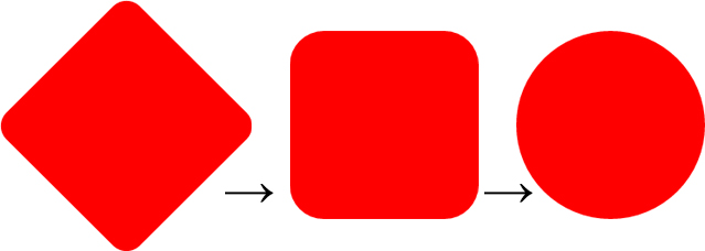
 Transitions With Attributes Animated at the Same Time
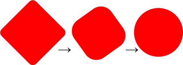
 Transitions With Attributes Animated Independently From Each Other
This way, you can create thoroughly complex hover effects without using JavaScript as well as without nesting HTML elements and equipping every single one with a transition effect.
Additionally, the order of animations stays the same even when the movement is reversed. Here, „transform“ is animated first, followed by „border-radius“.
Transitions With Attributes Animated Independently From Each Other
This way, you can create thoroughly complex hover effects without using JavaScript as well as without nesting HTML elements and equipping every single one with a transition effect.
Additionally, the order of animations stays the same even when the movement is reversed. Here, „transform“ is animated first, followed by „border-radius“.
CSS3 Transitions Using Delays
The „transitions“ attribute knows four different values. The first value determines which attributes should be animated per transition. While „all“ simply animates all attributes (as long as there is something to animate), you can also choose to only animate a specific attribute. The second value defines the duration of the animation in seconds and the third value is responsible for the easing - „ease“ „ease-out“ or „ease-in“, for example. There is also the option to define a temporal offset. This makes the transition start after a specific period of time.div {
transition: all 2s ease 1s;
border-radius: 0;
transform: rotate(45deg);
}
div:hover {
border-radius: 100%;
transform: rotate(90deg);
}
In the example, the values „border-radius“ and „transform“ are altered on hover. The animation takes two seconds, but it starts with an offset of one second.
Transitions With Attributes Animated at the Same Time
Combining Multiple CSS3 Transitions
Most of you probably know the way presented here. Unfortunately, it has the disadvantage that the transition for all attributes - „border-radius“ and „transform“ in this case - play at the same time. However, a slightly changed markup allows you to assign an individual animation duration as well as an individual delay to each of them.div {
transition: transform 0.5s ease, border-radius 1s ease 0.5s;
border-radius: 0;
transform: rotate(45deg);
}
In the second example, custom values are assigned to every attribute that is supposed to be animated via „transition“. The values are separated by commas. Here, the animation of the „border-radius“ attribute starts half a second after the start of the „transform“ attribute's animation.
Transitions With Attributes Animated Independently From Each Other
This way, you can create thoroughly complex hover effects without using JavaScript as well as without nesting HTML elements and equipping every single one with a transition effect.
Additionally, the order of animations stays the same even when the movement is reversed. Here, „transform“ is animated first, followed by „border-radius“.