


By Matt Cronin
Being able to organize data and information is a skill not to be overlooked. The way you organize content and text, generally referred to as copy, has a direct effect on how that content is received by users. You must find a way to organize information so that it is scannable and can be quickly absorbed by the reader. One way to organize information in a clean way is to use data tables. Data tables provide a structured way of showing large amounts of information.
Data tables have been in use since the beginning of Web development. The structure of the table hasn’t changed — and will not change, because, well, it’s a table. But even though the structure has stayed the same, styling has come a long way; and recent tables are just as readable as the early ones.

Common Uses Of Data Tables
Tables make organizing information in a clean and readable way very easy. They can be used to store and show large amounts of information, small amounts of information, static data and even data that is constantly changing.
Because of the chart-like layout of tables, they are extremely useful for making comparisons. Many websites use them to compare products, services and, as mentioned, pricing plans.
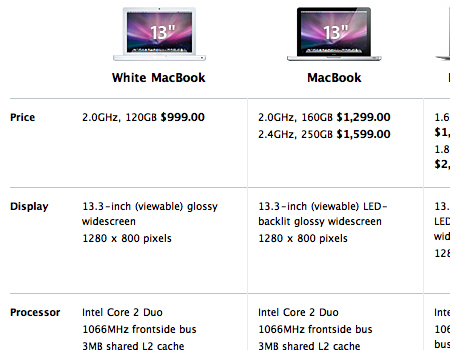
The table below on Apple’s website compares all of the MacBooks. The chart contains a large amount of information, yet it is still organized and easy to read through. It is an extremely simple table but looks nice because of the good spacing and borders. Also, notice how images of the laptops are included and important information is bolded. This makes the table very scannable.
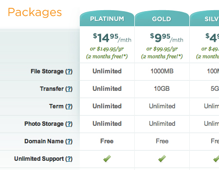
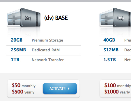
Data tables are often used to compare pricing plans. They provide space to show the names of plans, prices and the unique features of each plan. Most often, tables showing pricing plans contain a column for each plan and a row for each feature. Then, inside each cell is a marker indicating whether the plan comes with that specific feature.
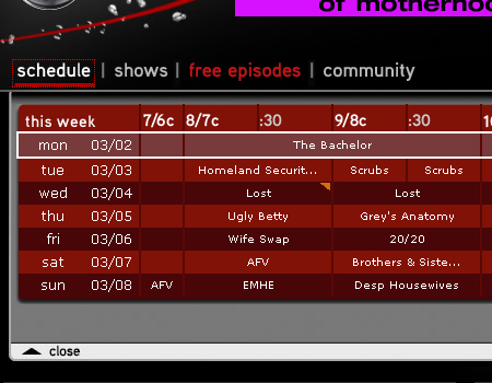
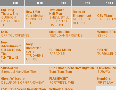
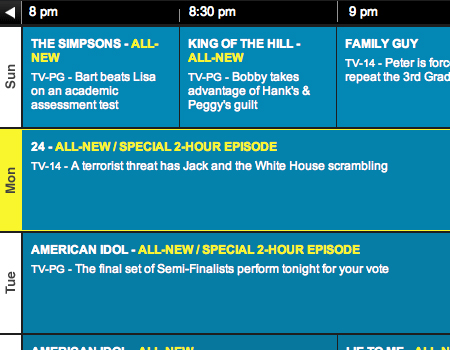
Finally, tables often appear on TV network websites to shows schedules. These are a little different than typical tables; the cells are of various sizes due to staggered viewing periods. Other than that, schedule tables follow the exact same structure.
Components Of A Useful Data Table
Although almost every user knows how to make sense of a table, you can still do a few things to take yours to the next level of usability.
Titles + Labels + Data = Data Table
Obviously, a data table consists of columns titles, rows labels and the actual data in the cells. A table should be nothing more and nothing less.
When adding color, you should make the cells contrast with labels and titles. Make the background color for labels and titles different than the one you use for core data. This makes the table much easier to read and eliminates confusion.
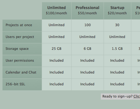
The table below by Goplan uses a darker color for column titles and row labels. Notice how reading this table is much easier because of the contrast.
Stick to a Simple Grid
All tables are grids, and they work nicely that way, so why do anything different? Grids are efficient because you can fit a large amount of information in a small area and the viewer is still able to read the content easily.
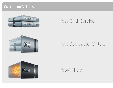
Use Icons
Icons are an excellent way to cut down on boring text on a page. Icons can also help organize data tables.
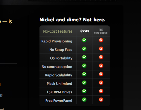
The table below makes excellent use of icons and looks very clean. Check marks and crosses are used instead of “Yes” and “No.”
Don’t Leave Blank Spaces
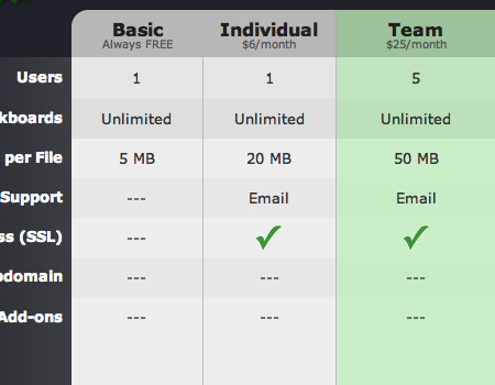
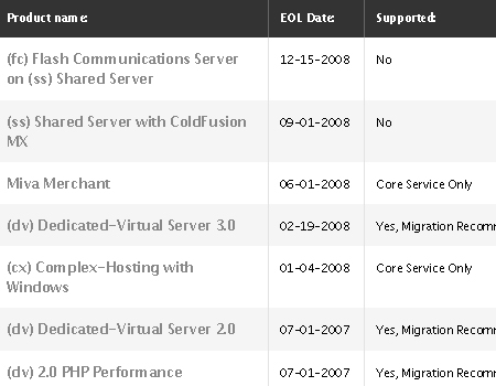
Tables often have cells to which data does not apply. Avoid simply leaving these spaces blank; instead, fill them with an marker, such as a cross (X), icon or, as in the table below, dashes.
This clean table uses three dashes to indicate that data does not apply to a cell; this looks much nicer than leaving an empty space.
Highlight Important Columns and Rows
Many data tables highlight columns and rows that provide particularly important or useful information. In pricing charts, you will often see the best plan highlighted. Take a look at the table below. The most important row — the schedule for the day on which the table is being viewed — is highlighted with a thick border and different background color.
Working With Larger And More Complex Data Tables
So far, we have focused mainly on small and simple data tables, but what about large, complex and data-heavy tables? There are many usability considerations that are specific to large data tables.
Make Columns Movable
Data tables figure prominently in many software applications, both Web-based and installed. Generally, developers will create tables so that columns can be moved and organized in any way desired by the user. Also, applications usually allow users to add and remove columns.
Allow for Reordering of Columns
In tables with a lot of data or data that changes frequently, you should give users the ability to reorder content and cells. The most common variables by which you can order data include date, alphabet and importance.
Provide Search for Large Tables
If data is extensive and the table very large, then a search box should be provided. This will improve the overall usability of large tables and make finding data much faster.
Provide Different Views
If your table contains information with thumbnail images or other visual content, another usability feature you can include is the ability to view that information in different ways. Provide options to view all text, both text and thumbnails or only thumbnails.
Take a look at this Flash-based data table. It provides many of the features that work well with large tables, as mentioned, including search, reordering options and different views.
Styling Data Tables
Styling, or lack of styling for that matter, plays a big part in how a user views a table and absorbs the data. Keep in mind, though, that it’s still only a data table and should not be overloaded with styling. Keeping it simple and readable should be your overall goal. Shadows and artistic borders may work with other elements in a layout, but stay away from them with data tables. Here are a few styling elements that work better for data tables.
Alternate Colors
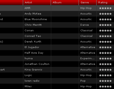
The most important characteristic of any data table is readability. One way to achieve this is by alternating colors for columns and rows. This makes it easier to read and more scannable.
The data table below is very well laid out. The rows of the table alternate colors, providing a clean, flowing, efficient layout. It has a lot of information but is still readable.
Borders
Separating cells with borders is extremely important. Borders make data much more readable and can eliminate confusion. With a lot of information, data in different cells can seem to blend together as one, but you want to keep them separate.
Ample Spacing
Like borders, spacing between data contributes to usability. In each cell, leave sufficient padding between the border and data. Use at least 20 pixels of space.
Simple Background Colors
Good data tables are all about readability, as we keep saying. Color and readability often go hand and hand. Data tables should always be simple, and one way to be simple is to use simple colors. Avoid using bright, obnoxious background colors that reflect poorly on the data being presented.
Showcase Of Data Tables
As promised, here are some websites that get data tables right.
Quantcast
A clean and basic table with nice fonts and a good color palette.
JukeFly
A large Flash-based data table with many usable features and user-friendly styling.
eWedding
A beautifully styled table that is still clean and readable.
Media Temple
A minimalist table with good use of icons, which provide an effective visual alternative to text.
iTunes
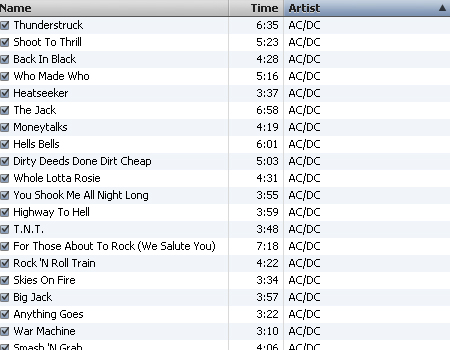
Data tables are everywhere, not just on the web. Applications such as iTunes use data tables.
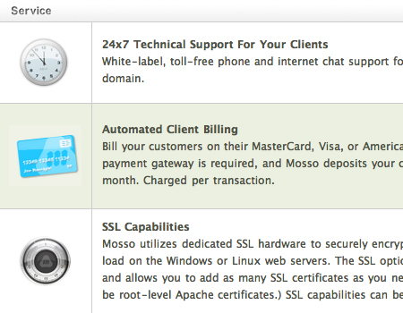
Mosso
A very nice table, with pleasant colors and icons and alternating background colors for rows.
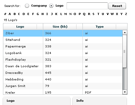
Zibler
A data table made with Flex that has search, movable columns and reordering options.
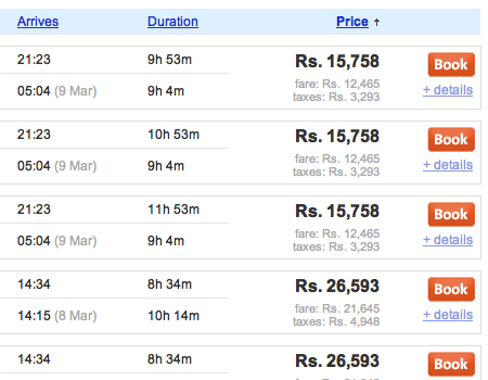
Cleartrip
Here is a complex table with a lot of information, but it can still be read with ease. Also note that the table has sorting and ordering options for columns.
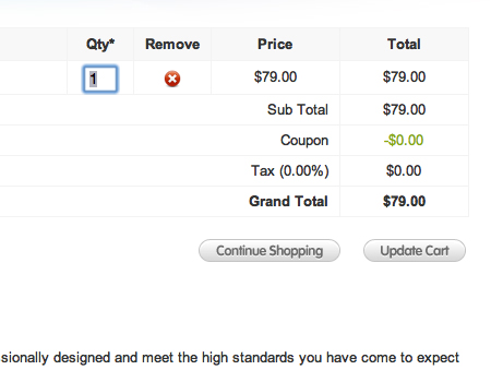
Realmac Software
Shopping cart areas are also built on a grid system. Here is one example from Realmac Software.
MT Support
This table makes good use of color and contrast.
CBS
Here is the CBS Network’s schedule.
Long Term Clients
A smooth table with excellent styling, a clean layout and alternating colors.
Media Temple
Another nice table from Media Temple, this one combining visual elements and text in a flowing table with readable data.
Fox
A data grid is used for the schedule on Fox.com. Notice again how the schedule for the current day is highlighted.
Quommunication
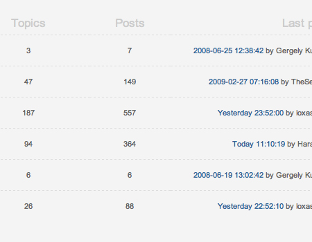
Many forum home pages are structured as a table. Here is just one example.
Viget
A well-structured and well-organized table.
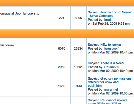
Joomla! Forum
Another example of a table on a forum landing page.
About the Author
Matt Cronin is a freelance Web and graphic designer as well as developer. He is the author and owner of Spoonfed Design, a design blog with great tips, how-to, inspiration, tutorials and more. Spoonfed Design is part of the VAEOU Creative Network, a new startup in progress with new services coming soon.
(al)


Send Comment:
29 Comments:
More than a year ago
Good list
More than a year ago
Good list.
What I'm looking for are designs that show headers and sub-headers (±3), multiple-row grouping and sub-total and total rows, differentiated perfectly. Anyone seen these beasts?
A rare breed. :)
More than a year ago
I used that lib before, to be honest if you dont want to get mad stay well away it, no documentation and that code is the worse thing they could come up with
More than a year ago
These came to be very useful when trying to move away from a boxy look for a table in our client's brochure. Thanks!
More than a year ago
Great work, very different to other articles and you touching a subject that is so important on how to present data to the users. Thank you for sharing your knowledge.
Eddy
More than a year ago
great collection
More than a year ago
I meant to bookmark this when I first saw it, but forgot to. I'm really glad I found it again! :)
More than a year ago
Does anyone have any tips or tutorials on making a table with a lot of columns? I have a table with about 10 columns and I'm getting frustrated on trying to make it fit into a 800 px content area. Any tips would be greatly appreciated.
More than a year ago
great collection
More than a year ago
Haha. For a second there, I thought the title meant websites that still use tables for the main layout. But that wouldn't be very modern, would it? :P
More than a year ago
Great way to visualize SQL.
More than a year ago
Nice table design. I like JukeFly design
More than a year ago
Here it is:
More than a year ago
If you are going to plug yourself, you might want to make sure you put up a link that works.
More than a year ago
wow!! a really good post
More than a year ago
I loved
More than a year ago
I am definitely bookmarking this page and sharing it with my friends.
Thanks..
More than a year ago
Great article on an aspect of web design that often gets overlooked.
More than a year ago
Nice round-up. Btw, if you're looking for a ready table with complex functionality, you may check dhtmlxGrid ( This is one of the most powerful datagrids out there.
More than a year ago
A great collection, thanksfor sharing!
More than a year ago
nice article , good tips about tables in web design , thanks a lot Matt :D
More than a year ago
very nice article of data tables in web design. wish you all a happy new year.
More than a year ago
Great stuff! Thanks for sharing
Happy Holidays!
More than a year ago
Some of these tables look very nice and modern (Media Template and Mosso) and then again, some don't look so amazing (Fox, CBS). I like this list, nice collection and now the question is: how do we implement this?
More than a year ago
very nice article. thanks!
More than a year ago
Really good information. To clear one thing up about alternating colors or "zebra stripping" as it is commonly referred to has been shown in numerous case studies to not increase readability or the ability to locate information any faster than tables without. To have or not to have is really a preference but it won't increase the functionality of the table, just make it more visually appealing.
More than a year ago
Thanks for this. Very useful stuff.
More than a year ago
Good round-up of tips how to use data tables. I've been running a gallery for data table styles for a few years now, you can see all the submission here:
More than a year ago
Nice collection!