
The Color of the Year 2017: Greenery by Pantone
15-0343 TCX, also known as "Greenery," is the name of the color of the year by Pantone. After having chosen pink and blue in the past year, I'm a little surprised to see a somewhat muddy green in 2017.
[caption id="attachment_79684" align="alignnone" width="975"] (Source: Pantone)[/caption]
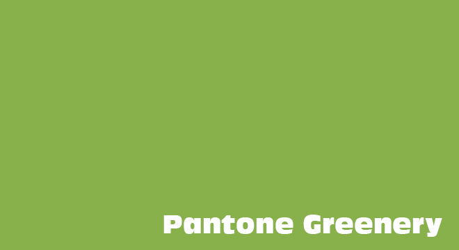 On the other hand, there's the color in itself. When looking at it without any context, as a pure color, it doesn't have the unrestrictedly positive effect it wants to represent. I find the color to be muddy, not really fresh, almost gross, like the cabbage soup that I had to eat way too often as a child.
Using Greenery, toxicity or atomic incidents can be illustrated just as well. In contrast to Serenity and Rose Quartz, Greenery is not entirely positive. You can probably tell that I don't agree with the choice unconditionally. Then again, nobody forces us to use the color just because it's the color of the year...
On the other hand, there's the color in itself. When looking at it without any context, as a pure color, it doesn't have the unrestrictedly positive effect it wants to represent. I find the color to be muddy, not really fresh, almost gross, like the cabbage soup that I had to eat way too often as a child.
Using Greenery, toxicity or atomic incidents can be illustrated just as well. In contrast to Serenity and Rose Quartz, Greenery is not entirely positive. You can probably tell that I don't agree with the choice unconditionally. Then again, nobody forces us to use the color just because it's the color of the year...
(Source: Pantone)[/caption]
Pantone: Color as a Political Statement
Pantone likes to issue statements. These statements are always delivered in the language of color. As such, political and social thoughts are behind the election of each year's color. This is What Pantone Has to Say:"While Serenity and Rose Quartz, the Pantone Color of the Year 2016, expressed the need for harmony in a chaotic world . . . Greenery bursts forth in 2017 to provide us with the hope we collectively yearn for amid a complex social and political landscape. Satisfying our growing desire to rejuvenate, revitalize, and unite, Greenery symbolizes the reconnection we seek with nature, one another, and a larger purpose."Of course, this is a sympathetic interpretation of the election of Greenery. And it's true that Greenery looks great within the context of the objects that Pantone wants you to associate Greenery with. Look at the following video from this post. https://www.youtube.com/watch?v=8zC75u81VKg
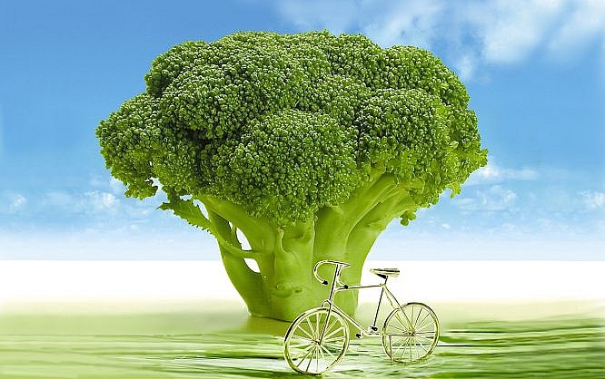
Greenery Brings Back Spring
The color is meant to make the early spring appear in front of your mind's eye; the time when leaves and grass are still light green since they are so young. This is the time in which nature reinvents itself every year, rejuvenating itself to get to work with newfound power. Who would want to shut themselves off from that?
On the other hand, there's the color in itself. When looking at it without any context, as a pure color, it doesn't have the unrestrictedly positive effect it wants to represent. I find the color to be muddy, not really fresh, almost gross, like the cabbage soup that I had to eat way too often as a child.
Using Greenery, toxicity or atomic incidents can be illustrated just as well. In contrast to Serenity and Rose Quartz, Greenery is not entirely positive. You can probably tell that I don't agree with the choice unconditionally. Then again, nobody forces us to use the color just because it's the color of the year...
Image by Kamegai Susumu from Pixabay
I don’t think that’s the color of the year.
This made me think about our decision to go with blue. We may need to redesign our whole site. Pantone greenery looks great.
Wonderful color chosen. A world of sensations, feelings and new possibilities for this 2017
Wow! Wonderful color and looks great.