CSS Rooted: Flexible Type Sizes With REM
Best practices of defining font sizes are discussed throughout the web since its inception. Besides the traditional candidates, such as Past Standard: Font Size per
Up to circa 2008, defining font sizes as flexibly as possible was looked at as best practice. To achieve this, units The Temporary Emancipation Of
In February of 2009, German developer Jens Grochtdreis published a post titled "Die leidige Sache mit der Schriftskalierung", which could have been called something like "Annoying Facts On Font Scaling" if it had been published in English. Grochtdreis advised the readers to go for "Root EM":
Since sometime in 2011, Fallback For Older Browsers:
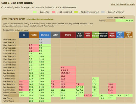
If this sounds to good to be true to your ears, you are right. There is exactly one catch to it: older browsers. The service http://caniuse.com/rem shows you, what to expect. And, honestly, what you can expect is quite a lot:
 Downsides of this method are associated - as always - with browser names, this time - as always - IE younger than version 9 and Opera Mini. These two and possibly other older contestants make the implementation of a pixel-based fallback mandatory. Goven the above example, this might look like this:
px, em and %, rem represents a fairly new alternative, taking the best of the other units and combining them into one.
Past Standard: Font Size per em or %
Up to circa 2008, defining font sizes as flexibly as possible was looked at as best practice. To achieve this, units em or % where implemented, relative to the browser's standard, which usually is defined at 16px.
This flexible mixture served for the best user experience, as lots of browsers did not have page zooms, and the IE6 was not able to to zoom text defined via px at all. At least not without altering system settings.
A common problem is that with em as well as % inheritance of type sizes has to be relative to something. Percentage values are relative by nature, usually relating to their parent element. The unit em doesn't differ much:
- In a box model property such as
margin-bottom,emrelates to the font size of the element itself. Changes in font size lead to changes in margin, which might be a desired effect. - On the other hand, font size definitions using
emalways relate to the font size of their parent element. Putting a0.875eminto play leads to further decrease with every nesting. The more nestings you have, the smaller the font will become.
The Temporary Emancipation Of px
In February of 2009, German developer Jens Grochtdreis published a post titled "Die leidige Sache mit der Schriftskalierung", which could have been called something like "Annoying Facts On Font Scaling" if it had been published in English. Grochtdreis advised the readers to go for px. At that time, modern browsers could already zoom natively and the importance of IE6 was on the decline.
One year later, German developer Gerrit van Aaken supported Grochtdreis in his post "Warum ich Pixel für CSS-Schriftgrade verwende", "Why I Use Pixel For CSS Type Sizes". Not less interesting than the article was the discussion it started right below the post itself. In the course of this dispute a small comment, namely #22 mentioned a unit by the name of rem, which was almost totally unknown 'til then.
"Root EM": rem, A New Star Is Born
Since sometime in 2011, rem started to grow better known, slowly, but steadily. This comes as no surprise as rem combines the upsides of px and em. It is not less flexible than its older brother em, but works around the downsides in terms of inheritance, as rem always relates to the root element <html>, not to <body>.
To get the value for rem, we divide the desires picel size by the the base value 16. In CSS this is how a font size definition would correctly look like:
html { font-size: 100%; } /* Browserdefault, 16px  */
h1 { font-size: 1.75rem; } /* 28/16 = 1.75 */
h2 { font-size: 1.375rem; } /* 22/16 = 1.375 */
p { font-size: 0.875rem; } /* 14/16 = 0.875 */
This way we can build a cascade of type sizes quickly. If there comes a time, where you'd want your fonts to look larger or smaller, you only need to change the base. The relation between paragraph text and headings will always stay the same.
Fallback For Older Browsers: px
If this sounds to good to be true to your ears, you are right. There is exactly one catch to it: older browsers. The service http://caniuse.com/rem shows you, what to expect. And, honestly, what you can expect is quite a lot:
 Downsides of this method are associated - as always - with browser names, this time - as always - IE younger than version 9 and Opera Mini. These two and possibly other older contestants make the implementation of a pixel-based fallback mandatory. Goven the above example, this might look like this:
html { font-size: 100%; }
h1 {
font-size: 28px;
font-size: 1.75rem;
}
h2 {
font-size: 22px;
font-size: 1.375rem;
}
p {
font-size: 14px;
font-size: 0.875rem;
}
Modern browsers will read and overwrite the px value with that of the rem unit during the course of the cascade, while older browsers will stick to the px instruction and ignore the second line. Just the way we thought it to be...
Related Links:
- In Defense Of Rem Units - Tech Time
- Can I Use Rem Units? - caniuse.com
Article written by Peter Müller
(dpe)
If we do
html {font-size:62.5%;}
then we could have the fallback as:
h1 {font-size:14px; font-size:1.4rem;}
much easier to translate
What are the upsides to using rem rather than px? Modern browsers all scale the text properly regardless of how the size is defined. What makes it better to use rem/em/percent?
Read the article…
Thanks for that well considered reply.
The article says that “defining font sizes as flexibly as possible was looked at as best practice” specifically because some browsers (IE6) didn’t let you resize the fonts if they were defined as px. It immediately goes on to say that it’s no longer an issue and px was able to be used as a result.
Then it describes rem and how to use it with no indication on why it’s better than px other than it’s flexible like em. If, however, browsers can easily resize fonts (the main reason listed for using ems), I’ll restate my question (which isn’t answered by the article): “What are the upsides to using rem rather than px?”
For those using less or sass, this logic can be wrapped in a function
http://css-tricks.com/snippets/css/less-mixin-for-rem-font-sizing/
So agree with Daniel, i have try and it work