
How to Create Websites That Meet Visitor Expectations

Creating good websites starts with a certain consistency. This consistency is essential for the cognitive burden of a website's visitor. When your design is consistent, using the website feels smooth and logic. However, when it is inconsistent, the user needs to put in unnecessary effort. This is what you need to avoid when you want to create websites that meet the expectations of your visitors.
 Consequence, in the sense of consistency, doesn't mean to do the same thing over and over. In some areas, more needs to be invested into building consistency while other areas are easier to create. It's also really boring to always do the same thing and to deliver boring, uniform designs. The key to success is the equilibrium between consistency and chaos.
 In this article, we will explain in detail, what consistency in web design means, why it is important to achieve, and what it means to bring it in line with user expectations.
 A clear user guidance. The user instantly knows his ways around
The current knowledge of your website's visitors depends on some external factors. However, in most cases, the expectations of the users will be appropriate, allowing you to react to them. In the end, the design is based on how much your users know already. This is not a new concept, but it has become the standard and can be found on almost every website or mobile application.
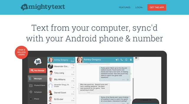
For example, there's a slider for the presentation of images, an envelope symbol for the email address, the logo of the website that leads back to the landing page when clicked. All of these are returning UI patterns that the visitors expect.
A clear user guidance. The user instantly knows his ways around
The current knowledge of your website's visitors depends on some external factors. However, in most cases, the expectations of the users will be appropriate, allowing you to react to them. In the end, the design is based on how much your users know already. This is not a new concept, but it has become the standard and can be found on almost every website or mobile application.
For example, there's a slider for the presentation of images, an envelope symbol for the email address, the logo of the website that leads back to the landing page when clicked. All of these are returning UI patterns that the visitors expect.
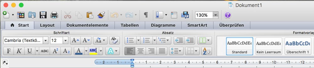 Microsoft Word for OS X
Probably all of us have used Microsoft Word or use it still. Its type of menu options has etched itself into the minds of users that often use text editors. Thus, it feels natural to find them in other applications. Even at this moment, writing this article, I have this type of user guidance in front of me because the WordPress TinyMCE editor uses the same design elements.
Microsoft Word for OS X
Probably all of us have used Microsoft Word or use it still. Its type of menu options has etched itself into the minds of users that often use text editors. Thus, it feels natural to find them in other applications. Even at this moment, writing this article, I have this type of user guidance in front of me because the WordPress TinyMCE editor uses the same design elements.
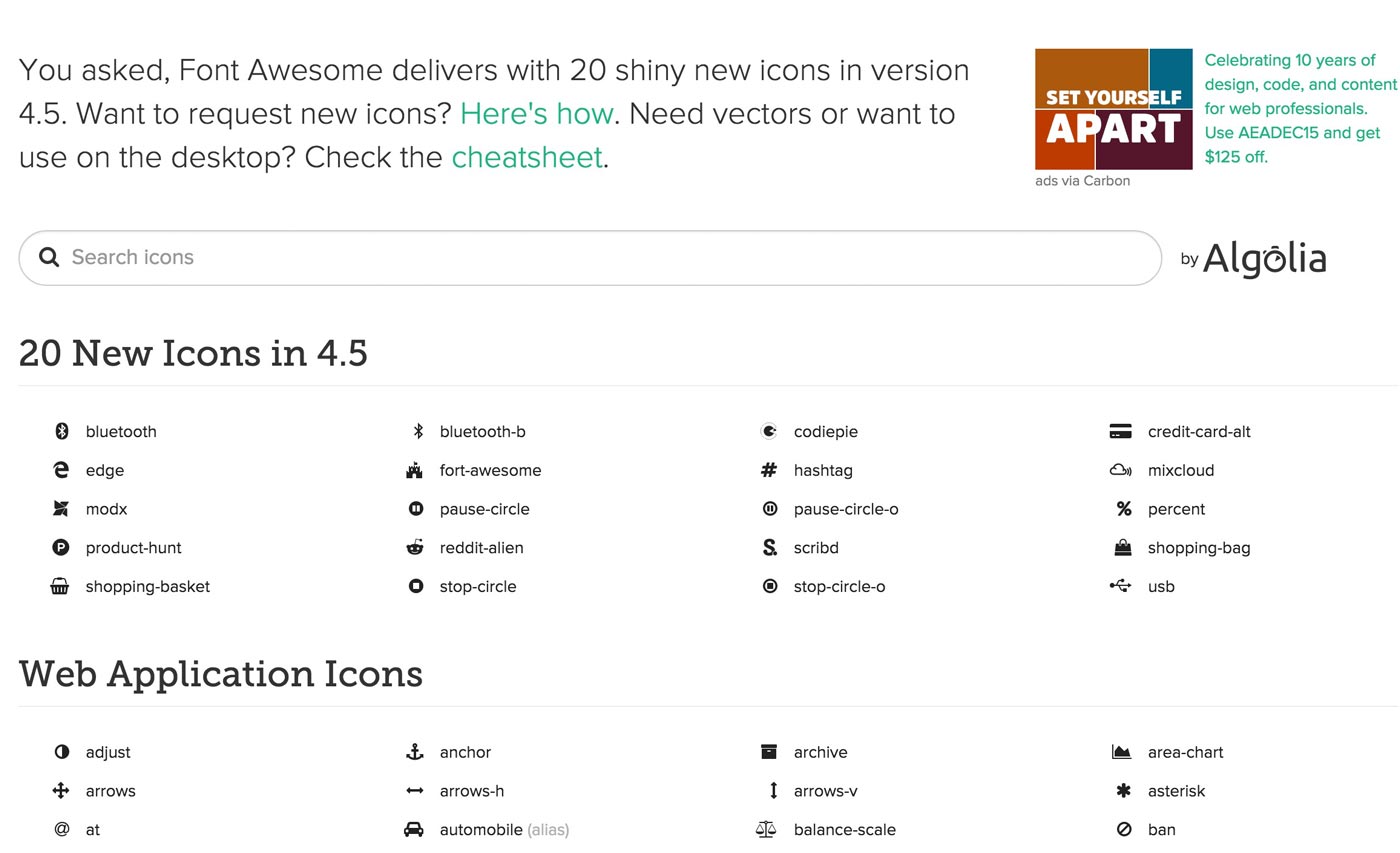 Font Awesome
The icon font »Font Awesome« is a superb example of a functional UI pattern. It offers many icons that a lot of people can immediately recognize and relate to. As these icons can also be edited in size easily, icon fonts are the first choice when creating a good user experience. As you can see, external consistency can have many faces, but the recall value is always very high and thus creates a good user experience.
Font Awesome
The icon font »Font Awesome« is a superb example of a functional UI pattern. It offers many icons that a lot of people can immediately recognize and relate to. As these icons can also be edited in size easily, icon fonts are the first choice when creating a good user experience. As you can see, external consistency can have many faces, but the recall value is always very high and thus creates a good user experience.
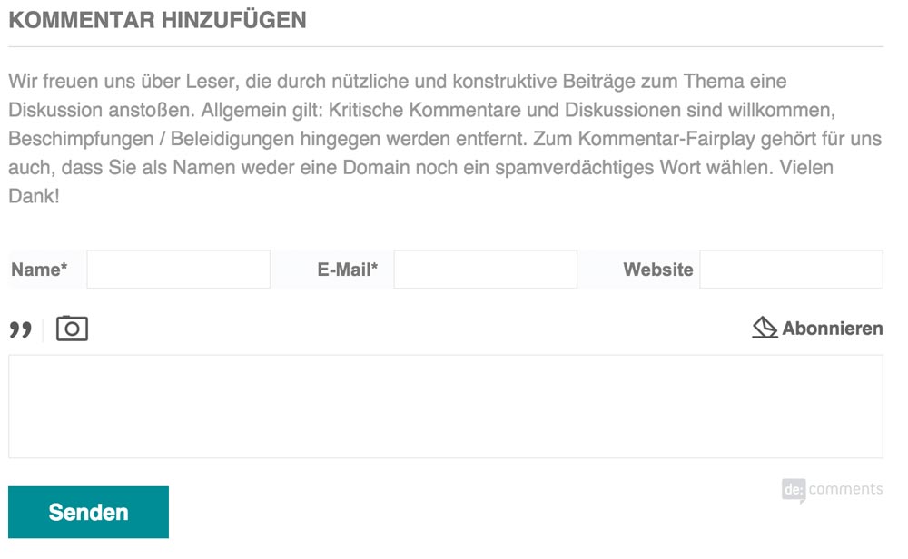
 Everything in the Right Spot: Our Beloved Sister Dr. Web
 In many sign up forms, the necessary fields outweigh the optional ones. Wouldn't it be easier to mark the optional fields with a star? Avis has tried just that a couple of years ago.
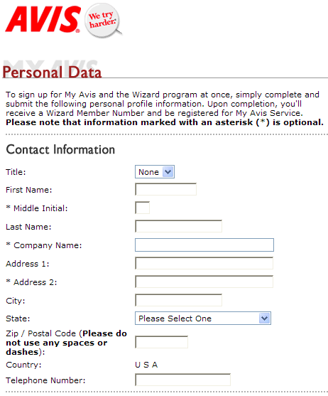 However, the only way of understanding this new labelling is to read the text above the form. Never underestimate the laziness of your users. Back then, the visitors of Avis have filled in the form like they were used to and were angry and confused about what the purpose of this new kind of user guidance was. This new design forced the users to read forms again. This has nothing to do with user friendliness. Avis quickly noticed the mistake and reoffers a standard form today.
 All required input fields can instantly be recognised, as the stars tell the user what to do. It doesn't matter if the stars are black or red; the user knows the meaning. Alternatively, the optional fields can also be labelled with the word "optional". However, that forces the user to read the form. The cognitive burden on the user increases - even if just for a few milliseconds -. This can not be the goal, as intuitive controls make the user feel comfortable. He will gladly visit the website you created again.
Consequence, in the sense of consistency, doesn't mean to do the same thing over and over. In some areas, more needs to be invested into building consistency while other areas are easier to create. It's also really boring to always do the same thing and to deliver boring, uniform designs. The key to success is the equilibrium between consistency and chaos.
In this article, we will explain in detail, what consistency in web design means, why it is important to achieve, and what it means to bring it in line with user expectations.
Why Consistency in Web Design is Important
Good design for interactions is based on the system's learnability. Put simple: When a user interface works well, it becomes predictable. This means that the user understands how to use certain features intuitively, without any guidance. And this sums up what the following article is all about. A safe and predictable UI leads to smooth operation of the final product - a good consistency. In contrast, when a user interface is inconsistent, it hinders the process, provokes frustration and causes a bad user experience. The user will not visit the website again. Of course, consistency is not restricted to the site you created. The user will spend most of his time surfing other websites. That way he will gain experience in dealing with a website. Regarding your site, this experience will then either be positive or negative, depending on how much effort you put into the user guidance and operability. Basically, consistency means that everything fits together perfectly and works homogeneously.The Principle of Minimum Surprise
When you're not sure on how to design the surface of your website, follow the principle of minimum surprise. Of course, small surprises, like the ones on MailChimp are alright. However, your core features shouldn't differ from the standard too much. The design rule should be adhered to. Videos shouldn't be confused with images; buttons should be easily identifiable, labelled with a clear message, and so on. Always check your design from the point of view of a user. When you're still not sure what consistent design means, read the iOS Human Interface Guidelines. That should help. These guidelines can also be applied to websites.Consistency in Web Design
Consistency regarding web design can be divided into two areas, internal and external consistency. External consistency means comparisons with other products and surfaces while internal consistency focuses on the project's surface in itself. Let's take a closer look at some of the best practices for surface design.External Consistency
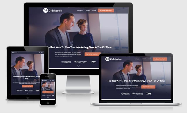
External consistency includes the comparability with similar products. Your website gets compared to multiple other websites every day. To summarise, you can say that external consistency means meeting user expectations. To create a design that does that, you need to look at your design and the work of other designers from the perspective of the user. When you are able to operate a website perfectly, you can apply the achieved external consistency to your own design.
A clear user guidance. The user instantly knows his ways around
The current knowledge of your website's visitors depends on some external factors. However, in most cases, the expectations of the users will be appropriate, allowing you to react to them. In the end, the design is based on how much your users know already. This is not a new concept, but it has become the standard and can be found on almost every website or mobile application.
For example, there's a slider for the presentation of images, an envelope symbol for the email address, the logo of the website that leads back to the landing page when clicked. All of these are returning UI patterns that the visitors expect.
Using returning surface patterns
Using so-called UI patterns or surface patterns prevents many problems regarding user friendliness. Many users already know these patterns from other solutions, learned them from visiting other websites or by using programs like Word or other everyday programs. Designers don't need to reinvent the wheel. The free E-book »Web UI Design Patterns 2014« covers most of the conventional patterns. You can get good ideas from there. Examples for UI PatternsMicrosoft Word
Microsoft Word for OS X
Probably all of us have used Microsoft Word or use it still. Its type of menu options has etched itself into the minds of users that often use text editors. Thus, it feels natural to find them in other applications. Even at this moment, writing this article, I have this type of user guidance in front of me because the WordPress TinyMCE editor uses the same design elements.
Icon Fonts
Recognisable, Clear, Structured and Intuitive
The most important things in web design can be summarised in one headline. That doesn't mean that your websites should always look the same. It only means that the essential elements are always exactly where the visitor of your website searches for them. A navigation belongs at the top area of a site. Here it will be visible and able to catch the eye instantly. The search feature - when offered - also needs to be easily distinguishable. The logo has to be clickable and has to lead back to the homepage. A website shouldn't be overloaded. Less means more here! Clear structures are necessary. Call-to-action buttons need to catch the eye instantly and need to be labelled appropriately so that the user knows what he's expected to do. Intuitive means that everything can be found where you look for it first. You know this. You are a consumer of websites as well. So check your design from that point of view.
Everything in the Right Spot: Our Beloved Sister Dr. Web
These Things Should Be Avoided
Expectations of visitors are not always preferences. Sometimes they are mere habits. Let's take a standard comment form as an example. We all know that a star next to the input field means that this information is necessary. If no information is entered, you can not continue.
In many sign up forms, the necessary fields outweigh the optional ones. Wouldn't it be easier to mark the optional fields with a star? Avis has tried just that a couple of years ago.
However, the only way of understanding this new labelling is to read the text above the form. Never underestimate the laziness of your users. Back then, the visitors of Avis have filled in the form like they were used to and were angry and confused about what the purpose of this new kind of user guidance was. This new design forced the users to read forms again. This has nothing to do with user friendliness. Avis quickly noticed the mistake and reoffers a standard form today.
All required input fields can instantly be recognised, as the stars tell the user what to do. It doesn't matter if the stars are black or red; the user knows the meaning. Alternatively, the optional fields can also be labelled with the word "optional". However, that forces the user to read the form. The cognitive burden on the user increases - even if just for a few milliseconds -. This can not be the goal, as intuitive controls make the user feel comfortable. He will gladly visit the website you created again.