


As a member of the design community you have probably heard the expression ‘KISS’ before. For those of you who haven’t, it stands for ‘Keep it Simple Stupid’. It’s an established design rule that you should not over-complicate your layouts, but rather focus on the core aims for your page. The trouble is that designing a simple web layout is notoriously difficult. Despite containing less data and less graphics, a successful minimal web design is actually very difficult to produce. There is no hiding behind flashy graphics or other such distractions. Every detail must be just right, and it is these details that can make or break a simple web design.
There is a vast difference between some text slapped on a plain background and a stunningly minimal website design.
Often several aspects can distinguish a simple design as something special:
- Awesome typography: Everything from line-spacing to letter-spacing needs to scream professionalism.
- Subtle but effective graphics: In a simple design graphics won’t be particularly overt, but can still add some great touches to your page. A creative logo design or clean icons beside your blog posts can really help set your design apart.
- Great visual hierarchy: Just because your page is simpler, doesn’t mean you wouldn’t have to focus on where you want to point your visitor’s gaze. Use typography, padding and color to draw your user’s eye down your page effectively.
- Coding matters more: In a page that is so basic little coding tricks can go a long way. A smooth html5 effect here, or a css3 show-off there can turn a minimal page from boring to stylish and impressive.
- Less columns = more: If you’re opting for a simpler design then consider a 1 column layout. This can really help focus attention on your key content and leaves less room for distractions.
KISS: A Showcase of Beautifully Simple Blog Design
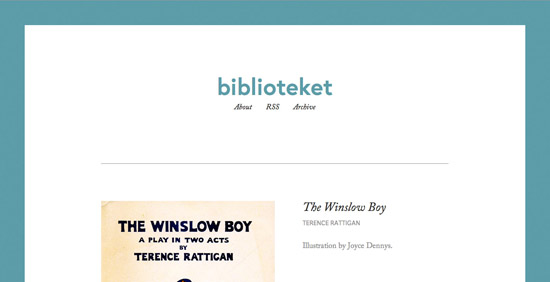
Biblioteket
Biblioteket is a classically simple blog design. The color palette is very limited, using a splash of teal for the background border and logo text. The menu and textual contents are very basic also. The entire design focuses mainly on the book covers posted, which provide the core content. As a ‘book cover blog,’ this is entirely appropriate and shows how a minimal design can give clearer focus to the key content. This focus is amplified by a large amount of white space and padding around each book design.
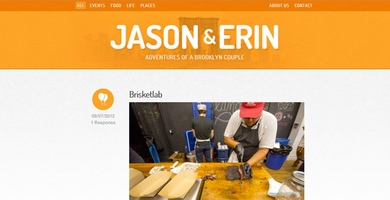
Jason and Erin
Jason and Erin is a charmingly minimal blog run by a couple from Brooklyn. The site feels very focused, avoiding any sidebar content and concentrating instead on a basic one column design. The clean header and user-friendly menu provide the perfect intro to the blog content, which is quite literally a list of photos and text, lovingly formatted.
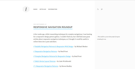
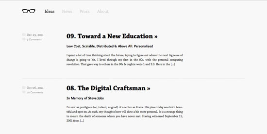
Ordered List
Ordered List is the archetypal minimal site, with a monotone color scheme, and distinct lack of images. In fact, the design is almost entirely constructed of black text on a white background. Simple? Yes. Boring? No way! This blog manages to look effortlessly stylish and elegant through it’s minimal approach. The text has been formatted to perfection, with every padding, line spacing, bold styling, font size and heading feeling just right. A great example of good design being in the details.

Old Guard
Another fantastic example of highly minimal design, Old Guard is a blog that just begs to be read. Whilst it is largely text based, the blog design beautifully implements images and video into certain posts. It also does a great job at guiding users through the page. You’ll notice varying shades of black/gray throughout the content, which clearly establish a visual hierarchy. For example, the large black post titles receive considerably more attention than the smaller, fainter text detailing the date. Similarly blue is used sparingly for links and underlines, immediately drawing our eye and encouraging action.
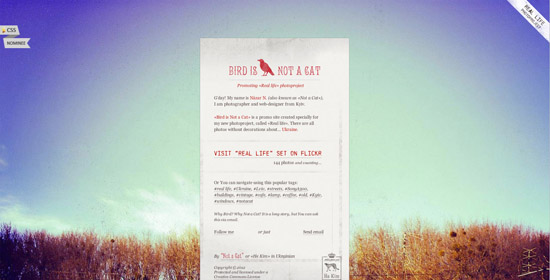
Bird is Not a Cat
Bird is Not a Cat is a lovely minimal blog from photographer Nazar N. In this design the content almost takes a back seat to the panoramic, scenic photographic backdrop to the site. The 1 column, narrow content area lets the eye easily scan down it, almost like reading a receipt. There are no distractions within this design and the main focus is on the work of the artist.
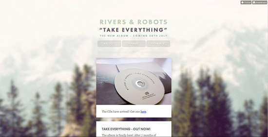
Rivers and Robots
Quite interestingly Rivers and Robots have created a mini-blog specifically to promote their album Take Everything. Due to the narrow focus of content they have been able to use a really minimal design, using a very narrow content arrow and one column approach. This type of minimal, narrow layout really makes their content more scannable. There is no clutter of a busy navigation, just three basic menu links.
Josh Collie
A blog so minimal that it doesn’t even have a header, logo or menu! Josh Collie’s website is proof that content truly is king, as despite omitting several conventions of blog/website design, it is entirely readable, engaging and beautiful. The text is perfectly padded and feels very easy on the eyes. The large interspersed images and videos help to break up the page nicely.
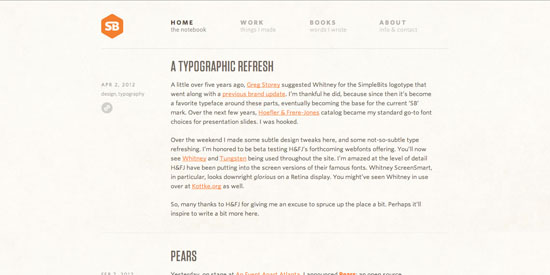
Simple Bits
Simple Bits has been held up as a modern day trend-setter for simplistic blog design. Originally it was the design that dared to be different in it’s minimal approach, but now it has inspired thousands of designers to strip away the detail in their own sites. The blog design is almost entirely type-based, yet doesn’t feel bare in any way. The stylish, minimal icons besides posts add a lovely element of detail while the varying, elegant typefaces provide an element of visual interest.
Fran Exposito
I may not be able to understand the content on this non-English blog, but it doesn’t stop me appreciating the minimal design! This blog design is a great example of how a creative, engaging logo design can hold up an entire website. Without the logo this design would be solid, but perhaps a little boring. However, the logo perfectly frames the content below it and adds as the visual centerpiece for this design.
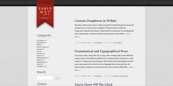
Table 37
Table 37 is another blog held up for it’s creative design within the design community. It is essentially a very basic two column, textual layout. However, the use of some subtle background textures and a striking, creative logo make this a true minimal design gem. Our eye is drawn immediately to the larger right column containing the blog posts, and the left sidebar acts as a natural supporting area of content for this. Basic design principles at their best.
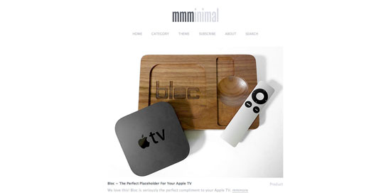
MMMinimal
As suggested by it’s name, MMMinimal has a wonderfully simple blog design. Interestingly, the site focuses the user’s attention on the pictures that accompany blog posts, rather than the textual content, which is less obvious, using a faint gray font. The slick, centered layout is in no way obtrusive, and simply acts as a subtle frame for the blog post previews.
Art Equals Work
Art Equals Work uses a super sleek, simplistic blog design. A light gray sidebar helps distinguish content areas, and the design remains essentially text-based. Visual hierarchy is artfully achieved through use of text-sizing, color and padding. The bright blue post titles are what draw our eye first, and the blog content is framed nicely by the minimal, artistic logo icon.
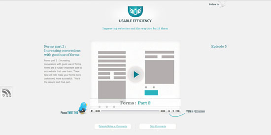
Usable Efficiency
Usable Efficiency is another minimal blog design that really puts emphasis on the content. The plain background, and limited teal color palette, as well as an omission of distracting sidebars means that the blog posts are the only place to look. Presented in video format they make a particularly striking visual piece for the design, which even in it’s details is understating (see the faint twitter bird top-right).
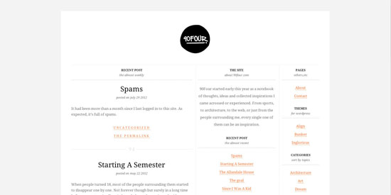
90 Four
Despite having a three column layout and a reasonable amount of content, 90 Four manages to still feel very minimal. This is largely due to the lack of graphics, as instead the site opts for a text-based layout over a plain white background. The design is still visually impressive due to the creative logo, great typography and deliberate use of color throughout.
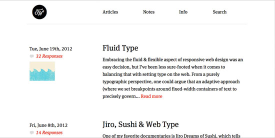
Trent Walton
Whilst many designs in this showcase use a narrow layout Trent Walton effectively uses as much space as possible in the browser. This wide, yet minimal design really allows the large text to breathe. It also helps to clearly distinguish the various areas of content. The color palette is limited to black, with rare uses of red for key links. I also like how the blog post images are displayed as a small thumbnail, which is much less obtrusive than typical formats.
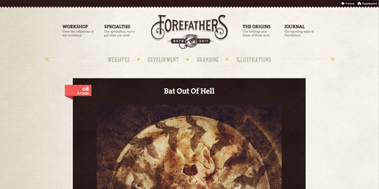
ForeFathers
A design that has inspired many designs since it’s first iteration, ForeFathers blog has now migrated to Tumblr, giving it an even more minimal approach. The textured background and old-style typography of the header is not overbearing, and leads down to a clear 1 column layout for the post content. This type of minimal layout let’s the user’s eye be drawn straight down the page in a natural fashion.
Strange Native
Another fantastic example of a minimal design that works really well due to it’s subtle touches. This design is largely text based, but the basic logo icon and date/comment icons add a lovely touch of detail to the page. The text is very well padded and uses varying shades of gray as well as text sizes to establish a clear visual hierarchy.
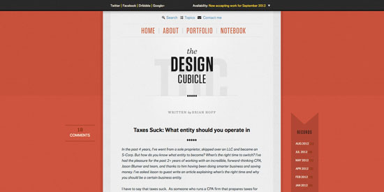
The Design Cubicle
Another pioneer in simplistic blog design, Brian Hoff has created a beautiful one column blog layout that gives primary focus to the content. Rather than detracting from the blog posts, the bold, bright background serves to frame the central content area.
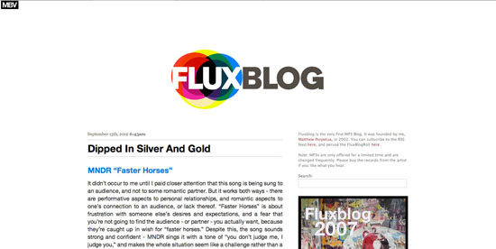
Flux Blog
Flux Blog is another minimal blog design that relies heavily on it’s creative logo to frame the otherwise simplistic design. Underneath the vibrant, colorful logo, the blog design is really very basic, with basic text sitting on a plain white background. There isn’t even anything distinguishing the various content areas, apart from differing sizes of text. Surprisingly the result is not chaotic, but the eye is naturally drawn down the larger left column of text through the various blog posts.
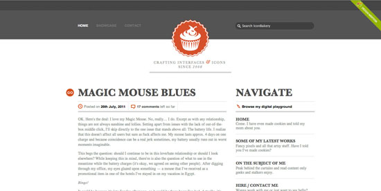
Icon Bakery
Another minimal blog design framed by a beautiful logo design. As this blog discusses icon design it seems appropriate that the visual point of interest is the elegant logo icon. The rest of the header and main content area is very simplistic, avoiding overly complex graphics and opting for clean icons and text. Rare splashes of color are used to guide the visitor’s eye down the page and emphasize key headings.
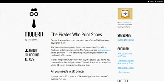
Modernerd
One of my favorite blog designs there is just so much to love about this website! Everything from the logo to the menu and blog posts feels effortlessly minimal. Essentially the site would just be a boring three column textual layout. However, several aspects combine to make the page beautiful. Firstly, if you look closely the background using an incredibly faint, subtle pattern design, which adds an element of depth to the page. Then crucially the typography uses non-standard web fonts to make each heading, each menu link a work of art in it’s own right. The best element of the page has to be the genius logo design though, which perfectly sums up the blog’s audience.
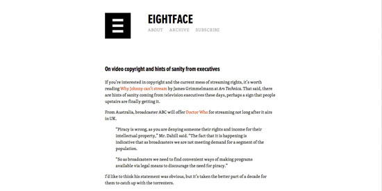
Eight Face
One of the simplest designs in this article, but one of the most effective. If we break down the page design it is essentially a single column of text. However, it’s another great example of how quality typography can make all the difference. The two carefully chosen fonts contrast and spark visual intrigue, as the clean logo/heading text combines with the more elegant menu/blog post text. Even the logo icon screams minimalism as it effortlessly communicates ‘8’ ‘E’ and ‘F’ in a few simple lines.
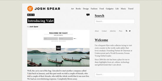
Josh Spear
Josh Spear’s site is so simple that it manages to feel like you’re reading a personal diary. There is no excess clutter on the page, instead giving focus to the content. The elegant typography is enough to make the page interesting, which is helped by a creative logo icon and some cool styling effects. The user’s eye is drawn straight to the text on the page and they can’t help but read.
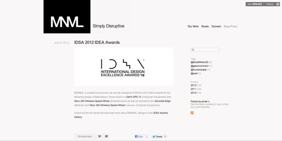
MNML
MNML’s tagline ‘simply disruptive’ is the perfect description of their blog design. The site is incredibly simple, comprised mainly of plain text over a plain background. However, unlike many minimal designs that stick to a single column or rigid grid, MNML’s opts for a deliberately disrupted layout. The various content areas are put out of alignment with one another which means that the user’s eye flows more in diagonals than directly down the page. An interesting design that shows what can be achieved by breaking the mold.
Simon Collison
Simon Collison’s blog design became instantly infamous after launching. It is considering a very minimal design, yet spices things up with some awesome illustrations and some html5 responsive design magic. This design has plenty of details, such as the page background pattern, yet none of these detract from the content which remains at the forefront. Any visual details are very subtle, and take a back seat to the blog posts. The red color in the design is used sparingly to guide the reader’s eye down the page.

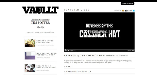
Vaullt
There is a reasonable amount going on in this design, yet it still feels quite minimal. The monotone black/white color palette helps to keep things very simple, and the content, whilst prevalent is very well spaced and doesn’t feel overbearing. Even the typography is very consistent, using a single, primary font throughout the page.
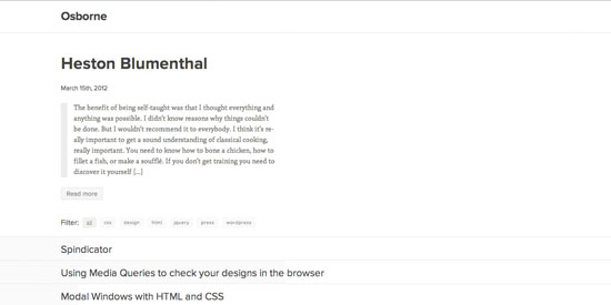
Jack Osborne
A design so simple that you really need to visit it and play around to appreciate it’s finer points. At first glance it’s simple a column of text with some relatively attractive typography. However, the beauty of this design are in the subtle details. Firstly, the top blog post takes precedence as the other lower posts are all collapsed (until you expand them). Upon hovering over these collapsed posts you’ll see a bar come up which varies based on the number of words in that article. It’s little touches like this that can distinguish between a boring design and a daringly minimal design.
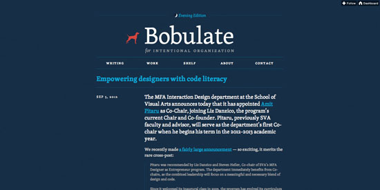
Bobulate
Bobulate is a wonderful, single column blog that utilizes some beautiful typography. The design has a presidential feel to it through the use of a blue/red/white color palette. Even at first glance you can identify a clear visual hierarchy on the page, as your eye is drawn down from the bold blue logo, to the smaller headline text, and finally to the lighter gray blog post text. It’s essentially a very minimal blog design, but the varying typographic elements help add a lot of visual diversity to the page and make it a very attractive design.
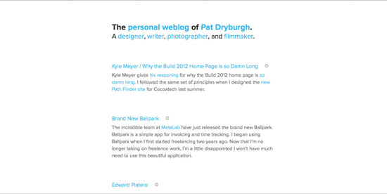
Pat Dryburgh
Pat Dryburgh has one of the simplest designs in this entire roundup. However, as a very minimal design it really works. The attractive typography uses ‘Proxima Nova’ which has become synonymous with modern web design. The color palette is limited to black, gray and blue and the blue is used to draw your eye down the page through a series of key links. The real merits of this design are how the incredible photography embedded into blog posts is integrated into the page, but you’ll have to visit the site and check out below the fold to appreciate this!
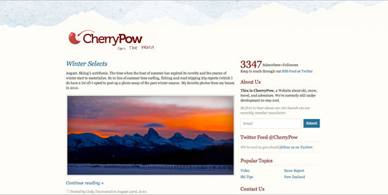
Cherry Pow
Cherry Pow is fairly content heavy, yet still feels overly minimal. This is partly due to the limited fonts in the design, yet also because of the non-obtrusive header background design. Besides the logo icon this faint background design is the main graphic element of the page, which is actually largely text-based. The reader is not presented with a load of unnecessary options when browsing the design, and rather naturally scans down through the prominent blog posts.
What Do You Think?
We would love to hear your opinion. Do you have any favorite examples from this post, or did you perhaps find a design that stood out to you especially? Let us know in the comments below.
Photo by Arnel Hasanovic on Unsplash
(dpe)


Send Comment:
20 Comments:
More than a year ago
Every company must have or required a web design strategies to help their website become more attractive and useful in endorsing the companies products and services. Thanks for sharing your thoughts with us!
More than a year ago
I love the way you take the time to introduce each site - so much more interesting than a list of inspiring designs - I kept finding myself taking a look at examples I would have missed - and finding it was well worth the trouble. Nice writing - thanks.
More than a year ago
[...] - Noupe Design: KISS: A Showcase of Beautifully Simple Blog Design - Design Disease: Big, Bold & Beautiful Typography In Web-Design – 30 Examples - CSS Mania - [...]
More than a year ago
really great article as how to designed a simple blog.
More than a year ago
All the typos we make are left for you to keep. So, if you find one, be happy ;-)
More than a year ago
Yes, yes, oh yes! Good for you, Lexa (lexa for words? lexicon?) I hope Noupe takes note and makes changes - they hadn't done when I accessed the site on 29 January.
More than a year ago
Themes are cool, but definitely too simple.
More than a year ago
A great collection to browse and I might not have found many of these without your helpful post. (One tiny point on grammar - "it's" with the apostrophe means "it is". For phrases like "its finer points" there should be no apostrophe.)
More than a year ago
Thanks for featuring - Bird is Not a Cat.
More than a year ago
Firstly, thanks for featuring my site - - it is much appreciated, my site is in great company on this list!
Secondly, I wanted to reply to some of the comments on this post. Minimalism isn't to everybody's tastes, as with any style it is largely subjective and down to personal opinion. But it is just that - a style. Calling minimalism a fad or trend ignores decades of artists and designers working with this style across many different mediums, genres and industries.
More than a year ago
Minimalist is in the trend. Simple designs and great navigation. Good list.
More than a year ago
I want to create a simple, clutter free blog to share my views on a variety of topics. However I have found most free blog sites have very few templates that don't require gobs of pictures or graphics, and an endless array of colums. I basically want TITLE, TEXT, BLANK SPACE,TITLE,TEXT, BLANK SPACE....etc
And possibly an idex of the titles in a left hand column/margin.
I'm looking for simplicity and ease of creation and use, but the suppliers want me to throw everyhting in except the proverbial kitchen sink. Mabey it's not a blog I need....is there such a thing as a Web Journal with the kind of format I want?
More than a year ago
I think that simple designs are the current trend and we're only going to see more of them (at least until the next trend). Personally my designs have been getting simpler and simpler. Clearly I am biased but I do think my own website is quite a good example of a simple design that isn't boring. There's some ideas in the websites you mentioned that I will likely try in my own design as well :)
More than a year ago
I look forward to see your new themes
More than a year ago
Some of these are way too simple for my taste, probably someone likes them. The type of design I like are blogs like Modernerd or Icon bakery. Nice list overall.
More than a year ago
Specific set of bloggers / publishers only prefer simple designs, so they are here to stay. Collection shared by you is fresh and (too) simple.
White is dominant color in above designs, it will be interesting to discover simple designs that have some more color splashed here and there - what say?
More than a year ago
Not my cup of tea... while I recognize the work beyond so-called "simple" design, I like blogs to be a bit more lively, without being cluttered.
More than a year ago
Thanks for showcasing our site (Jason & Erin). It's also responsive :) Keep up the great work guys!
More than a year ago
I love minimalistic designs! Some people think it's a lack of design skills, but I think it's just the opposite. It's an example of great design that puts the focus where it should be - either on the content or the conversion goal of the blog.
More than a year ago
Great collection, but I think that many examples are very, very simple :)