
Making Communication Valuable
Design without functionality is useless. With the resources needed to design websites, videos and graphics at the fingertips of those who crave them, the value of communication today is evident. Many factors will shape the future of the creative design industry, so the more we share ideas the better. We would all benefit from interoperability. Our job is getting harder, because as the problems we try to solve become more intricate, so must our methods become. Less time spent catching up on the principles of design means more time to experiment with what we know.


 I developed this print format (one of many) for the mass reproduction of a singular style.
Here is an example of a print media style sheet. The format can be adapted for Web development if you know a few basic elements of CSS. In the type treatment, the heading is set to 72 points and the body to 12 points. This means that the heading is six times the size of the body text. By using ems as the relative unit of measurement in your CSS declarations, you can maintain every text size setting as a pre-formatted style:
I developed this print format (one of many) for the mass reproduction of a singular style.
Here is an example of a print media style sheet. The format can be adapted for Web development if you know a few basic elements of CSS. In the type treatment, the heading is set to 72 points and the body to 12 points. This means that the heading is six times the size of the body text. By using ems as the relative unit of measurement in your CSS declarations, you can maintain every text size setting as a pre-formatted style:
The Art of Typography
Photo by Daniel Herron on Unsplash When it comes to type, beauty is in efficiency and simplicity.
In the study of graphic design, typography has been the most difficult aspect to implement in my studies. It’s the most complex and time-consuming, yet it provides the strongest foundation. If a design has strong typographic organization, the rest falls into place. Minimalist design is captivating and projects a sense of economy; it’s clear that the designer has mastered the basics. Simple design is also a key element in the brilliance behind proportional units of measurement, such as ems and percentages. We can transplant typefaces, principles of organization and grid-based design from print to the screen by having a couple of Web-design tactics handy.Letterform
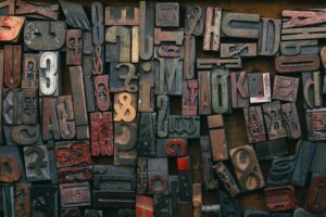
Photo by Bruno Martins on Unsplash The original movable type.
Old-style, modern, sans-serif, slabs: typeface elements vary in size, weight, form and structure. An old-style serif typeface might evoke feelings of warmth and elegance, class and extravagance. For something contemporary, a sans-serif typeface like Helvetica or Lucida—with a high x-height and uniform weight—would convey simplicity. When using a combination of fonts, contrast helps readers differentiate between them, with their opposing structures and forms. Type is a matter of personal preference. Stick to a small variety at first so that you can learn to recognize the differences. Here’s a good exercise: choose one font and experiment with different weight and size combinations in that family.Grid-Based Design
Typographic grids, like architectural blueprints, lay a solid foundation, which is necessary in the initial stages of design. Rigidity in structure has defined grid-based design throughout its existence, and movement occurs when a viewer is led along a particular path through a composition. Fluid Web content has changed this by introducing the element of adaptability, which makes a static medium responsive to a rapidly changing environment. Basic print and Web structures exist on the same planes: the x and y axes. Columns and gutters lie perpendicular to the baseline grid and can be measured and organized the same way. When combining the two, pay attention to the details that make each unique, such as the CSS that enables fluid content and the solid structure that print media has perfected over time.Divine Proportions
The Golden Ratio, which is based on the Fibonacci Sequence, underlies international paper sizes (the “A” series: A1, A2, A3, A4, etc.). Unlike American paper sizes, international sizes are uniform in symmetry and (metric) measurement. Paper size doesn’t necessarily bear on Web design, but proportion does. Graphic design is visual organization, and the beauty is in the details.“The end result is the sum of all the details.” – M. Vignelli
Making These Principles Work On The Web
Photo by Brad Neathery on Unsplash Sketching on paper can be a refreshing and inspiring break from the screen.
Responsive Type
By using relative units as the focus of a design’s typographic structure, every word on the page can react as one to the display size. Readability issues are thus resolved in the early stages of programming, and adaptive functionality is added, creating unity.Fluid Content
Applying the principle of responsive type to every element of a Web page makes the content capable of adapting to a variety of issues that might otherwise compromise compatibility and readability. Proportional units of measurement free a Web page from static size and can be used to design content for mobile browsers—one of the major areas guiding the direction of Web design right now. Using proportional units of measurement in CSS makes content fluid and ties in the math and proportions that have allowed traditional typography to become a means of expression and an art form (instead of mere rules to dictate what cannot be done).Media Queries
Screens come in a thousand different sizes and resolutions. What I like about the CSS3 media query feature is the option to design for different media. With the specifications in place, you can add advanced variables in response to different types of output, not just a screen: projectors, printers and mobile phones are just the beginning. And conditional CSS declarations allow for progressive design.Example
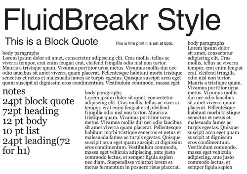
I developed this print format (one of many) for the mass reproduction of a singular style.
Here is an example of a print media style sheet. The format can be adapted for Web development if you know a few basic elements of CSS. In the type treatment, the heading is set to 72 points and the body to 12 points. This means that the heading is six times the size of the body text. By using ems as the relative unit of measurement in your CSS declarations, you can maintain every text size setting as a pre-formatted style:
body { font: normal 100% Georgia, Garamond, serif; }

h1   { font-family: Helvetica, sans-serif;
       font-size: 6em; }
This same principle will keep elements on the page fluid. Set CSS declarations for page ids that tell the HTML to act this way (do this for ids, not classes, because ids occur once per page, while classes can occur more than once):
#page { margin: 40px auto;
        padding: 0 1em;
        max-width: 60em; }
That’s what CSS does: it defines the way you want the HTML to act. Set ems again as the unit of measurement to make it behave uniformly. How did I know which em values to use? It’s in the math and percentages.
First, convert the body-text setting (12 points) to 16 pixels. Then, because everything is based on that setting, you can use it to convert the margins and font sizes to conform to your grid.
Further Resources
These are available as PDF downloads:- Choosing Typefaces Literature from Susan G. Miller on the core elements of typography.
- Liquid Layouts A CSS tutorial for adaptive layouts.
- The Vignelli Canon The monograph of M. Vignelli, one of the founders of modern graphic design.
- Perfect Your Kerning Skills A tutorial on kerning and how to use it effectively.
Common Terms of Design
- Movement The visual flow that directs a viewer’s eye through a design.
- Proportion The relationship in scale between elements and their size, shape and quantity.
- Emphasis The varying degrees of dominance in a design, usually defined by weight, space and perspective.
- Unity The quality that makes a design complete; the degree to which the parts of a whole come together and resist falling apart.
Very Informative…
nice article……………………..
No with things like Cufon and @fontface i is much easier to use type in web design.