
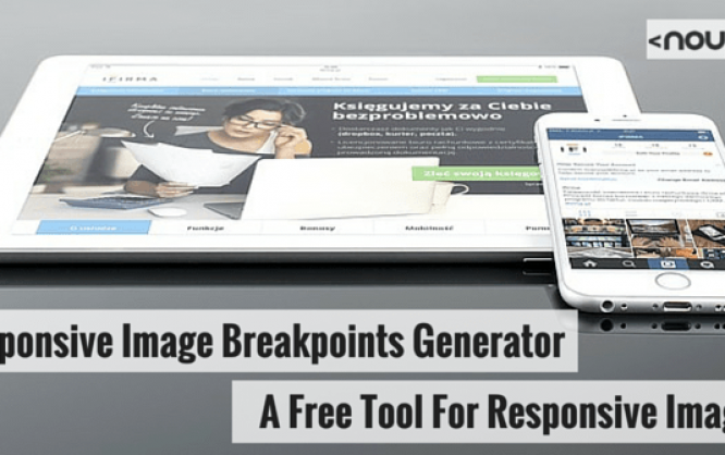
Responsive Image Breakpoints Generator: A Free Tool For Responsive Images
With consumers using devices of multiple sizes – from smartphones and tablets to laptops and desktops, responsive web design is no longer a luxury, it’s a necessity. More and more users are browsing the web via mobile devices, requiring websites to support an increasing number of screen resolutions. In order to deliver the best user experience possible, developers are increasingly adopting responsive design. Websites must now adapt and select the correct image sizes and resolutions to cater to each user’s device, and the key to doing that effectively is responsive breakpoints generation.
 You can, of course, select any JavaScript library or rely on HTML5 attributes. But even after doing so, you will need a mechanism that enables your code to decide which image dimension should be used for a given screen resolution. Determining the optimal image dimensions for every picture is what we call responsive image breakpoints.
Finding the best number of responsive breakpoints for your images is not an easy task. If you are looking for the best way to address this challenge, the Responsive Image Breakpoints Generator will enable you to generate the optimal number of responsive breakpoints for your images.
You can, of course, select any JavaScript library or rely on HTML5 attributes. But even after doing so, you will need a mechanism that enables your code to decide which image dimension should be used for a given screen resolution. Determining the optimal image dimensions for every picture is what we call responsive image breakpoints.
Finding the best number of responsive breakpoints for your images is not an easy task. If you are looking for the best way to address this challenge, the Responsive Image Breakpoints Generator will enable you to generate the optimal number of responsive breakpoints for your images.
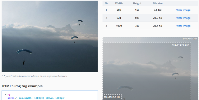
 This tool also creates an HTML5 image tag that you can copy and paste in your code. The srcset attribute of the tag lists the image versions and width values as per the selected breakpoints. It will enable web browsers to automatically process the image tag and then figure out which version of the image to use based on the required responsive layout for the given device.
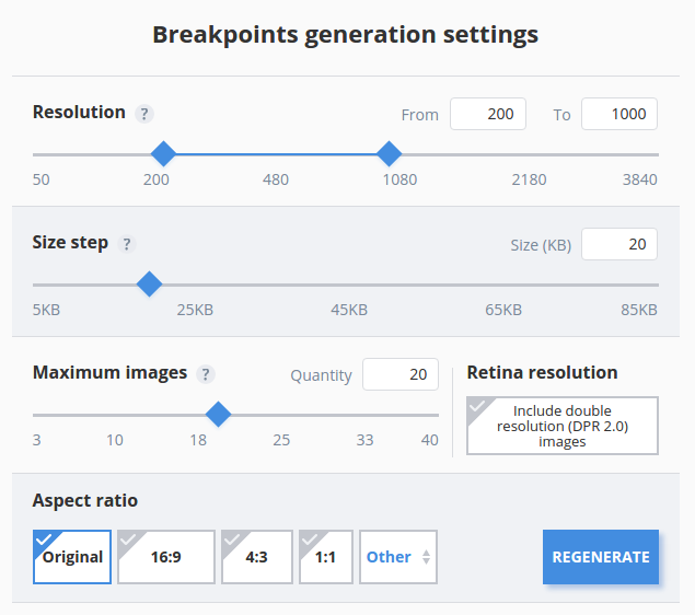
Responsive image generation is useless in the absence of smart art direction. For most mobile devices, the aspect ratio of the images needs to change, especially when the screen size is smaller and resolution is lower. In these cases, the Responsive Image Breakpoints Generator tool lets you appropriately crop images, specifying multiple aspect ratios for your images and generating the breakpoints for each aspect ratio, independently.
To help you better understand this tool, let’s put it to work and see what it can do.
This tool also creates an HTML5 image tag that you can copy and paste in your code. The srcset attribute of the tag lists the image versions and width values as per the selected breakpoints. It will enable web browsers to automatically process the image tag and then figure out which version of the image to use based on the required responsive layout for the given device.
Responsive image generation is useless in the absence of smart art direction. For most mobile devices, the aspect ratio of the images needs to change, especially when the screen size is smaller and resolution is lower. In these cases, the Responsive Image Breakpoints Generator tool lets you appropriately crop images, specifying multiple aspect ratios for your images and generating the breakpoints for each aspect ratio, independently.
To help you better understand this tool, let’s put it to work and see what it can do.
 After that, you can alter the aspect ratio and crop the picture to meet your unique needs.
 Once done, you can download the zip file with the generated images, and you can grab the code for the HTML5 picture tag and img tag.
 It’s that simple. If you are an existing Cloudinary user, you also can make use of Cloudinary’s API to directly upload your images to the cloud and then automatically generate breakpoints. To become a Cloudinary user, you can sign up for an account for free.
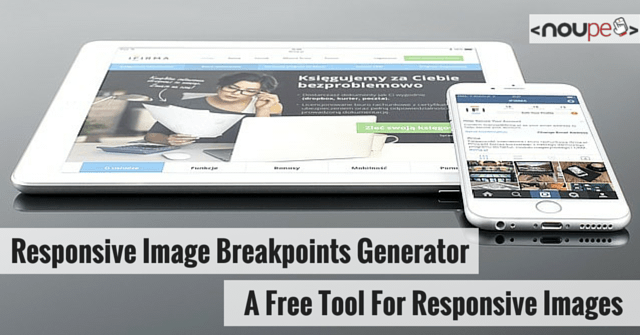
Responsive Image Breakpoints Generator: A Free Tool For Responsive Images
What are Image Breakpoints?
When building a responsive website, you need to keep in mind the needs of different devices, which all come with various image sizes and resolutions. It goes without saying that your website needs to render well and look great regardless of which device your visitor is using. To do this, you must be able to display the same image in different dimensions, depending on the screen size and resolution of your user’s device. Naturally, it is impossible to have one new image for every significant change in pixels, as you will probably end up creating an infinite number of copies of the same image. In addition, you cannot overlook image resolution either, because advancements in smartphones and tablets, the number of standard image resolutions has become too high.
You can, of course, select any JavaScript library or rely on HTML5 attributes. But even after doing so, you will need a mechanism that enables your code to decide which image dimension should be used for a given screen resolution. Determining the optimal image dimensions for every picture is what we call responsive image breakpoints.
Finding the best number of responsive breakpoints for your images is not an easy task. If you are looking for the best way to address this challenge, the Responsive Image Breakpoints Generator will enable you to generate the optimal number of responsive breakpoints for your images.
What Does it Do?
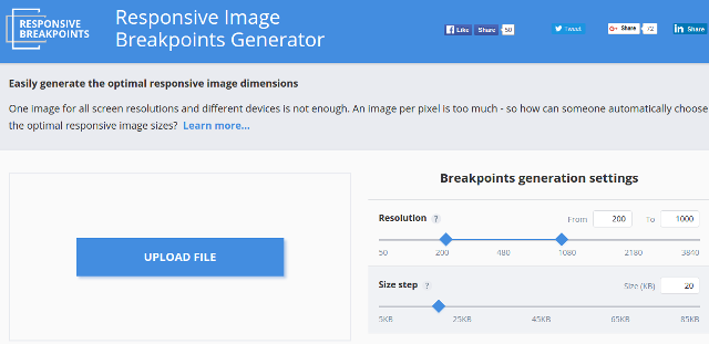
Responsive Image Breakpoints Generator is a free tool powered by Cloudinary, the leader in end-to-end image management. The Responsive Image Breakpoints Generator enables you to upload your images and specify the settings that you need. Then, you can define the image dimensions for your design project, and generate responsive breakpoints for your images within minutes.
This tool also creates an HTML5 image tag that you can copy and paste in your code. The srcset attribute of the tag lists the image versions and width values as per the selected breakpoints. It will enable web browsers to automatically process the image tag and then figure out which version of the image to use based on the required responsive layout for the given device.
Responsive image generation is useless in the absence of smart art direction. For most mobile devices, the aspect ratio of the images needs to change, especially when the screen size is smaller and resolution is lower. In these cases, the Responsive Image Breakpoints Generator tool lets you appropriately crop images, specifying multiple aspect ratios for your images and generating the breakpoints for each aspect ratio, independently.
To help you better understand this tool, let’s put it to work and see what it can do.
How Does it Work?
First up, you need to upload your image to the Responsive Breakpoint Generator Tool, and then specify the settings for the image breakpoints.
After that, you can alter the aspect ratio and crop the picture to meet your unique needs.
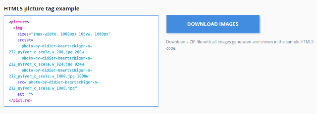
Once done, you can download the zip file with the generated images, and you can grab the code for the HTML5 picture tag and img tag.
It’s that simple. If you are an existing Cloudinary user, you also can make use of Cloudinary’s API to directly upload your images to the cloud and then automatically generate breakpoints. To become a Cloudinary user, you can sign up for an account for free.
Verdict
When designing a responsive website, to do justice to your design, you need to find the optimal number of image versions and breakpoints. Of course, you could generate images for all possible values, but that would be overkill. By relying on compression mechanisms and automated image breakpoints generation tools such as this one being offered by Cloudinary, you can save a good deal of time and also ensure that your website’s images render well on all devices, irrespective of the screen resolution and dimensions. The number of devices and screen resolutions is only likely to increase, and as a result a web developer’s job will only become more complicated. You cannot overlook the importance of images in your design, because the majority of today’s websites rely heavily on images. If your pictures do not perform well on mobile devices, the user experience and the performance of your website will suffer. Responsive image breakpoints can ensure that your images scale appropriately, and perform well, whether it’s on a mobile phone or a tablet. The free tool Responsive Image Breakpoints Generator by Cloudinary is a blessing for anyone looking to build a responsive design. Responsive Image Breakpoints Generator is fully open sourced and comes with an MIT License. The code rests over at GitHub, but the actual algorithm for image breakpoints generation and image cropping, resizing and other manipulation runs in the cloud.Links
- Responsive Image Breakpoints Generator
- Cloudinary API for Responsive Image Breakpoints Generator
- GitHub (source code only)
- Further reading (Smashing Magazine)
Nice! This is one of few solutions I have found that support DPR 2.0
Hey.
Got a question. I don’t really get the Image Breakpoints. I have a responsive WordPress site, made it on my home computer. When i visit it with a phone or ipad, it looks great. The pictures have the right proportions and size. So why would I need to use this “Image Breakpoints”??? Or is there something I’ve missed?
//Alex
The idea, Alex, is to ask the browser to download a specific version of the photo depending on the visitor’s browser screen size. The goal is to reduce bandwidth use and to help the user download the web page faster.
Anyway, I agree with you. This is not really necessary if you optimized your picture before uploading it to the site. Granted, most people do not do it.
That generator is a useful tool so thanks for writing about it. Seen a few sites where the breakpoints aren’t natural and images change too soon or not at all.
Great one..Also look at my article.
How Effective are Animated Logos in Brand Design?
http://www.oodlesstudio.com/blogs/logo-and-brand-design-company/
Great one..Also look at your article. Really good resource. thanks dear.