
Ten Golden Rules for Choosing the Right Website Images
Images are the single most critical design element designers implement on their website. Yes, even in a world of web design that swears by design minimalism and flat web design, images still play a very important role in determining the success or failure of a site. To put it simply, you cannot afford to go wrong with them. A perfect image selection strategy can help you differentiate your website from its competition.
 Image by Josch13 from Pixabay
This strategy consists of ten golden rules that need to be followed for picking the perfect images for your site.
Image by Josch13 from Pixabay
This strategy consists of ten golden rules that need to be followed for picking the perfect images for your site.
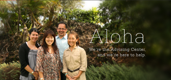 As a viewer you will experience a range of emotions when you look at the above image, but primarily you feel happy and satisfied like the people in the image. That’s the raw power of emotional imagery at work and why you need such images on your site.
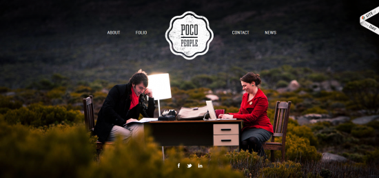 Poco People does this brilliantly with an image of an office desk placed in the middle of nowhere.
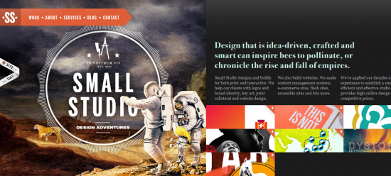 The image on the left perfectly captures the essence of the text on the right. It shocks with its creativity, does its job brilliantly and describes the Small Studio brand perfectly.
 The site makes its point with some haunting images that make you think about protecting oceans and your beaches from sewage, marine litter and more.
 Sportswear sites like Nike use images of people performing a particular activity wearing a specific product that the company wants to promote. One look at these images and website visitors are tempted (read motivated) to buy that product.
 One reason why the Bear CSS site imagery looks like it will stand in good stead for a very long time is the image of the cute bear mascot that figures prominently in the design. You will find websites figuring a brand mascot don’t really need to change their imagery all the time. The mascot is a mascot because it is characterized by a certain kind of longevity.
 Stoos Customs is a website for a custom motorcycle shop. When you come across the images on the site there is no doubt in your mind about the brand they represent and what it is into. The imagery is self-explanatory and the question – ‘Why this image was used?’ does not come up at all.
 Highrise shows happy satisfied people who’ve used its product and who have good things to say about it. In this case the imagery acts as a testimonial, which is proof that the product works. The images have tremendous visual appeal and deliver an insanely practical benefit.
 And finally, it all boils down to the quality of your images. They must be pixel perfect, large sized and meet the highest benchmarks of clarity. You might think this is pretty self-evident but this where some designers go wrong. The critical nature of this rule cannot be emphasized enough.
 (dpe)
Image by Gerd Altmann from Pixabay
(dpe)
Image by Gerd Altmann from Pixabay
Image by Josch13 from Pixabay
This strategy consists of ten golden rules that need to be followed for picking the perfect images for your site.
#1 | Images That Tug at The Emotions of The Viewer
Images with emotive appeal influence a viewer’s brand sentiment. If the subjects in an image are sad, there is a very good chance of the user feeling sad. So the question is – is that the emotion you want to get out of them? The answer to this question is very important and needs to be decided before you zero in on an image pick for your website. Working out the emotions that can influence your target audience’s feeling about the product or services your brand is selling is crucial. If you think it’s a feeling of envy that’s going to help your product sell better, making sure the image you choose displays envy will help. What is at work in such cases is the emotional contagion (PDF download). It is the tendency of two people to emotionally converge and you are providing fuel to this tendency by choosing images that embody the emotion you want the customer to feel about your products. The images trigger emotional convergence which ultimately results in a conversion.
As a viewer you will experience a range of emotions when you look at the above image, but primarily you feel happy and satisfied like the people in the image. That’s the raw power of emotional imagery at work and why you need such images on your site.
#2 | Shock and Awe
Images that shock get visitor attention. Shock and awe tactics do their job well provided you’ve taken care of one important image characteristic – relevance. These images must be relevant to the purpose of the site. Irrelevant images cut no ice with users whatsoever, irrespective of whether they grab attention or not. The purpose of shock and awe is to ensure the brand’s message is conveyed through the image. Don’t think along the lines of Shock and Awe tactics employed by the American armed forces in Gulf war; just think of it as pleasant kind of shock.
Poco People does this brilliantly with an image of an office desk placed in the middle of nowhere.
The image on the left perfectly captures the essence of the text on the right. It shocks with its creativity, does its job brilliantly and describes the Small Studio brand perfectly.
#3 | Fascination
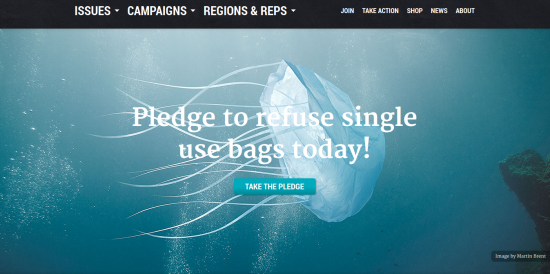
Images that fascinate have a rare kind of stickiness. Long after we’ve visited the site, we still remember the images we saw on a particular site. There is something about these images that makes us think or ‘want to think’ more about what they meant. You will find such images on sites that are championing a particular cause, a case in point being Surfers Against Sewage.
The site makes its point with some haunting images that make you think about protecting oceans and your beaches from sewage, marine litter and more.
#4 | Images Need to Motivate
Your image must look good, but also persuade people to take a positive decision vis-à-vis the products/services on your site. It needs to have an inherent ability to convert. That should be its defining purpose. The core focus must be on motivating people to make an informed decision with the image becoming an integral part of the information disbursal activity on your site.
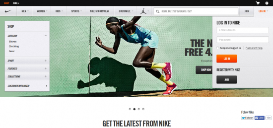
Sportswear sites like Nike use images of people performing a particular activity wearing a specific product that the company wants to promote. One look at these images and website visitors are tempted (read motivated) to buy that product.
#5 | Timelessness
Website images need to stand the test of time. There is a very good chance that you are not going to change your images in a hurry. You might only change the image if and when your website will go through a redesign. This is why it’s important that your images look fresh all the time. Pick images that you believe won’t look outdated after a period of time.
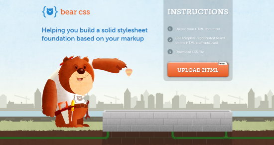
One reason why the Bear CSS site imagery looks like it will stand in good stead for a very long time is the image of the cute bear mascot that figures prominently in the design. You will find websites figuring a brand mascot don’t really need to change their imagery all the time. The mascot is a mascot because it is characterized by a certain kind of longevity.
#6 | Aligned with your Brand
The best images are one’s that leave no room for imagination that they are perfectly aligned with your brand, its products/ services, principles, values and objectives.
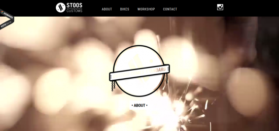
Stoos Customs is a website for a custom motorcycle shop. When you come across the images on the site there is no doubt in your mind about the brand they represent and what it is into. The imagery is self-explanatory and the question – ‘Why this image was used?’ does not come up at all.
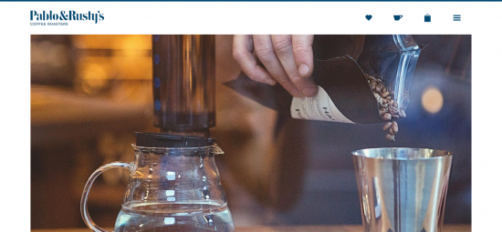
#7 | Images Shouldn’t Distract
There are times when you land up on a site and are taken in by its images, but you wonder what the website is all about. What this essentially means is that the images have distracted you from focusing on the message the website wants to deliver. Pablo and Rusty’s is a site selling coffee and shows how images should be used to center visitor attention on the message and nothing but the message. When you hit its landing page, huge images greet you that get the message home. Coffee holds pride of place in its imagery which is absolutely top of the line and doesn’t distract in the least.
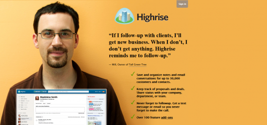
#8 | Feature People Who Represent Your Target Audience
Who is your website for? I am sure you know its target audience. So, why not use images of people who are a part of this audience. Such images will resonate deeply with your website visitors. Such imagery also improves the trust and credibility of your website.
Highrise shows happy satisfied people who’ve used its product and who have good things to say about it. In this case the imagery acts as a testimonial, which is proof that the product works. The images have tremendous visual appeal and deliver an insanely practical benefit.
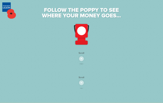
#9 | Image Consistency
Website design is a form of visual storytelling; and it is images that help you tell a story that hooks website visitors and slowly persuades them to try out a particular product or service. Images therefore are crucial design elements that help move this story forward. This is why it’s important to maintain the consistency of images and which taken together help website and the brand make an impression on its target audience. The Royal British Legion website makes good use of parallax scrolling and a mixture of consistent illustration (images) and animations to makes its point.
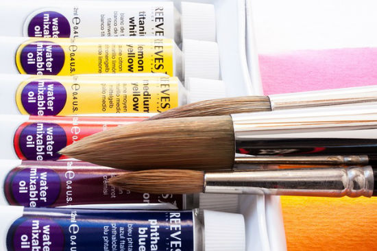
#10 | Quality
And finally, it all boils down to the quality of your images. They must be pixel perfect, large sized and meet the highest benchmarks of clarity. You might think this is pretty self-evident but this where some designers go wrong. The critical nature of this rule cannot be emphasized enough.
The Wrap
Following these rules will not only help you design a site with great visual appeal but also immense functional value. Both are important if you want your website to create ripples within its target audience.
(dpe)
Image by Gerd Altmann from Pixabay
Thanks for such the great share! #3 | Fascination is a great example, I would think one rule should be that typography should be readable though. Image consistency is a huge mistake I see across the web, good tips!
Image consistency and quality has great importance to pick a right image for website. Great article indeed.
very nice tips :)
I really liked how you touched on image consistency and how important it is. This something that either eluded me in the past or I just simply looked over by being in a rush or just my ignorance.
Many many thanks for such a nice post. Please keep giving tips like that.