
Text Effects With SVG: Patterns, Masks and Clipping Paths
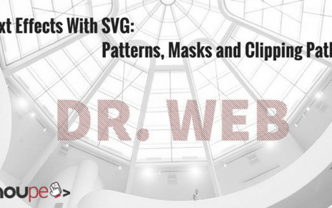
You already know that the SVG format can do much more than displaying vector-based shapes. Today, I want to show you how text effects can be created with SVG. Patterns, masks and clipping paths allow you to implement a plethora of creative ideas. You can realize unusual and unique text effects that can't even be done with the help of the many features of CSS3 or that at least don't work in every popular browser.
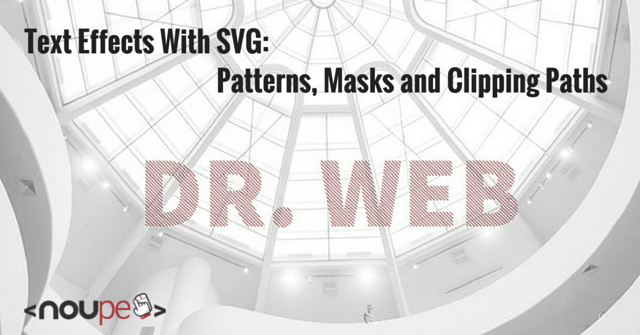
 In the example, a pattern is marked with the ID „pattern“ via „<pattern>“ and subsequently assigned to a „<text>“ element. In contrast to purely graphic solutions, the text can still be selected and thus, it can also be copied. CSS3 has a similar option with its attribute „background-clip“. The value „text“ makes sure that a background graphic that was assigned to an element will only be used on the text of this element. This creates the same effect as in the SVG example. However, Chrome is the only browser that supports the value „text“ for this attribute.
 In this example, a multiline text is clipped to match the shape of two overlapping circles. The ID of the clipping path is assigned to the „<text>“ element by the CSS attribute „clip-path“.
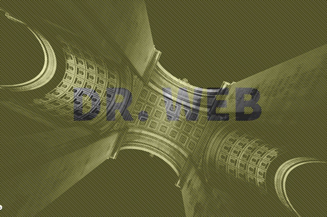
Patterns as Text Background
The „<pattern>“ element allows you to create any pattern you want via SVG and set it as the background for shapes, and also for texts. This can be repeating lines, circles or squares. Defining two squares with the length of one pixel each is enough to create a two by two-pixel chess board pattern. Even a simple line can become an interesting pattern for texts.<defs>
<pattern id="muster" x="0" y="0" width="5" height="5" patternUnits="userSpaceOnUse">
<line x1="0" y1="0" x2="5" y2="5" stroke="#a62121" />
</pattern>
</defs>
„<pattern>“ elements, as well as other elements, that are not directly displayed, but are referenced, should be placed withing the „<defs>“ container.
An ID has to be assigned to the pattern for it to fill an element. Afterwards, this ID is assigned to the pattern via „fill“ attribute or CSS characteristic. This doesn't only work with classic shapes, but also with the font element „“.
text {
  fill: url(#muster);
}
In the example, a pattern is marked with the ID „pattern“ via „<pattern>“ and subsequently assigned to a „<text>“ element. In contrast to purely graphic solutions, the text can still be selected and thus, it can also be copied. CSS3 has a similar option with its attribute „background-clip“. The value „text“ makes sure that a background graphic that was assigned to an element will only be used on the text of this element. This creates the same effect as in the SVG example. However, Chrome is the only browser that supports the value „text“ for this attribute.
Cut Out Text
Using the „<mask>“ element allows you to achieve the opposite effect of the first example. Instead of adding a pattern to a text, you can cut out text from a pattern. To do so, you need to set a pattern, as well as a mask via the „<mask>“ element in the <defs>“ area. Masks work similar to how they work in Photoshop and other image editing applications. The tonal value determines what a mask should represent. The brighter the tonal value, the higher the transparency. White means 100 percent visibility and black equals no visibility at all. When you place a black, page-filling rectangle and put white text in front of it, you get a mask that does not cover the text.<defs>
<pattern id="muster" width="5" height="5" patternUnits="userSpaceOnUse">
<line x1="0" y1="0" x2="5" y2="5" stroke="yellow" />
</pattern>
<mask id="maske">
<rect fill="white" />
<text x="50%" y="50%" fill="black">Dr. Web</text>
</mask>
</defs>
In contrast to the first example, the text is part of the mask and not an independently displayed element. In the last step, the mask needs to be assigned to an element via the „mask“ attribute. In this case, the element is another page-filling rectangle. This square is filled with the pattern via „fill“.
defs + rect {
  fill: url(#pattern);
  mask: url(#mask);
}
In the example, the rectangle displayed on the drawing area receives the mask with the ID „mask“ via the „mask“ attribute, as well as the pattern with the ID „pattern“ via „fill“.
It is important, that the used rectangles and their parent elements all have 100 percent width and height so that the pattern can cover the entire page. As the text is part of the mask here, the text is not selectable in this case.
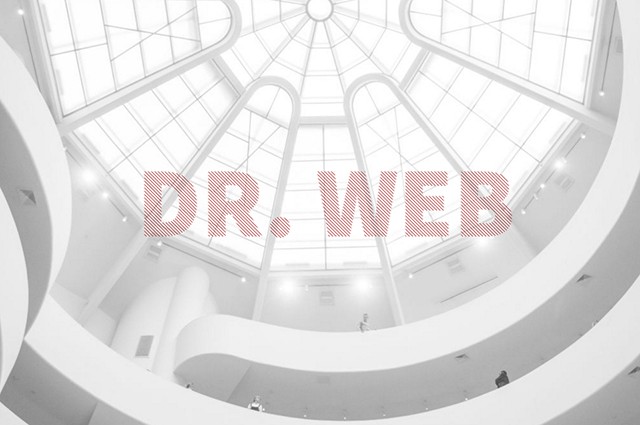
Clipping Text With Paths
Besides masks, SVG knows clipping paths. These also work similar to how they do in Photoshop. A clipping path defines a path that is used to clip an element, a text, for example, to match the shape of the path. To do that, a clipping path is defined in the „<defs>“ area via „<clip-path>“.<defs>
<clipPath id="pfad">
<circle cx="33%" cy="50%" r="150" />
<circle cx="66%" cy="50%" r="150" />
</clipPath>
</defs>
This can contain random paths that add up and thus result in the clipping path. Afterwards, the clipping path is assigned to an element by the attribute „clip-path“.
In this example, a multiline text is clipped to match the shape of two overlapping circles. The ID of the clipping path is assigned to the „<text>“ element by the CSS attribute „clip-path“.
text {
  clip-path: url(#pfad);
}
Of course, this clipping effect can also be achieved with a mask. However, masks always require a black and a white area. This means that you need several shapes, which all need to have a colour attached to them. All you need for a clipping path is a path.