
The Future of Webdesign: Trends 2017

I'll try my luck as a fortune teller once again, and dare to give you a preview of future web design trends for the year 2017. Some things remain the same; other things will move into the foreground. But one thing is sure: there won't be any more classic desktop designs.
A bunch of things will change in 2017. Web design will become more complicated than it was before. However, that's what makes our job so great. We get to keep on learning and improving ourselves. I wrote this article to allow you to do this early on.
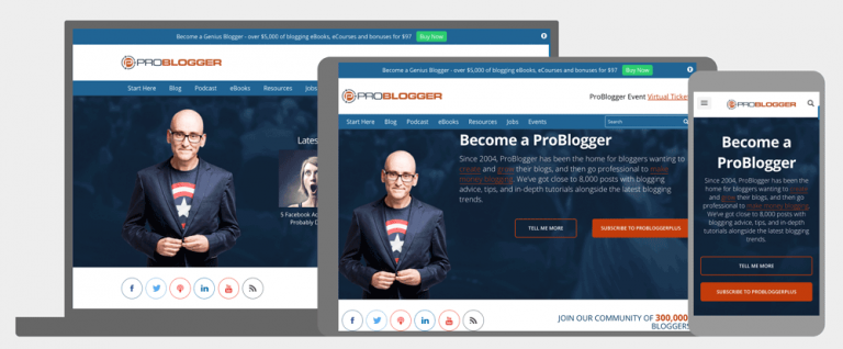 Does it sound stale when I mention this? Sorry, but I have to do it. In the medieval design process, the developer usually started with the desktop version of a website. It had to work properly because the client would see and approve this release first.
After that, the mobile variants were developed, and the website was adjusted to responsive views. In 2017, this won't work anymore. Customers have educated themselves as well, and pure desktop sites are on the verge of being punished by Google. Mobile First will be imperative for a good ranking in the search results.
First, the mobile views will be developed, since a website has to look and work perfectly on smartphones and tablets. The desktop version is designed subsequently.
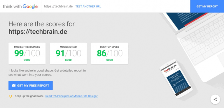
By the way, Google has provided a new online tool that is more informative than the old one.
Does it sound stale when I mention this? Sorry, but I have to do it. In the medieval design process, the developer usually started with the desktop version of a website. It had to work properly because the client would see and approve this release first.
After that, the mobile variants were developed, and the website was adjusted to responsive views. In 2017, this won't work anymore. Customers have educated themselves as well, and pure desktop sites are on the verge of being punished by Google. Mobile First will be imperative for a good ranking in the search results.
First, the mobile views will be developed, since a website has to look and work perfectly on smartphones and tablets. The desktop version is designed subsequently.
By the way, Google has provided a new online tool that is more informative than the old one.
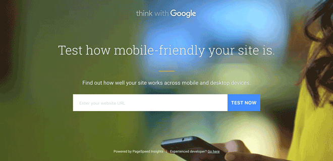 A Test With the New Tool:
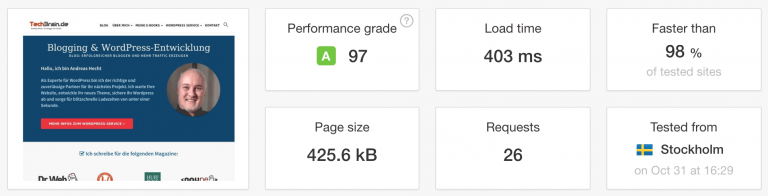 A Speed Test of My Landing Page.[/caption]
 Interactive storytelling will indeed assert itself, although it is very complex, and reminds me of old Flash pages to an extent. It offers an experience to the user. Each scroll changes the screen content and tells a story that the visitor is drawn into.
The website of Peugeot is a good example for that.
Interactive storytelling will indeed assert itself, although it is very complex, and reminds me of old Flash pages to an extent. It offers an experience to the user. Each scroll changes the screen content and tells a story that the visitor is drawn into.
The website of Peugeot is a good example for that.
 Hunger Crunch
 Lighthouse Brewing
 ...next, the content is split.
1 - Mobile First Design
Does it sound stale when I mention this? Sorry, but I have to do it. In the medieval design process, the developer usually started with the desktop version of a website. It had to work properly because the client would see and approve this release first.
After that, the mobile variants were developed, and the website was adjusted to responsive views. In 2017, this won't work anymore. Customers have educated themselves as well, and pure desktop sites are on the verge of being punished by Google. Mobile First will be imperative for a good ranking in the search results.
First, the mobile views will be developed, since a website has to look and work perfectly on smartphones and tablets. The desktop version is designed subsequently.
By the way, Google has provided a new online tool that is more informative than the old one.
Think with Google
A Test With the New Tool:
2 - Website Speed
Another trend of 2017 will be the optimization for extremely fast loading times. Google has declared a speed limit of 1.5 seconds for a couple of years now. In this short timespan, Google wants a website's entire loading process to be completed. Of course, 1.5 seconds are not contemporary anymore. A lot faster times would be possible. At least on landing and overview pages of a blog, loading speed of less than one second is possible - even with moderate effort. Some article pages may load slower, so one and a half seconds would be a good average. Even loading times of half a second wouldn't be a problem on a landing page and blog overview. Now, the time to deal with speed optimization has come, preparing your website for next year. [caption id="attachment_78607" align="alignnone" width="640"] A Speed Test of My Landing Page.[/caption]
Further Information:
- Noupe: No Nonsense: What Really Accelerates WordPress Websites – [#1]
- Noupe: High Speed: Really Accelerate WordPress Websites – [#2]
- Noupe: High Speed: Really Accelerate WordPress Websites – [#3]
- Noupe: High Speed: Really Accelerate WordPress Websites – [#4]
- Noupe: High Speed: Really Accelerate WordPress Websites – [#5]
3 - Interactive Storytelling
Interactive storytelling will indeed assert itself, although it is very complex, and reminds me of old Flash pages to an extent. It offers an experience to the user. Each scroll changes the screen content and tells a story that the visitor is drawn into.
The website of Peugeot is a good example for that.
4 - Handcrafted Illustrations
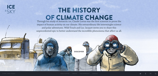
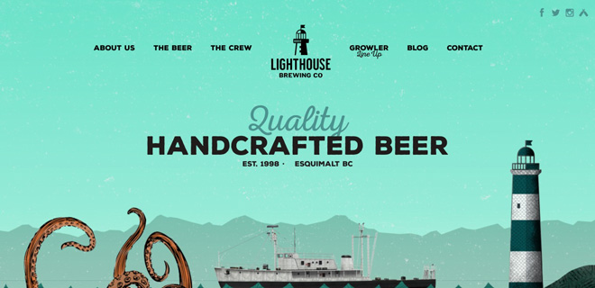
Hero images that fill the entire screen have been trending for a while now. But in the future, significantly fewer stock images will be used. The trend is definitely pointing towards a unique visitor experience. Businesses don't mind spending money on this. Handmade, original illustrations have a much higher recognition value, and clearly show where the future will head to.Some Examples:
Ice and Sky
Hunger Crunch
Lighthouse Brewing
5 - Lazy Loading
Lazy loading feeds a website's visible area with content bites. The advantage, especially for sites with lots of content, like Facebook or Instagram, is obvious. A large amount of content is not loaded all at once but is only loaded after the user demands it. Only when the user scrolls down will the content be loaded. For the most part, this happens very quickly. As the website speed is paramount for SEO - and conversion rates - I expect a widespread usage of lazy loading in 2017.6 - Centered and/or Split Content
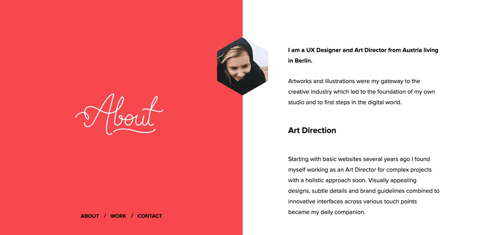
Centered content is a powerful style with high significance. The main message is placed in the center of the screen and highlighted by a couple of visual tricks. When it's well executed, this technique achieves a dramatic visual effect. This doesn't work for all types of websites, however. Pages with minimal to moderate amounts of content will be well-served by this technique. Split content divides the content into (mostly) two areas, which creates visual attention, giving the designers more creative freedom, without endangering the clarity of the content hierarchies.A Good Example for this is the Website of Melanie DaVeid
First, the site provides centered content on the landing page...
...next, the content is split.
Websites have improved so much over the last few years as more and more are now featuring videos and interactive content. Interesting to see how things will be in 10 years from now.
Andreas, the article is really cool. You have outlined the main tendecies which we should expect in the comming year. In addition, may I support them with thoughts and ideas of famous designers http://adoriasoft.com/technology-trends-2017-ui-ux-design/ . As far as we can analyse, we should wait for more hand-made images, more mobile oriented and minimalistic web designs.
Interesting read this, wonder how websites will be like in many years to come
thanks for this information, it’s really useful. Check out also good article about 6 quick UX design techniques that really work – https://www.cleveroad.com/blog/6-quick-ux-design-techniques-that-really-work
If you are interested in making websites as a hobby, you can unleash your potential by creating interactive websites for other people in order to increase your earnings.
Mobile phones in today’s world are essential and cannot be replaced easily.
Consumer demands for mobile phones with the latest technology have been increasing.
To satisfy the consumer needs with ever changing trends in mobile technology and app development, competitiveness of making the best mobile app keeps on increasing.
So, Read more here https://artjoker.net/blog/mobile-applications-whats-trendy-in-2017/
I didn’t have any expectations concerning that title, but the more I was astonished. The author did a great job. I spent a few minutes reading and checking the facts. Everything is very clear and understandable. I like posts that fill in your knowledge gaps. This one is of the sort.