
The Psychology of Colors in Marketing and Branding

The psychology of colors and their effect is one of the most interesting and controversial aspects of marketing. The depth of the analysis has always been a problem. Color theory is a very complex topic with many nuances. Unfortunately, the quite popular infographics on the topic don't go into detail as much as they should. Today, we'll try to work out this difficult subject.

 © The Logo Company[/caption]
The truth is, that the effect of colors is too dependant on personal experience, making it impossible to assign individual emotions to one color. However, there are certain patterns in the perception of the color.
In a study titled "Impact of color on marketing," scientists found out that up to 90% of purchase decisions are linked to specific colors; depending on the product, of course. When it comes to a particular color's role in branding, another study worked out that the connection between a brand and its color is imperative. Consumers will quickly notice if a brand's color fits to what it's trying to sell.
Another study concluded that the purchase intention of the consumers strongly depends on the color used by the brand. Colors influence how customers perceive the brand's personality. Who would buy a Harley Davidson without the label giving them the feeling that these bikes are super cool?
Our brain wants to be able to immediately recognize brands as such. That's an important element when it comes to creating a brand identity. A blue Coca-Cola logo wouldn't even be half as effective regarding brand perception and selling the product. To compete with a direct rival, a strong brand identity and the right color for the branding is required.
When it comes to finding the "right" color - science found out that - predicting the consumer reaction to appropriate colors is said to be greater than the unique color itself. The Harley-Davidson logo conveys ruggedness and coolness; Coca-Cola conveys refreshment, and the Apple logo expresses a desire. Thus, the goal is to find colors that are the most capable when it comes to playing with these emotions.
The psychologist and Stanford professor Jennifer Aaker conducted studies on this subject. Her research work "Dimensions of Brand Personality," suggests that there are five core dimensions that affect brand personality.
© The Logo Company[/caption]
The truth is, that the effect of colors is too dependant on personal experience, making it impossible to assign individual emotions to one color. However, there are certain patterns in the perception of the color.
In a study titled "Impact of color on marketing," scientists found out that up to 90% of purchase decisions are linked to specific colors; depending on the product, of course. When it comes to a particular color's role in branding, another study worked out that the connection between a brand and its color is imperative. Consumers will quickly notice if a brand's color fits to what it's trying to sell.
Another study concluded that the purchase intention of the consumers strongly depends on the color used by the brand. Colors influence how customers perceive the brand's personality. Who would buy a Harley Davidson without the label giving them the feeling that these bikes are super cool?
Our brain wants to be able to immediately recognize brands as such. That's an important element when it comes to creating a brand identity. A blue Coca-Cola logo wouldn't even be half as effective regarding brand perception and selling the product. To compete with a direct rival, a strong brand identity and the right color for the branding is required.
When it comes to finding the "right" color - science found out that - predicting the consumer reaction to appropriate colors is said to be greater than the unique color itself. The Harley-Davidson logo conveys ruggedness and coolness; Coca-Cola conveys refreshment, and the Apple logo expresses a desire. Thus, the goal is to find colors that are the most capable when it comes to playing with these emotions.
The psychologist and Stanford professor Jennifer Aaker conducted studies on this subject. Her research work "Dimensions of Brand Personality," suggests that there are five core dimensions that affect brand personality.
 Sometimes, brands possess a mix of two of these characteristics, but for the most part, they are dominated by a single one of them. Generally speaking, some specific colors are connected to specific traits; like brown and sturdiness, purple with ingenuity, and red is often perceived as exciting. Almost every study will indicate, that when it comes to branding, finding a color to support the personality is better than relying on stereotypical color connotations.
So, there are no clear guidelines regarding which colors individual companies should use. Of course, "it depends" is a frustrating answer to the question about the optimal color choice, but it's the truth. A color should always be viewed in the context in which the brand is moving. It's the feeling, the mood, and the image that influence the color choice of the brand or the product.
Sometimes, brands possess a mix of two of these characteristics, but for the most part, they are dominated by a single one of them. Generally speaking, some specific colors are connected to specific traits; like brown and sturdiness, purple with ingenuity, and red is often perceived as exciting. Almost every study will indicate, that when it comes to branding, finding a color to support the personality is better than relying on stereotypical color connotations.
So, there are no clear guidelines regarding which colors individual companies should use. Of course, "it depends" is a frustrating answer to the question about the optimal color choice, but it's the truth. A color should always be viewed in the context in which the brand is moving. It's the feeling, the mood, and the image that influence the color choice of the brand or the product.
 Blue is one of the favorite colors of both genders.[/caption]
 The majority of men and women don't like these colors.[/caption]
Research makes it evident that nuances in color perceptions and the preferences often are the main factors. Men usually prefer stronger colors, while women favor the softer, gentle colors.
The male gender tends to like shades of colors with black components, while women tend to like shades with white elements better. The different color preferences have always been an often-discussed issue, although brands can and should easily work outside of gender stereotypes.
Breaking expectations can be rewarded, as shown by several brands already. The majority of both genders does not like red. However, the color is the base for a lot of really successful brands. An appropriate color choice does not have to consist of the favorite colors to be successful.
The majority of men and women don't like these colors.[/caption]
Research makes it evident that nuances in color perceptions and the preferences often are the main factors. Men usually prefer stronger colors, while women favor the softer, gentle colors.
The male gender tends to like shades of colors with black components, while women tend to like shades with white elements better. The different color preferences have always been an often-discussed issue, although brands can and should easily work outside of gender stereotypes.
Breaking expectations can be rewarded, as shown by several brands already. The majority of both genders does not like red. However, the color is the base for a lot of really successful brands. An appropriate color choice does not have to consist of the favorite colors to be successful.
 Another route to take would be using a background, a base, and an accent color that support a clear hierarchy of the website; the customers and visitors are "trained" to do certain actions.
Why is this important? Understanding these principles means achieving better conversion rates. Let's pay attention to the effect on our mind when the color of a button changes. Which button will be clicked more frequently?
Another route to take would be using a background, a base, and an accent color that support a clear hierarchy of the website; the customers and visitors are "trained" to do certain actions.
Why is this important? Understanding these principles means achieving better conversion rates. Let's pay attention to the effect on our mind when the color of a button changes. Which button will be clicked more frequently?
 The red button is the obvious winner of the test conducted by Hubspot. The conversion rate increased by 21 percent. Of course, this is not only due to the red color but also due to the isolation of the button color.
The rest of the website was designed with a lot of green elements. In the end, this means that the green button simply drowns in the rest of the website. The red button immediately stands out, and clearly, sets itself apart from the other used colors. The result is the improved conversion rate. So that's a good example of using complementary colors.
We'll find a similar effect in a test of multiple variants published by Paras Chopra in the Smashing Magazine. Paras tested a couple of variants of download links for his PDFProducer program.
The Following Versions Were Tested:
The red button is the obvious winner of the test conducted by Hubspot. The conversion rate increased by 21 percent. Of course, this is not only due to the red color but also due to the isolation of the button color.
The rest of the website was designed with a lot of green elements. In the end, this means that the green button simply drowns in the rest of the website. The red button immediately stands out, and clearly, sets itself apart from the other used colors. The result is the improved conversion rate. So that's a good example of using complementary colors.
We'll find a similar effect in a test of multiple variants published by Paras Chopra in the Smashing Magazine. Paras tested a couple of variants of download links for his PDFProducer program.
The Following Versions Were Tested:
 Can you guess which combination scored the best results? Here's the answer:
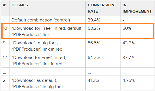 The tenth variant worked a lot better than all the others. It is not possible to consider this a coincidence, though, as version ten had the best contrast of all examples. The text "PDFProducer" is small and gray, but the red call-to-action text "Download For Free" creates a high contrast, which is vital for higher conversion rates. But how do we define success for tests like this? Do we measure clicks or sign-ups?
Of course, this depends on what we plan to achieve with the call-to-action. In this case, sign-ups would certainly be the right answer. The "free download" is paid with the email address of the interested user, as a sign-up for the newsletter is necessary.
The tenth variant worked a lot better than all the others. It is not possible to consider this a coincidence, though, as version ten had the best contrast of all examples. The text "PDFProducer" is small and gray, but the red call-to-action text "Download For Free" creates a high contrast, which is vital for higher conversion rates. But how do we define success for tests like this? Do we measure clicks or sign-ups?
Of course, this depends on what we plan to achieve with the call-to-action. In this case, sign-ups would certainly be the right answer. The "free download" is paid with the email address of the interested user, as a sign-up for the newsletter is necessary.
Common Misconceptions About the Effects of Colors
Science has shown that personal preferences, experience, parenting, and cultural differences can affect the way we perceive colors. Thus, the idea to trigger certain emotions with certain colors is not reliable in practice. Nonetheless, there is a lot to learn about colors and their effects. We also need to test if we want to accept that nothing is guaranteed and that there are no precise answers.The Important Meaning of Colors in Branding
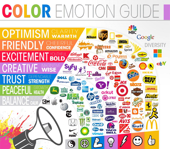
First, let's take a look at branding, and color perception in connection with the design of brands. Plenty of studies attempted to classify the consumer reactions on different colors: [caption id="attachment_77549" align="alignnone" width="640"] © The Logo Company[/caption]
The truth is, that the effect of colors is too dependant on personal experience, making it impossible to assign individual emotions to one color. However, there are certain patterns in the perception of the color.
In a study titled "Impact of color on marketing," scientists found out that up to 90% of purchase decisions are linked to specific colors; depending on the product, of course. When it comes to a particular color's role in branding, another study worked out that the connection between a brand and its color is imperative. Consumers will quickly notice if a brand's color fits to what it's trying to sell.
Another study concluded that the purchase intention of the consumers strongly depends on the color used by the brand. Colors influence how customers perceive the brand's personality. Who would buy a Harley Davidson without the label giving them the feeling that these bikes are super cool?
Our brain wants to be able to immediately recognize brands as such. That's an important element when it comes to creating a brand identity. A blue Coca-Cola logo wouldn't even be half as effective regarding brand perception and selling the product. To compete with a direct rival, a strong brand identity and the right color for the branding is required.
When it comes to finding the "right" color - science found out that - predicting the consumer reaction to appropriate colors is said to be greater than the unique color itself. The Harley-Davidson logo conveys ruggedness and coolness; Coca-Cola conveys refreshment, and the Apple logo expresses a desire. Thus, the goal is to find colors that are the most capable when it comes to playing with these emotions.
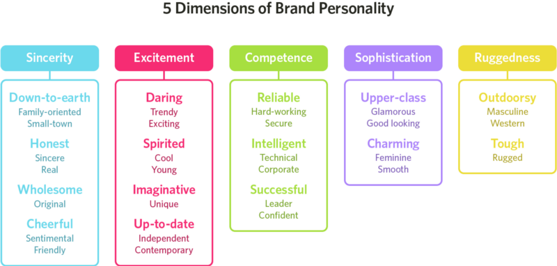
The psychologist and Stanford professor Jennifer Aaker conducted studies on this subject. Her research work "Dimensions of Brand Personality," suggests that there are five core dimensions that affect brand personality.
Sometimes, brands possess a mix of two of these characteristics, but for the most part, they are dominated by a single one of them. Generally speaking, some specific colors are connected to specific traits; like brown and sturdiness, purple with ingenuity, and red is often perceived as exciting. Almost every study will indicate, that when it comes to branding, finding a color to support the personality is better than relying on stereotypical color connotations.
So, there are no clear guidelines regarding which colors individual companies should use. Of course, "it depends" is a frustrating answer to the question about the optimal color choice, but it's the truth. A color should always be viewed in the context in which the brand is moving. It's the feeling, the mood, and the image that influence the color choice of the brand or the product.
Color Trends for Men and Women
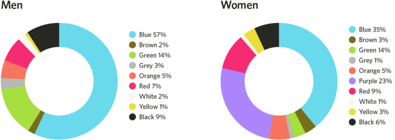
One of the most interesting examinations on this subject is the work of Joe Hallock, on »Color Assignment«. Hallock's data shows clear preferences of the different genders regarding colors. Here, blue seems to dominate both genders. However, purple shows the different preferences of men and women. It's important to include the environment and cultural perception when dealing with the suitability of a specific color for a gender. Often, the milieu and the cultural environment affect the cognition of colors. This may also affect individual decisions. In our cultural environment, a soft blue and rose are often associated with boys and girls. An Image of Hallcock's Assessments:The Favorite Colors of Men and Women
[caption id="attachment_77552" align="alignnone" width="640"] Blue is one of the favorite colors of both genders.[/caption]
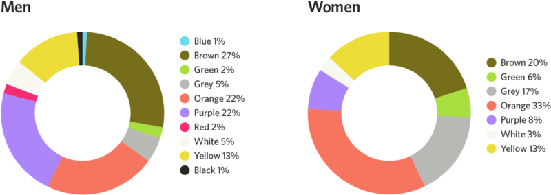
However, Men and Women Don't Like These Colors
[caption id="attachment_77553" align="alignnone" width="640"] The majority of men and women don't like these colors.[/caption]
Research makes it evident that nuances in color perceptions and the preferences often are the main factors. Men usually prefer stronger colors, while women favor the softer, gentle colors.
The male gender tends to like shades of colors with black components, while women tend to like shades with white elements better. The different color preferences have always been an often-discussed issue, although brands can and should easily work outside of gender stereotypes.
Breaking expectations can be rewarded, as shown by several brands already. The majority of both genders does not like red. However, the color is the base for a lot of really successful brands. An appropriate color choice does not have to consist of the favorite colors to be successful.
Harmonious Color Coordinations
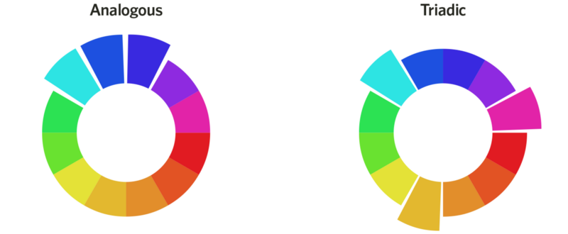
The psychological principle of isolation states that an element that works like a "sore thumb" is very likely to be remembered. Here, studies show that the participants remember an article or product a lot better when it stands out and sets itself apart from the rest. Two other studies on color combinations - one dealt with the measurement of aesthetic reactions, while the other focused on consumer preferences - worked out that a wide majority prefers color patterns with similar colors. However, palettes with a high contrast color choice were also perceived as pleasant. Regarding color coordination, this means creating a visual structure that consists of a base of analog colors and the contrast with complementary (or tertiary) colors.
Another route to take would be using a background, a base, and an accent color that support a clear hierarchy of the website; the customers and visitors are "trained" to do certain actions.
Why is this important? Understanding these principles means achieving better conversion rates. Let's pay attention to the effect on our mind when the color of a button changes. Which button will be clicked more frequently?
The red button is the obvious winner of the test conducted by Hubspot. The conversion rate increased by 21 percent. Of course, this is not only due to the red color but also due to the isolation of the button color.
The rest of the website was designed with a lot of green elements. In the end, this means that the green button simply drowns in the rest of the website. The red button immediately stands out, and clearly, sets itself apart from the other used colors. The result is the improved conversion rate. So that's a good example of using complementary colors.
We'll find a similar effect in a test of multiple variants published by Paras Chopra in the Smashing Magazine. Paras tested a couple of variants of download links for his PDFProducer program.
The Following Versions Were Tested:
Can you guess which combination scored the best results? Here's the answer:
The tenth variant worked a lot better than all the others. It is not possible to consider this a coincidence, though, as version ten had the best contrast of all examples. The text "PDFProducer" is small and gray, but the red call-to-action text "Download For Free" creates a high contrast, which is vital for higher conversion rates. But how do we define success for tests like this? Do we measure clicks or sign-ups?
Of course, this depends on what we plan to achieve with the call-to-action. In this case, sign-ups would certainly be the right answer. The "free download" is paid with the email address of the interested user, as a sign-up for the newsletter is necessary.
I find that many of the main social media sites (facebook, twitter, tumblr, vimeo, etc.) use the color blue primarily. I read on a tumblr page that this is because blue stimulates the senses and makes humans think they are more awake therefore making them use the app or site longer- is this true? Can the color blue really make us think we are less tired?
That’s an interesting thought!
Hello Andreas, I recently read something similar about the color blue. It was about how blue is used as a primary color for a few main social media apps and sites (facebook, twitter, tumblr, vimeo, etc.). Someone claimed that the color blue stimulates the human senses and makes us think we are less tired than we actually are therefore making us scroll, tweet, reblog, etc. for much longer- this post (found on tumblr) was not backed up with any scientific evidence but it does make sense to me. Is it possible for the color blue to make us feel less tired?
Our brain is flexible – we can teach it to perceive colors differently than society dictates it.
BUT it’s necessary to have very strong willpower and self-discipline.
I’ve read research in which our habits were illustrated in the brain as running on the round paths neurons, And we make them change directions, as a result, old paths after being about a month unused grow with a grass. Such Substitution can help our mind to become resistance to such unconscious controls of the human.
Taco Bell a creative brand? Nice article.
No Doubt Colors play Important role in Brand Marketing. Few months ago i start new Food Recipe Venture. I found this article very informative according to men and women colors Psychology. After reading this one i decide to take some changes in my site. I must follow your instructions regarding color scheme in my new design. Thanks for your efforts. Keep it up Andreas Hecht.
Choosing the right color scheme for the design is an important issue. I would say that everyone should conduct the A/B testing of the different options. But not all businesses have that opportunity. So there is only a taste of the creator that needs to be considered.