
Flickity: Beautiful Galleries on All Devices – Responsive and With Gesture Control

There are several solutions to creating galleries via JavaScript. But sometimes you may find the handling is not convincing, others provide a rather poor functionality. Flickity, however, is a state-of-the-art JavaScript framework for galleries that works great on desktops, as well as mobile devices. The gallery is responsive and can be controlled with your mouse or gestures - or even your keyboard. Thanks to CSS3 you can quickly navigate through galleries with animations.

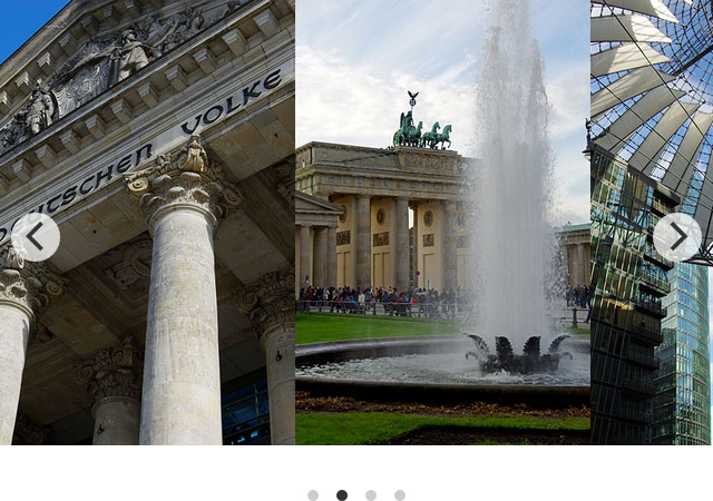
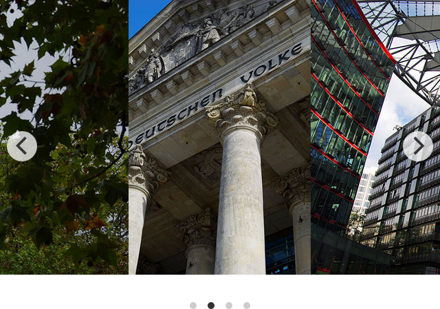 Standard layout: the selected image is displayed in the center[/caption]
The arrow buttons are marked up via <button> element, the dot navigation as a list through <ul> and <li> elements. The button arrows are SVGs. The menu items of the dot navigation are designed with CSS.
The stylesheet is responsible for the animation when you switch from one image to another. If you don't specify the gallery width, the width of the parent element will be applied. This doesn't affect the size of the images, however. Depending on the width, you'll see gallery elements next to the active element in the bleed.
If you change the browser's width, the gallery will be automatically adjusted to the new width. The same happens when you change the screen orientation on mobile devices.
Even though images are a classic application for a gallery, Flickity is not reduced to images. As already mentioned, you can mark up any elements as a gallery element using "gallery-cell". It can contain any content like texts or texts along with images.
Standard layout: the selected image is displayed in the center[/caption]
The arrow buttons are marked up via <button> element, the dot navigation as a list through <ul> and <li> elements. The button arrows are SVGs. The menu items of the dot navigation are designed with CSS.
The stylesheet is responsible for the animation when you switch from one image to another. If you don't specify the gallery width, the width of the parent element will be applied. This doesn't affect the size of the images, however. Depending on the width, you'll see gallery elements next to the active element in the bleed.
If you change the browser's width, the gallery will be automatically adjusted to the new width. The same happens when you change the screen orientation on mobile devices.
Even though images are a classic application for a gallery, Flickity is not reduced to images. As already mentioned, you can mark up any elements as a gallery element using "gallery-cell". It can contain any content like texts or texts along with images.
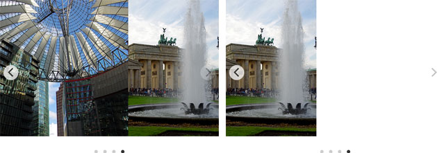
 Gallery displaying the selected image left-aligned[/caption]
The parameter "contain" fills out the whole gallery width with the gallery elements. The first gallery element will be displayed at the left edge, the last element at the right edge. So, there will be no empty space.
Gallery displaying the selected image left-aligned[/caption]
The parameter "contain" fills out the whole gallery width with the gallery elements. The first gallery element will be displayed at the left edge, the last element at the right edge. So, there will be no empty space.
 Two galleries with left-aligned layout: the left one with "contain" parameter, the right one without[/caption]
One thing I'd like to point out is that you can allow free scrolling using "freeScroll". It prevents the active image from being automatically aligned in the defined position when dropping it. The "wrapAround" option realizes infinite scrolling, displaying the first gallery element after the last one, and the last element before the first one.
Two galleries with left-aligned layout: the left one with "contain" parameter, the right one without[/caption]
One thing I'd like to point out is that you can allow free scrolling using "freeScroll". It prevents the active image from being automatically aligned in the defined position when dropping it. The "wrapAround" option realizes infinite scrolling, displaying the first gallery element after the last one, and the last element before the first one.
Quickly Integrated and Configured
If you don't want to read the documentation, you can quickly integrate Flickity into your project without any further configuration. You need to add a JavaScript file for the functionality and a stylesheet file for the layout and animated transitions to the HTML header. Then you can mark up the gallery via HTML. Define a container element that wraps around all gallery elements and assign the classes "gallery" and "js-flickity" to it. This can be a <div> element or any other block element, for example, <figure>. Add the class "gallery-cell" to each gallery element. This can also be a <div> element that wraps around, for example, images or other content. But you can also use a <img> element. You're completely free to choose the elements that work best for you.<figure class="gallery js-flickity">
<img src="1.jpg" class="gallery-cell" />
<img src="2.jpg" class="gallery-cell" />
<img src="3.jpg" class="gallery-cell" />
…
</figure>
In the above example, a <figure> element is defined as container and three <img> elements as content for the gallery. And that's all you need to do if you want to create a responsive gallery with Flickity. Buttons can be added via JavaScript. There are two arrow buttons to jump to the next or previous image. In addition, you can also directly navigate to each image in the gallery - using the dot navigation at the bottom. As if that were not enough, you can also navigate through the gallery via drag function of your mouse. Gesture control is provided for mobile devices.
[caption id="attachment_91111" align="alignnone" width="640"] Standard layout: the selected image is displayed in the center[/caption]
The arrow buttons are marked up via <button> element, the dot navigation as a list through <ul> and <li> elements. The button arrows are SVGs. The menu items of the dot navigation are designed with CSS.
The stylesheet is responsible for the animation when you switch from one image to another. If you don't specify the gallery width, the width of the parent element will be applied. This doesn't affect the size of the images, however. Depending on the width, you'll see gallery elements next to the active element in the bleed.
If you change the browser's width, the gallery will be automatically adjusted to the new width. The same happens when you change the screen orientation on mobile devices.
Even though images are a classic application for a gallery, Flickity is not reduced to images. As already mentioned, you can mark up any elements as a gallery element using "gallery-cell". It can contain any content like texts or texts along with images.
High Flexibility Due to Various Settings
Flickity comes with a whole bunch of settings and can be customized to your needs. The configuration parameters are defined through the data attribute "data-flickity-options" directly in the container element of the gallery. They're assigned as JSON objects. Thus, you can disable both menus - the next and previous button and the dot navigation.<figure class="gallery js-flickity" data-flickity-options='{"prevNextButtons": false, "pageDots": false}'>
…
</figure>
As the parameters within the JSON object require double quotes, the JSON object itself must be assigned in single quotes to the data attribute.
In the above example, all menu items are removed via "prevNextButtons" and "pageDots". Then you can navigate only with your mouse or gestures.
You can also customize the layout of the gallery by aligning the single elements via "cellAlign". They can be displayed left-aligned, right-aligned, or centered.
<figure class="gallery js-flickity" data-flickity-options='{"cellAlign": "left"}'>
  …
</figure>
[caption id="attachment_91110" align="alignnone" width="640"] Gallery displaying the selected image left-aligned[/caption]
The parameter "contain" fills out the whole gallery width with the gallery elements. The first gallery element will be displayed at the left edge, the last element at the right edge. So, there will be no empty space.
<figure class="gallery js-flickity" data-flickity-options='{"contain": true}'>
  …
</figure>
[caption id="attachment_91109" align="alignnone" width="629"] Two galleries with left-aligned layout: the left one with "contain" parameter, the right one without[/caption]
One thing I'd like to point out is that you can allow free scrolling using "freeScroll". It prevents the active image from being automatically aligned in the defined position when dropping it. The "wrapAround" option realizes infinite scrolling, displaying the first gallery element after the last one, and the last element before the first one.
<figure class="gallery js-flickity" data-flickity-options='{"freeScroll": true, "wrapAround": true}'>
  …
</figure>
The "autoplay" parameter automatically advances to the next gallery image. You can specify how long you want each image to be displayed. The autoplay function will be disabled when the gallery is manually controlled.
<figure class="gallery js-flickity" data-flickity-options='{"autoPlay": 1500}'>
  …
</figure>
In the above example, images change every 1.5 seconds.
If you use several galleries and want to control them centrally, you'll need to integrate jQuery or Vanilla JS.
$(".gallery").flickity({
  cellAlign: "right",
  contain: true
});