
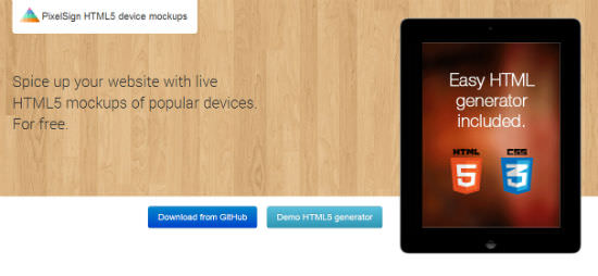
Freebie of the Day: Spice Up Your Website With Live HTML5 Device Mockups
This is great, I promise. We know Finland for a lot of things, rubber boots for instance or - ehm - Helsinki. Angelos Arnis and Tomi Hiltunen want to add to this ample variety. They just published a set of device mockups, all in PNG and CSS, that you can actually bring to life with real content. You've got a web app for mobile clients you want to show on your website? Not very impressive, unless you present it inside the frames of its mobile boundaries. That's what Arnis and Hiltunen have built...
Pure CSS or HTML5 Data Attributes Control The Look & Feel
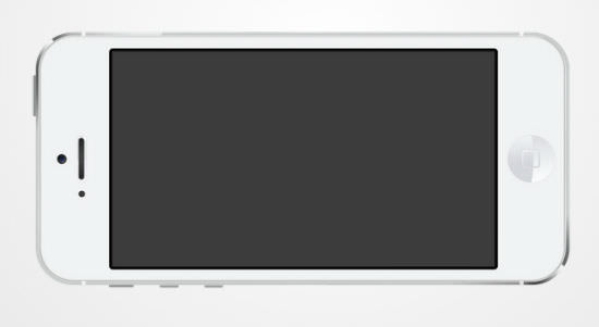
At the time of writing, the set of HTML5 device mockups consists of eight popular and common (besides the Surface and the Lumia 920) pieces of hardware. There are the iPhone 5 and the iPad in portrait and landscape orientation, both in black and in white. Then we have the iMac and the MacBook Pro. For the Android fraction, we see an Galaxy S3 in blue and in white with different orientations and last and as well least you can have your website, web app or other content embedded into the viewport of a Surface tablet or a Lumia 920. One good thing about the Lumia, it comes in yellow...
Besides the necessary PNGs, Arnis and Hiltunen also deliver the source PSD files. That way you can even produce static mockups or presentations in flyers or wherever you might need them.
The heart of the project, which is hosted over at Github, are two CSS files. Basically they both perform the same tasks. The difference is that device-mockups.css works using CSS classes, while device-mockups2.css uses HTML5 data attributes.
The following example works with the second variant. But first things first. To start we import the CSS into our website.
Next, we fire up the included Mockup Device Generator.html (or the one from the demo site, for that matter) in our browser. Now we can choose our desired mockup device, the generator - well - generates the necessary code we will then embed into our webside.
I chose an iPhone in white and landscape orientation like this:
This is the code that got generated:
As you can see, the device is defined via data attributes. As I said, the other variant is going to use additional CSS classes instead.
The most important part in this little piece of code is the div with the class screen. This is where you will want to enter the actual content. And this content can be media, such as video, images or JavaScript apps or any other content able to be displayed in an iframe. The div with the class button lets you assign a function to the home button. You might do that or remove the section altogether.
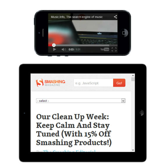 Examples From The Project Homepage[/caption]
You don't need too much fantasy to be able to see the benefits. The most obvious use case is to show your specialized web apps for mobile devices inside the mockup of the very device you created them for.
The HTML5 device mockups, as the official project title goes, can be used free of charge in both private as well as commercial projects, Arnis tells me in an email.
So, what is your take on the project? Let me know in the comments below!
Related Links
- Spice up your website with live HTML5 mockups of popular devices | Aarnis.com
- pixelsign / html5-device-mockups | Github Repository
- The Mockup Generator on the Demo Site