
Combining Typefaces Made Easy (Free eBook)
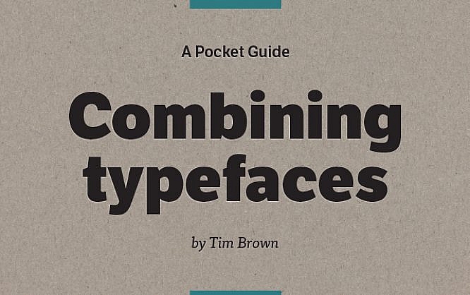
Since the introduction of web fonts, the undivided variety of typography is available to web designers and their projects. However, combining the right fonts is easier said than done. The free ebook "Combining Typefaces" helps you find fonts that fit together nicely. So, which fonts suit my web layout and which fonts harmonize with each other? The ebook answers this and other questions on over 60 pages.
 Anatomy of the Letters
Whenever it gets very specific, the book refers to websites and books that allow you to deepen your knowledge. The classification of fonts - meaning the stylistic and historical placement of fonts - is only mentioned briefly. There are references to further literature on the topic, however.
Anatomy of the Letters
Whenever it gets very specific, the book refers to websites and books that allow you to deepen your knowledge. The classification of fonts - meaning the stylistic and historical placement of fonts - is only mentioned briefly. There are references to further literature on the topic, however.
 Comparing Fonts
You should choose a suitable font for the anchor font, which is used for headers, for example. Here, "Combining Typefaces" presents some criteria to keep in mind while selecting. Comparing the font's proportions is very helpful as well. Compare the relation of the upper case letters to the lower case letters, as well as the letter width. This way, you'll find fonts with similar proportions, which thus harmonize well with your anchor font.
Comparing Fonts
You should choose a suitable font for the anchor font, which is used for headers, for example. Here, "Combining Typefaces" presents some criteria to keep in mind while selecting. Comparing the font's proportions is very helpful as well. Compare the relation of the upper case letters to the lower case letters, as well as the letter width. This way, you'll find fonts with similar proportions, which thus harmonize well with your anchor font.
 Example for Combined Fonts on a Website
For all presented fonts, there are links to the respective foundries. This way, you can possibly find one or two new fonts for inspiration, or maybe even a font provider that you didn't know before.
Overall, "Combining Typefaces" is an extensive book that is interesting and helpful for both typography beginners, and advanced users. If you're looking for a profound entrance into the topic of typography and the combination of fonts, this book certainly is a good choice for you.
The ebook covers 60 pages and weighs in at ten megabytes. It can be downloaded for free as a PDF file from Adobe's font service Typekit.
(dpe)
Example for Combined Fonts on a Website
For all presented fonts, there are links to the respective foundries. This way, you can possibly find one or two new fonts for inspiration, or maybe even a font provider that you didn't know before.
Overall, "Combining Typefaces" is an extensive book that is interesting and helpful for both typography beginners, and advanced users. If you're looking for a profound entrance into the topic of typography and the combination of fonts, this book certainly is a good choice for you.
The ebook covers 60 pages and weighs in at ten megabytes. It can be downloaded for free as a PDF file from Adobe's font service Typekit.
(dpe)
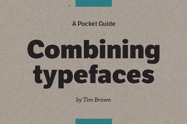
Introduction to the Basics of Typography
Everyone that wants to first read the basics will find a lot of general information on font and typography in the first chapter of "Combining Typefaces." The chapter gives the reader an overview of the anatomy of letters, meaning that, among other things, it explains ascenders, descenders, and serifs. Foreign readers can learn the English expressions in this chapter. The ebook is written in English.
Anatomy of the Letters
Whenever it gets very specific, the book refers to websites and books that allow you to deepen your knowledge. The classification of fonts - meaning the stylistic and historical placement of fonts - is only mentioned briefly. There are references to further literature on the topic, however.
Choosing and Combining Typefaces
The rest of the chapters deals with the actual issue. Which criteria should you follow when choosing one or multiple fonts? What do you want to achieve with the typography? There are many factors that play a major role when picking a font. For one, there's the readability. Fonts can also be chosen and applied to attract the reader's attention, however. The book's primary emphasis, the combination of fonts, is explained in a very detailed way. That's because the combination of appropriate and harmonic fonts is not always easy. Those that would rather stay on the safe side stay within one font family and, for instance, combine a font without serifs with a serif font of the same family. The ebook also gives a lot of useful advice on how to find fonts that suit each other outside of one font family. For example, it is helpful first to decide on one "anchor font," the font that you will use for text blocks and is thus used for the majority of your texts.
Comparing Fonts
You should choose a suitable font for the anchor font, which is used for headers, for example. Here, "Combining Typefaces" presents some criteria to keep in mind while selecting. Comparing the font's proportions is very helpful as well. Compare the relation of the upper case letters to the lower case letters, as well as the letter width. This way, you'll find fonts with similar proportions, which thus harmonize well with your anchor font.
Combining Typefaces: Well-Done Examples
In the final chapter, a couple of well-done examples of good font combination are presented. There are explanations as to why the fonts fit together and what makes the combination excellent and unique, according to specific scenarios.
Example for Combined Fonts on a Website
For all presented fonts, there are links to the respective foundries. This way, you can possibly find one or two new fonts for inspiration, or maybe even a font provider that you didn't know before.
Overall, "Combining Typefaces" is an extensive book that is interesting and helpful for both typography beginners, and advanced users. If you're looking for a profound entrance into the topic of typography and the combination of fonts, this book certainly is a good choice for you.
The ebook covers 60 pages and weighs in at ten megabytes. It can be downloaded for free as a PDF file from Adobe's font service Typekit.
(dpe)