


Typography can be one of the most creatively rewarding parts of web design, but it can also be one of the most frustrating. Working with just one or two fonts can be challenging enough for most web designers, yet some still insist on using three, four, seven, or even more fonts in their designs. Some people excel at creating sites with complicated typography, while others fail miserably. Read on to find out tricks to creating fantastic website designs with complicated type, as well as some great examples of sites that get it right, and those that get it wrong.
Pro Tip
Sign up for a free Jotform account to create powerful online forms in minutes — with no coding required.
1. Pay attention to scale and proportion
Multiple fonts work best together when they have similar proportion and scale. For example, Georgia and Verdana have similar shapes, even though one is serif and one is sans serif. The same could be said for Times New Roman and Arial Narrow. Look at specific characters in each font to see how similar they are, as well as entire words.
Fonts don’t necessarily have to be identical in scale and proportion. What you want to look for are either fonts that are very, very similar, or fonts that are very, very different. Fonts that are “kind of the same” are generally going to look strangest when placed near each other. Fonts that are very similar are going to appear to have the same weight on screen in most cases, while fonts that are very different can more easily be played against one another to give emphasis to specific parts of the site.
2. Unify fonts with color or style
If you throw up six different fonts on your site, with ten different colors, and four different styles, you’re probably just going to give your visitors a headache (if they stick around that long). While you don’t necessarily have to only use one color or one style, you need to be much more careful in how you use them.
As far as colors go, try to stick to colors either in the same hue or saturation level. You want the colors to mesh, rather than clash.
You have a bit more leeway with font styles, but make sure that the styles you choose make sense with the existing weight and emphasis of the particular fonts you’ve chosen. You can make a heavier font oblique (italic) to de-emphasize it’s weight a bit, or add a strong tag to a lighter-weight font to bring it more in-line with the heavier fonts on your page. Underlining can emphasize both light and heavy fonts without making either appear heavier than they already are.

3. Pay attention to priority and emphasis of different fonts
This has been touched on a bit already, but the priority and emphasis that different fonts convey naturally has to be taken into account. Some fonts are going to draw more attention than others. It’s one reason using multiple fonts is both incredibly fun and very hard to get right.
You can compensate for heavier or lighter fonts in a few ways. Increasing or decreasing the size is the most obvious. Adding styles and font decorations (oblique, strong, underline, etc.) can also emphasize and even help de-emphasize most fonts.
Changing the color of a font can help, too. If your typography is mostly black, adding in shades of gray to de-emphasize certain parts can work really well. In fact, putting certain type in gray can work even if your design is more colorful (to really unify things, make sure the gray has just a hint of one of the main colors in your other typography).
4. Avoid anything too similar
Similar fonts are tricky. Using something like Georgia and Garamond right near each other, for example, doesn’t really do much and can end up making one or both fonts look a little off. A lot of non-designer folks might not really see the differences between the fonts and think they just look strange—not quite right. The same can be said for fonts like Verdana and Tahoma or Arial and Helvetica. Try for a bit more variation for the best end-result.
5. Keep body text readable
While playing around with funky typography can work really well in navigation, headers, and other parts of your site, large chunks of body copy just don’t work well with multiple typefaces. Stick to one, preferably site-wide. Pick a font that’s easy to read and web safe while also being similar in proportion and weight to the other fonts on your site.
6. Don’t overlook different font styles
We’ve talked about how using different styles and font decorations can change the priority and importance of different typographic elements. But one thing many designers overlook is using multiple styles, sizes, and decorations to achieve the look of mixed typography while still working entirely with web-safe fonts. This technique is also great for designers who are just starting to experiment with web typography, as it eliminates many of the common issues with proportion and scale between different typefaces. Mix italic, bold, small caps, all caps and other styles within the same fonts to get the look of mixed typefaces without the headaches.

7. Trust your instincts
This is probably the most important thing on this list. Whenever you’re designing anything, you should be sure to take a step back from it often and look at the big picture. If something doesn’t look right or feel right to you, cut it.
It’s no different with typography. If a certain font just doesn’t seem to be working, you’ll have to cut something. In these cases, you have two options: you can cut that font and find another one that works better, or you can scrap all your other fonts and find ones that work better with the one you’re having trouble with. What you do depends on which fonts you’re more attached to.
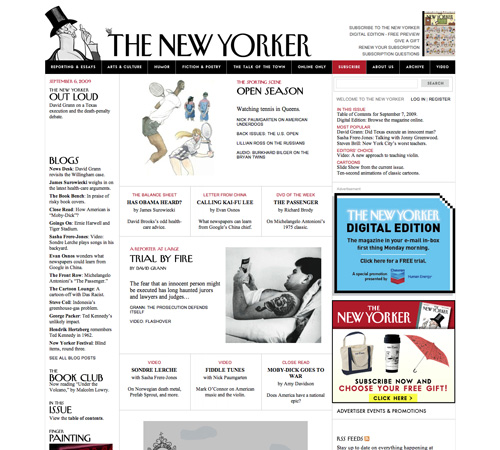
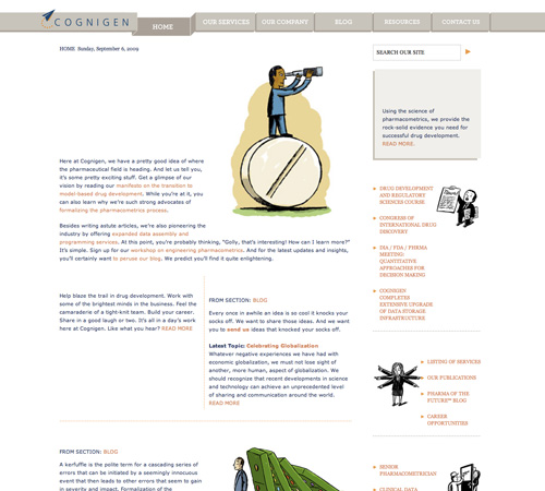
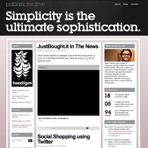
Examples of Great Typography
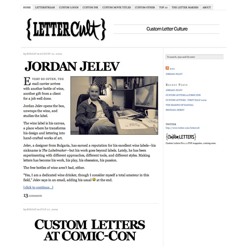
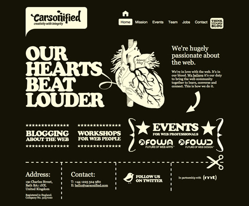
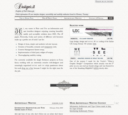
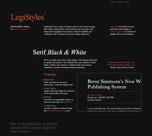
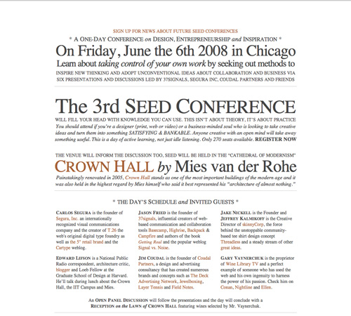
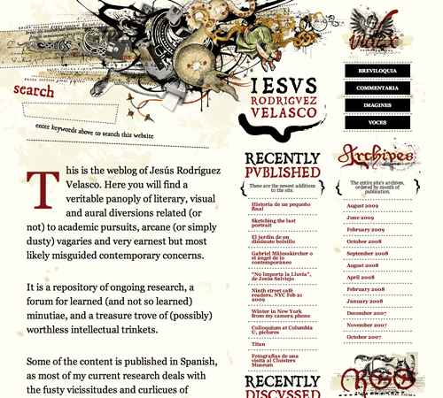
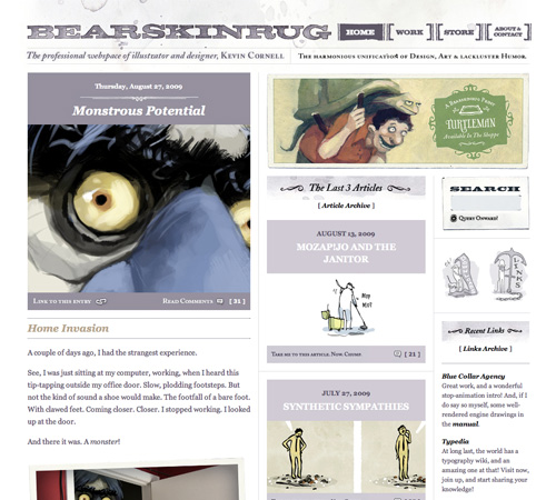
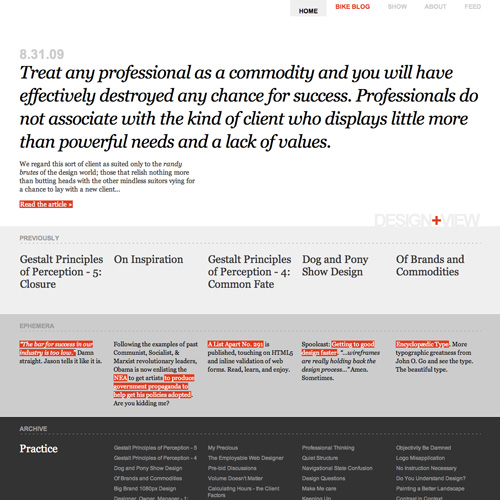
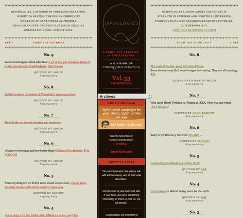
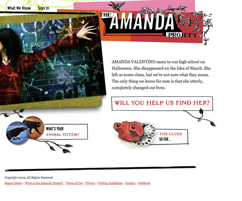
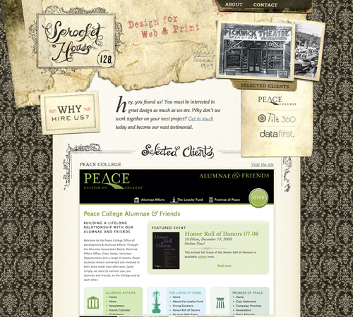
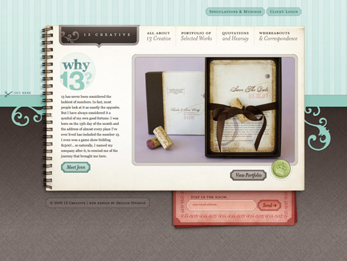
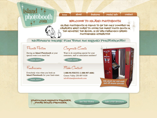
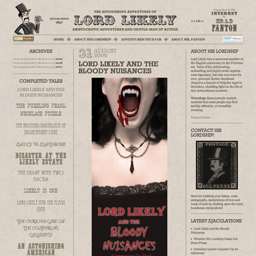
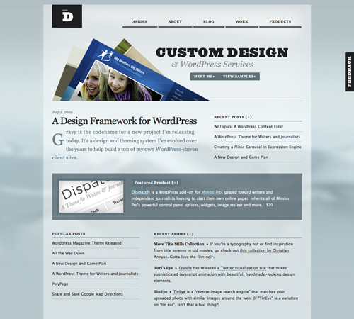
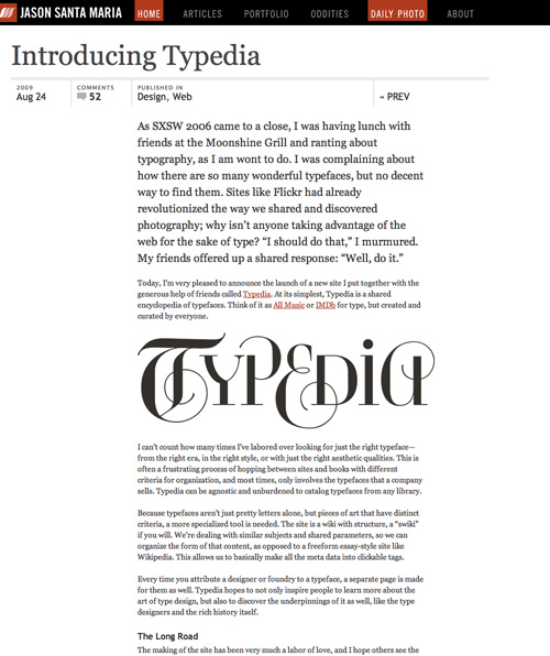
Here’s a collection of sites that use multiple fonts really well. Most use between three and five fonts, and sometimes in really creative ways (there’s at least one case where the ampersand in the header is a different font than basically everything else on the site).


Banner Image by StartupStockPhotos from Pixabay


Send Comment:
29 Comments:
More than a year ago
Seems to me a number of these go against the rules and look like a jumbled mess because of this. Too many pages using 4+ different fonts.
More than a year ago
You forgot about the one that says don't put textured backgrounds behind your reading text because it's super hard to read. But seriously, good article.
More than a year ago
Hey ! Great article !
Thanks.
Typography is really an art on itself.
More than a year ago
Thanks for the display, good to have persons that care for the things they display.
More than a year ago
would a mixture of Arial and tahoma work?
More than a year ago
Thanks for including us! It's humbling to be considered alongside so many talented designers.
More than a year ago
Beautiful picks. Thanks for sharing with us.
More than a year ago
Beautiful examples
More than a year ago
Great archive.
More than a year ago
Very helpful! Thanks.
More than a year ago
Very interesting and fantastic article. Keep your good work up.
More than a year ago
very cool
More than a year ago
I am usually opposed at mixing multiple fonts but these guys pull it off. thanks for the article!
More than a year ago
That's a very good article!
More than a year ago
stumbled, thanks. Great article, great site!
More than a year ago
Hey Cam! :)
Nice article - I often get all to focused on 'web-safe' fonts that I never really push the envelope anymore. This has gone quite a way to re-awaken my love of type.
Thank you! :) some fantastic examples!
More than a year ago
It’s an awesome approach of how to choose types and good tricks as well.
Thanks to share it.
More than a year ago
Great article, thanks
More than a year ago
Great article, usefull tips, thx
More than a year ago
second example really nice
More than a year ago
A print design professor always said a good rule of thumb (though not the only thing you should look at) is if you're using a serif, make the second font a sans and vice versa.
More than a year ago
"Now that cross-browser font embedding is possible w/ @font-face (Learn How) Here are some good font-mixing guidelines (this article)" - via Twitter @Randsco
More than a year ago
Very nice i likes a lot the first example really attractive
Thanks
More than a year ago
Thanks, great article, very useful.
More than a year ago
It's really a challenge to use multiple fonts in the same design. Thanks for the tips, very useful stuff.
More than a year ago
Great article, good read.
More than a year ago
Thanks for this great article Cameron. I was actually discussing this topic with a colleague. I'm glad there is a good reference point for us now.
More than a year ago
Cool collection of sites using different fonts. I mostly prefer using Serif font types rather than Sans Serif. But, I've been inspired by the sites linked here using quite a lot of Sans Serif fonts.
More than a year ago
Fonts can either make or break your site. Great article.