


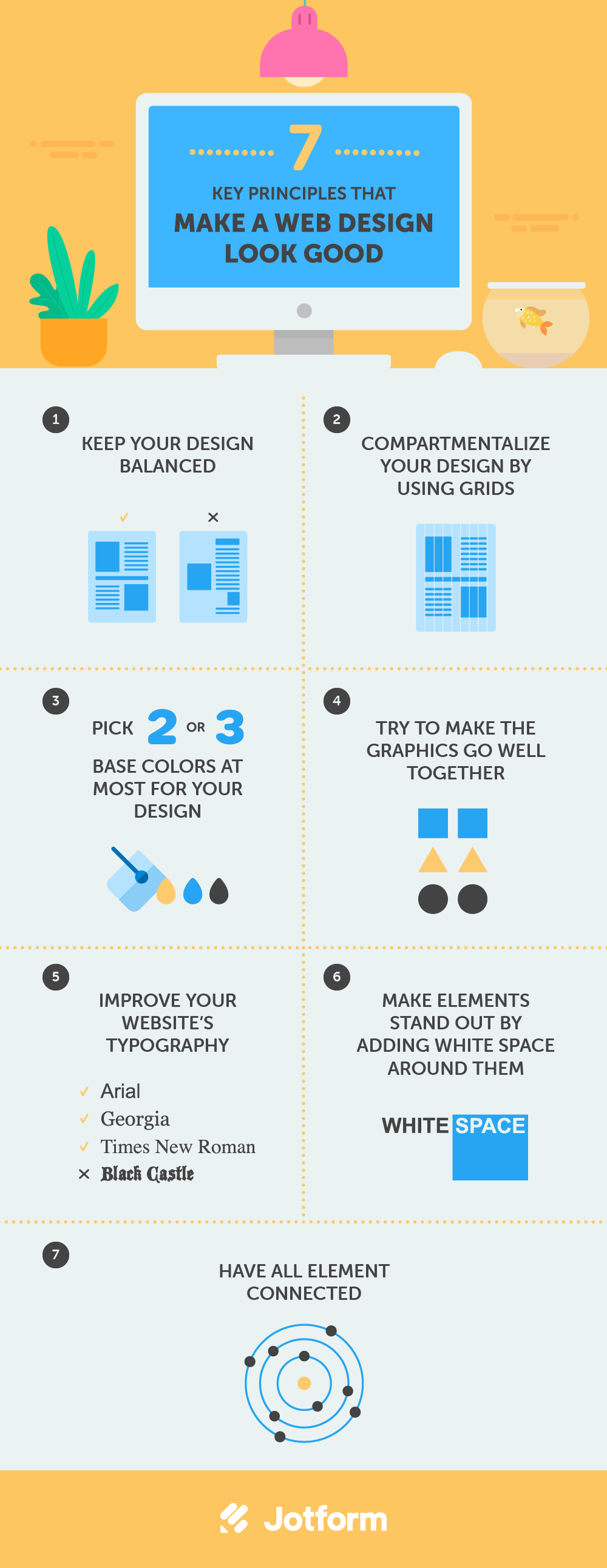
How to design a good-looking website
- Keep your design balanced.
- Compartmentalize your design by using grids.
- Pick two or three base colors at most for your design.
- Try to make the graphics go well together.
- Improve your website’s typography.
- Make elements stand out by adding white space around them.
- Have all elements connected.
Everyone and their grandfather (and dog) seems to have made a website these days. The Web is getting more crowded by the day, with literally dozens of websites being added as you read this article. It is becoming harder and harder to get noticed among the masses.
“Fortunately” for us designers, not everyone seems to understand what makes or breaks a Web design. Granted, Web design is to a large extent a creative process and can therefore be called more art than science. But because it is intrinsically a medium of presentation, some rules (or at least principles) apply. By following some simple pointers, anyone should be able to create a visually pleasing design and take one step closer to fame. Okay, it’s not that simple, and talent and experience do matter, but anyone can turn their home page into something prettier within mere minutes.
So what makes something pretty? It is not Flash. Not to say that Flash has no merit, but Flash alone doesn’t make a design good; some nasty Flash websites are out there. Also, one doesn’t have to be a great illustrator to make appealing designs. Instead, look at Web design as a symbiosis of different elements. No single element counts the most; rather, the sum of the elements makes a design look good.
Did You Know
You can’t have amazing web design without spiffy forms. Create beautifully-designed web forms today.
1. Keep your design balanced.
Balance is all about ensuring that your design does not tip to one side or the other. It is like the balance of weight in achieving symmetry or asymmetry.
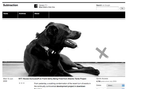
Look at the dog in the header graphic of Khoi Vinh’s Subtraction website below. I took this example from The Principles of Beautiful Web Design by Jason Beaird. Jason points out how the cross to the right makes up for the added visual weight that the dog provides on the left. It is a small but not insignificant detail. See for yourself by hiding the cross with your hand.
This is what we call asymmetrical balance, and this is what balance is about. If you’re not careful about how you lay things out, the design will become unbalanced rather quickly. You can manipulate the visual weight of a design in many ways, such as with color, size and the addition or removal of elements. If you were to make the cross, say, a vibrant orange, it would become heavier and perhaps throw the layout off balance again. Achieving asymmetrical balance is an especially delicate matter that takes time to fine-tune and a somewhat trained eye to really pull off.
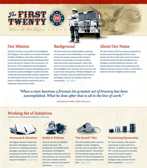
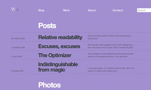
Here below is another example of symmetrical balance, this one by The First Twenty. Although the header graphic is asymmetrically balanced (can you spot how it’s done?), the rest of the design lower down has symmetrical columns. Asymmetrical balance might be harder to pull off, but it tends to make a design more playful.
You will find that every design you think looks good has a well-constructed balance underlying it. And every design featured here scores high on each of the seven principles we discuss. So take a minute to scroll up and down and see for yourself if they all pass muster.
2. Compartmentalize your design by using grids.
The concept of grids is closely related to that of balance. Grids are a series of horizontal and vertical rulers that help you “compartmentalize” a design. Think of columns. Columns improve readability, making a page’s content easier to absorb. Spacing and the use of the Rule of Thirds (or similar Golden Ratio) make everything easier on the eye.
The Rule of Thirds and Golden Ratio account for why sidebars, for example, are usually about a third of the width of the page and why the main content area is roughly equal to the design’s width divided by 1.62 (equalling phi in mathematics). We won’t get into why this is, but it does seem to hold true in practice. It is also why the subject in professionally taken photographs is usually positioned not in the middle but at the intersection of an imaginary nine-square grid (three by three, with two horizontal and two vertical lines).
The grid lends itself particularly well to minimalist designs. 5 Thirty One by Derek Punsalan shows why:
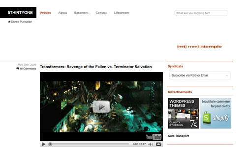
While the design is not visually impressive in itself, the clear strict structuring of elements makes it easy on the eye. The left column is roughly twice the size of the right sidebar, which just makes sense and is something to think about when creating your own designs.
3. Pick two or three base colors at most for your design.
What if you changed the base red on the The First Twenty website (above) to lime green? Would it look good? Most likely not. Because it does not belong to the same color palette (and of course lime green isn’t the easiest color to work with). Websites such as ColourLovers exist for a reason. You can’t just pick your colors Rambo-style, guns blazing. Some colors go well together, others don’t. A lot of theories on colors and their combinations exist, including conventions on monochrome and contrasting schemes, but a lot comes down to common sense and having a feel for it.
Find out for yourself what works together. Soak up as many website designs as possible, such as those featured on any of the many CSS showcase websites (like Best Web Gallery), to get a feel for how colors interact with each other. Pick two or three base colors at most for your design, and then use tints (which are lighter, mixed with white) and shades (which are darker, mixed with black) of these base colors to expand the palette where necessary.
Picking nice colors is as important as picking the right colors (that is, the right colors for the job). A Web design for a cozy little restaurant would do well with “earthy” tones: reds, browns, etc. Of course, there is no such thing as a surefire recipe. Every color sends out a message, and it is up to you to get the message right.
Bence Kucsan’ website has a color scheme style of his own. It’s mainly monochromatic (tints and shades of a single color) and achromatic (black and white) with a color (red) to stand out:
The black and white conveys chic and professional, while the red adds the spice that makes certain elements stand out and keeps the design from looking dull; of course, more than just red makes this design interesting. By the way, one company in particular popularized this style.
Speaking of color, WebDesigner Wall by Nick La is pure bliss:
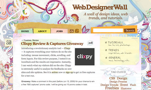
All of those soft pastels make this design shine. At first glance, the color choices may look somewhat arbitrary, but when you look closely you notice a strictly defined color palette, which is necessary to ensure that all of the elements get along well. The website, and especially its background, also demonstrates a good combination of colors and graphics, which brings us to number four…
4. Try to make the graphics go well together.
Okay, great design doesn’t need fancy graphics. But poor graphics will definitely hurt a design. Graphics add to the visual message. Websites like WebDesigner Wall have impressive illustrations, while others are understated.
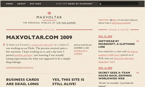
Tim van Damme uses only a handful of graphics on his website Max Voltar, but he implements them with the greatest thought and care. A non-intrusive background image and a sophisticated crown are two of the graphics. Visually, they are not overly impressive, but they all add to the look and feel of the website, and nowhere is one out of place.
For some time now, Max Voltar has had a different design than the one shown above. But for the two months that this one was online, it was easily one of my favorites. Because of this and because its use of graphics is so exemplary, I picked it over the latest version.
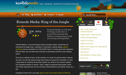
Rogie King’s Komodo Media is a lot more graphics-heavy, perfectly executed from both a technical and thematic standpoint.
You may not be a great illustrator or photographer, but that doesn’t mean you can’t put great graphics on your website. Some basic Photoshop skill, possibly some stock images and great taste are all you need. Try to make the graphics go well together, and make sure they embody the style you are aiming for. We are not all gifted with the same natural ability, though. You can pick up some things by learning from others, but sometimes you just have to pick the style that suits you best (like a clean style if you are not the greatest of illustrators).
5. Improve your website’s typography.
The art of type is a tricky subject to talk about because it encompasses so many elements. While it can be regarded as a branch of design, one can spend a lifetime mastering all of its aspects. This is not the place to provide a complete typographic reference, so we will limit our discussion to what will benefit you in the short term.
Web typography is handicapped compared to print typography. The biggest difference is our lack of complete control over the appearance of type on the Web, due to its dynamic character. Obviously, dynamic rendering has its strengths, but Web designers have little control over the results, at least for now. Missing fonts on the user’s computer, differences in browser and platform rendering, and generally subpar support in CSS make Web typography a daunting if not frustrating task. But while we may have to wait for CSS 3 for Web typography to reach its full potential, we have the means now to make it look interesting and, more importantly, pretty.
Font Stacks
There are several fairly easy ways to significantly improve your website’s typography, three of which we’ll cover here. One of them is font stacks.
Font stacks are just basic CSS. They let you define the order in which fonts should be rendered. To be precise, we are speaking of typefaces here, not fonts. For a good summary on this, please refer to Jon Tan’s Typeface != Font.
body { font-family: "Helvetica Neue", Helvetica, Arial, sans-serif; }
The property above will give the body copy the typeface of “Helvetica Neue.” This, however, requires that the user’s computer has that particular typeface installed. Macs nowadays come with Helvetica (Neue) pre-installed, but most Windows machines don’t.
The beauty of font stacks is that you can define “fallbacks,” meaning that whenever a defined typeface is missing, the browser simply looks for the next one in line. Of course, this means the design will not look exactly the same for everyone, and as such we lose some control yet again. But for those who do not want to resort to another solution (such as image replacement), this is the best that pure CSS offers at the moment (until the day we can comfortably use @font-face).
Wilson Miner uses the font stack we cited above. Helvetica Neue is an improvement of Helvetica. And while Arial is installed on almost every computer (at least on Windows and Mac machines) and therefore a popular choice for the Web, most designers prefer Helvetica to Arial. This way, you get the best of both worlds: Helvetica for those who have it and Arial in case Helvetica is unavailable.
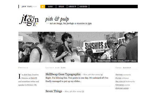
Jon Tan uses another interesting font stack for his headings:
body { font-family: baskerville, 'palatino linotype', 'times new roman', serif; }
Only a relatively small number of visitors will see the headers in Baskerville, but that is not a problem. It gives the design an extra bit of character while not hurting anyone who doesn’t have it. Again, font stacks are not a perfect solution, but they do give you an advantage.
Measure and Leading
Measure is the length of lines, and leading is the height (or vertical spacing) of lines. In CSS, measure can be controlled by defining a width for the containing box (e.g. the paragraph element). Both affect readability. If the lines are too short or too long, users won’t be comfortable reading the content; one often sees this problem with fluid layouts. Between 40 and 80 characters per line seems ideal.
Leading can be increased (or decreased, if you really want to) by defining the line-height CSS property. Generally, a line height of 1.5 works well for paragraphs. This means that when the size of the text is 12 points, the height of the line becomes 18 points (12 × 1.5), which gives the text some breathing room.
Hanging Quotes and Bullets
A third way to improve readability is with hanging quotes and bullets. Rather than leave the text of bulleted lists and quotes with the default alignment, horizontally align it with the rest of the text on the page.
Tim van Damme uses hanging bullets for his latest redesign of Max Voltar:
We have added the red line to emphasize how all of the text has been horizontally aligned. By simply setting the padding-left CSS property of the bulleted list to 0, you can achieve the same result.
Pulling off hanging quotes, on the other hand, is not as straightforward. Most designers resort to a background image for quotation marks and then align accordingly, as done by Matthew Buchanan:
The hanging quotation mark here does not disrupt the flow of text. It’s a detail not often attended to but well worth the investment.
Print Rules That Do Not Apply
Print and Web are not the same. That seems pretty obvious, but a lot of people treat them as if they were the same. Print is fixed, and the Web is dynamic. Having complete control over how your Web design will look for everyone is impossible.
Vertical rhythm, proper justified text (with hyphenation and without rivers) and multi-column layouts are just a few of the features of print that are (almost) impossible on the Web. Thus, we have a lot to look forward to with CSS 3. CSS 3 will probably not be, however, a be-all and end-all solution, and it will likely be another few years before we can fully take advantage of it. We simply have to accept these differences for now: don’t look at the Web as an online version of print; rather, use the intrinsic potential of the Web to its fullest.
A Word About Image Replacement
What about image replacement (the technique of replacing fonts with images)? We’ve talked about font stacks, but aren’t they inferior to image replacement? Well, that depends on what you think is more important: being able to display the exact font you want or having dynamic, accessible and SEO-friendly content? Certain image replacement techniques have gotten pretty advanced, but they still aren’t as flexible as plain text. Image replacement lends itself well to headers and excerpts, but it is hardly a solution for body text.
6. Make elements stand out by adding white space around them.
White space, or negative space, has to do with what is not there. Like measure and leading, white space gives text some breathing room and spatial peace. You can make elements stand out by adding white space around them. Copy, for example, shouldn’t look cramped. To ensure readability, make sure paragraphs have sufficient padding.
Perfume ads — or any ad for a luxury product for that matter — are known for their use of white space… loads of it; and a serif typeface for good measure.
I suppose it’s time for a shameless plug. The screenshot above is of my own website Shift (px). The design relies heavily on typography and white space. White space probably takes up about 50% of the page. White space is one of the easiest (because you aren’t really adding anything, are you?) and most effective ways to create a visually pleasing and readable design.
White space adds a lot of class to a design. Don’t be afraid to leave some holes open, even gaping ones. Inexperienced designers are tempted to put something in every little corner. Design is about communicating a message. Design elements, therefore, should support this message, not add noise to it.
Another good example of plenty of white space:
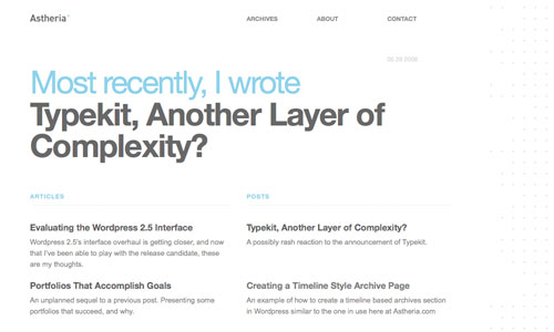
Kyle Meyer’s Astheria shows that not much is needed for a pleasing design. Some people may confuse “minimalist” with “simple.” But pulling off such a style is neither simple nor easy (even if one does not have to be great with graphics or illustrations).
7. Have all elements connected.
“Connection” is a bit of a made-up term here, but it seems to be the best one for what we mean. Connection here refers to a Web design that has both unity and consistency. These two attributes demonstrate the profesionalism of a design (and thus its designer). They are very broad attributes. A design should be consistent in its use of colors, in its range of fonts, with its icons, etc. All of these aspects count; a design can look great and still suffer from inconsistencies.
When a design is inconsistent, its unity can be lost on the user. Unity is slightly different from consistency. Unity refers to how the different elements in a design interact and fit together. For example, do the colors and graphics match? Does everything contribute to one unified message? Consistency, on the other hand, is found between the pages of a design.
Unity is perhaps the more important of the two. Without unity, having a good design is hard. Inconsistency, however, may look a bit “sloppy” but may not make the design “bad.”
Of the seven principles addressed in this article, connection is the most important. Connection has to do with how all elements come together: balance, grid, colors, graphics, type and white space. It is sort of the glue that binds everything together. Without this glue, the design falls apart. You could have pretty type and a brilliant and meticulously chosen color palette, but if the graphics are awful or simply don’t match or if everything is crammed together without thought, the design will fail.
This is the hardest part of designing. It is not something that can be easily taught or necessarily be taught at all. A little natural ability and experience is required. But it is what it is, and it makes a design look good in the end.
We praised Nick La’s WebDesigner Wall earlier because of its lovely graphics, but it is also a good example of connection. When you look closely at the graphics and the style in general, everything has a hand-drawn watercolor look to it: the articles’ images, the watercolored background images, the hand-drawn doodles and icons, the styling of the poll, and so on. The attention to detail makes this design excel.
Further Resources
- HTML Basics for Beginners: How to create a website using HTML
- Five Simple Steps to Designing Grid Systems: A beginner’s guide to grids.
- The Golden Ratio in Web Design
- 8 Simple Ways to Improve Typography in Your Designs
- Fonts and the Web: About the state of fonts on the Web and image replacement.
- 4 Principles of Good Design for Websites: Four other principles, more from a practical standpoint.
An additional resource
If you are new to web design, our guide on how to make a website is going to lead you all the way from the very beginning.
Conclusion
Good Web design is not limited to the seven key principles discussed here. Aspects such as accessibility, readability and usability play a part, too.
This is the reason why Web design is so difficult. Getting your feet wet in design is easy, especially today, with so many content management systems, blogging tools and themes readily available. But truly mastering all of the facets of Web design takes time and, let’s be honest, talent. Having the ability to craft pretty designs is just one facet, but an important one.


Send Comment:
124 Comments:
163 days ago
I agree with you,
Additionally, consider user experience. Ensure easy navigation, usability, and relevant, engaging content. Use high-quality images, consistent color schemes, clear fonts, and ample whitespace. Design for responsiveness across all devices.
These are really important to make a website look good and accessible to all.
246 days ago
Design aesthetics play a vital role in captivating users. Incorporating ample white space and selecting a harmonious color palette truly enhances the visual appeal of a website. Additionally, considering the psychology of colors while choosing the palette can evoke specific emotions in users. This blog effectively breaks down the principles of making web designs visually appealing.
More than a year ago
Designing a website can be hard and intimidating neonbrand.com is the perfect website for all your design needs. This site provides clear and concise tutorials about how to design a website, what fonts to use, where to go when you need stock photos, and more. This site is the ultimate resource for anyone who is looking to create their own beautiful site!
More than a year ago
It’s easy to get overly eager to see the web design take shape. After all, aside from launch, this is the most exciting part of the process: when you are imagining the countless directions your project can take.
More than a year ago
Thank you for sharing your blog, seems to be useful information can’t wait to dig deep!
More than a year ago
Hello, This is really too useful and have more ideas from yours. keep sharing many techniques. eagerly waiting for your new blog and useful information……nice…….
More than a year ago
Thanks for Sharing such an informative blog on web designing. I am sure that all the above mentioned principles will help you to develop the best and your dream website. Keep sharing such a informative blog.
More than a year ago
나는 그것을 조금씩 즐기고있다. 훌륭한 웹 사이트이자 좋은 공유입니다. 고맙습니다 잘 했어! 여러분은 훌륭한 블로그를 만들고 훌륭한 내용을 가지고 있습니다. 좋은 일을 유지
More than a year ago
Excellent post. It's really helpful. I was looking for a blog which will help me with all the tips at a single place and I got this. Thank you so much. Keep feeding us.
More than a year ago
Great Post!
More than a year ago
Great point about replacing text with images. As a designer., I think it will hinder your SEO goals. However, it's probably best not to do that for keywords or any important information that you are hoping the seach engine detects.
More than a year ago
The best thing which I really like about your articles is, you covers each and every thing in your articles which makes your article more helpful.
These all tips for web design are excellent and very helpful for every newbie.
More than a year ago
Thanks for sharing amazing content about the designing of wrodpress blog
More than a year ago
Hi..
This page must have( overflow-x: hidden; ) for the body tag.
More than a year ago
Hi. I love your site and all of your ideas for making extra income! Thank you for sharing! I have a question that may seem pretty ridiculous, but with the lack of income in the beginning, how did you go about getting a desktop or computer? I only have access to my phone, my small hp stream and then my work computer which I can’t use. I thought maybe you would have some ideas about getting something that can handle the workload at a decent price. Thanks so much!
Victoria Tegg
More than a year ago
I found a very good suggestion here. Can improve the design knowledge.
More than a year ago
I just want to mention I am new to weblog and honestly loved you're page. Likely I’m going to bookmark your blog post . You surely have exceptional article content. Regards for sharing your blog.
More than a year ago
Very good principals to take along with you when designing a website. Web designers tend to focus too much on graphics sometimes. I have to admit, I do so myself. But I have been thinking about text based sites and there appearance online.
More than a year ago
great article! thanks for this! Additional aspects to practice!
More than a year ago
Nice topic you can also see my website that i build and charge just few pound for a sexy website...
More than a year ago
When you say that the Main Content area should be equal to the width of the page divided by 1.62, I'm a bit confused...
More than a year ago
It's nice and I like it.
Many thanks
More than a year ago
Great information! It's amazing reading this to today how relevant these principals are in 2013. Thank you for being such a great resource!!
More than a year ago
This article is damn good man contain lot of useful information for people like who wanted their web design look good. Thanks
More than a year ago
this was really helpful in my ICT lesson. Thanks a million times over.
More than a year ago
This article is very insightful. I learned a lot reading it. I am doing research into web design and I am using this article as my main basis of research. The author should be proud of himself, it is written so well.
More than a year ago
Thanks a lott for the info.........
More than a year ago
I love it, it thought me a lot. thanks
More than a year ago
Hi there.people. Just remember that your website can only be as great as the content. Content matters lots and if you have nothing to offer, showoff or to interest the reader your pretty design goes bye bye in a matter of a minutes.
I've bumped into some of the ugliest websites on the planet and because their content is so delicious that those ugly websites have succeeded and are still here since the day http came online.
So for all those that think design is important don't ever for get your content matters too. Even the way you writer needs to know how to entertain with great scripts or users hit the home button so fast you lost them.
Just saying.
More than a year ago
Hey Colon,
very informative 7 key principles to make a Web design look good , nice article which covers basic things which are always missed by new developers.
More than a year ago
Hey Colon,
Page Loading Speed is important aspect of website design these days, no visitor want to hang up for long if the page is taking time to load. Survey says that visitor will wait for 4 seconds maximum in most cases.
Many thanks for other wonderful pointers.
More than a year ago
Hello! I am from Ukrain and I dont speak english so gut, but I have homework to find the english text to read and translate it. So, I find this article and try to translate it. So, I want to tell "thank you" to the autor, because I find a lot of interesting information, that I can use for my website and develop my skills to make something beautiful! ^_^
More than a year ago
This is the best article I've ever read on this subject. I'm not a professional web designer nor do I have a degree in arts. I'm a physicist that moved on to the computer science filed and eventually ended up developing a website. It is not hard to see why I had such a hard time trying to make it look nice. I've been searching to web for good information on principles that explain what we look at in a web design when we find it pretty. Since our assessment of beauty tends to be an automatic process I had never stopped and wonder about what specific details make a website look good. As a physicist I knew about the golden ratio but I lack the experience and education (and probably talent) needed understand what went wrong when I saw my own design and I didn't like what I saw. This is definitely an art to me, but I'm glad I've found somebody who took the time to explain the basic principles that serve as guidelines. Thank you very much! (Sorry about my poor English. It is not my native language). Greetings!
More than a year ago
Great info, always good to have an outside opinion on website design. When your building the site it is all too easy to fall into a trap without knowing.
More than a year ago
I would really love to read this article but your images are broken
More than a year ago
could you please let me the preferred width of a website.
Thank you in advance
More than a year ago
Thanks, This was a good points to keep in mind and know before and after of website design.
More than a year ago
All the pictures are broken! Looks like a good article but is fairly useless without the pictures you constantly reference!
More than a year ago
This is a great article, well written and worthy of "bookmark" status! Thanks for sharing!
That said, there is a typo (strenghts) in the second paragraph under Typography ;-)
More than a year ago
Very nice article.
I liked the point of having balanced. Using graphics & typography is good but must be well optimised.
Site loading time is also an essential part of a good web design.
Grid sytems are good.
Thank you for such a useful resource
More than a year ago
i agree.
More than a year ago
Great article and point of reference - I've revisited this page a couple of times.
More than a year ago
I couldn't have really asked for a better blog. You're ever present to present excellent advice, going directly to the point for straightforward understanding of your readers. You're undoubtedly a terrific professional in this matter. Thanks a ton for remaining there for folks like me.
More than a year ago
From what I have read in this article the title is absolutely correct. It is an article about *design* princeples. However it should be noted that they should really substitute design for 'teh pwetties'.
Now, if only designers can also comply to those pesky little things called standards, usability and proper design princeples, my job of turning your pretty unrealistic pictures into an actual website will be ten times easier.
More than a year ago
I find that balance, weight, color etc. are extremely useful tools as well. Thanks for the great article. KH
More than a year ago
Very good article. Looking forward to an article on usability of the design.
Thanks !
More than a year ago
I really enjoyed reading this article, however you don't really mention what bad examples of each are, like a comparison.
Aside that it was very informative and pretty straight forward with the content delivered.
Well done.
More than a year ago
Reading this i finally took a break from my job. I run a hardware store, and i get kinda stress throughout the day =) this site just bought me a few minutes of relax =] I managed to find a rss feed on your site, so that i could subscribe for some more. Ill be sure to come here more often from now on ^__^
More than a year ago
Thanks for posting!
More than a year ago
Hi,
This post is exactly what I was looking for. Most of the posts I came across is talking about stuffs which are important but not directly related to web site designing, pro. Thankfully, I would be able to enhance my skills gradually by implementing few suggestions here as I missed on few previously, I guess. I am recently designing supplementary graphics for easymoneyschemes.com and want it to be near perfect and that is how I got in here. Learning curve is never ending and thanks to people, who never mind sharing their experience and knowledge.
Thanks,
Nick
More than a year ago
love the information here hope to read more
More than a year ago
Great info, very useful. Thanks for sharing!
More than a year ago
Needless to say – Superb article. Thanks a bunch for sharing this resource.
More than a year ago
nice stuff - thanks for the infos
More than a year ago
Great article, thanks.
More than a year ago
Very nice article. I found out a few thing that I was not aware of.
Thanks.
More than a year ago
I always find these lists difficult to write.
Top 10 Principles of UX Design
7 Top Design Priorities
Eleven Rules to Effective Site Design…..
I like your list of 7 things. But where do you talk about navigation excise, or human centered design (e.g., smart system messaging), or accessibility?
but instead of making the list longer, I propose making it shorter.
1) Connection. Design and use a rational design language system that accommodates both present needs and future design extensions.
2) Grid. Balance, typography, whitespace, and graphics are all subsets of the design and use of a well-architected grid.
3) Color. Easily the most subjective and most abused principle in most art/design projects. Also, probably the deepest rabbit hole where the final color doesn't matter nearly so much as the system used to create your palette. Trends just ebb and flow too quickly (like typefaces) to recommend a color scheme. But the main principle here should be a system that is easy to manage in RGB (Hex, HSB), CMYK, and can adapt with little fanfare by using tints, shades, and duotones. Unless you're a photographer and need to also manage Lab / 16-bit color within your design workflow you can eliminate that most delightful to use colorspace.
More than a year ago
Ahhh... those are basically the 7 principles for design. Nice try taking credit for it though. At least it opens some eyes to some designer wanna-bes.
More than a year ago
Wow! very well articulated and your examples are well chosen.
#Bookmarked
More than a year ago
Awesome info -thanks for creating a great resource through this post!
More than a year ago
An epic list, consise but highly informative. Excellent job.
More than a year ago
What can be done, if the various sources for increased energy production do not fully offset the decline in oil and gas production? ,
More than a year ago
Tutorial added to thewebtuts.com
More than a year ago
Agree with everything you've written, and thanks for trying to educate about design discipline. There are some terrible websites out there, put together with no knowledge of the fundamentals of good graphic design.
I've always come to web design with the same set of rules, guidelines, principles (whatever you want to call them) as I would for a print design project. Everything described above is the basis of successful design, regardless of the medium.
Admittedly, there are some web-specific considerations, but just because the medium changes, we shouldn't throw out the design rule-book, just adapt it accordingly.
More than a year ago
Fantastic article. Very thorough and helpful. I will be checking out some of the other resources as well. Enjoyed this very much!
More than a year ago
So do you have any of your own comments? The stuff here makes sense. Very helpful for designers like me.
More than a year ago
Nicely done - I hope all my clients read this!
More than a year ago
very well written... very helpful
More than a year ago
Interesting article. I think these points make sense although a website can look good without them.
With regard to font replacement, here are a few methods which I found work best: Two great ways to embed a font in your website :-)
More than a year ago
Typography if easily the trickiest on for me. It's amazing how the slightest variations in thickness or rounded corners can change the way a word looks or the reactions it sets off. It's a very subtle art that takes a lot of focus.
More than a year ago
This is the first post of this sort that I didn't think was weighed down with unnecessary design dogma. Other than one of the examples (for "Unity") that I felt was a less than optimal example, I think this post is spot-on. This should be shown to anyone endeavoring on designing a website for the first time.
More than a year ago
Beautiful article. I always felt there are two sides to any design. The art and the science. Few people can separate it. If we can, leave the art to a truly creative person and the science to any one who is interested in learning design with out being an artist.
More than a year ago
Nice article, hope to have the time to apply these rules to my website...
More than a year ago
One of the most comprehensive tutorials in a long time. Thanks.
More than a year ago
I think you can not subject unique design on some principles. This is only for a good designs.
More than a year ago
I agree its very nice to see some typography and not entirely visual flash based sites. Finding all three things can be hard 1) SEO 2) Functionality 3) Visual appeal
More than a year ago
Thanks all for the kind words, much appreciated! Gives me the energy to keep doing what I do.
More than a year ago
Talents and efforts. These two factor is contributing much in web design. Hope that i can be these people (Nick La and this post writer). Better be true..
More than a year ago
One of the best article I have red.
It's a very good overview and the examples have been very well chosen !
Thanks for sharing.
More than a year ago
Hosting and designing a website isn't cheap, especially when the resources offered to the reader are FREE.
So the owner puts some ads on the blog to actually recoup expenses, Oh noes!
Go complain elsewhere.
More than a year ago
Great tips, sometimes we don't look these details.
More than a year ago
great article :)
More than a year ago
yep, it's funny how many 'design' blog are implementing massive adverts in very obvious places about the fold. It is starting to get ridiculous haha
More than a year ago
Good article.
These are all design principals covered in 100/200 level university classes for most BA/BFA disciplines.
More than a year ago
I would be careful with specifying helvetica neue in your font stacks, as a print designer I have various weights activated, normally postscript versions, and that leads to them rendering like crap, especially in FF.
More than a year ago
Nice list. Yes, it's really is that simple, eh?
There one more that's worth considering and that is, Target Audience. As they say, "Beauty is in eye of the beholder." And IMHO all (except balance) of the above exist in the context of the beholders, no?
Also, do you consider UX as part of "good design"? We've all been on sites that look great but are inappropriate for the target and/or are not user friendly.
More than a year ago
I'm sorry, but Web Designer Wall looks amazingly ugly to me.
More than a year ago
I definitely agree with you Mr. Coolen. These seven points are wonderfully explained as well as the way you have narrated them with examples is very good. Everything is easily understood and there is logic behind everything point too. Also agree to your conclusion that web designing is not that easy as it seems to be. Truly appreciate your article.
More than a year ago
Nice post and superb examples. Good work.
More than a year ago
Excellent post! I've bookmarked this post for future reference ;)
More than a year ago
Nice post and great examples, thanks!
More than a year ago
Great article and interesing examples :D
More than a year ago
Excellent post. I've learned a lot in one read :) Thanks!
More than a year ago
Definitely please more of this. Great tips and though we may all have some scence of this we seem to get caught up in the bulk.
More than a year ago
Definitely agree. Web designers tend to focus too much on graphics sometimes. I have to admit, I do so myself. But I have been thinking about text based sites and there appearance online. Nice Post.
More than a year ago
This is a great breakdown of basic principles of things that go into a good design. Well done!
More than a year ago
It's a good article for non designers. Any good designer should know all of this already. And then some.
More than a year ago
Nice rundown of the principles. However, I notice that none of the examples have to deal with one real-world issue: ad placement. What do you do when 25% of the available window at any given time has content you cannot control in any way?
More than a year ago
yep, very good, i'm even thinking about grids now, though i've never wanted to...congrat !
More than a year ago
8. Put a whole wall of paneled advertising on your tech blog because it looks sooo great. Then use that as a platform to sound like you know what you're talking about and pretend like it doesn't cheapen your message.
More than a year ago
Thanks, Marcel. I have no formal education in design, so thanks for pointing that one out!
More than a year ago
7: The word you are looking for is:
It is one of the first concepts that is taught in design.
More than a year ago
Great article! Will apply these on my website. Got a lot of things to learn from this article. Made me review my stance on web design...
More than a year ago
Nice Post.
Unrelated: Is anyone else having the fonts on the site look very illegible(italic and very light weight). I'm using the latest version of Firefox (mac). Firebug says Helvetica Neue but it is way too light to be the normal weight. Everything looks fine in Safari, but not FF. Havn't checked any other browsers.
More than a year ago
Nice work, I especially like the part about print and web being different. I try to explain this to people all of the time. there are a lot of print designers who think that they can very easily design a website, but they don't take things like changing content and consistent interfaces into account.
More than a year ago
Have to say, that this was first "X things to know before..." writings that I actually read through! You really had some good points there that I had to put behind my ear. Thanks!
More than a year ago
Thank you!!!
so useful article.
More than a year ago
Great article!
I love great typographic-based designs. I don't know what it is about them, but great use of fonts really does it for me.
I'm not that clued up on good typography, but the best tip I ever picked up was to be careful when mixing serif and sans-serif. Personally, I generally use serif for headers, titles, etc and sans-serif for the main bodies of text. I think it creates a pleasant balance.
Graphics, on the other hand, is my thing! I'm not as good at designing them as I'd like to be, but I know how to use the components to put together a great site. I get a lot of stuff from and I have the collection from - I don't think I've had to design anything from scratch in a long time!
More than a year ago
Step 1: Put a giant banner ad above your headline. ;)
More than a year ago
good, now use this info of yours to fix up this crappy blog design
More than a year ago
Great tips. It's nice to see a website based on typography versus heavy graphics :)
More than a year ago
Very good principals to take along with you when designing a website. I am becoming better with communicating the need for "whitespace" to my clients.
More than a year ago
great post, thank you..
More than a year ago
I really love this post. It's full of great advice about the basics that everyone should understand before moving on with a design.
Thank you
More than a year ago
fantastic outline for what goes into great website design.
And yes it is great for us designers that a lot of folks out there don't know how to design great sites. Even when you expose the "mystery" I still don't think they can do it with out professional help.
Hope they can try...
--
Thanks and Regards
Noel
--
More than a year ago
Absolutely agree with author
More than a year ago
Excellent information, useful! Thank you
More than a year ago
I love these blogger circle jerks. They all compliment each others blog designs like its the only right way to do things.
More than a year ago
big thanks for this info
More than a year ago
Good read!
More than a year ago
Juul, goed artikel: lekkere brain verfrissing.
We want more!
More than a year ago
Very good points.
More than a year ago
Excellent post with some awesome examples... more of this please! :)
More than a year ago
interesting ... :)