
Comment Form Styling: Examples and Best Practices
by György Fekete
Comment forms are an essential part of our blogs, social networks and websites. Comment forms are our websites' communication channel. Through these forms we get feedback on our content; therefore, it's necessary to design them in such a way that they are easy to understand by our user base.
A good comment form should align with our website's main design, but at the same time it should be interesting enough to encourage easy commenting. It must be usable and accessible if we want to capture all of our visitors' feedback.
We searched for some examples and found original and creative ones. Below we present these examples along with a few guidelines that a designer should follow to make a great comment form.

Guidelines And Best Practices
Even a relatively simple-looking comment form can hide a very complex design behind it. There are many variables that a designer should take in consideration. The ones presented in this article are the most important and can be applied not just to comment forms but to Web forms in general.1. Keep it simple
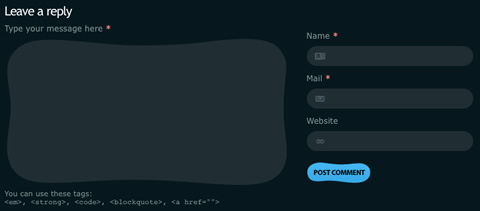
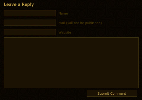
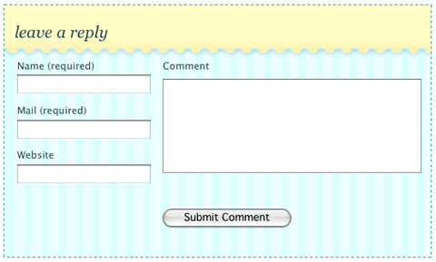
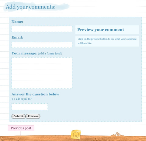
People don't like filling in (yet more) comment forms, because there's usually only one field that changes for them: the message text field. All of the other fields generally remain the same. A good design should take this into consideration. When you design a comment form, make sure you don't include text fields that are not necessary. For example asking users to write their country or phone number in a comment field is a mistake because it has no relevance to the form itself. The only purpose of a comment form is to get the user's feedback and to communicate with the user. The following comment form makes this mistake, although it does make it an optional text field.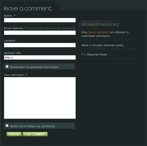
2. Give meaning to the form elements
A comment form stands in for the content author or website owner. Users are not robots; they're human beings. When they post their comments, it's like they are talking to the content author. People do not speak in keywords like "Comment" or "Feedback"; instead, they speak in gentler, more meaningful ways, like "Share your thoughts with us." This is what a comment form should do: communicate its purpose in a meaningful way. Instead of plain old titles such as "Comment here," a designer should give meaningful, more natural-sounding titles like "Leave a comment" or "Add your opinion."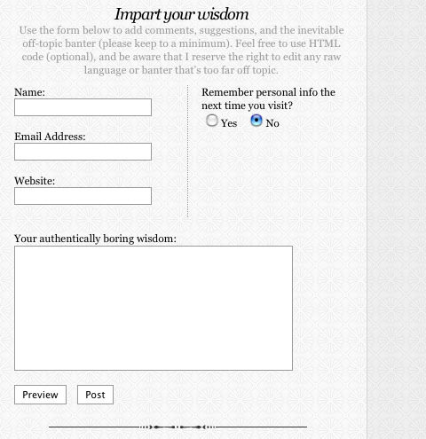
3. Identify required fields
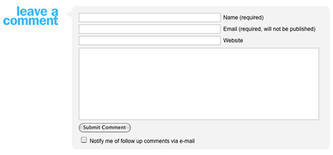
Not knowing which text fields are required and which are optional just increases confusion. A designer should clearly separate required fields from the rest by marking them. Marking required fields with text (e.g. "required") is good, but using the "*" character is often simpler and better because it's widely used for this purpose and gives a visual representation of the text "required."
4. Guide the user in filling the form
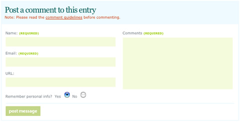
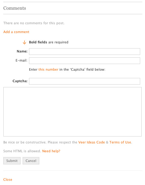
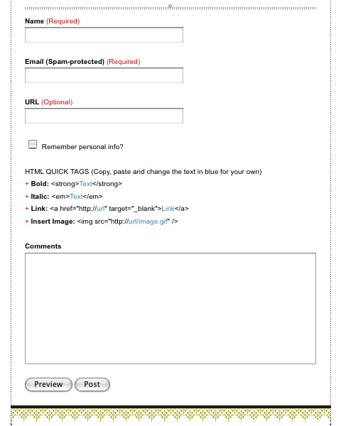
The primary goal of every comment form is successful completion by the user. Every comment form should have a solid design behind it that guides the user from start to finish. Every form has its own completion flow. Don't break this flow. Many users interact with comment forms by using the Tab key to switch from one text field to the next. A designer should implement proper HTML markup so that tabbing works as expected. The form in the following screenshot breaks the completion flow. The mistake lies in the placement of the "Submit" button. It should be placed after the check box "Notify me of follow-up comments via e-mail."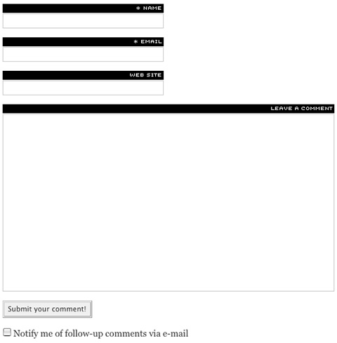
5. Minimize the pain
Every interaction with a comment form triggers complex actions in the user's brain. Every text field can be considered a question that the author asks of the user. Knowing this, we should construct a comment form so that it "asks" easy, familiar "questions" first, such as "Name" and "Email address." It is a bad practice to place the message field first in the comment form, because this demands a more intense thought process of the user and it could result in the user not completing the form. Always place the more demanding fields at the end.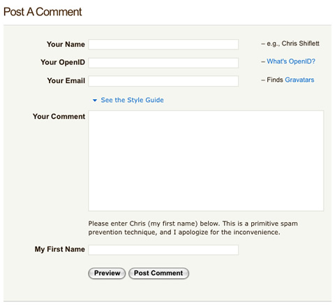
6. Validate on the fly and efficiently
Using AJAX to validate email addresses is essential and contributes to completion flow. If we were to use server-side validation, the page would have to refresh and the user wouldn't get instant feedback about whether the fields were completed correctly. Also keep in mind usability and AJAX's obtrusive nature. A developer should emphasize unobtrusive, on-the-fly validation. In some cases, it is not obvious at first that a text field requires validation, often resulting in poor usability. For example, it is a mistake to validate a "Name" text field to contain only alphabetical characters and nothing else, because then people with names such as "O'neil" are left out. If a comment form's text fields are constrained to a specified maximum character count, then the designer should indicate this next to the relevant field. Many comment forms use reverse counting, meaning they count down from the maximum allowed characters to let users know how many characters they have left to use.
7. Avoid CAPTCHAs if possible
CAPTCHA stands for "Completely Automated Public Turing test to tell Computers and Humans Apart." The most widely used type of this is text embedded as an image to test verify whether a user is human or a spambot. These kinds of tests should be avoided if possible. A more accessible solution is to use a third-party spam filter service, such as Akismet.8. Don't break habit
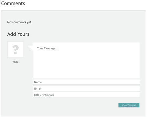
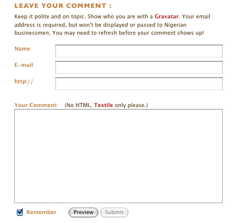
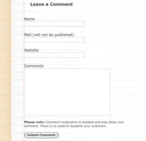
When designing your comment forms, always keep in mind the famous quote "Don't try to reinvent the wheel." There are many designs that have been tested and just work. Don't try to come up with your own, because it will most likely fail. You should align your design with traditional comment form designs, meaning you should include three, or at most four, fields, such as "Name," "Email address," "Website URL," and "Message (Comment)."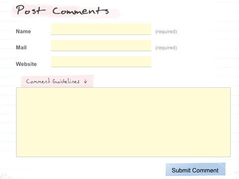
9. Keep in mind localization
It is most likely that not only English-speaking users visit your website and comment on your content. Designers shouldn't discriminate against these visitors; instead, they should keep in mind the peculiarities of different languages. For example, in many European countries, names are written in reverse order, last name first and first name last. And many people, mostly in Arab cultures, have more than two names. If a designer includes only two fields, "First name" and "Last name," then these people won't be able to write their name completely. A best practice is to simplify this type of text field and just include a "Name" field.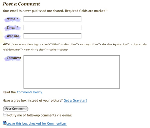
10. Do not use visual elements excessively
It's true in many cases that an image is worth a thousand words, but it's not a good motto to follow when designing comment forms. A designer can use icons and other visual elements moderately but should keep in mind that different icon styles confuse visitors. In the following screenshot, the icon in the third field does not entirely convey that the field should contain a website address; and not including a descriptive label next to each field can confuse users even more.
Comment Form Showcase
AisleOne.net

“When designing your comment forms, always keep in mind the famous quote “Don’t try to reinvent the wheel.” There are many designs that have been tested and just work. Don’t try to come up with your own, because it will most likely fail.”
What are you trying to say here? To me it sounds like you’re saying: “Don’t design your own comment form, but just copy someone elses”
I’m guessing you mean not to code one yourself or use other elements than the standard ones (Name, Email, Website and Message)
Nice collection, but some of those forms who are published have two equal-designed Buttons. But if you wanna get a high conversion you need a “Submit-Button” who is more “eye-catching” then a “Cancel-Button”!
Well I had to fill out a comment just to check your form follows best practice ;-), and it doesn’t! the notify me box is after the submit button!
Great roundup! I have been debating whether my contact form is too low-contrast. Any thoughts?
http://vintom.com/contact/
Great article and nice examples. I’d just disagree with location example (at least to some extent).
I use dropdown with countries on my comment form that enables readers to have a flag of their countries associated with their names, and it is well accepted. Although it is not relevant to the form itself it does affect the overall user experience (ok, it differs from the example in this article).
Please don’t get me wrong, I completely agree that forms should be as simple as they can be.
Also, I’d disagree that asterisk sign (*) is the best solution for required fields. Web designers, developers and other professionals might be familiar with meaning of this sign, but many internet users are not.
Keep up the good work, looking forward to reading more articles like this.
Awesome post! This reminds me of how I wanted to redesign my comments form ;)
wonderful read, keep up the great work. more writers like you are needed on the net
Great article and awesome list of forms. These look great.
What can we expect next? ,
First of all, I want to thank the Almighty God for the enlightening answer that Bro. ,
Hi, cool post. I have been thinking about this issue,so thanks for sharing. I?ll probably be subscribing to your blog. Keep up great writing
Great Article. I am looking for best practice info about where to place forms on a page. Specifically contact forms. Any help would be much appreciated.
your blog is very good, keep up the good work.
Well those are very inspiring, this comment form is cute too, my preferred style is the Hand-drawn. Cool post continue rocking smashingmedia :)
The forms are wikid, and yours too, good job! ;)
~ K.
Hi just thought i would tell you something.. This is twice now i’ve landed on your blog in the last 2 days looking for completely unrelated things. Spooky or what?
Noch nie was gehoert davon, aber wirklich interessant.
Super compilation. Thx ^_^
Hi,
Thanks for this nice article. I’m gonna use one of them..
Have a nice day,
Thanks a lot.The articles of your site is really helpful and usable for visitors., one of the excellent blog in which i
please solve above problem
Great article. Thanks!
we appreciate this website. i have told my pal harry about it because he cares for this sort of stuff as well!
Great blog, keeping me from fishing. Good to see more people writing about photography.
please solve above problem
I have look for such a article for a long time, thanks a lot.
your blog is very good, keep up the good work
thank you.nice collection.
thank for sharing..great collection
Comment forms is very good !
Nice article. Thanks!
Hey, excellent article.I spotted this using ask on a semi related quiery. Reguards from England
what should maximum characters be in comment box?
Hello. remarkable job. I did not imagine this. This is a splendid story. Thanks!
Development nowadays is really a competition between software engineers trying to construct greater and superior idiot-proof applications, and the World attempting to make greater and better dummies. Up to now, the Universe is definitely succeeding
I was very happy to find this web-site.I wished to thanks on your time for this glorious read!! I positively having fun with each little little bit of it and I have you bookmarked to take a look at new stuff you blog post.
Thank you for your guiding. I try to use your way,it’s useful.
I am really loving your posts, please keep them comming, Thank You.
Very nice collection, but some forms are not actual.
Mate, this looks great but your images are all broken…
This was very useful.
I want to design exactly same comment page for my webpage.
I know how to take input from user and save it to database. But i donot know how to display them on screen together.
Please help me.
I used ajax and php for my webpage.
I designed a Comment page where users can comment, but they are not visible on display on webpage, but stored in Database.
Please Help
Is there an RSS feed with the full articles instead of just the teasers?
Really worth reading article. This will help people a lot. Thank you Thank you ..
Really great, a lot of inspiring ideas.
got many dieas. thank !!
All the images are broken :(
Nice tutorial
Nice article thanks for sharing this useful information with us
Nice Blog