
Graphic Design Trends That Will Rock 2016
Graphic design is a genre of its own, and it has its own norms, conventions as well as trends. Much like web design, graphic design too evolves with time and is never static or rigid. That said, graphic design is as much about making a statement and leaving an impression as it is about focusing on user experience and ease of accessibility. So, what are some of the major trends in graphic design that we can expect to see in 2016? This article answers precisely this very question.
Graphic Design Trends That Will Rock 2016
Typography
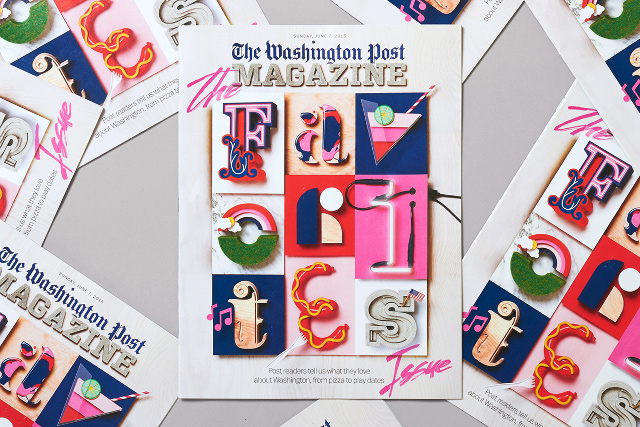
Typography and the use of fonts is one of the most crucial aspects of graphic design. In the absence of proper type and lettering, even the best of graphics might fall flat. The trend seems to be, among other things, for not just legibility but also big and bolder fonts. The goal behind typography in graphic design is not only to convey a message but to leave an impression; and for this purpose, bolder and bigger fonts tend to do well. Consider the recent work by SNASK for The Washington Post Magazine. The typography surely is bold and vigorous, but it does not stop at just that -- by making judicious use of color within typography, SNASK have emphasized the message being sent via their design -- something fun and tactile.
The Washington Post by Snask Stockholm , Magdalena Czarnecki , Richard the Gray on behance under CC BY-NC 4.0
Going further into 2016, this trend of complementing typography with the help of colors and style will surely catch on even more.Colors
Speaking in terms of color for graphic design, there are certain variables that need to be kept in mind. First up, concepts such as Material Design and Flat Design have affected not only web and app, but also graphic design. Of course, flat isn’t always the best in graphic design, especially if you are looking for something purely for the printed media, but notwithstanding that, both Material Design elements and flat design are gaining favor in graphic design as far as the digital graphics are concerned. As such, colors in graphic design tend to depend on those guiding concepts. Secondly, and more importantly, unlike web design where mute design principles such as reductionism and radical minimalism tend to do really well, graphic design at times needs to be “loud”, and eye-catching. Thus, brighter colors, such as pastels, neons, vibrant hues, etc. seem to be rising in stature this year, and they surely will dominate graphic design in 2016. Electric colors, pastel gradients and other similar shades too can be expected to be popular.Abstract Design
Abstract design patterns have, for quite a while, been popular in art. However, in the past few months, abstract design has found favor in graphic design as well, both in the print and digital formats. The most evident and popular application of abstract design in graphic design would be the use of geometric design patterns. Geometric shapes and patterns are rising steadily in graphic design, and have, in fact, become not just a trend but a design concept in themselves. Concerning graphics, geometric shapes and patterns are often employed as supplements to chunks of text, logos, or as background graphics on the web. As such, geometric shapes are serving the dual purpose of being both illustrative as well as decorational. The polygonal shapes, as you can see, are being used to both complement and highlight the pictures and text, as well as to fill up the otherwise blank space.The Use of Negative Space
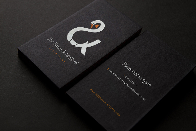
Negative Space has been around for quite many years by now, and it has become a staple component of any good design - be it a graphic, a website or even a newspaper layout. However, negative space application in graphic design seems to be rising in uncharted areas, where it was not so prominent earlier on. For instance, negative space is being used more and more in sign boards and logos. Furthermore, the negative space in graphic design rarely equates to whitespace (in web design, it has become almost a standard practice to use “negative space” and “whitespace” as synonyms). In fact, in graphic design, negative space is often treated with a darker color, such that the primary graphics stand out and are visible from a distance. A good example would be this sample signboard and logo for a restaurant.
Design by John Randall on behance under CC BY-NC 4.0
The negative space is treated with a shade of black, so as to make the white logo stand out, and cast a clear but prominent impression on the viewer. Furthermore, the card also relies on negative space to make the white text noticeable. These are the graphic design trends that are expected to be on the rise in 2016. What are your thoughts on these trends? Share them in the comments below!Photo by Theme Photos on Unsplash
(dpe)
Large bold typography along with loud colors are definitely an attention grabber that will cut through the clutter. These design trends are given by necessity it seems. Flat does seem to work well in digital, but printed materials sometimes need depth for added appeal. With digital graphics I find whitespace does a great job to helps readers through the content. Whereas, cluttered content with insufficient whitespace can be a turn off and overwhelm a reader. Solid graphic design is vital and these trends are all in line.