
Let It Flow – 26 Awesome Examples of Responsive Web Design
Responsive web design is undoubtedly a rapidly growing trend right now, the increasing tablet and mobile device usage has definitely been an ingredient in the success of web responsiveness. It would not be surprising to see the majority of popular websites adapt responsive web designs in the near future. Responsive websites not only enhance the user experience when viewed on tablets or mobiles, but it is mind-blowingly cool to see designs adapt to the size of a browser window as you resize it. I've compiled some of the best examples of responsive web design for inspiration. Check them out below and let us know your opinions.
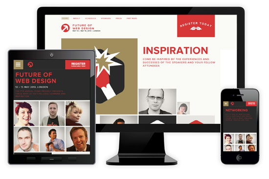 As the name suggests, this is a website for the Future of Web Design Conference in London 2013. For its namesake the website itself is amazingly responsive and is definitely a benchmark for any responsive site with a tile like design. Every part of its functionality has been accounted for despite using three layouts. Even the color scheme changes slightly as the width reduces.
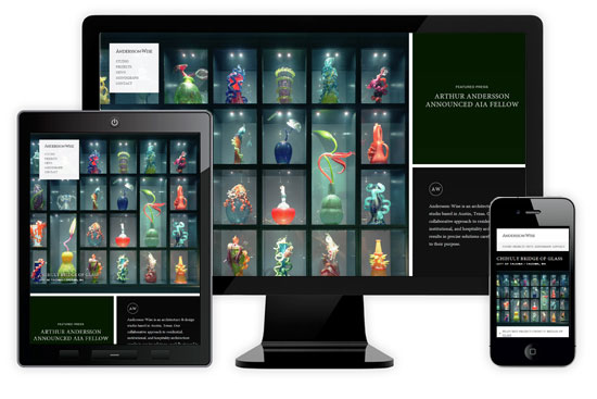 There are not many responsive websites that abuse the use of large and beautiful images (yet). However, Andersson Wise does this beautifully and very fluidly. The homepage and project pages highlights perfect transitions between the full width desktop and mobile/tablet versions. Highly effective style of responsive image gallery used here, this one is a must see.
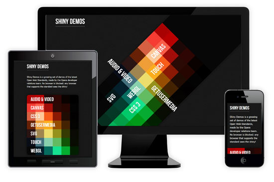 Made by the Opera developer relations team, this website shows off the latest Open Web Standards in a big way. Although browsers that support every feature of the site are limited, not much will get in the way of admiring its dual responsive layouts. Pure genius!
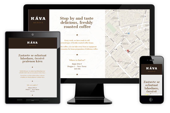 Simple and effective one page site that utilizes Google Maps very nicely. There isn't anything outstanding about the design or functionality at all, but this is a great example of "less is more" when it comes to using responsive web design.
 At first glance this website is an unlikely candidate for a responsive design. Be surprised as the tablet layout includes a drop-down menu and cleverly rearranges the site content. This is a great example of very practical uses of responsive design for an event based site.
 There are many web designers and developers with brilliant responsive websites, William Csete is the first in this showcase. With a clean approach, this website clearly demonstrates the advantages of responsive web design when it comes to navigation. The usability of the menu is straight forward and prominent on every screen size as shown below.
 These guys took the humorous approach and made this website extra fun. Besides the great use of illustrations, scrolling background and a cute drop down logo animation, the coolest thing about this site is the illustrated man on the scooter that becomes younger as the width of the website decreases. Oh, the scooter he rides on gets "younger" too!
 It's hard to have a responsive web design showcase without this site. With it's sleek modern design and seamless single page website transitions I'm surprised it hasn't won any web awards yet. The text menu converts into icons at smaller layouts and the usability is frankly top notch regardless of layout size.
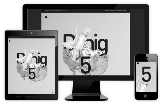 No wonder this is a crowd favorite. Very effective use of scrolling navigation and persistent background that is distinctly well designed for responsiveness. Clever removal of the large "Dmig" in smaller layouts put the icing on this cake.
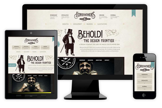 Not everyone is a fan of the antique and older style design. This responsive website pulls it off nicely, take special note of the evolving navigation and seamless removal of design elements.
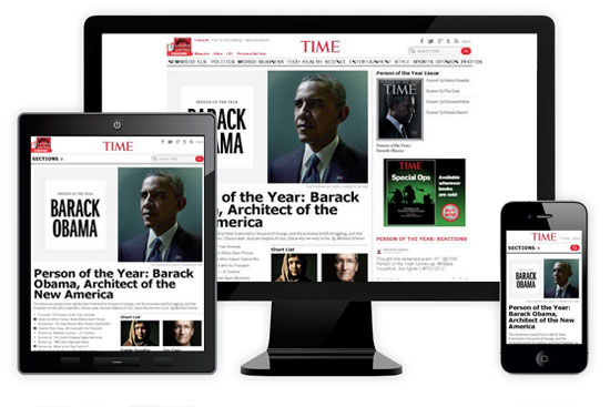 TIME Magazine is likely the most recognized and prestigious name in terms of printed media. Their online magazine-styled website lives up to the name with no problems, exhibiting great use of responsive web design principles. Its effective use of space and prioritization of important content can easily go unnoticed.
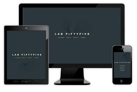 After the initial awe from the nifty mouse over effects wear off, you'll notice the effectiveness of dual navigation and its proven usability transitioned into every responsive layout. See if you can find the Easter egg on this site!
 This is a prime example of "a smaller layout doesn't necessarily mean all the elements get shrunk". You'll notice the consistent prominence of the blue circular icon regardless of device size.
 There aren't too many typography based website designs, probably due to the difficulty in creating visual stimulus without the use of imagery. Deren Keskin does an awesome job of this and abuses his talent with typography. The main feature of this site is the large responsive text title.
 At first I was hesitant to include this website since it's only an example, but it illustrates how responsive design isn't limited to layout changes. This example demonstrates incredible precise fine-tuning to reshape pages: increasing target area on links for smaller screens, selectively show or hide elements to enhance a page's navigation are demonstrated perfectly here.
 Embedding videos is inevitable on the web, FortyOneTwenty makes embedded video the primary focus in their responsive design. On supported devices the Vimeo video functions no differently and remains the star of the show here.
 Effortless simplicity describes this website perfectly. The obvious thought put into the responsive design shines in the effective user experience of smaller layouts - which is arguably better than the full width layout. The smart rearrangement of the company logo is also a nice touch.
 There's actually nothing fancy at all about this responsive design. However, that is the beauty of it. This site presents flawless layouts without any drastic changes to the user interface and content at all, whilst maintaining solid usability.
 This well known online news site is actually wonderfully responsive. It's a very good example of how responsive web design can benefit content heavy sites as well. All three layouts of The Next Web boldly emphasizes its latest news content and the advertisements are the first to disappear - fortunately for readers.
 "I love my big banner image too much!", responsive web design doesn't mean sacrificing the best part of your website at all. The notable feature of this website is definitely the consistency of the main car image and the banner message which is never compromised despite the responsiveness of this website.
 Besides having very cute animations and nicely drawn illustrations, this website is a splendid example of using both width and height responsiveness. It's rare, but the navigation of this Ginger Whale website completely relies on the height being responsive.
 One of the best implementations of responsive e-commerce design currently. With a daunting amount of different products it can be difficult to design responsively, United Pixelworkers solved this issue with a tiled design that is surprisingly user-friendly on smaller devices.
 Having a visually impressive menu on a full width website can become a problem during responsive web design. The illustrated character menu on this is fun website is just as impressive on different devices and the fantastic illustrations do not go to waste.
 There are plenty of online audio streaming websites, but this one stands out in terms of responsiveness. The user interface re-positions on smaller devices for a better user experience, simple responsive web concepts executed flawlessly.
 This might be against some design morals, but it is entirely possible for a website to look significantly different depending on browser or device size. The user experience could be completely distinct dependent on layout, this idea opens up a whole world of responsive web design possibilities which this website is a front runner for.
 Very typical corporate looking website that is amazingly responsive. The Lancaster University website uses a variety of techniques to ensure every piece of functionality is accessible regardless of screen width or device size. There isn't much eye-candy, but plenty of responsive design went into this website.
1. Future of Web Design 2013
As the name suggests, this is a website for the Future of Web Design Conference in London 2013. For its namesake the website itself is amazingly responsive and is definitely a benchmark for any responsive site with a tile like design. Every part of its functionality has been accounted for despite using three layouts. Even the color scheme changes slightly as the width reduces.
2. Andersson Wise Architects
There are not many responsive websites that abuse the use of large and beautiful images (yet). However, Andersson Wise does this beautifully and very fluidly. The homepage and project pages highlights perfect transitions between the full width desktop and mobile/tablet versions. Highly effective style of responsive image gallery used here, this one is a must see.
3. Shiny Demos
Made by the Opera developer relations team, this website shows off the latest Open Web Standards in a big way. Although browsers that support every feature of the site are limited, not much will get in the way of admiring its dual responsive layouts. Pure genius!
4. Kava Ruzova
Simple and effective one page site that utilizes Google Maps very nicely. There isn't anything outstanding about the design or functionality at all, but this is a great example of "less is more" when it comes to using responsive web design.
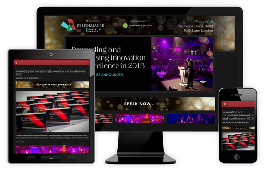
5. Performance Marketing Awards 2013
At first glance this website is an unlikely candidate for a responsive design. Be surprised as the tablet layout includes a drop-down menu and cleverly rearranges the site content. This is a great example of very practical uses of responsive design for an event based site.
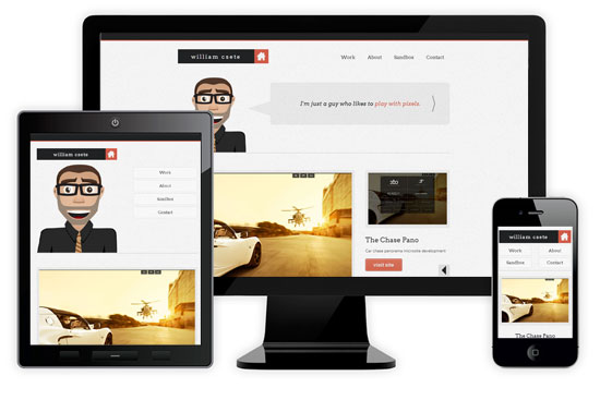
6. William Csete
There are many web designers and developers with brilliant responsive websites, William Csete is the first in this showcase. With a clean approach, this website clearly demonstrates the advantages of responsive web design when it comes to navigation. The usability of the menu is straight forward and prominent on every screen size as shown below.
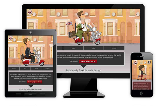
7. Stuff & Nonsense
These guys took the humorous approach and made this website extra fun. Besides the great use of illustrations, scrolling background and a cute drop down logo animation, the coolest thing about this site is the illustrated man on the scooter that becomes younger as the width of the website decreases. Oh, the scooter he rides on gets "younger" too!
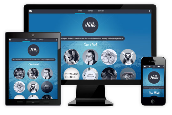
8. Digital Atelier
It's hard to have a responsive web design showcase without this site. With it's sleek modern design and seamless single page website transitions I'm surprised it hasn't won any web awards yet. The text menu converts into icons at smaller layouts and the usability is frankly top notch regardless of layout size.
9. Design made in Germany Issue 5
No wonder this is a crowd favorite. Very effective use of scrolling navigation and persistent background that is distinctly well designed for responsiveness. Clever removal of the large "Dmig" in smaller layouts put the icing on this cake.
10. Forefathers Group
Not everyone is a fan of the antique and older style design. This responsive website pulls it off nicely, take special note of the evolving navigation and seamless removal of design elements.
11. TIME
TIME Magazine is likely the most recognized and prestigious name in terms of printed media. Their online magazine-styled website lives up to the name with no problems, exhibiting great use of responsive web design principles. Its effective use of space and prioritization of important content can easily go unnoticed.
12. Lab Fiftyfive
After the initial awe from the nifty mouse over effects wear off, you'll notice the effectiveness of dual navigation and its proven usability transitioned into every responsive layout. See if you can find the Easter egg on this site!
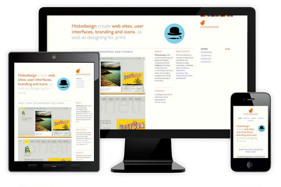
13. Hicksdesign
This is a prime example of "a smaller layout doesn't necessarily mean all the elements get shrunk". You'll notice the consistent prominence of the blue circular icon regardless of device size.
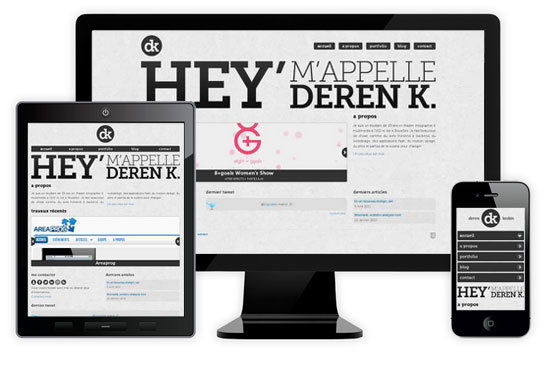
14. Deren Keskin
There aren't too many typography based website designs, probably due to the difficulty in creating visual stimulus without the use of imagery. Deren Keskin does an awesome job of this and abuses his talent with typography. The main feature of this site is the large responsive text title.
15. Seminal Responsive Web Design Example
At first I was hesitant to include this website since it's only an example, but it illustrates how responsive design isn't limited to layout changes. This example demonstrates incredible precise fine-tuning to reshape pages: increasing target area on links for smaller screens, selectively show or hide elements to enhance a page's navigation are demonstrated perfectly here.
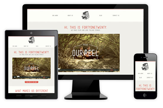
16. FortyOneTwenty
Embedding videos is inevitable on the web, FortyOneTwenty makes embedded video the primary focus in their responsive design. On supported devices the Vimeo video functions no differently and remains the star of the show here.
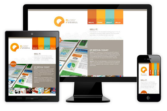
17. Oliver Russell
Effortless simplicity describes this website perfectly. The obvious thought put into the responsive design shines in the effective user experience of smaller layouts - which is arguably better than the full width layout. The smart rearrangement of the company logo is also a nice touch.
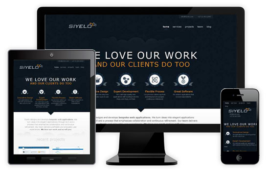
18. Siyelo
There's actually nothing fancy at all about this responsive design. However, that is the beauty of it. This site presents flawless layouts without any drastic changes to the user interface and content at all, whilst maintaining solid usability.
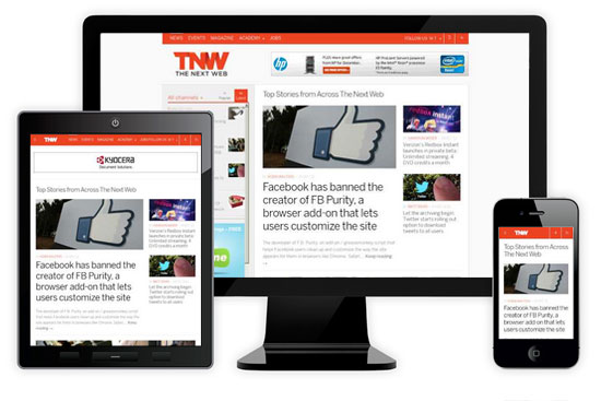
19. The Next Web
This well known online news site is actually wonderfully responsive. It's a very good example of how responsive web design can benefit content heavy sites as well. All three layouts of The Next Web boldly emphasizes its latest news content and the advertisements are the first to disappear - fortunately for readers.
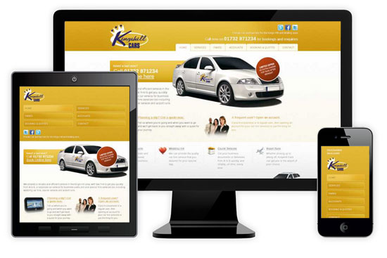
20. Kings Hill Cars
"I love my big banner image too much!", responsive web design doesn't mean sacrificing the best part of your website at all. The notable feature of this website is definitely the consistency of the main car image and the banner message which is never compromised despite the responsiveness of this website.
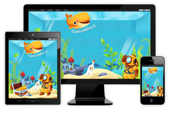
21. Ginger Whale
Besides having very cute animations and nicely drawn illustrations, this website is a splendid example of using both width and height responsiveness. It's rare, but the navigation of this Ginger Whale website completely relies on the height being responsive.
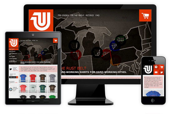
22. United Pixelworkers
One of the best implementations of responsive e-commerce design currently. With a daunting amount of different products it can be difficult to design responsively, United Pixelworkers solved this issue with a tiled design that is surprisingly user-friendly on smaller devices.
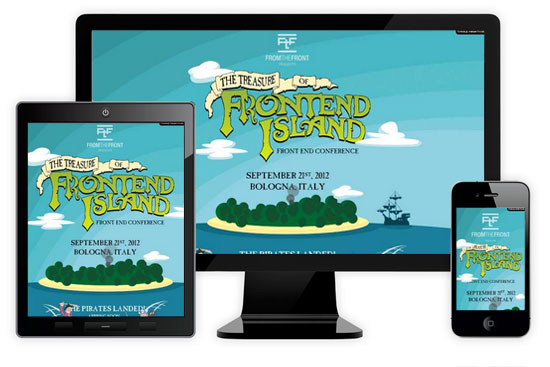
23. Treasure of FrontEnd Island
Having a visually impressive menu on a full width website can become a problem during responsive web design. The illustrated character menu on this is fun website is just as impressive on different devices and the fantastic illustrations do not go to waste.
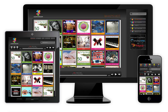
24. Audio Vroom
There are plenty of online audio streaming websites, but this one stands out in terms of responsiveness. The user interface re-positions on smaller devices for a better user experience, simple responsive web concepts executed flawlessly.
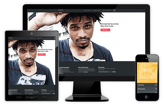
25. Somewhat
This might be against some design morals, but it is entirely possible for a website to look significantly different depending on browser or device size. The user experience could be completely distinct dependent on layout, this idea opens up a whole world of responsive web design possibilities which this website is a front runner for.
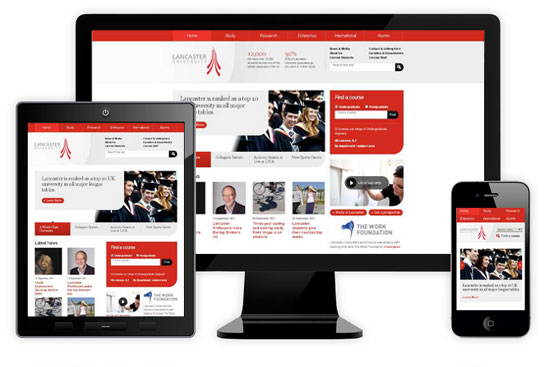
26. Lancaster University
Very typical corporate looking website that is amazingly responsive. The Lancaster University website uses a variety of techniques to ensure every piece of functionality is accessible regardless of screen width or device size. There isn't much eye-candy, but plenty of responsive design went into this website.
I think sports.sho.com should be here! :>
I did consider that one! Maybe on our next feature.
It is not enough theme or template to be responsive. Content should be also. So reconsider your intention to “consider that one! Maybe on our next feature.” :)
Nice list. I’ve done som responsive websites as well but it’s nice to see how it should be done.
Hopefully you found some inspiration and some of your future work might end up here, who knows.
Hey great article, great websites, a lot of cool stuff to be inspired. Recently i stumbled upon what i think i the best example of responsive desing to date,a small company from Croatia called Flip – http://flip.hr
Other great example will be http://www.pnoir.com
Lanchaster University’s screenshot is used for The Next Web as well.
Great suggestions, maybe they’ll make it on our next showcase! :)
Just a heads up. The Next Web Image is the Lancaster University photo.
Gone are the days of mobile sites, in with responsive all the way!
Nice websites and interesting article, however were you being ironic with not having this article responsive? ;)
anyone have a guide on how to make a site like 8. Digital Atelier
I love how it flips to the content without making you dizzy scrolling through everything
Nice collection. Some good inspiration there. Particularly like Ginger Whale.
What you think about http://spreeconf.com ?
This is a very inspiring collection. I love #25.
Fantastic list. This is really going to inspire me. My favourite is no.24.
Great article Josh – I particularly love the Stuff and Nonsense site!
Waaa, Love Shiny Demos!!!
I wish my University’s site was as good as Lancaster’s!
What a gorgeous selection. Particularly impressed with FortyOneTwenty and their focus on the video embeds… such a source of pain for users when videos don’t play on mobile.
Do all these sites have a 3-breakpoint responsive design or is that just the best way to display them all consistently? I’m interested because we at http://3seven9.com have just launched our new responsive site with a 5 breakpoint design and wondering if you have other examples of that, what your thoughts are on it as a concept!
Great Collection of themes Thank you…
I love them all, but the third one, Shiny Demos was my favorite. I love all the interactive little demos you can play with.
I really like the stuff and nonsense design! Good use of cartoon imagery
I like this simple approach to responsive nav: pulsecms.com.
Wonderful collection, great for inspiration. Thanks for sharing
nice. I’m always looking for design inspiration… thanks!
Wow what a great way to lay these out for us to see! Thanks for the inspiration and sharing. I really dislike mobile sites that more or less reduce the size of the site so you pretty much need a stylus to click anything accurately. It annoys me to no end and I can never understand those who stay oblivious to it. Thanks again for posting!
Nice collection of responsive sites here. As you say great for the user experience. And although it is cool to see your website respond to changing your browser size, ideally the end user wont particularly see this happen.
Thanks for the collection.