Showcase of Well-Designed Banking and Investment Websites
Online banking and investment services have become big business in recent years. Whether it's a tiny local bank or a major, multi-national one, if a bank wants to be successful, a user-friendly, well-designed website is a necessity. But that doesn't mean every bank out there has a great site. In fact, a lot of bank websites barely manage in terms of usability and functionality, and leave a lot lacking in the design area.
But there are some well-designed banking, investment, and financial management sites out there with beautiful designs and good usability. These sites should serve as a model for other financial industry sites. If you have a favorite banking or investment website that has a great design and fantastic usability, please share it in the comments!
 Legg Mason
 uses a simple grid-based layout for their home page. They offer plenty of information about who they are and what they do, while also being easy to navigate. Placing a link to their Annual Report prominently on the home page also lends a sense of credibility and fairness to their business.
Legg Mason
Legg Mason uses a simple grid-based layout for their home page. They offer plenty of information about who they are and what they do, while also being easy to navigate. Placing a link to their Annual Report prominently on the home page also lends a sense of credibility and fairness to their business.
 Raymond James
The Raymond James website is simple, with a strong blue and gray color scheme. Any time images of people (especially customers) are included in a site, it makes a site feel more personal and trustworthy. Featuring the CEO prominently on the home page also makes the company seem more personal.
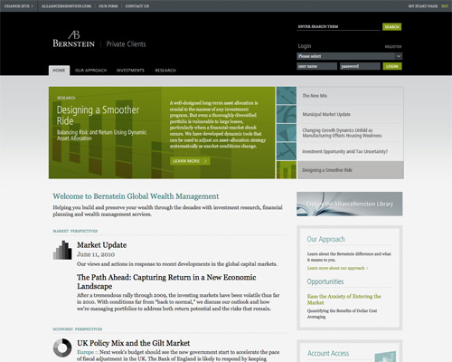
 AllianceBernstein
 uses a sleeker design, more reminiscent of a blog theme than a lot of the other sites here. The gray and black color scheme is elegant, while the green and aqua accents liven things up a bit.
AllianceBernstein
AllianceBernstein uses a sleeker design, more reminiscent of a blog theme than a lot of the other sites here. The gray and black color scheme is elegant, while the green and aqua accents liven things up a bit.
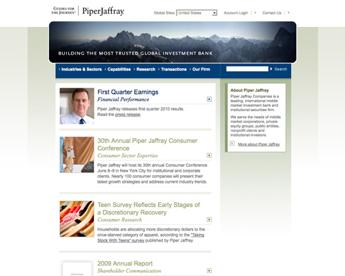
 Piper Jaffray
 uses a strong header image to pull visitors in. The rest of the home page has a blog-like feel, which makes it seem more modern. It's also easy to navigate and the search box is prominently displayed.
Piper Jaffray
Piper Jaffray uses a strong header image to pull visitors in. The rest of the home page has a blog-like feel, which makes it seem more modern. It's also easy to navigate and the search box is prominently displayed.
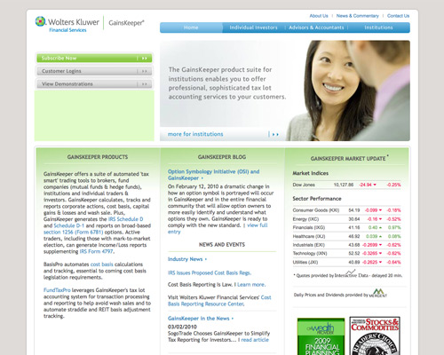
 Gainskeeper
The fresh blue and green color scheme used here offers a much more modern feeling than many investment sites. But the very traditional layout and images keep the site feeling trustworthy and secure.
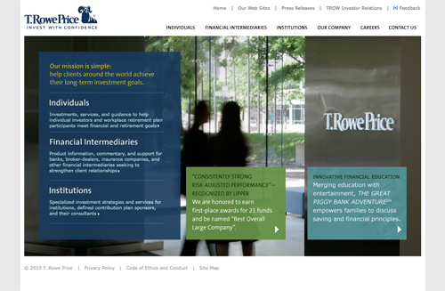
 T.Rowe Price
The use of a strong background image and transparent, colorful boxes makes the T.Rowe Price site seem very current. The site is also user-friendly and information is easy to find.
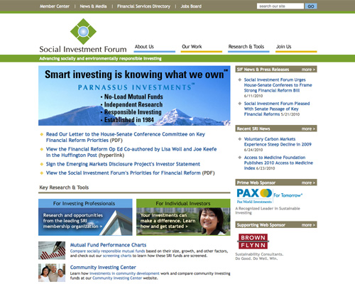
 Social Investment Forum
Using a simple design with a muted color scheme works well to make a site appear honest and straight-forward. Emphasis is placed on the information provided, not the design itself, which works well for a site like this one.
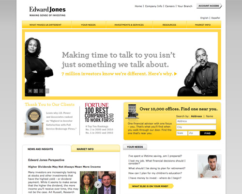
 Edward Jones
 takes a much more modern approach to their website, with a bright yellow and gray color scheme. By prominently including things like their J.D. Power and Associates award information and Fortune magazine mentions, they still come across as a long-standing, reliable and honest company. It's a riskier design strategy for an investment firm, but in this case it definitely pays off.
Edward Jones
Edward Jones takes a much more modern approach to their website, with a bright yellow and gray color scheme. By prominently including things like their J.D. Power and Associates award information and Fortune magazine mentions, they still come across as a long-standing, reliable and honest company. It's a riskier design strategy for an investment firm, but in this case it definitely pays off.
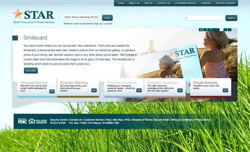
 STAR
The STAR home page is well-thought-out and makes it easy for visitors to find what they're looking for, both through links and via search. The color scheme and bright background image both make the site seem more inviting and personal.
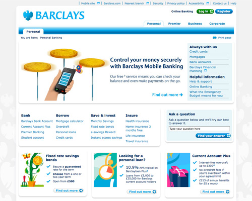
 Barclays
The Barclays website uses a simple grid layout and blue color scheme, though they've deviated from the traditional, corporate navy to a much brighter hue. Navigation is spread throughout the page, but is still easy to use due to well-designed headers.
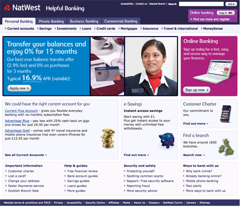
 NatWest
The NatWest site uses a more unexpected purple, lavender, and fuschia color scheme, not often seen in the financial sector. But the grid layout and fairly traditional images and content keep the site feeling trustworthy.
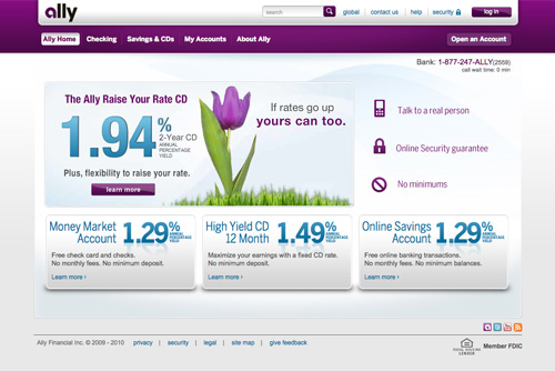
 Ally
Ally is another site that's opted for a less-traditional purple color scheme. Combined with blue and gray, it works well and comes across as very rich feeling (not surprising since purple was originally a color reserved entirely for royalty).
Ally
Ally is another site that's opted for a less-traditional purple color scheme. Combined with blue and gray, it works well and comes across as very rich feeling (not surprising since purple was originally a color reserved entirely for royalty).
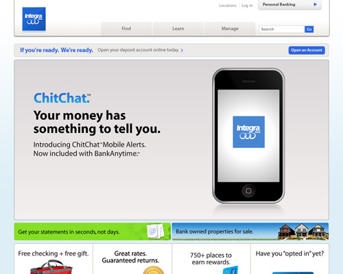
 Integra Bank
Featuring their iPhone app prominently indicates the market Integra Bank is after on their website: younger, more tech-savvy customers. The rounded corners and other design elements reinforce that idea.
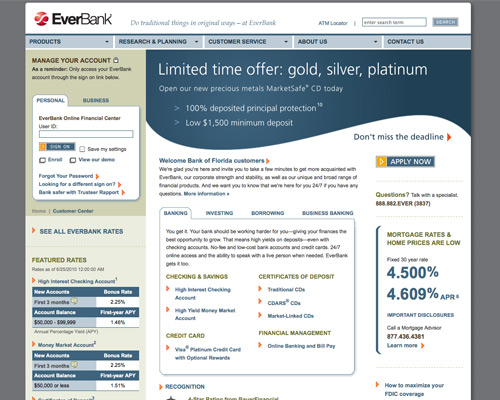
 EverBank
 has stuck to a very traditional site design and color scheme. But the site is also easy to navigate, and the login area is featured prominently. The site's typography is also top notch.
EverBank
EverBank has stuck to a very traditional site design and color scheme. But the site is also easy to navigate, and the login area is featured prominently. The site's typography is also top notch.
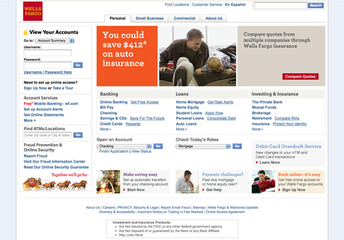
 Wells Fargo
 has a simple design with tabbed navigation and a well-placed login area. Tabbed navigation in the header is user-friendly, while headings above the navigation further down the page maintain the ease-of-use.
Wells Fargo
Wells Fargo has a simple design with tabbed navigation and a well-placed login area. Tabbed navigation in the header is user-friendly, while headings above the navigation further down the page maintain the ease-of-use.
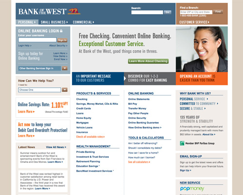
 Bank of the West
The color scheme is what really stands out here. They've used multiple colors but have pulled it off seamlessly. The grid-based design also shines and keeps everything well-organized.
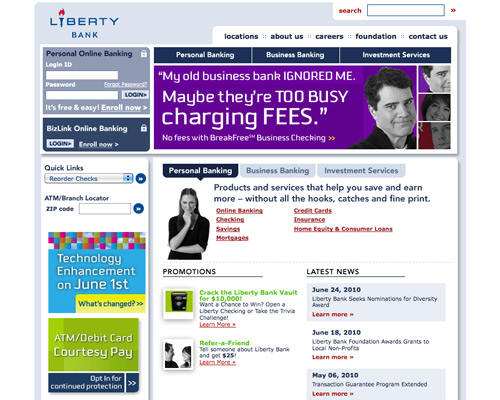
 Liberty Bank
The rounded corners on this site add a lot of visual interest, while the mostly-blue color scheme keeps things feeling grounded. Navigation is well-placed and easy to use, while the login area is easy to find.
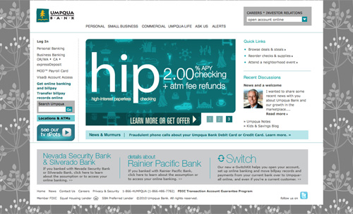
 Umpqua Bank
The graphic background image used here is unexpected, while the gray and blue-green color scheme feels very traditional.
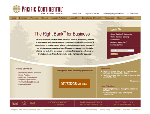
 Pacific Continental Bank
The tan and burgundy color scheme here is very traditional while being a change from the usual corporate blue and gray. The curved line below the main content area mimics a smile while also creating a sense of motion in the design.
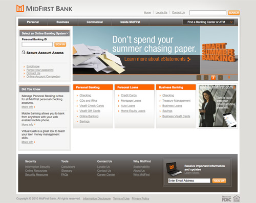
 MidFirst Bank
The gray and orange color scheme of MidFirst Bank's site is very modern, and the rest of the site echoes that. They obviously know what segment of the market they want to appeal to and aren't afraid to make bold moves in that direction.
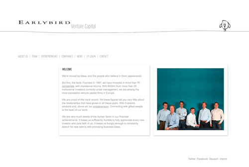
 Earlybird Venture Capital
Venture capitalists have a bit more leeway with their website designs, as is shown here. The minimalist design with the animated bird reflects their business name, while the site's typography keeps everything looking professional.
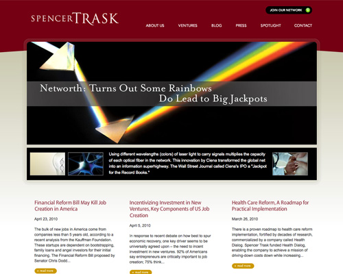
 Spencer Trask & Company
Another site with a tan and burgundy color scheme, this time with bolder images. There's plenty of negative space here, which makes it easy to navigate and places the emphasis squarely on the content.
 The Motley Fool
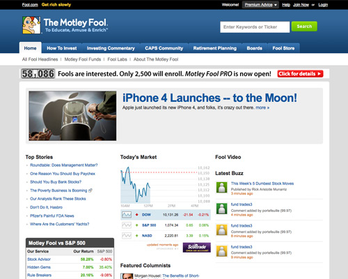
's design is reminiscent of a blog design, with featured content at the top and tabbed navigation. Information is laid out in a grid format, making things easy to find.
The Motley Fool
The Motley Fool's design is reminiscent of a blog design, with featured content at the top and tabbed navigation. Information is laid out in a grid format, making things easy to find.
 Morningstar
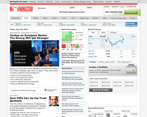
 uses a grid layout to organize vast amounts of information. Keeping the color scheme simple keeps the site from feeling busy.
Morningstar
Morningstar uses a grid layout to organize vast amounts of information. Keeping the color scheme simple keeps the site from feeling busy.
 Bloomberg
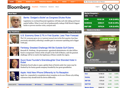
The new Bloomberg design is simple and straightforward, with a blog-like feel.
 Discover
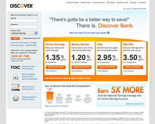
's site design is very modern-feeling, especially with the light blue, orange, and gray color scheme. Important information is placed prominently, and the login area is easy to find.
Discover
Discover's site design is very modern-feeling, especially with the light blue, orange, and gray color scheme. Important information is placed prominently, and the login area is easy to find.
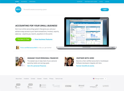
 Xero
The Xero site is minimalist, with plenty of white space. The bright blue and green colors used make it feel fresh and modern. The simplicity of the site gives it a professional edge.
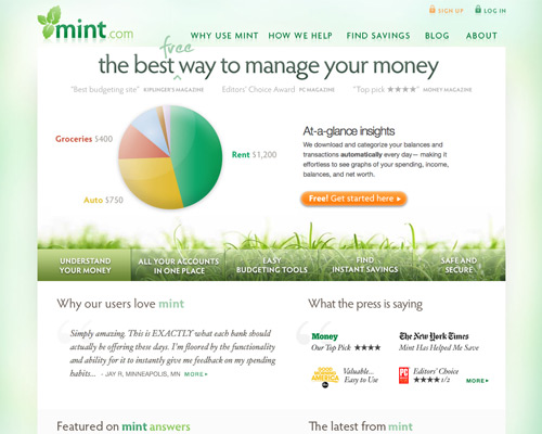
 Mint
The Mint site feels very fresh and new, which is further reinforced by the graphics. Navigation is prominent, as is important information, and the whole thing is very user-friendly.
 Rudder
's blue and white color scheme looks very modern. The navigation in the header is fantastic, and the entire home page is laid out in a way that makes it simple to find what you're looking for.
Rudder
Rudder's blue and white color scheme looks very modern. The navigation in the header is fantastic, and the entire home page is laid out in a way that makes it simple to find what you're looking for.
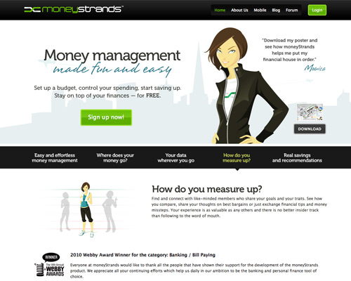
 moneyStrands
The mostly black-and-white color scheme here feels sophisticated and modern, and the green accents only highlight that feeling. The graphics on the site make it obvious they're trying to appeal to a younger audience, and it works really well.
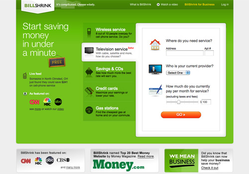
 BillShrink
The bright green color scheme and use of icons make the BillShrink website look thoroughly modern. Including the coverage they've received from major media outlets prominently on the home page makes them seem very reliable, as well.
 Bonus: Ready to be inspired? Take a look at of the Chime Banking Website.
Investment and Money Management
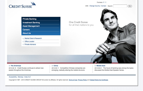
Most investment and money management firms cater to upper-middle-class and wealthier clients. They need to convey trustworthiness, stability, and loyalty. After all, clients are often entrusting them with hundreds of thousands or millions of dollars to manage, so trust is key. Credit Suisse The Credit Suisse website has an open, modern feeling. The inclusion of a person on the home page makes the site feel more personal (and more trustworthy). A traditional color scheme is used (gray, blue, and maroon), which also adds to the feeling of security and strength. Legg Mason
 uses a simple grid-based layout for their home page. They offer plenty of information about who they are and what they do, while also being easy to navigate. Placing a link to their Annual Report prominently on the home page also lends a sense of credibility and fairness to their business.
Legg Mason
Legg Mason uses a simple grid-based layout for their home page. They offer plenty of information about who they are and what they do, while also being easy to navigate. Placing a link to their Annual Report prominently on the home page also lends a sense of credibility and fairness to their business.
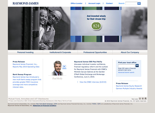
 Raymond James
The Raymond James website is simple, with a strong blue and gray color scheme. Any time images of people (especially customers) are included in a site, it makes a site feel more personal and trustworthy. Featuring the CEO prominently on the home page also makes the company seem more personal.
 AllianceBernstein
 uses a sleeker design, more reminiscent of a blog theme than a lot of the other sites here. The gray and black color scheme is elegant, while the green and aqua accents liven things up a bit.
AllianceBernstein
AllianceBernstein uses a sleeker design, more reminiscent of a blog theme than a lot of the other sites here. The gray and black color scheme is elegant, while the green and aqua accents liven things up a bit.
 Piper Jaffray
 uses a strong header image to pull visitors in. The rest of the home page has a blog-like feel, which makes it seem more modern. It's also easy to navigate and the search box is prominently displayed.
Piper Jaffray
Piper Jaffray uses a strong header image to pull visitors in. The rest of the home page has a blog-like feel, which makes it seem more modern. It's also easy to navigate and the search box is prominently displayed.
 Gainskeeper
The fresh blue and green color scheme used here offers a much more modern feeling than many investment sites. But the very traditional layout and images keep the site feeling trustworthy and secure.
 T.Rowe Price
The use of a strong background image and transparent, colorful boxes makes the T.Rowe Price site seem very current. The site is also user-friendly and information is easy to find.
 Social Investment Forum
Using a simple design with a muted color scheme works well to make a site appear honest and straight-forward. Emphasis is placed on the information provided, not the design itself, which works well for a site like this one.
 Edward Jones
 takes a much more modern approach to their website, with a bright yellow and gray color scheme. By prominently including things like their J.D. Power and Associates award information and Fortune magazine mentions, they still come across as a long-standing, reliable and honest company. It's a riskier design strategy for an investment firm, but in this case it definitely pays off.
Edward Jones
Edward Jones takes a much more modern approach to their website, with a bright yellow and gray color scheme. By prominently including things like their J.D. Power and Associates award information and Fortune magazine mentions, they still come across as a long-standing, reliable and honest company. It's a riskier design strategy for an investment firm, but in this case it definitely pays off.

Online Banking
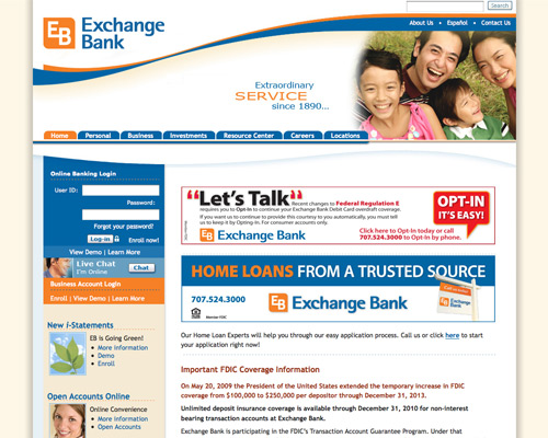
Online banking is a key service among banks, and something that needs to be user-friendly to both tech novices and experts. Consumers also need to trust their bank and its website in order to feel comfortable managing transactions over the Internet. Exchange Bank Exchange Bank's website is both user-friendly (with tabbed navigation and a prominent login area) and establishes trust without seeming stuffy. It works well to appeal to a wide range of customers. STAR
The STAR home page is well-thought-out and makes it easy for visitors to find what they're looking for, both through links and via search. The color scheme and bright background image both make the site seem more inviting and personal.
 Barclays
The Barclays website uses a simple grid layout and blue color scheme, though they've deviated from the traditional, corporate navy to a much brighter hue. Navigation is spread throughout the page, but is still easy to use due to well-designed headers.
 NatWest
The NatWest site uses a more unexpected purple, lavender, and fuschia color scheme, not often seen in the financial sector. But the grid layout and fairly traditional images and content keep the site feeling trustworthy.
 Ally
Ally is another site that's opted for a less-traditional purple color scheme. Combined with blue and gray, it works well and comes across as very rich feeling (not surprising since purple was originally a color reserved entirely for royalty).
Ally
Ally is another site that's opted for a less-traditional purple color scheme. Combined with blue and gray, it works well and comes across as very rich feeling (not surprising since purple was originally a color reserved entirely for royalty).
 Integra Bank
Featuring their iPhone app prominently indicates the market Integra Bank is after on their website: younger, more tech-savvy customers. The rounded corners and other design elements reinforce that idea.
 EverBank
 has stuck to a very traditional site design and color scheme. But the site is also easy to navigate, and the login area is featured prominently. The site's typography is also top notch.
EverBank
EverBank has stuck to a very traditional site design and color scheme. But the site is also easy to navigate, and the login area is featured prominently. The site's typography is also top notch.
 Wells Fargo
 has a simple design with tabbed navigation and a well-placed login area. Tabbed navigation in the header is user-friendly, while headings above the navigation further down the page maintain the ease-of-use.
Wells Fargo
Wells Fargo has a simple design with tabbed navigation and a well-placed login area. Tabbed navigation in the header is user-friendly, while headings above the navigation further down the page maintain the ease-of-use.
 Bank of the West
The color scheme is what really stands out here. They've used multiple colors but have pulled it off seamlessly. The grid-based design also shines and keeps everything well-organized.
 Liberty Bank
The rounded corners on this site add a lot of visual interest, while the mostly-blue color scheme keeps things feeling grounded. Navigation is well-placed and easy to use, while the login area is easy to find.
 Umpqua Bank
The graphic background image used here is unexpected, while the gray and blue-green color scheme feels very traditional.
 Pacific Continental Bank
The tan and burgundy color scheme here is very traditional while being a change from the usual corporate blue and gray. The curved line below the main content area mimics a smile while also creating a sense of motion in the design.
 MidFirst Bank
The gray and orange color scheme of MidFirst Bank's site is very modern, and the rest of the site echoes that. They obviously know what segment of the market they want to appeal to and aren't afraid to make bold moves in that direction.

Other Financial Services and Related
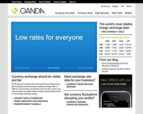
The websites featured below include everything from venture capital firms to money management tools. But like the investment and online banking sites above, these firms still need to convey a sense of loyalty and trust to their customers. Whenever financial transactions are taking place online, consumers have to feel comfortable that their personal information is safe. Oanda The Oanda website is simple, with a black, white and lime green color scheme and plenty of negative space. It's a simple design, but one that works well for putting the focus on the information they provide. Earlybird Venture Capital
Venture capitalists have a bit more leeway with their website designs, as is shown here. The minimalist design with the animated bird reflects their business name, while the site's typography keeps everything looking professional.
 Spencer Trask & Company
Another site with a tan and burgundy color scheme, this time with bolder images. There's plenty of negative space here, which makes it easy to navigate and places the emphasis squarely on the content.
 The Motley Fool
's design is reminiscent of a blog design, with featured content at the top and tabbed navigation. Information is laid out in a grid format, making things easy to find.
The Motley Fool
The Motley Fool's design is reminiscent of a blog design, with featured content at the top and tabbed navigation. Information is laid out in a grid format, making things easy to find.
 Morningstar
 uses a grid layout to organize vast amounts of information. Keeping the color scheme simple keeps the site from feeling busy.
Morningstar
Morningstar uses a grid layout to organize vast amounts of information. Keeping the color scheme simple keeps the site from feeling busy.
 Bloomberg
The new Bloomberg design is simple and straightforward, with a blog-like feel.
 Discover
's site design is very modern-feeling, especially with the light blue, orange, and gray color scheme. Important information is placed prominently, and the login area is easy to find.
Discover
Discover's site design is very modern-feeling, especially with the light blue, orange, and gray color scheme. Important information is placed prominently, and the login area is easy to find.
 Xero
The Xero site is minimalist, with plenty of white space. The bright blue and green colors used make it feel fresh and modern. The simplicity of the site gives it a professional edge.
 Mint
The Mint site feels very fresh and new, which is further reinforced by the graphics. Navigation is prominent, as is important information, and the whole thing is very user-friendly.
 Rudder
's blue and white color scheme looks very modern. The navigation in the header is fantastic, and the entire home page is laid out in a way that makes it simple to find what you're looking for.
Rudder
Rudder's blue and white color scheme looks very modern. The navigation in the header is fantastic, and the entire home page is laid out in a way that makes it simple to find what you're looking for.
 moneyStrands
The mostly black-and-white color scheme here feels sophisticated and modern, and the green accents only highlight that feeling. The graphics on the site make it obvious they're trying to appeal to a younger audience, and it works really well.
 BillShrink
The bright green color scheme and use of icons make the BillShrink website look thoroughly modern. Including the coverage they've received from major media outlets prominently on the home page makes them seem very reliable, as well.
 Bonus: Ready to be inspired? Take a look at of the Chime Banking Website.

Well designed site inspire trust, especially if they are going to hold your hard earned cash.
I like the Mint website the best
I think not all site was weel designer for banking system, but some are very good.
I suggest another site concern 100% online banking from italy “webank.it”. It could be a good starting point about online banking (Winner as Best online banking of 2009).
I’m getting tired of (inspirational) posts like this one. I see them everywhere and it’s like all of them all from one person, namely, Chapman.
+1
BBVA recently re-designed all of their website:
https://www.bbva.es/
Not sure about the re-design, it is very different to how it was before and haven’t seen a similar design for banks around.
Nice sites,I think the Mint site is nice, If I had to choose a favourite one, I think that would probably be the Rudder site I think.
Lovely collection :-)
thanks.. good inspiration for a project I’m about to undertake
BR
Very good post.I found it very helpful.
I think another good one to include would be usaa.com When I goto a bank I want to login and they do a good job of making that the most important element on the page whereas a lot these other banks sort of make if difficult to find the login.
I agree with Dan. USAA is a fantastic site always improving their interface and functionalities, I was hoping it would have been listed :-)
JG
Pretty nice list and good timing. I was going to post a similar list as I am in the banking field and thought this would be interesting to many folks who work this industry (for better or worse :). Though, I would have added Bank of New York (http://www.bnymellon.com) to the list as well.
they are good except:
Social Investment Forum
Exchange Bank
NatWest
EverBank
If you showcase smaller, locally owned banks, you’ll start to see more design issues than bigger banks.
i like oanda.com design
Why wasn’t bankofamerica.com included? Especially their online account manager.. it’s top notch.. by far the best user experience wise, and better than many on this list. Nice article otherwise!
I like the Mint and BillShrink site designs the best. Nice article.
‘Mint’ is awesome; it has a fresh look and a green effect. Mint – definitely stands out from rest of the sites.
Hello,
I would have added the portuguese Banco Espirito Santo(http://www.bes.pt) to the list.
Regards
One of the best banking site made about 6 years ago in Poland http://www.pdk.pl/index_feng.html
Great collection. Usually these types of sites don’t get a lot of attention even though the majority of design work is found in more serious project like this! I have to say my favorite is Pacific Continental Bank’s site design.
By looking at the Banking sites it seems to me that the bigger the bank the more you can see how they’re using font, content, and layout as design. You can see how they are designing more towards function and performance then some of the other, smaller (read: less trafficked) banks who probably have a partial interest in a marketing approach.
Sure they look good, but I wouldn’t put that as a primary concern when using a bank website, as I’d be more worried about the security of it.
Nice post none-the-less.
My favourite is still a bank I was using when I was in Australia: commbank.com.au/ – easy to find information, great layout and modern design (even though it’s a few years old now). Online transactions / banking was a breeze with this site too. Now I use HSBC :( Please HSBC – learn a thing or two from Commonwealth!
Thank you for the design inspiration. My fave has got to be Money strands, There is something about the black I love.
Regards
Thanks for those really inspiring websites
Great showcase! I would also definitely add Beneficial Bank thebeneficial.com/
Hey i like your designs very much, Because you said rite that three colours gray, blue, and maroon which will give security and security to the visitors who is visiting the website especially visitors who want to invest or bank online… As you stated as multinational bank or major banks etc.. If you take swiss bank and american bank which is multinational bank and major banks like Indian Overseas and State Bank of India they used the three colours only which you mentioned as these will give security and strength to the customers… Thanks for Your Information Cameron.. Sure i will come visit your blog again for more information
Venkatesh – Gulfwebstudio.com
I thought that http://www.zopa.com might have got a mention?
I think ZOPA http://www.zopa.com would be a great addition to the list, its website is first class!
Great design..
I love the designs :)
Thanks for the huge list……… Truly inspirational.
This is a great resource! Thanks so much for sharing this, it’s saved me countless hours of researching!
cool. i will need tips from bloggers like your self to make my blogs up to par. great info, well put together.
I love the look of the new Kashoo. The piggy bank is so cute, and a great idea!
A very well written and researched article. I would add only one small point to your splendid expose: the “person” promoting the “Credit Suisse” website is actually Roger Federer, ATP’s no. 3 and ambassador for Credit Suisse.
Otherwise, a splendid read and research material.
Thank you!
Horia
I just wanted to point out that companies that provide commercial real estate lending services need to show accurate information and be as safe as possible. I do agree that the color scheme needs to be classy as your company might not give a sense of comfort needed for the end user. We actually took your advise and revamped our financial company’s website portal http://www.commercialloandirect.com where we try to give our clients valuable information coupled with good customer service.
Great list, also see Johnson Bank. Gorgeous bank site. I guess when you have endless amount of dough, something like this can be achieved.
Good list, I prefer the Oanda design, it is a site that is of lots of use to me everyday due to my work.
Beautifull collection. Really inspiring design Specially Oanda Design.
I’d like to see a list of the various web firms that did these sites. Any recommendations on either a source for such a list (web dev firms with a knack for retail bank sites) or specific firms?