
The Importance of Cross Browser Compatibility: Tips and Resources
By Sean Geng
Nowadays everyone's using a different browser. Between popular options like Firefox, Safari, Chrome and Internet Explorer, which make up close to 98% of the internet market share of browsers, and the other little known browsers like Konqueror, there are a multitude of browsers being used to view your site.
How does your website function across all these options? It's important that your website is usable across all major media, whether it be popular browsers, mobile devices, or any other web browsing devices. In this article, we'll cover some basics of making sure your site is cross-browser-compatible, including snippets and resources to help you along the way.
The Problem
Not everyone uses the same browser. Similar to how everyone is running on a different operating system, you can't expect all people to be using the same web browsing tool. So what are the options? The data about current browser share varies depending on the source and the region, but in general, Internet Explorer, Firefox, Chrome, Safari, and Opera make up most of the market share, with Internet Explorer dominating the market. Internet Explorer 8 has over 25% market share, Internet Explorer 6 has 215 and Internet Explorer 7 having 14%. When there are so many different options out there, each running their own rendering engine, how do you ensure that your web design or application will hold up in each of them? That what we hope to cover and provide solutions for in this article.How does your site perform?
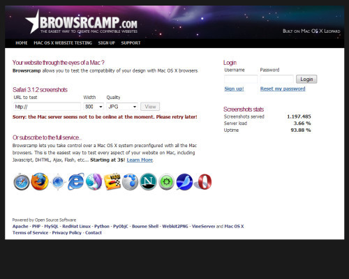
So, how does your current site perform in the multitude of browsers that are out there? Why not check for yourself? Cross browser testing is a good way to ensure your site looks good and is compatible with all browsers. If you don't want to install all the major browsers out there on your own personal machine, here are some resources to help you out. Adobe Browser Lab Adobe Browserlab offers an awesome solution for viewing on demand screenshots of your site. This is usually my go-to program for testing in various browsers.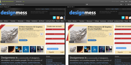
Browser Proofing Your Site
So turns out your site doesn't function as expected across all the major browsers? Don't worry. It happens to the best of us. Now it's time to go about fixing it.Validate
First off, validate your site. Ironing out those XHTML and CSS errors can often solve those pesky browser bugs. I suggest running your site through W3's XHTML Validator and CSS Validator.CSS Reset
Another great way to ensure your site is cross browser compatible is to always reset your CSS before working on a project. There are many different global CSS resets, but Eric Meyer's one and Yahoo's one are considered to be the most correct ones: Eric Meyer's Reset Reloadedhtml, body, div, span, applet, object, iframe,
h1, h2, h3, h4, h5, h6, p, blockquote, pre,
a, abbr, acronym, address, big, cite, code,
del, dfn, em, font, img, ins, kbd, q, s, samp,
small, strike, strong, sub, sup, tt, var,
dl, dt, dd, ol, ul, li,
fieldset, form, label, legend,
table, caption, tbody, tfoot, thead, tr, th, td {
margin: 0;
padding: 0;
border: 0;
outline: 0;
font-weight: inherit;
font-style: inherit;
font-size: 100%;
font-family: inherit;
vertical-align: baseline;
}
/* remember to define focus styles! */
:focus {
outline: 0;
}
body {
line-height: 1;
color: black;
background: white;
}
ol, ul {
list-style: none;
}
/* tables still need 'cellspacing="0"' in the markup */
table {
border-collapse: separate;
border-spacing: 0;
}
caption, th, td {
text-align: left;
font-weight: normal;
}
blockquote:before, blockquote:after,
q:before, q:after {
content: "";
}
blockquote, q {
quotes: "" "";
}
YUI's CSS Reset
body,div,dl,dt,dd,ul,ol,li,h1,h2,h3,h4,h5,h6,pre,form,fieldset,input,textarea,p,blockquote,th,td {
        margin:0;
        padding:0;
}
table {
        border-collapse:collapse;
        border-spacing:0;
}
fieldset,img {
        border:0;
}
address,caption,cite,code,dfn,em,strong,th,var {
        font-style:normal;
        font-weight:normal;
}
ol,ul {
        list-style:none;
}
caption,th {
        text-align:left;
}
h1,h2,h3,h4,h5,h6 {
        font-size:100%;
        font-weight:normal;
}
q:before,q:after {
        content:'';
}
abbr,acronym { border:0;}
Either include thet CSS reset styling at the top of your stylesheet, or have Yahoo host it and simply link to it in your HTML-documents, right before your own stylesheet:
<link rel="stylesheet" type="text/css" href="http://yui.yahooapis.com/2.8.0r4/build/reset/reset-min.css">
Conditional Statements
Another popular method of ensuring your site is cross-browser-compatible is targeting specific browsers using conditional statements. Basically, the idea is to detect the user's browser, and if it is one of those specified, it should perform a certain action. One of the most common uses of conditional statements is to include a stylesheet if the browser is Internet Explorer. By doing this, you can correct some bugs that exist in your code and override your current stylesheet. To use conditional statements, simply include the statement in the head section of your XHTML, right below the stylesheet inclusion. Include a stylesheet if the browser is IE<!--[if IE]>
<link href="ie.css" rel="stylesheet" type="text/css" />
<![endif]-->
Target Specfic Versions of IE
<!--[if IE6]>
        <link href="ie.css" rel="stylesheet" type="text/css" />
<![endif]-->
(Of course, you can replace IE6 with any version of IE)
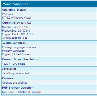
PHP Browser Detect
If you are looking for a more specific way of targeting browsers and even operating systems, then you should consider checking out Techpattern's PHP Browser Detection Script. It's a very powerful script that will detect everything from your visitor's operating system, browser, JavaScript support, screen resolution, and more.
jQuery Browser Detection
For a jQuery-based solution of detecting browsers and adding a corresponding class to the body of your site, check out TVI Design's Browser Detection using jQuery. The script adds a class to the body, which you can then style in CSS.Mobile Devices
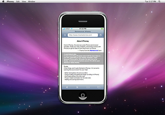
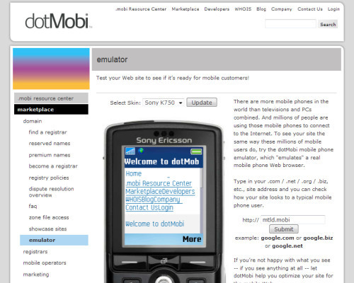
Things are changing. New devices are emerging as a medium for browsing the web these days. Whether it'd be smartphones, iPods or an iPad, there is a new enviornment for web design and as they become increasingly popular, it means that you must also take them into consideration when designing a site.What does my site look like in a mobile device?
How about testing your site in some web based mobile emulators? If you are looking to test your design in a mobile device, here are some great resources: Test iPhone Simulator for quickly testing your iPhone web applications
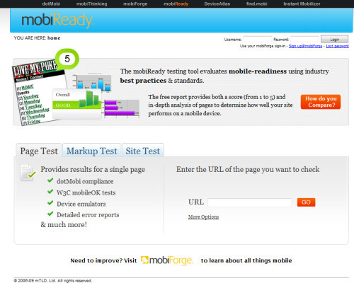
Ways to make your site mobile friendly
So how do you go about making your site mobile friendly? Well, if you are interested in pursuing a mobile version of your site, here are a few ways of doing so. Redirect Users on a Mobile Device An easy way of making sure your site is mobile-friendly is to redirect users viewing it from a mobile device to a certain "plain" version of the page on your server. Some of the easiest ways of doing this include Studio Hyperset's Mobile Redirect Script, or using Mobiforge's Lightweight Device Detection in PHP. Mobify Mobify allows you to design a mobile version of your site based on your current design. It also allows for traffic stats and advertising options.

Further Resources
Still hungry for cross browser compatibility resources and solutions?- 15+ techniques and tools for cross browser CSS coding Cats Who Code's very useful reference guide of great CSS techniques for cross browser coding.
- 7 Fresh and Simple Ways to Test Cross-Browser Compatibility More resources for testing your site on different browsers.
- Browser Tests, Services, and Compatibilty Test Suites Smashing Magazine's article on Browser Tests
- Tips to design your site for mobile devices Woork's excellent article on designing for the mobile device.
Great Article! I enjoyed a lot reading it, a lot of helpfull tips.
Cheers!
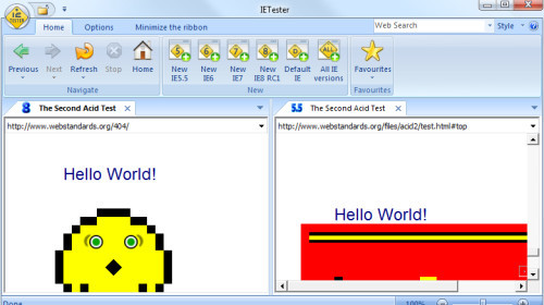
the IE Tester is very helpfule vor the CSS Problem in the IE Browsers
Be careful with the IEtester, we used to use it and then realease it only simulates what I thinks it will look like in older versions IE.
It is no 100% accurate.
In the office we connect to servers remotely that are running IE6 and 7
good article thanks lot
Thanks mate really helpful article. I wonder if there are any Linux software for this purpose.
Finally an article that covers this. Good job.
Although personal preference, I keep separate machines for the major ones. A laptop runs windowx xp with ie7 and firefox 2 – another pc runs windows 7 with ie8 and firefox 3, safari on the iMac and iPhone for mobile.
And although I’m not advertising it just yet, I make a quick pass on the iPad just to see, but if it works in Safari, its proven to be solid on there as well so far.
I’ve used many of the services listed above and I just prefer to have it live on a PC. Some of the screen shot ones can’t convey flash and although the majority of work we do is strait html, sometimes flash has to be used for ad’s or the like.
I am slowly moving to VM’s, but even then, the drain on the system is so much so, i have the machines laying around, so i may as well offload the task to them.
-Mario
Internet Explorer 6 has 215
I assume you mean 21%. No need to approve this comment. Thanks for the article! :)
Great range of resources. I would actually say the majority of headaches come from IE6 and IE7. As Lewis mentioned, IETester isn’t 100% accurate so it is best to run older versions of IE on separate machines.
My wish as a designer, IE6 and IE7 were obliterated and IETester worked as nicely as Firebug does.
PS. I personally would add Firebug to the list as it is the easiest method of testing website layouts.
* {
margin: 0;
padding: 0;
}
My CSS reset, works for everything, never have any ‘trouble’ getting things cross-browser-compatible with that.
I agree,
no need for a long css resetter.
This is mine :
*{
margin:0;
padding:0;
border:0;
text-indent:0;
list-style:none;
-moz-outline:none;
outline:none;
outline-color:none;
}
html > body{font-size:11px; (example size)}
body{
background-color: #-a-colour;
line-height:a-value;
color:#-a-colour;
text-align:left;
font-family:font-name, font-name,….;
font-size:68.8%(example size compensated for
cross-browser size reliability);
}
The * selector slows the rendering of the page.
There’s literature regarding this, or you could install a profiler like Google’s Page Speed and check it out for yourselves.
In any case: You’re doing it wrong.
very useful.
thank you very much.
nice article..luv it
It is really nice article and the tools given are really helpful.
From:
Shabir Gilkar
Kashmir Asia
its very nice and clear article .. thanks buddy
Great write up. I find iecollection more loyal to the original ie than ietester.
I’d love to see a list of common bugs in the browsers and how to fix them.
Great article thanks
Why is it that cross-browser compatibility is such an issue? All you need to know is how to properly use floats, properly use positioning. Besides that, all the newer browsers all handle code decently. If you account for IE7/8, Chrome, Firefox 3+, you cover 95%+ of the market. Also, if you want to see how it looks in other browsers, download them and actually use them, sites like browsershots are not always accurate, it’s better to see it for yourself.
This article highlights how people come up with hacks to make these things work, there’s always a separate IE css file, or a whole javascript file dedicated to fixing IE stuff, none of this is necessary if you just learn to code properly.
“Also, if you want to see how it looks in other browsers, download them and actually use them, sites like browsershots are not always accurate”
I agree with the second part of your statement, applications to simulate browsers aren’t always accurate. However, the problem with the first part, about downloading the browsers, is that I have a Mac, and I think many designers do. I don’t have Bootcamp or any other emulator, so I am forced to rely on BrowserShots and the like.
Try CrossBrowserTesting. Works for all platforms (including mac), and allows you to test across all platforms, including multiple versions of Windows and OSX. Provides both screenshots and live testing. The live testing allows you to connect to any of the configurations via VNC to actually use and interactively debug your site.
I agree that using automated tools to see browser screen shots is not going to be very accurate. I always test in the actual browsers myself with 2 computers setup for IE6 and IE7 testing that I can remote desktop into. With screen shots there’s no way to test behaviour and functionality from forms or JavaScript. Some of these tools can still be useful to get a quick visual check if stuff is where it’s supposed to be since it’s not practical to setup test environments for a wide range of browsers with different browser versions on different versions of operating systems.
By the sounds of it you’ve never had to do much IE6 testing. Learning to code properly has nothing to do with IE6 fixes. Even if you have perfect mark-up and follow CSS specifications to the letter and adhere to known web standards IE6 will always screw up in one way or another. IE6 is buggy and regardless of how much you’ve coded correctly it, more often than not, renders stuff incorrectly. IE7 is significantly better but still has some serious issues rendering valid CSS/HTML.
For an extension of the iPhone simulator check out ProtoFluid, described at…
http://menacingcloud.com/?c=cssMediaQueries
Rapid Web App prototyping using CSS3 Media Queries. Lets you specify custom device dimensions, not just iPhone.
Thanks, great article!
„It’s a very powerful script that will detect everything from your visitor’s operating system, browser, JavaScript support, screen resolution, and more.“
No it wont, if your browser doesn’t delivers the user agent setting to the webserver during the page request. „Never trust user input“ is the webdevelopers principle. And the user agent setting is one of these header informations, a client can manipulate or set to whatever he wants. So don’t count on gettings the right browser informations just because You’re using this piece of software! Create the layout cross-browser-compatible is the better way to solve these problems.
Sorry about my rough english. Regards –n
Great article! I think browser compatibility is important, but I don’t think its necessary to ALWAYS support every browser. I think that compatibility has a lot to do with your target audience. For example, I doubt that many designers-especially web designers- use Internet Explorer. For that reason, I feel that blogs like this one don’t really need to worry about supporting it. My previous statement is only an assumption, of course, so I could be wrong. Anyway, that’s just how I feel about it. Again, great post!
Very Useful Post, Thanks for this :-)
Very useful article – nothing can beat the testing of the site in the real browser itself, VirtualBox combined with images for various versions of windows / Linux help with this testing for me personally. Granted, there is always a limit to how many you can test in (time = money etc).
Making sure you always check it in the majority of common browsers is a must though (IE6, 7 and 8, Firefox then Opera and Chrome/Safari)
TO IE Tester, I prefer :
http://tredosoft.com/Multiple_IE
Allows to install multiple version of IE on one machine.
Excellent well narrated article..
I just build a mobile version website with Mobify, it’s simply awesome!
Internet Explorer 6 has 215? Maybe was the bad karma from ie6 or just need to press shift harder to make it 21%! Beside that, personally i don’t like conditional statements or any kind of browser sniffing to achieve cross browser compatibility, but i try to make compatibility happen using a cross-browser custom css framework. While building a custom framework is not a first option for many, you can take the “easy” way by using an open source css framework like blueprint, 960 and many others.
PS: check spelling of /tools/the-importance-of-cross-browser-compatibi..ty/ and correct it before gets link juice.
Real nice article, it is very important to cater to different browsers.
You pointed out a few browser comparison tools that I haven’t seen yet. I’m going to try out the IE Tester. Like Tim Igoe, I’ve got a couple VM’s running through Virtual Box – one for IE6 and one for pure IE7, then I’ve got all my other testing browsers installed on my primary. I’ve even started testing in Flock to maintain a different perspective on the mozilla browsers, and using Avant and Maxthon2 for yet another iteration of the trident engine.
Also, I have been using the expression web super preview to get a view of IE6, 7, 8 and firefox. it helps, but is limited (and slow, like most MS stuff).
Great article and great topic to cover.
Um i am here for tips on crossbows and am disappointed
awesome.. another decade of dealing with unclosed tags, mixed case tag names, an non quoted attributes. really im ecstatic.
Unfortunately the majority of the time a margin and padding reset is need in order to stop IE from ***** up. There’s no way to “set everything to appropriate values” if an element isn’t supposed to have padding or margin to begin with. Going around adding margin and padding 0 to every element is also stupid. This is why a reset is needed. I wouldn’t go as crazy as resetting everything the author had though.
Cross-browsing is hell!
But nice article… :-)
According to W3Schools, as of April 2010, Firefox is the most used browser with nearly 50% of users , IE 8 at about 18% and Chrome close behind with about 13%. IE6 is at about 8% and IE 7 is at about 9%, with more users dropping them each month.
Just thought I’d throw it out there that IE might not be the most used browser. http://www.w3schools.com/browsers/browsers_stats.asp
at least these tools will make some development easier.
thanks for the list.
has anyone tried browserlab in dreamweaver cs5?
What a great article. I’ve never thought of using a CSS reset. Might start doing it from now on.
Thanks for this wonderful article. I have realized the importance of reset.css however this is a Plus to that.
Thanks again!!
very useful resources..thanks
Highly useful article and tools. Thanks a lot man! There is no way in which we can escape cross browser compatibility now!
There are certainly some substantial advantages to chrome in my opinion, not least of all its stability
Opera has a desktop tool to emulate Opera Mini.
http://dev.opera.com/articles/view/opera-mobile-10-widgets-mobile-emulator-desktop/
Nice read, but you did not mention one tool that I find very auseful for automated cross browser testing – BrowserSeal.Robot
browserseal.com
Many design schools and community colleges offer short, intensive summer courses. These are a great option for someone who wants more web design education, but can’t commit to a full-time program.
Excellent article! Love your site!
Its a really cool post.
I like it
thank you for posting these types of articles.
hi
this is uttam
my problem is dropdown menu not working in internet explore
so plz help me
Great article Sean, read the full article after so many days. Otherwise there are a very few articles which are worth reading top to bottom.
Keep it up.
Good to read such valuable information. Thanks.
PLEASE NOTE!
This code is wrong:
(Of course, you can replace IE6 with any version of IE)
There needs to be A SPACE between “IE” and “6” (or the number of whatever version you are trying to target). I’m not sure if this is only applicable for HTML5 but without a space it was not calling the stylesheet at all.
Great article though. Thanks for the help.
it’s really good article, things are more clear,
thanks a lot
:)
Excellent Article. Thank you so much.
Why didn’t I come across this article earlier ??? Well now I found it – Thanks
thanks, helpful … something that i want to find …
Dear friends …it is nice to see u peoples here . i think it is a main problem that must be on focus. can it possible we define a general CSS and a general template from which we create all others applications to avoid Cross Browser Problems.
any solution or advise will be appreciated