The first article (
Introduction to jQuery Mobile), published over at MSDN, in this series looked at the subject of themes at a high level and at themes available in jQuery Mobile (jQM). In this, the third of three articles on jQM, I show how to build a custom theme using the Theme Roller, as well as look at some custom themes that allow a mobile Web application to look more like an iPhone, Android or Windows Phone application.
Building a Custom Theme with the Theme Roller
Building a custom theme for jQM involves creating the CSS. Manually creating the CSS is a long process, so instead you can use the Theme Roller, which handles the details of creating the required CSS files and other code. The developer or designer is merely responsible for setting the necessary values. Here are the steps to create and use a theme with the Theme Roller:
- Point your browser at the Theme Roller, shown in Figure 1. (The URL for obtaining the Theme Roller is listed in the resources for this article.)
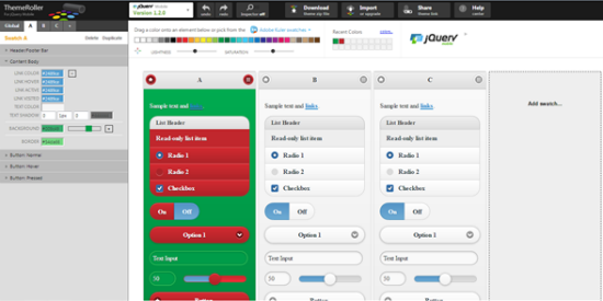 Figure 1: The jQM Theme Roller
- Once you set the values for the colors, spacing and other properties, click the Download button at the top of the page to display the dialog box shown in Figure 2. That dialog contains instructions on how to use the theme within a page.
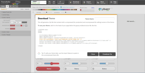 Figure 2: The Download Theme Dialogue
- After the zip file is downloaded, extract the file into its various parts.
- Import the project into the application. You can use the CSS or a similar directory.
- Start using the code in the application by adding the style sheet and necessary pages to the header of the layout page, as shown in the following code sample.
<head>
<meta  charset="utf-8">
  ..<meta name="viewport" content="width=device-width,  initial-scale=1">
  ..<title>jQuery Mobile: Theme  Download</title>
  ..<link  rel="stylesheet" href="css/themes/ugly.min.css" />
  ..<link rel="stylesheet"  href="http://code.jquery.com/mobile/1.2.0/jquery.mobile.structure-
1.2.0.min.css" />
<script  src="http://code.jquery.com/jquery-1.7.2.min.js"></script>
  ..<script  src="http://code.jquery.com/mobile/1.2.0/jquery.mobile-1.2.0.min.js"></script>
  </head>
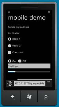
The result of this theme is shown in
Figure 3. I admit it’s not the prettiest theme, but I’m a developer, not a designer.
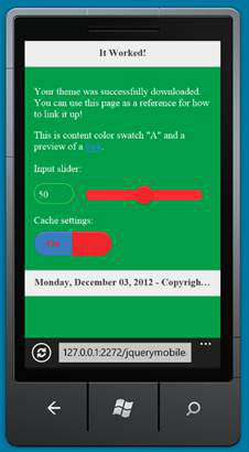 Figure 3: A Custom Theme in the Windows Phone Emulator
Windows Phone/Modern UI jQuery Mobile Theme
Themes are great and cool, but developers are charged with an unwritten rule: users want applications that look like all the other applications on their systems. Truthfully, jQM applications don’t look like all the other applications on a device—they have an overly generic look to them. So how can developers create a more “native” look for their jQM applications? There are a couple of solutions to this:
- Create a custom jQM theme. The Theme Roller makes this process easier, but there’s still a lot of work to do. Hand-coding a jQM theme is a significant amount of work and should not be attempted without understanding the consequences of that choice—support, use on future devices and general pain and agony.
- Use a prebuilt jQM theme. Whenever possible, it’s best to use existing code that is known to work.
Thankfully, with Windows Phone, Microsoft has created a jQM theme that you can download via Nuget and then integrate within an application very quickly and nearly painlessly. Once the code is downloaded into a project, the following code needs to be set up in your app:
<meta content="text/html;  charset=utf-8"/>
  <meta name="viewport"  content="width=device-width, initial-scale=1"/>
  <title>jQM theme for Windows  Phone</title>
  <link rel="stylesheet"  href="css/metro/jquery.mobile.metro.theme.css"/>
  <link  href="css/progress-bar.css" rel="stylesheet"  type="text/css" />
  <link  href="css/toggle-button.css" rel="stylesheet"  type="text/css" />
<style type="text/css">
   /*  custom icons for toggle button*/
    .ui-icon-demo-help,
    .ui-icon-demo-set {
    background-repeat: no-repeat;
    background-position: 50% 50% ;
    background-size: 30px 30px;
   }
  .ui-toggle-button-a .ui-icon-demo-set,
    .ui-toggle-button-b[checked='checked'] .ui-icon-demo-set{
    /*background-image: url(Images/set.dark.png) ;*/
    background-image: url(data:image/png;base64,.....);
   }
  .ui-toggle-button-b .ui-icon-demo-set,
    .ui-toggle-button-a[checked='checked'] .ui-icon-demo-set{
    /*background-image: url(Images/set.light.png);*/
   background-image:  url(data:image/png;base64,......);
   }
</style>
  <script src="js/jquery.js"  type="text/javascript"></script>
  <script  src="js/jquery.mobile.js"  type="text/javascript"></script>
  <script  src="css/metro/jquery.mobile.metro.theme.init.js" type="text/javascript"></script>
  <script  src="js/jquery.globalstylesheet.js"  type="text/javascript"></script>
  <script  src="js/jquery.mobile.themeswitcher.js"  type="text/javascript"></script>
  <script  src="js/progress-bar.js"  type="text/javascript"></script>
  <script  src="js/toggle-button.js"  type="text/javascript"></script>
  <script  type="text/javascript">
    $.themesDir = 'css/';
    $(function() {
    $("#btn-dark").click(function(event) {
    $.addTheme("Dark", false);
    event.preventDefault();
    return false;
    });
    $("#btn-light").click(function(event) {
    $.addTheme("Light", false);
    event.preventDefault();
    return false;
    });
   });
  </script>
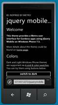
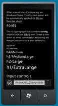
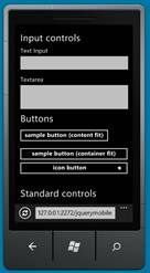
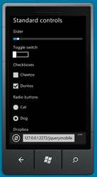
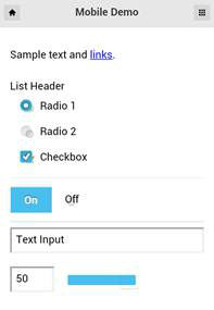
The result of the jQM theme for Windows Phone from Microsoft is an app with a much more native look to it than a generic app based around jQM.
Figure 4 shows some sample output.
Figure 4: Examples of the jQM Windows Phone Theme
iPhone/iPad Inspired jQuery Mobile Theme
Windows Phone is not the only device in the mobile marketplace, of course. The smartphone revolution crystalized around the iPhone, with its introduction in 2007. According to various statistical surveys, the iPhone is the number two smartphone in the United States at this time (Kantar Worldwide says it is number one) and has the majority of Web traffic for mobile devices. Thankfully, creating a jQM application that looks like a native iOS application involves using a custom jQM theme. The steps to add jQM-theme support to an application are as follows:
- Download the jQM theme. It is listed on github and in the resources at the end of this article.
- Import the files into a project.
- Add code such as the following to the necessary pages or layout file. You might need to change this code to meet the specific requirements of your application.
<meta  name="apple-mobile-web-app-capable" content="yes">
   <link  href="http://code.jquery.com/mobile/1.2.0/jquery.mobile-1.2.0.min.css"  rel="stylesheet" />
   <link  rel="stylesheet" href="css/iOS/styles.css" />
    <script  src="http://code.jquery.com/jquery-1.7.2.min.js"></script>
    <script>
   //  all dialog buttons should close their parent dialog
    $(".ui-dialog button").live("click", function () {
    $("[data-role='dialog']").dialog("close");
    });
    $(document).on("mobileinit", function () {
    $.mobile.defaultPageTransition = "slide";
    });
    </script>
   <script  src="http://code.jquery.com/mobile/1.2.0/jquery.mobile-1.2.0.min.js"></script>
   <style>
   #footerTabs {
    background: #FFF -webkit-radial-gradient(circle, #FFF, #dee2e4);
    }
    .ui-listview sup {
    font-size: 0.6em;
   color: #cc0000;
   }
    </style>
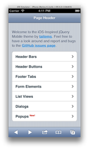
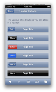
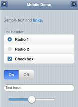
Once you place the code into the head of the HTML (or layout) page, the application will look like
Figure 5. As you can see, the user is presented with a layout that looks remarkably similar to a native iPhone/iPad/iOS application.
Figure 5. Examples of the Custom iOS Theme
Android Holo jQuery Mobile Theme
Inside the United States, there is some discussion about whether Android is the most popular smartphone. Outside the United States, Android smartphones have the largest market share by a wide margin. A jQM theme has been created for this platform as well. Follow the same steps described earlier to implement the theme. Here’s a sample of the code you would add to the necessary pages or layout file:
  <meta name="viewport"  content="width=device-width, initial-scale=1">
  <link  href="css/Android/android-holo-light.min.css"  rel="stylesheet" />
  <link rel="stylesheet"  href="http://code.jquery.com/mobile/1.2.0/jquery.mobile.structure-1.2.0.min.css"  />
   <script  src="http://code.jquery.com/jquery-1.8.3.min.js"></script>
   <script  src="http://code.jquery.com/mobile/1.2.0/jquery.mobile-1.2.0.min.js"></script>
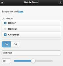
The result is an application that will have the general look shown in
Figure 6.
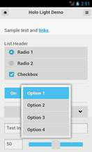 Figure 6. The Android Light Holo Theme
Putting Themes Together
Building a jQM application that looks like an iPhone app and deploying that to Windows Phone users is likely to create a lot of unhappy users. Developers want an application that looks as much as possible like the native platform that users have, but they don’t want to create a separate application for each platform. Ideally, the user interface of an application can be standard across all platforms, and the only part that needs to change is the jQM theme.
In this exercise, we use an ASP.NET Layout file to indicate what mobile device a user is connecting with and then load the necessary versions of the jQM themes, assuming that the development project is set up and already contains the necessary themes.
For the purposes of this example, the application is concerned with four possible platforms: Windows Phone, iPhone, Android, and all other platforms. In this application, the user is presented with a native-looking application on Windows Phone, the iPhone, and Android. On all other platforms, the user is presented with a generic jQM user interface.
 <!DOCTYPE html>
  <html>
  <head>
  <title>@Page.Title</title>
  @RenderSection("head", required: false)
  @{
  var ua = Request.UserAgent;
  var pt = MobileHelper.TypeOfPhone(ua);
  }
  @{
  if ( pt == MobileHelper.PhoneType.WindowsPhone )
  {
   <text>
   <meta name="viewport" content="width=device-width,  initial-scale=1" />
   <link rel="stylesheet" href="@Href("~/www/css/metro/jquery.mobile.metro.theme.css")" />
   <link href="@Href("~/www/css/progress-bar.css")" rel="stylesheet" type="text/css" />
   <link href="@Href("~/www/css/toggle-button.css")" rel="stylesheet" type="text/css" />
   <style type="text/css">
   /* custom  icons for toggle button*/
   .ui-icon-demo-help,
   .ui-icon-demo-set {
   background-repeat: no-repeat;
   background-position: 50% 50% ;
   background-size: 30px 30px;
   }
   .ui-toggle-button-a .ui-icon-demo-set,
   .ui-toggle-button-b[checked='checked'] .ui-icon-demo-set{
   /*background-image: url(Images/set.dark.png)  ;*/
   background-image: url(data:image/png;base64,....);
   }
   .ui-toggle-button-b .ui-icon-demo-set,
   .ui-toggle-button-a[checked='checked'] .ui-icon-demo-set{
   /*background-image:  url(Images/set.light.png);*/
   background-image: url(data:image/png;base64,....);
   }
   </style>
   <script src="@Href("~/www/js/jquery.js")" type="text/javascript"></script>
   <script src="@Href("~/www/js/jquery.mobile.js")" type="text/javascript"></script>
   <script src="@Href("~/www/css/metro/jquery.mobile.metro.theme.init.js")"
   type="text/javascript"></script>
   <script src="@Href("~/www/js/jquery.globalstylesheet.js")" type="text/javascript"></script>
   <script src="@Href("~/www/js/jquery.mobile.themeswitcher.js")"
   type="text/javascript"></script>
   <script src="@Href("~/www/js/progress-bar.js")" type="text/javascript"></script>
   <script src="@Href("~/www/js/toggle-button.js")" type="text/javascript"></script>
   <script type="text/javascript">
   $.themesDir = @Href(“~/www'css/”);
 $(function () {
   $("#btn-dark").click(function (event) {
   $.addTheme("Dark", false);
   event.preventDefault();
   return false;
   });
   $("#btn-light").click(function (event) {
   $.addTheme("Light", false);
   event.preventDefault();
   return false;
   });
   });
   </script>
   </text>
  }
  if ( pt == MobileHelper.PhoneType.Other )
  {
   <text>
   <meta name="viewport" content="width=device-width,  initial-scale=1" />
   <script type="text/javascript" src="http://code.jquery.com/jquery-1.8.3.min.js"></script>
   <link rel="stylesheet" href=http://code.jquery.com/mobile/1.2.0/jquery.mobile-1.2.0.min.css
   />
   @if (IsSectionDefined("Head"))
   {
   @RenderSection("Head", false);
   }
   <script type="text/javascript" src="http://code.jquery.com/mobile/1.2.0/jquery.mobile-1.2.0.min.js"></script>
   </text>
   }
   if ( pt == MobileHelper.PhoneType.iPhone )
   {
   <text>
   <meta name="viewport" content="width=device-width,  initial-scale=1" />
   <meta name="apple-mobile-web-app-capable" content="yes">
   <link href="http://code.jquery.com/mobile/1.2.0/jquery.mobile-1.2.0.min.css" rel="stylesheet"
   />
   <link rel="stylesheet" href="@Href("~/css/iOS/styles.css")" />
   <script src="http://code.jquery.com/jquery-1.7.2.min.js"></script>
   <script>
   // all dialog buttons should close their parent dialog
   $(".ui-dialog button").live("click", function () {
   $("[data-role='dialog']").dialog("close");
   });
   $(document).on("mobileinit", function () {
   $.mobile.defaultPageTransition = "slide";
   });
   </script>
   @if (IsSectionDefined("Head"))
   {
   @RenderSection("Head", false);
   }
   <script src="http://code.jquery.com/mobile/1.2.0/jquery.mobile-1.2.0.min.js"></script>
   <style>
   #footerTabs {
   background: #FFF -webkit-radial-gradient(circle, #FFF, #dee2e4);
   }
   .ui-listview sup {
   font-size: 0.6em;
   color: #cc0000;
   }
   </style>
   </text>
   }
   if ( pt == MobileHelper.PhoneType.Android )
   {
   <text>
   <meta name="viewport" content="width=device-width,  initial-scale=1">
   <link href="@Href("~/css/Android/android-holo-light.min.css")" rel="stylesheet" />
   <link rel="stylesheet" href="http://code.jquery.com/mobile/1.2.0/jquery.mobile.structure-1.2.0.min.css" />
   <script src="http://code.jquery.com/jquery-1.8.3.min.js"></script>
   @if (IsSectionDefined("Head"))
   {
   @RenderSection("Head", false);
   }
   <script src="http://code.jquery.com/mobile/1.2.0/jquery.mobile-1.2.0.min.js"></script>
   </text>
   }
   }
  </head>
  <body>
  <!--  User Agent: @ua -->
  @RenderBody()
  </body>
  </html>
The code for the MobileHelper.cs file is shown in the next code listing. The class contains an enum, which will have the phone type that the browser is using to load the page, and a method to determine the type of the phone. Granted, there are a number of ways to detect the type of mobile device. This is just one way to do it—by inspecting the user agent string that the server detects.
public class MobileHelper
  {
   public  MobileHelper()
   {
   //
   //  TODO: Add constructor logic here
   //
 }
    public enum PhoneType { iPhone, Android, WindowsPhone, Other }
  public static PhoneType TypeOfPhone(String userAgent)
   {
    var pt = PhoneType.Other;
   if  (userAgent.IndexOf("Android") >= 0)
   {
    pt = PhoneType.Android;
   }
   if  (userAgent.IndexOf("Windows Phone") >= 0)
   {
    pt = PhoneType.WindowsPhone;
   }
   if  ((userAgent.IndexOf("AppleWebKit") >= 0) &&
    ((userAgent.IndexOf("iPad") > 0) ||
    (userAgent.IndexOf("iPhone") > 0)))
   {
    pt = PhoneType.iPhone;
   }
    return pt;
   }
  }
The final result of this code is shown in
Figure 7. Each views shows the output from a different device.
Figure 7. Output from Applying Theme Dynamically Based on Device. Top left: Windows Phone; top right: Android; bottom left: iPhone; bottom right: generic device in Internet Explorer
The advantage to developers is that you can build one application with one UI, and the content is then sent to the user with one consistent user interface. The developer has only one application to support, and users get an application that closely resembles other applications that they have on their device. Everyone is happy.
Wrapping Up
As a mobile guy, I hope that you’re able to use a theme for each device. As I said earlier, users want applications that look like all of the other applications they have. By using the ASP.NET Razor Layout pages and some basic logic, developers can easily and quickly build jQM apps that are optimized for all of their intended devices.
References
About the Author
Wallace McClure is a redneck from Tennessee who somehow found his way to Atlanta and Georgia Tech. He was lucky enough to graduate from there twice, with a BS and MS in electrical engineering. He’s always loved things that were new and different, which led to his love of writing software (starting in COBOL and x86 asm), digging into Microsoft's Web technologies, jumping whole-hog into the .NET Framework 1.0 beta, following in love with mobile way back in 1999, and a whole host of things he probably shouldn't have done but did anyway. Somewhere along the way, he was contacted by someone representing a publisher that would eventually get purchased by John Wiley and Sons and folded into their Wrox division. Several books later, he’s run the gamut from software architecture, to scaling applications, ADO.NET, SQL Server, Oracle, Web, AJAX and mobile technologies. He’s worked for startup companies and many different organizations, all the way up through U.S. federal government agencies.
When not writing software, writing about software, talking about software or thinking he is a comedian, Wally can be found playing golf, in the gym or coaching basketball.
Find Wally on:
(dpe) 
Thanks for these tips about jQuery mobile. The post is very helpful :)