
CSS Techniques I Wish I Knew When I Started Designing Websites
By Tim Wright and TJ Kelly
CSS is the best thing to happen to the web since Tim Berners-Lee. It's simple, powerful, and easy to use. But even with all its simplicity, it hides some important capabilities. Ask any designer, and they'll tell you that the majority of their code headaches are caused and ultimately solved by CSS.
All designers at some point in their career go through the process of encountering a weird display issue, searching for a resolution, and discovering a trick, technique, or hack could have saved them hours of frustration—if they had only known when they started.
We've put together a list of the most frustrating and time-consuming CSS headaches and, more importantly, their solutions (along with examples and further resources). I hope this list will help you save some gray hairs. As for me, I think I feel some coming in right now...
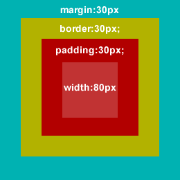 We know that the box's total width is 260px, but in CSS the
Resets & Browser Inconsistencies
Not all browsers are created equal. In fact, every browser is different. What is the default margin, padding, or font-size of a<p> element? You might be surprised at the wide range of values. To handle the differences between browsers, many of us want to level the playing field and start from scratch, by using CSS reset styles.
The early stages of resets, designers dealt with differing margin and padding values, using a global reset:
* { margin: 0; padding: 0; }
But, as more people used and discussed resets, it became clear that resetting only margin & padding wasn't enough (and, applying the above rule to every element is taxing on the rendering engine). Thanks to the work of Eric Meyer and other CSS pioneers, a better, more complete collection of reset rules was created:
html, body, div, span, applet, object, iframe,
h1, h2, h3, h4, h5, h6, p, blockquote, pre,
a, abbr, acronym, address, big, cite, code,
del, dfn, em, font, img, ins, kbd, q, s, samp,
small, strike, strong, sub, sup, tt, var,
dl, dt, dd, ol, ul, li,
fieldset, form, label, legend,
table, caption, tbody, tfoot, thead, tr, th, td {
	margin: 0;
	padding: 0;
	border: 0;
	outline: 0;
	font-weight: inherit;
	font-style: inherit;
	font-size: 100%;
	font-family: inherit;
	vertical-align: baseline;
	}
/* remember to define focus styles! */
:focus {
	outline: 0;
	}
body {
	line-height: 1;
	color: black;
	background: white;
	}
ol, ul {
	list-style: none;
	}
/* tables still need 'cellspacing="0"' in the markup */
table {
	border-collapse: separate;
	border-spacing: 0;
	}
caption, th, td {
	text-align: left;
	font-weight: normal;
	}
blockquote:before, blockquote:after,
q:before, q:after {
	content: "";
	}
blockquote, q {
	quotes: "" "";
	}
As important as it is to note which elements are included in the most popular CSS reset available today .It's also important to note some of the elements that are deliberately excluded from this list:
- input
- button
- hr
Resources for Resets
- Eric Meyer's Resets and the reasoning behind them
- Smashing article: “Design from Scratch”
- Google BluePrint CSS & Resets
- Yahoo YUI CSS Resets
Box Model — Margin, Padding & Borders
The box model is the basis for all layouts. It governs the dimensions & spacing of the elements on a page. To understand it, we have to understand the difference between block-level elements and inline elements. Block-level elements, by default, take up the entire width of their containing element and the height of the default line-height. They will stack up underneath each other, top-to-bottom. Therefore, by default, they will take up their own line on a page. Some block-level elements are:<div>, <pre>, <p>, <ul>, <ol>, <li>, etc.
Inline elements are, just as their name implies, in-line. They will stack up next to each other, left-to-right. When given content, they will take up the exact width and height of that content. Given no content, they will collapse down and have no width or height. Some in-line elements are: <img>, <em>, <strong>, <a>, <span>, etc.
All HTML block-level elements have five spacing properties: height, width, margin, padding, and border (inline elements have them too, they just work a bit differently). Width and height are tricky attributes, as they require a bit of calculation. When measuring an element's width, designers must consider the entire box.
In the example below, the box has a total width of 260px. The margin, padding, and border are 30px each (remember, that's 30px on top, 30 on bottom, 30 right, and 30 left). So, in this example, the margin takes up 60 pixels of the box's width. Likewise, the border and padding consume 60px each. All together, the margin, border, and padding amount to 180 pixels of the box's total width.
We know that the box's total width is 260px, but in CSS the width attribute refers to the content area on the inside of the box. So, for this example, we have to subtract 180 pixels (for margin, border, and padding) from 260 (total box width), leaving us with a content area of 80px. Therefore, our CSS looks like this:
div {
  margin:30px;
  border:30px solid yellow;
  padding:30px;
  width:80px;
  height:80px;
}
Extras
- All of the examples and rules we're discussed for the
widthproperty also apply toheight. margincan support negative values. Use them cautiously but they can prove to be very strong design elements.- Don't forget the units with the box model. Only a zero-value (margin:0;) can be written without a unit specified.
Resources for CSS Box Model
- W3C CSS Specifications
- HTMLsource Box Model tutorial by Ross Shannon
- “Beginner’s Guide to Margins and Paddings” at Web Designer Notebook
Dimensions — Width, Height, Min & Max
Now that we understand how to use width and height in unison with the box model, let's look at some of the flexibility of CSS dimensions. Modern browsers support min- and max-width (and the same for height), allowing us to get creative with dimensions and create flexible layouts. Width/height specify the space an object should occupy. They can be measured in pixels (10px), ems (10em) and percentages (10%), as well as a few other units. Defining a width or height for an element will force that element to keep those dimensions, regardless of the content inside it. So, if our content is too big for its container, it will be cut off, hiding the bottom of our content (or just look really messed up).Min-width & min-height
Giving an element a min-width or min-height will set the element to our exact dimension by default. But, since we only provided a minimum dimension, as the content grows, the containing element will allowed to stretch and all of our content will remain visible. Min-width & min-height can he useful for form elements like<input /> and <textarea>. We can define them with a minimum width/height and let them expand as the user types.
In IE6, "height" acts the same way "min-height" does in modern browsers as a container will grow with content (something to be aware of when using building for IE6).
Max-width & max-height
If we give an element a max-width or max-height, it will collapse down to the size of our content by default. As our content grows, the container will stretch—until it reaches our maximum. Then our remaining content will be cut off or look really weird hanging of the bottom of a content block. Max-width & max-height can be useful for browsing long lists (if you correctly manage your overflow - create scrolling if the list goes too long).Using Max & Min width in IE6
Min & Max width are both great tools to have in your design arsenal, but unfortunately they don't work in IE6, so what do we do? We usually lock down the width of our site instead of creating the ideal fluid layout we want, sacrificing user experience for out of date browsers. Luckily, we can use a short JavaScript command targetting IE to accomplish a nice fluid layout with max & min widths in IE6:#page-wrap{
min-width:800px;
max-width:1000px;
width:expression(document.body.clientWidth < 800? "800px" : document.body.clientWidth > 1000? "1000px" : "auto");
}#page-wrap{
min-width:800px;
width:expression(document.body.clientWidth < 800? "800px": "auto" );
} Resources for dimensions
- Top 10 CSS Tricks from SitePoint
- Cross Browser Min-height
- Min-width for Internet Explorer
- CSS Dimension Properties
Floats & Clearing
A float will place an element outside the normal flow of elements and moves the element right or left until it reaches the margin or padding of another block-level element. Float and clear are some of the most powerful—and the most misunderstood—properties in CSS. To understand it, we must refer back to block-level vs. inline elements. Applying float to an element will automatically make it a block-level element. This means two things: 1) by default, all floated elements (even<span> and <strong>) will behave like block-level elements, 2) Giving an element both float:left; and display:block; is redundant and unnecessary. Also, using display:inline on a floated image is actually a very popular method of fixing many cross-browser quirks.
Floating a div to clear a div
Floating a div to clear a div is one of those things you stumble upon with some experimenting and frustration. What basically happens is that you can apply a float to a parent element that contains other floated elements and they will all equalize and clear properly:HTML
<div class="parent-element">
     <div class="floating-element"></div><!--/.floating-element-->
     <div class="floating-element"></div><!--/.floating-element-->
     <div class="floating-element"></div><!--/.floating-element-->
</div><!--/.parent-element-->
CSS
.floating-element   { float:left;width:33%; }
.parent-element { float:left; }Resources for clear and float
Conditional Comments
Back in 2004, when I really got into full-time Web design I used a lot of IE hacks and techniques to patch together sites in an attempt to achieve some level of cross browser compatibility. This can cause very bloated and slow loading style sheets. Everyone was doing it, heck, there were even articles about how to best organize your IE hacks. Little by little the design community discovered a hidden gem buried within the functionality of the Triton rendering engine (Internet Explorer). You could use IE specific HTML to target specific versions of the browser and then load a special style sheet just to deal with those issues.Using conditional comments to target IE and cut out your hacks, will slim down your main style sheet, and help load the page quicker in browsers that don't need the correction code.<!--[if IE]> Target all versions of IE <![endif]--><!--[if lte IE 7]> Target all versions of IE that are less than or equal to "7" <![endif]--><!--[if IE 6]> Target IE 6 <![endif]-->
Resources for Conditional Comments
Overflow & Zoom
Like many designers, if there's time to be wasted on a project, it usually gets wasted dealing with IE 6 and some of it's weirder quirks. This is where overflow and zoom have helped me a great deal.Overflow
Many-a-times when I've encountered a serious layout issue, a simple application of overflow:hidden on the offensive div would solve the problem. It's difficult to pin point specific issues for this, but it can happen in any browser (I just had it happen in Safari a couple weeks ago) and the overflow property can provide a quick solution to your cross browser woes.Zoom
To my surprise, the zoom property is not very well know, but a very powerful tool in dealing with cross browser issues; particularly IE 6/7. Zoom is a proprietary IE property that actually does effect the zoom level of a page (if you set the zoom to 2 you'll see everything get bigger). As a site effect it also triggers hasLayout on the offending element, and fixes a lot of layout issues. Try it out, it actually saves a lot of time.body { zoom:1; }
Thank you, Tim & Noupe crew, for acknowledging my contributions to this post!
Great work, Tim!
Great list. A couple more:
1. Clearfix — http://www.positioniseverything.net/easyclearing.html
2. IE6 double-margin bug — http://www.positioniseverything.net/explorer/doubled-margin.html
Plus another
3. Shorthand CSS – http://www.thefloatingfrog.co.uk/web-design/10-css-shorthand-techniques-youll-use-everyday/
and a visual look at the box model
4. 3D Box Model – http://hicksdesign.co.uk/journal/3d-css-box-model
Pretty cool list – spotted some I wish I’d learned initially as well!
You actually hit on most of the things I wish I’d known starting out. I also wish I’d realized that divs can be just as dangerous (if not more so!) than tables! Specificity would have been a great thing to know, too.
Realize that if you’ve chosen this profession you must accept that danger is inherent to all we do. It’s not just a coincidence that so many TV dramas and action films are based on the lives of Web developers.
For some reason I can’t bring myself to use a CSS reset. I’ve tried, but I hate having multiple style declarations for one element.
“I hate having multiple style declarations for one element”
Thats what the “C (Cascading)” is CSS is about though, no?
Actually, no. The “Cascade” is the way multiple stylesheets are applied to a document, in that order:
User agent style
User style
Author style(s)
We’d rather talk about Specificity to name the phenomenon you’re talking about but basically, yes, you’re still right ;-)
I think that I really spent a lot of time getting grey hair because of IE6. The most important lesson I learned from meddling with CSS is that no browser renders the same way. Workarounds are cool and hacks too but what we as web designers need to do is to be consistent: first build with all the known and proven standards, then modify according to the browsers you cross.
I love the advice: go to class. We never stop learning and get confronted to new challenges, this is what makes Web design so cool!
Whoa . . . that’s deep man. Totally frickin mind blowing. Do you write for Jack Handy by chance?
gr8 post
thanx Tim
very nice and informative as usual
nice article thanks! nice to review some of the things i have forgotten, or know and not know why.
.mike
Great summary of the common pitfalls and workarounds for CSS Tim. Wish I had it when I was starting out too (though more than that I wish ie6 weren’t around then). Also some things I didn’t know about even after years of working with CSS, like the Zoom bit.
Overflow is one of my favorite cure-alls, but it’s worth noting that line-height is another big cause of differences between IE & everything else.
Nice Tricks
You should use this method for min/max heights and widths. The use of expressions in expensive, thus they should be avoided at all costs. The following will create styles for a min-height of 100px. Works in all browsers.
/* Start Min-Height */
min-height: 100px;
height: auto !important;
height: 100px;
/* End Min-Height */
Also, here another one for the stack. ie6 doesn’t support inline-block, well at least not in the typical way. Here is how to achieve it in all browsers.
/* Start Inline-Block */
display: inline-block;
*display: inline;
zoom: 1;
/* End Inline-Block */
Good points all.
But it’s worth pointing out the downside to css expressions in IE (“Using Max & Min width in IE6”). They can be evaluated tens of thousands of times per page and may dramatically slow down any page where they are used [1].
If their use is restricted to IE6, this may not be a large problem (it might even help move a few people away from that dinosaur…), but it’s worth keeping in mind.
[1] http://developer.yahoo.com/performance/rules.html#css_expressions
really nice round up with css… this is the basics that everyone should know! thanks
Thanks for the comments guys, this was actually a pretty fun article to write trying to revisit the frustration I felt when I was first starting out.
@roydukkey nice addition, thanks
Great tips! (but your article title makes me feel incredibly ancient!)
Windows Internet Explorer, including IE 6, inserts an extra three pixels of space between the edge of a floated block and the edge of the following content. If the following content has a width or height assigned, the three pixel gap shows up as a space between the blocks. If it does not have a width or height, the blocks seem to sit next to each other, but the content within the following box is pushed over by three pixels for as long as the float extends beside it, shifting back over to the edge where it belongs after the end of the float. Setting a margin of zero does not get rid of this mysterious gap, but setting a margin of -3px pulls things back into their proper position.
More: http://www.communitymx.com/content/article.cfm?page=3&cid=B0029
Great post. The bit of zoom triggering haslayout is very nice – you’re right it does fix a lot if layout issues.
Thank you for the refresher!
just wanted to clarify that CSS expressions are insanely expensive to calculate, as they are re-computed on each consecutive event and reflow/repaint of the page, which could lead to tens of thousands of executions. note that from steve souder’s list of rules for “high performance websites”, avoiding CSS expressions is Rule #7.
another alternative to @roydukkey’s suggestion is to use single expressions to calculate a value only once:
div {
-singlex: expression(this.singlex ? 0 : (function(t){ t.singlex = 0; t.height = document.documentElement.clientHeight + “px”;} )(this)); }
this snippet computes the initial value, assigns it to the node, and adds a singlex property. when future calculations are run, because the singlex property is found, the execution is avoided.
Awesome Post. Behalf of the Freshers am extremely thankful for what you have done.
It cant get easier than this. You told like a its nothing..
Your post is awesome..I love it…Very Informative,
I owe you big time.
W/ lots of love and Kiss.
Shawnna
Great post!!
Well … one nice trick is to visit this project:
http://code.google.com/p/ie7-js/
It’s a script which upgrades IE6 to IE7 and that saves a lot of %^$#%^# and &*&%* when making new layout :)
Since IE6 loose popularity, and almost anyone who have it have JS enabled this sollution is really lifesaver :)
It’s a great post, so inspirational.
Thanks to share it!
Nice article and congratulations:
^ (oh, sorry) http://www.imagesl.info/arata/Anonymous/Anonymous/congratulations.png
Some Great Tips, very useful, Thanks
Your min-width solution will fail if javascript is disabled. I did a pure css solution for min-width emulation in IE6 without expressions and without using borders, like Stu Nicholls solution which isn’t the best due to the fact you can’t make borders transparent in IE6. My technique uses padding IE6 min-width.
Great list of tips! Answered a few questions I have about IE hacks and cross browser hang-ups! Thanks!
You actually think we are in the “biggest browser war to date”? Have you been around when Netscape and IE have been fighting for the lead?
We have a lot more variety of browsers today – and that’s no war, that’s competition. And competition is good.
That may be true, but due to the growth of the internet as a whole there are probably more people using firefox now than the total number people using ANY browser during the last browser war :)
I gain new knowledge from this tutorial. It’s great information … thanks
Great post. Wish I had all this as a reference when I started, or even when taught basic web design at univ.
It’s pointless to try to use min-height for IE6 as this browser interpret height as min height, right? Very interesting article! By the way, for when a mobile version of the website? Thanks.
Forgot to mention how much easier life would be for all designers if Microsoft would get out of the browser business.
Thank you for this, very informative and useful.
Nice article. By the way, IE’s rendering engine is called Trident, not Triton. Cheers
Very useful, thank you very much for this post!
There’s no need for js fixing min-height/width in IE6. You can just declare a height/width (per conditional stylesheet) and IE6 will interprete it similar to the other browsers.
Thanks man, amazin list, amazin techniques… Even last week i asked to myself why my websites are so differnts of the other than a i see, very enlightment this list! =)
thanx a lot for great tips. always i wish same kind of post from you.
Great Article. I wish I had known that you can use multiple classes on one html element.
bla
The method @roydukkey uses for min-width is by far the best, and it is so simple. IE6 is the only browser to ignore !important and the only browser that interprets height as min-height. So by setting the height to auto !important; is the ultimate solution.
When I first started I wish I knew that leaving out the DOCTYPE puts IE in to quirks mode, which most notably disobeys the box model. A container with a width of 100px and padding of 25px should have 100px of content but quirks mode will give it only 50px (25×2)
Great compilation!. A cheatsheet will be useful.
Great Work. Thanks!
Great tips! I loved this post. =)
I wish I had known about and used min-height and min-width properties when I first started, not to fix IE bugs, but to allow for greater flexibility when text is resized or more content is added. I also agree with whoever said they wish they’d known about the dangers of ‘divitis’, no one ever told me too many divs were bad!
Helpful tips!
overflow:hidden — Here’s generally what’s happening when overflow:hidden helps you out: You’re dealing with floated and non-floated content. So if the problem you’re having concerns either a box with floated content inside it or a box next to floated content, adding overflow:hidden is very likely to fix it.
For instance, if you have a box with floated content inside it, adding overflow:hidden to the outer box will cause it to expand to contain the floated content (in a similar manner as floating the box or adding clearfix rules to the floated box). Also, if you have a floated box, and then a non-floated box next to it, the traditional box model will cause the non-floated box to expand all the way to the left or right (depending on the direction of the float). In other words, only the content of the non-floated box gets shifted, not the box itself. Adding overflow:hidden causes the box itself to be shifted.
Great list, I can’t agree more with the reset! Once I learned that it saved me sooo much trouble! I would also have to add z-index. While some may considerate ‘intermediate’ CSS, I think it can be very helpful to those just starting out to understand the 3rd dimension in web design.
I remember when the box model was still the box model hack.
Clear Fix – set your parent div to overflow:hidden, works in IE 6 too. You dont need to set a height on your parent div either.
wow great article :D
BTW the First time hear about Zoom oO :) thanks for sharing
Perfect! I’m just starting so Huzzah! Thanks for the help.
cool tutorial, thanks
Very helpfull tips :-)
I’m not a fan of reset stylesheets. In moderation it’s ok, but it’s easy to take it too far. You just have to accept that different browsers and different operating systems are going to render things differently on the web, and you have to design accordingly. Let go of that control a bit, and be flexible in your design.
Thanks man, I learned more of CSS with the articles, many people know how to style with no multiple declarations.
Hi
It was really a great help for me.
since im beginer come to know many things.
“Why Is It So?”
thanks
Excellent Post. Web design has evolved quite a bit over the years. Between items like this, Semantic designs etc… its is becoming much less of an art and quite a bit more of a science. The true Art of webdesign comes in applying these concepts to different sites in the intended context of the site with success.
Thanks!! :)
Nice resource for a beginner…
Even very beautiful)
Very informative article this.
Hey! I can translate this article with credits?
web designer,Kolkata
Nice tutorials for the fresher .thanks
I wish I had a better understanding of CSS specificity and the DOM itself when I first started. It took me a while to finally grasp concept of using CSS specificity, CSS hooks on container elements and CSS declarations. As well as using a combination of tags classes and IDs for style declarations rather than slapping a class on every single element. But then again when I first started CSS was still in its infancy and the DOM barely out of kindergarten.
A good way to get a better grasp of this concept is to try to style an existing web page page using only CSS and not modifying the HTML at all. It’s a good way to force you to think differently and prevents you from slipping into old bad habits.
fantastic article. VERY comprehensive, many thanks
It’s very interest for me. Thanks….
Although I am pretty well-versed in programming, I always need to spread love to those who share their findings with those who may not be so educated in things like this. Thank you!
Check out my work at:
Thanks Really helpful Article
i was searching for it
I think conditional comments in particular are important, with so may versions of browsers out there. Also, I’m assuming this would work with conditional formatting for mobile versions of sites as well.
You always wish you already knew what you know now.
I kinda stopped reading when I saw incorrect information in the very first section:
“* { margin: 0; padding: 0; }”
“(and, applying the above rule to every element is taxing on the rendering engine)”
The “everything” selector is fast and efficient, because browsers special-case it out. Those CSS Resets that explicitly list elements are far slower, and less beneficial due to diminishing returns.
The reason the “everything” selector has gained a reputation as being slow is because it gets abused. Altering the selector in *any way* means the browser has to traverse the DOM tree to find all the elements that match – the “everything” selector on its own does not contain that step.
I completely agree on the part about JavaScript. I also spent a lot of time learning HTML and CSS. After I learned JavaScript, I viewed both much differently. Thanks for the article.
thx for this topic
loved it
I love these kind of articles where things are explained very well… Great resource… Thank you
Really helpful Article. Thanks admin