
Brain-Friendly Web Design 101
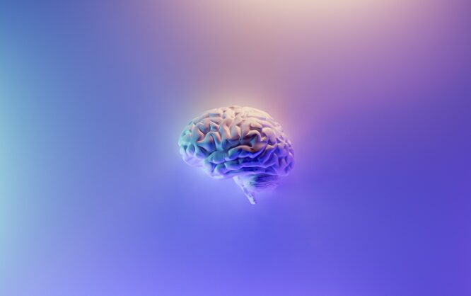
The human brain works in a way that you can't ignore if you want your design to be successful. Brain-friendly web design is what determines success and failure, so don't take it lightly.
As an experienced designer, you know that your designs cannot be judged purely by aesthetic taste. Luckily, especially when it comes to creating big designs, like e-commerce websites, user test procedures have become the standard. Even though we know the basics of creating designs, individual target groups can prefer some surprising specialties.
If you stick to Steve Krug's old recommendation "Don't make me think," at the very least, you have a rough idea of mistakes to avoid making. However, it can't hurt to have some more knowledge on the basic functionalities of the human brain. The following won't be about more psychological aspects. On that, you'll find articles on our website too, however.
 With fewer alternatives, decisions are easier to make. Your memory is to blame. Photo by Scott Webb on Unsplash[/caption]
What does that mean for our design? We should expect people that visit our website to lose orientation after a few seconds if we don't help them with a solid guide. According to Nielsen Norman, there are multiple aspects to keep in mind here:
The loading time of our websites should not be so long that we run the risk of transactions being canceled because the page's loading performance is too slow. Especially during the checkout process, you should pay attention to that, before the potential client forgets that he's still in a purchasing process.
Especially visited links should be highlighted in different colors, telling the user where he has been before. This way, there is no useless information taking up his limited storage slots. Overall, you can't have too much help and support, because you don't want the visit to depend on cognitive processes that exceed the ultra-short-term memory.
If you want to sell something, and you provide a good selection, make it easy for the visitor to compare the different offers to each other. Otherwise, the potential client won't be able to remember the individual features compared to the competing product, and consider canceling the purchase. Additionally, this also eases a qualified selection, which is made harder by the nature of the human memory otherwise.
If a human has to choose from too many options, the brain jams, as each option has to be evaluated. To do so, past experiences are considered. If too many of them are activated at the same time, evaluation takes more time than the user might be willing to spend. The principle of limitation of selection is the one Apple has been successfully using since the noughties.
[caption id="attachment_103346" align="aligncenter" width="1024"]
With fewer alternatives, decisions are easier to make. Your memory is to blame. Photo by Scott Webb on Unsplash[/caption]
What does that mean for our design? We should expect people that visit our website to lose orientation after a few seconds if we don't help them with a solid guide. According to Nielsen Norman, there are multiple aspects to keep in mind here:
The loading time of our websites should not be so long that we run the risk of transactions being canceled because the page's loading performance is too slow. Especially during the checkout process, you should pay attention to that, before the potential client forgets that he's still in a purchasing process.
Especially visited links should be highlighted in different colors, telling the user where he has been before. This way, there is no useless information taking up his limited storage slots. Overall, you can't have too much help and support, because you don't want the visit to depend on cognitive processes that exceed the ultra-short-term memory.
If you want to sell something, and you provide a good selection, make it easy for the visitor to compare the different offers to each other. Otherwise, the potential client won't be able to remember the individual features compared to the competing product, and consider canceling the purchase. Additionally, this also eases a qualified selection, which is made harder by the nature of the human memory otherwise.
If a human has to choose from too many options, the brain jams, as each option has to be evaluated. To do so, past experiences are considered. If too many of them are activated at the same time, evaluation takes more time than the user might be willing to spend. The principle of limitation of selection is the one Apple has been successfully using since the noughties.
[caption id="attachment_103346" align="aligncenter" width="1024"] Past Experiences Are a Significant Factor for Decision-Making Today. Image by Karolina Grabowska from Pixabay[/caption]
It is recommendable to initiate connections to possibly existing information in other parts of the brain's memory. This invokes interest and raises the chances of your visitor staying.
This triggering of connections is especially important when it comes to the navigation design. Depending on your page's complexity, it won't make sense to shorten the navigation to five or seven selections, to not be too demanding for your visitor's ultra-short-term memory. This could even backfire, as this kind of contraction would force you to design a very generic navigation. Then, this is likely to make it hard for visitors to get an idea of what's behind the terms, lowering the interaction rate.
When working on the navigation, we don't primarily work with the memory but focus on advanced cognitive processes instead. This is supposed to make it easy for the visitor to recognize what we offer, and move in the according direction. That job is done by meaningful symbols, clear texts, and established nomenclature.
Generally, we can note down that our design should do everything possible to relieve the memory of the potential client. The less his ultra-short-term memory is challenged, the higher the chances of keeping him on our site.
Furthermore, a general recommendation is to go for a minimalistic design approach. Not only does this relieve the visitor's memory, but it also enables us to trigger connections to experiences and memories stored in deeper memory layers. Once again, the recommendation to keep the amount of information to process as low as possible plays a role.
[caption id="attachment_103347" align="aligncenter" width="1024"]
Past Experiences Are a Significant Factor for Decision-Making Today. Image by Karolina Grabowska from Pixabay[/caption]
It is recommendable to initiate connections to possibly existing information in other parts of the brain's memory. This invokes interest and raises the chances of your visitor staying.
This triggering of connections is especially important when it comes to the navigation design. Depending on your page's complexity, it won't make sense to shorten the navigation to five or seven selections, to not be too demanding for your visitor's ultra-short-term memory. This could even backfire, as this kind of contraction would force you to design a very generic navigation. Then, this is likely to make it hard for visitors to get an idea of what's behind the terms, lowering the interaction rate.
When working on the navigation, we don't primarily work with the memory but focus on advanced cognitive processes instead. This is supposed to make it easy for the visitor to recognize what we offer, and move in the according direction. That job is done by meaningful symbols, clear texts, and established nomenclature.
Generally, we can note down that our design should do everything possible to relieve the memory of the potential client. The less his ultra-short-term memory is challenged, the higher the chances of keeping him on our site.
Furthermore, a general recommendation is to go for a minimalistic design approach. Not only does this relieve the visitor's memory, but it also enables us to trigger connections to experiences and memories stored in deeper memory layers. Once again, the recommendation to keep the amount of information to process as low as possible plays a role.
[caption id="attachment_103347" align="aligncenter" width="1024"] Reserved, Clear Designs Unburden the Visitor. Photo by picjumbo.com on Pexels[/caption]
Now, once we've succeeded at moving the visitor past the stage of the ultra-short-term memory, we should try to create a permanent connection, moving into the long-term memory via brain-friendly web design. The classic path there leads through the repeated application and focused effort. Both require will force on the side of the target user. We can hardly affect that.
Of course, it is possible to subliminally activate the effect of repetition with a very clear and clean design, letting us "cheat" our way into the user's long-term memory. We don't have any way to trigger the focused effort, though.
Luckily, there is another way to enter the long-term memory. This one leads through emotions. If you succeed at activating fundamental emotions with your design, chances of leaving a lasting memory are high. The problem with emotions is the wide grey zone in which humans have a completely different emotional response to the same visual stimulus. You would have to go for unambiguous accents which means you would be moving in extremes. I'm not too comfortable with that, so I'll leave the appeal to emotions to you.
However, you should not ignore the emotional factor when it comes to the feelings invoked by your UX design. A bad user experience leads to your website being forgotten. However, the subtle feeling of the bad experience remains for a long time. Vice versa, a positive user experience can get you visitors that return happily and often, as they enjoy your site, or because it has such a pretty design. There are various reasons why.
Reserved, Clear Designs Unburden the Visitor. Photo by picjumbo.com on Pexels[/caption]
Now, once we've succeeded at moving the visitor past the stage of the ultra-short-term memory, we should try to create a permanent connection, moving into the long-term memory via brain-friendly web design. The classic path there leads through the repeated application and focused effort. Both require will force on the side of the target user. We can hardly affect that.
Of course, it is possible to subliminally activate the effect of repetition with a very clear and clean design, letting us "cheat" our way into the user's long-term memory. We don't have any way to trigger the focused effort, though.
Luckily, there is another way to enter the long-term memory. This one leads through emotions. If you succeed at activating fundamental emotions with your design, chances of leaving a lasting memory are high. The problem with emotions is the wide grey zone in which humans have a completely different emotional response to the same visual stimulus. You would have to go for unambiguous accents which means you would be moving in extremes. I'm not too comfortable with that, so I'll leave the appeal to emotions to you.
However, you should not ignore the emotional factor when it comes to the feelings invoked by your UX design. A bad user experience leads to your website being forgotten. However, the subtle feeling of the bad experience remains for a long time. Vice versa, a positive user experience can get you visitors that return happily and often, as they enjoy your site, or because it has such a pretty design. There are various reasons why.
The Brain as an Example for Natural Algorithmics
Please keep in mind that the following is not a medically accurate explanation. The simplifications allow you to understand just as much as you need for work. If you're already studying medicine, this article is not for you. The human brain works in repeating loops from simple to difficult. This process is what today's artificial neuronal webs try to imitate algorithmically. The term "Deep Learning" is associated with that. This rough display of the work method already allows conclusions regarding how you should set up a website. Easy to control from the get-go, with the option to dig deeper as needed.The Different Function Areas of the Human Memory
One of our brain's main performance features is the memory. One could be tempted to compare it to a hard drive. Like data on a hard drive, information is stored in our memory. However, this is way too short-sighted. Our memory is not just a mass storage but divided into different "departments." There are different methods to classify the memory. The method that is relevant to us is the one going off the duration of "storage." The ultra-short-term memory is a purely sensorial function area. Here, with a maximum of a few seconds, sensory input is saved just long enough to create a context from the combination of multiple inputs. In the working memory, we keep content that we need in a defined context for a little while. For example, we store an address, to enter it into the navigation device, and will have forgotten it shortly after successfully entering it. The short-term memory works with a timeframe of a few hours and is usually considered a pre-stage of the long-term memory. Information stored in the short-term memory can be moved to the long-term memory via repetition. A lot of well-known learning systems use this principle. The long-term memory is used for the permanent storage of information and is used whenever information is needed for more than a few days. Here, storage can even be lifelong. If we wanted to compare the memory to a hard drive, the long-term memory would be the closest comparison we can get. However, when looking at the working method of the long-term memory, it is evident that we can't compare it to some kind of hard drive. Saving information that just entered the long-term memory is not just done using free storage space, or by overwriting data that is free to delete. Instead, the brain integrates the new information into existing structures. It creates new memory content, connecting it to existing content, so to speak. Here, existing experiences are just as important as basic questions of attitude in general. The new information alters the old information to fit in. In other words: the information in the long-term memory is never completely objective. We would never buy that kind of hard drive.When Brain-Friendly Design Tries to Overcome the Memory
Now that we know how the human memory works, we ask ourselves which areas we want to address. The answer is connected to the question what we want to achieve. On the lowest level, we definitely need to get past the ultra-short-term memory. Here, information is only kept for a maximum of 20 seconds before it vanishes. During scientific studies in 1956, it was proven, that the number of memorable information snippets in the ultra-short-term memory is about seven plus/minus two. Later on, it was clarified that the capacity indication was related to seven numbers. With letters, the capacity limit was six, and for words, it was five. [caption id="attachment_103348" align="aligncenter" width="1024"] With fewer alternatives, decisions are easier to make. Your memory is to blame. Photo by Scott Webb on Unsplash[/caption]
What does that mean for our design? We should expect people that visit our website to lose orientation after a few seconds if we don't help them with a solid guide. According to Nielsen Norman, there are multiple aspects to keep in mind here:
The loading time of our websites should not be so long that we run the risk of transactions being canceled because the page's loading performance is too slow. Especially during the checkout process, you should pay attention to that, before the potential client forgets that he's still in a purchasing process.
Especially visited links should be highlighted in different colors, telling the user where he has been before. This way, there is no useless information taking up his limited storage slots. Overall, you can't have too much help and support, because you don't want the visit to depend on cognitive processes that exceed the ultra-short-term memory.
If you want to sell something, and you provide a good selection, make it easy for the visitor to compare the different offers to each other. Otherwise, the potential client won't be able to remember the individual features compared to the competing product, and consider canceling the purchase. Additionally, this also eases a qualified selection, which is made harder by the nature of the human memory otherwise.
If a human has to choose from too many options, the brain jams, as each option has to be evaluated. To do so, past experiences are considered. If too many of them are activated at the same time, evaluation takes more time than the user might be willing to spend. The principle of limitation of selection is the one Apple has been successfully using since the noughties.
[caption id="attachment_103346" align="aligncenter" width="1024"] Past Experiences Are a Significant Factor for Decision-Making Today. Image by Karolina Grabowska from Pixabay[/caption]
It is recommendable to initiate connections to possibly existing information in other parts of the brain's memory. This invokes interest and raises the chances of your visitor staying.
This triggering of connections is especially important when it comes to the navigation design. Depending on your page's complexity, it won't make sense to shorten the navigation to five or seven selections, to not be too demanding for your visitor's ultra-short-term memory. This could even backfire, as this kind of contraction would force you to design a very generic navigation. Then, this is likely to make it hard for visitors to get an idea of what's behind the terms, lowering the interaction rate.
When working on the navigation, we don't primarily work with the memory but focus on advanced cognitive processes instead. This is supposed to make it easy for the visitor to recognize what we offer, and move in the according direction. That job is done by meaningful symbols, clear texts, and established nomenclature.
Generally, we can note down that our design should do everything possible to relieve the memory of the potential client. The less his ultra-short-term memory is challenged, the higher the chances of keeping him on our site.
Furthermore, a general recommendation is to go for a minimalistic design approach. Not only does this relieve the visitor's memory, but it also enables us to trigger connections to experiences and memories stored in deeper memory layers. Once again, the recommendation to keep the amount of information to process as low as possible plays a role.
[caption id="attachment_103347" align="aligncenter" width="1024"] Reserved, Clear Designs Unburden the Visitor. Photo by picjumbo.com on Pexels[/caption]
Now, once we've succeeded at moving the visitor past the stage of the ultra-short-term memory, we should try to create a permanent connection, moving into the long-term memory via brain-friendly web design. The classic path there leads through the repeated application and focused effort. Both require will force on the side of the target user. We can hardly affect that.
Of course, it is possible to subliminally activate the effect of repetition with a very clear and clean design, letting us "cheat" our way into the user's long-term memory. We don't have any way to trigger the focused effort, though.
Luckily, there is another way to enter the long-term memory. This one leads through emotions. If you succeed at activating fundamental emotions with your design, chances of leaving a lasting memory are high. The problem with emotions is the wide grey zone in which humans have a completely different emotional response to the same visual stimulus. You would have to go for unambiguous accents which means you would be moving in extremes. I'm not too comfortable with that, so I'll leave the appeal to emotions to you.
However, you should not ignore the emotional factor when it comes to the feelings invoked by your UX design. A bad user experience leads to your website being forgotten. However, the subtle feeling of the bad experience remains for a long time. Vice versa, a positive user experience can get you visitors that return happily and often, as they enjoy your site, or because it has such a pretty design. There are various reasons why.
Links on the Topic
- How Human Memory Works: Tips for UX Designers. | UX Planet
- Short-Term Memory and Web Usability | Nielsen Norman Group
- The Layers of our Memory | Brain, and Learning
- The Psychology of Colors in Marketing and Branding | Noupe
- Design principle: IKEA effect | UXDesign.cc
- 7 Proven Cognitive Biases (And How They Impact Your Design) | Sitepoint