
Design: Using Mobile Web Apps Has to be Simple

Creating something just because it's possible is a widespread bad habit in development. Especially smartphones provide a lot of technological options. But don't forget that the user wants to have an easy time with your mobile web apps. The following article tells you what exactly that means.
It's a perspective that designers rarely take: could the available interaction methods contain some that the user does not even want to use?
The consultancy Change Sciences looked into this exact question and got some surprising results. The scientists took a structured approach to the topic of mobile users with the help of smaller (up to 20 participants), and larger (up to 100 participants) studies.
For both responsive web design and native app design, they put out some solid recommendations you should consider if you want mobile users to turn into clients as well.
 Most smartphone users like to interact with only one hand necessary. (Photo: Pixabay)[/caption]
Swiping is no longer a problem for users either. Most of them try the gesture in the upper screen area, regardless of visual hints, such as arrows. In other areas of the screen, however, making users swipe takes visual clues.
Users know about tapping, but it's not one of the preferred interaction options. In contrast to clicking on the desktop, users are quick to lose patience with tapping.
Pinch zooming is a gesture that is avoided whenever possible. Thus, there is no reason to force the action on the users. Responsive design makes it easy for you to make zooming redundant. It turned out that users tend to look for an alternative before zooming for quite some time.
For mobile design, this means that you should integrate as few gestures as possible. If you have to use actions that are not easy to grasp, you could implement small animations that give hints regarding the usage.
Most smartphone users like to interact with only one hand necessary. (Photo: Pixabay)[/caption]
Swiping is no longer a problem for users either. Most of them try the gesture in the upper screen area, regardless of visual hints, such as arrows. In other areas of the screen, however, making users swipe takes visual clues.
Users know about tapping, but it's not one of the preferred interaction options. In contrast to clicking on the desktop, users are quick to lose patience with tapping.
Pinch zooming is a gesture that is avoided whenever possible. Thus, there is no reason to force the action on the users. Responsive design makes it easy for you to make zooming redundant. It turned out that users tend to look for an alternative before zooming for quite some time.
For mobile design, this means that you should integrate as few gestures as possible. If you have to use actions that are not easy to grasp, you could implement small animations that give hints regarding the usage.
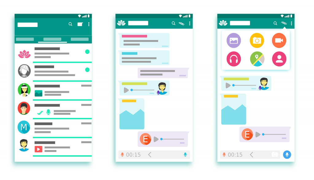 Messenger services are used for speech rather than text more and more often. (Illustration: Pixabay)[/caption]
For design, this means that you should entirely forgo type input, if possible. If not, you should go for as few input fields as possible.
Messenger services are used for speech rather than text more and more often. (Illustration: Pixabay)[/caption]
For design, this means that you should entirely forgo type input, if possible. If not, you should go for as few input fields as possible.
 Icons are ambiguous too often. (Photo: Pixabay)[/caption]
This is not good for the user. Users have no interest in deciphering the fiftieth super neat version of the search icon. Change Sciences found out that over 90 percent of the study participants only clearly understand the triangle (play) and the X (close). The hamburger icon, which is quite popular among designers, has been proven to be a bit unclear as well.
Icons are ambiguous too often. (Photo: Pixabay)[/caption]
This is not good for the user. Users have no interest in deciphering the fiftieth super neat version of the search icon. Change Sciences found out that over 90 percent of the study participants only clearly understand the triangle (play) and the X (close). The hamburger icon, which is quite popular among designers, has been proven to be a bit unclear as well.
Forgo Unnecessary Gestures
Change Sciences found out that mobile users mainly rely on three gestures, and, if possible, avoid the use of further interaction methods. Above all else, they don't want to be confronted with other control actions innovatively invented by the web app developer. According to that, the most important gestures are scrolling, swiping, and tapping. The scroll gesture is the most popular and most used action of all of them. According to Change Sciences, 94 percent of all users make use of this gesture more than three times in a session of at least ten minutes. Scrolling is already familiar from the desktop and its mouse controls. [caption id="attachment_104094" align="aligncenter" width="1024"] Most smartphone users like to interact with only one hand necessary. (Photo: Pixabay)[/caption]
Swiping is no longer a problem for users either. Most of them try the gesture in the upper screen area, regardless of visual hints, such as arrows. In other areas of the screen, however, making users swipe takes visual clues.
Users know about tapping, but it's not one of the preferred interaction options. In contrast to clicking on the desktop, users are quick to lose patience with tapping.
Pinch zooming is a gesture that is avoided whenever possible. Thus, there is no reason to force the action on the users. Responsive design makes it easy for you to make zooming redundant. It turned out that users tend to look for an alternative before zooming for quite some time.
For mobile design, this means that you should integrate as few gestures as possible. If you have to use actions that are not easy to grasp, you could implement small animations that give hints regarding the usage.
Demand as Little Typing as Possible
It's no surprise. People don't like to type on mobile devices. Thus, the necessity of extensive typing should be avoided, as it potentially leads to the client canceling the process, and leaving the site. The reluctance towards typing is so high, that visitors even accept the rather unpopular social login via Facebook or other networks, just to avoid it. [caption id="attachment_104095" align="aligncenter" width="1024"] Messenger services are used for speech rather than text more and more often. (Illustration: Pixabay)[/caption]
For design, this means that you should entirely forgo type input, if possible. If not, you should go for as few input fields as possible.
Only Use Clear Icons
Icons are one of the favorite toys of today's designers. You can already tell from the vast variety of download icon sets on the web. Almost every day, at least two pictogram collections enter the market. [caption id="attachment_104092" align="aligncenter" width="1024"] Icons are ambiguous too often. (Photo: Pixabay)[/caption]
This is not good for the user. Users have no interest in deciphering the fiftieth super neat version of the search icon. Change Sciences found out that over 90 percent of the study participants only clearly understand the triangle (play) and the X (close). The hamburger icon, which is quite popular among designers, has been proven to be a bit unclear as well.
Navigation Does Not Belong to the End of the Screen
At a glance, this is a good idea: hold the smartphone in one hand, giving you easy access to the lower parts of the screen. So, placing the navigation there should be logical. Studies, however, show that users always look for the navigation at the top, and tend to ignore menus at the bottom. This is another circumstance likely related to computer usage, as, since the introduction of the operating system Windows, navigations have always been located at the top of the screen. The last software I remember with menus at the bottom was the good old Microsoft Word 5. The escape key took the user to the menu. Nowadays, no developer would do this, but back then, this was the market leader.Don't Forgo a Back Button
When surfing on the desktop, the back button, which always takes us back one step, is one of the most important control elements. Generations of developers have tried to get rid of this undesired behavior, but they were only moderately successful. Thus, it is recommended to go with the masses, and always provide users with options to take on step back. The swipe feature of iOS is very well made. Here, a swipe to the right takes users to the previous screen. With Android, the arrow icon has to do the job. In both cases, you should still offer an independent solution, like a back arrow in the top area of the screen. Think of the OS-exclusive solutions as additional options.Other Results of the Change Sciences Team
- Multitasking does not happen on mobile devices. The newer approaches that allow for multiple apps to be displayed and used at once are useless on the small screen. Only larger apps make users display multiple applications at once (just to use them one by one anyway).
- In contrast to desktop devices sound is an established and even expected feedback method on mobile devices. We all know the classic sound of "pull to refresh".
- The distinction of the first and second screen is blurred. When using the mobile device as a so-called "second screen", when watching TV, for example, the usage of the smartphone outweighs the usage of the supposed first screen.
- Mobile users expect a better user experience than provided by desktop devices. One of the reasons for that is that the small screen forces websites and apps to be designed more economically. This makes them seem clearer and less packed. The fact that there's less room for ads is regarded with favor as well.
- Organizing Mobile | Luke Wroblewski
- Discover how people really use the mobile web | Creative Bloq
- How to Design for Mobile UX | Marc Schenker
- Mobile vs Desktop: 13 Essential User Behaviors | Madalina Lambrea
- Motivating Users: Behavioral Psychology in Mobile Design | Worry Free Labs
- 10 mobile behaviours and how to design for them | Pamela Pavliscak
I used the same or some of the SEO tips when I started and I did saw an increase in my website traffic. But there’s one mistake that I did to my blogs – It is cluttering my blog with ads. So, remember to always use Optimized images & lesser ads for your blog to load your blog/website fast.