
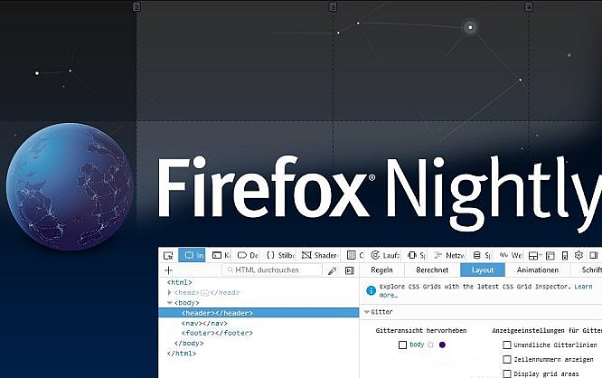
Full Control over Grids: Firefox’ New Layout Panel For CSS Grids
Previously, proper grid based layouts were only possible via inconvenient ways. The new CSS grids, which have been available in the newer versions of the popular browsers for a little while now, finally allow for these layouts. In Firefox, at least in the Nightly version, there's a new layout panel in the inspector of developer tools, making dealing with CSS grids easier.
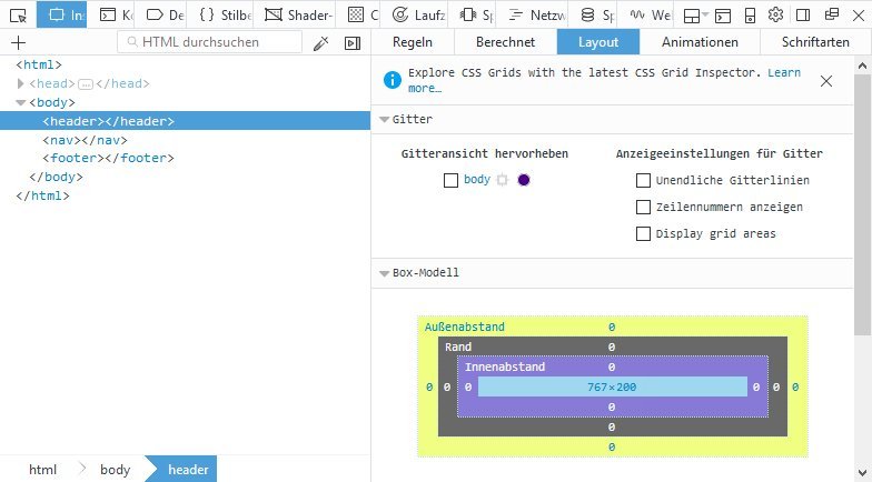 You can reach the layout panel by accessing the developer tools and switching to the inspector. There, you'll locate the layout panel. For each grid element, there's a button that displays the grid for the respective element. In the browser window, the grid lines are placed on top of the layout, highlighting the grid you defined via CSS-Grids.
The raster is also displayed in the panel itself. Moving the mouse over said raster highlights the respective row in both the inspector and the browser window.
You can reach the layout panel by accessing the developer tools and switching to the inspector. There, you'll locate the layout panel. For each grid element, there's a button that displays the grid for the respective element. In the browser window, the grid lines are placed on top of the layout, highlighting the grid you defined via CSS-Grids.
The raster is also displayed in the panel itself. Moving the mouse over said raster highlights the respective row in both the inspector and the browser window.
 Showing row numbers makes it easier for you to locate specific grid cells. The optional infinite grid lines extend the grid's lines past the respective grid element. This can be both useful and annoying, which is why hiding and showing this option makes sense.
 If you move your mouse in across a grid cell in the layout panel, not only the cell but also the area it is assigned to will be highlighted in the browser.
Better Layouts Via CSS Grids
The new grid model finally allows us to develop complex designs that are based on a custom grid. You get to define CSS columns and rows, distances, and widths. Afterward, any desired elements will be placed inside of the grid.body {
display: grid;
grid-template-rows: 200px 1fr 100px;
grid-template-columns: 25% 25% 25% 25%;
}
For a grid layout, the "display" attribute needs to be converted to the new layout model via "grid." Subsequently, the grid's rows and columns are defined using "grid-template-rows" and "grid-template-columns". Here, both absolute and relative specifications are possible.
For each row or column, a value is distributed. The combination of absolute and relative values is possible. This allows rows to have fixed values, as shown in the example. The unit "fr" for fraction allows us to create flexible widths and heights. Here, the unit "fr" fills the empty space within the grid.
Additionally, you can use "grid-row-gap" and "grid-column-gap" to define gaps between the individual grid cells. This gives you the opportunity to develop unique and flexible grids for your web layouts.
Once the grid has been defined, the individual contents have to be placed. To do so, define in which of the grid's cells the content is supposed to be set.
header {
  grid-column-start: 1;
  grid-column-end: 5;
  grid-row-start: 1;
  grid-row-end: 2;
}
Use "grid-column-start" and "grid-column-end" to select the start and end points within the raster. Analogously to that, there's "grid-row-start" and "grid-row-end." These four attributes define the cells within which the respective element will be.
The principle of the CSS grid is pretty simple. The markup, on the other hand, is not as easy to grasp - especially when it comes to more complex grids. Here's where the new layout panel of Firefox's inspector enters into play.
New Layout Panel Shows Grids
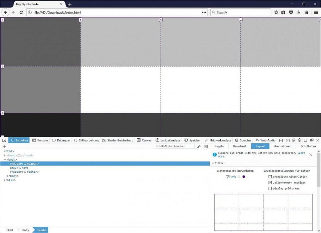
First of all, the new panel makes sure that all grids defined on a page are displayed. While the actual grid is not visible on a website, Firefox displays the individual columns and rows, as well as potential gaps, making it easier for developers to find their way within the grid.
You can reach the layout panel by accessing the developer tools and switching to the inspector. There, you'll locate the layout panel. For each grid element, there's a button that displays the grid for the respective element. In the browser window, the grid lines are placed on top of the layout, highlighting the grid you defined via CSS-Grids.
The raster is also displayed in the panel itself. Moving the mouse over said raster highlights the respective row in both the inspector and the browser window.
Showing row numbers makes it easier for you to locate specific grid cells. The optional infinite grid lines extend the grid's lines past the respective grid element. This can be both useful and annoying, which is why hiding and showing this option makes sense.
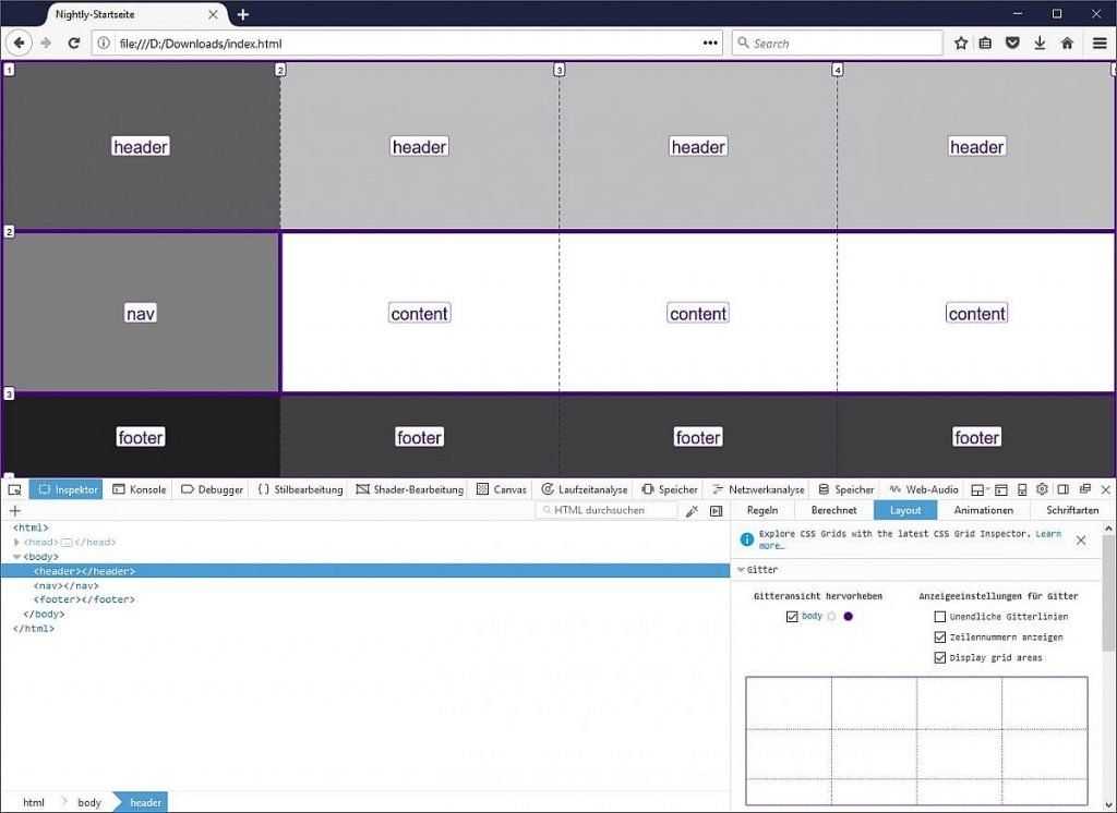
Naming and Displaying Grid Areas
The CSS attribute "grid-areas" lets you name areas within your grid, pooling them into some sort of group. All cells with the same label become one group.grid-template-areas: "header header header header" "nav content content content" "footer footer footer footer";The option "Display grid areas" displays these grid areas in the browser window. Here, the individual areas are highlighted within the grid, using a thicker line. Additionally, the area's respective label is displayed.
If you move your mouse in across a grid cell in the layout panel, not only the cell but also the area it is assigned to will be highlighted in the browser.
Thank you for your sharing. Thanks to this article I can learn more things. Expand your knowledge and abilities. Actually the article is very practical. Thank you!