
Google Resizer Cares for Responsive Design
Thanks to plenty of types of mobile devices, contemporary websites need to be designed for different resolutions and orientations. However, to see how a site looks on a tablet, smartphone, or a standard monitor, it's not necessary to have all devices ready at all times. Google Resizer is a handy web tool which will easily show you a website for many different types of devices and resolutions.
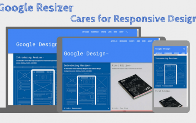
 Display on Desktop, Tablet and Smartphone at One Glance
Google has developed this tool specifically for its Material Design. It's supposed to help web designers and developers test breakpoints, as well as responsive rosters on the different resolutions. But any other website, which is not based on Google's Material Design can be tested on various devices via Google Resizer.
Display on Desktop, Tablet and Smartphone at One Glance
Google has developed this tool specifically for its Material Design. It's supposed to help web designers and developers test breakpoints, as well as responsive rosters on the different resolutions. But any other website, which is not based on Google's Material Design can be tested on various devices via Google Resizer.
 Display on the Desktop With Different Breakpoints
This way, you can quickly see how your website reacts when it appears on larger or smaller monitors or browser sizes. The sizes are obtained from the guidelines of Google's Material Design. There, seven breakpoints, which are named accordingly, are defined. Thus, there are different breakpoints between "Window xsmall" and "Window xlarge".
Display on the Desktop With Different Breakpoints
This way, you can quickly see how your website reacts when it appears on larger or smaller monitors or browser sizes. The sizes are obtained from the guidelines of Google's Material Design. There, seven breakpoints, which are named accordingly, are defined. Thus, there are different breakpoints between "Window xsmall" and "Window xlarge".
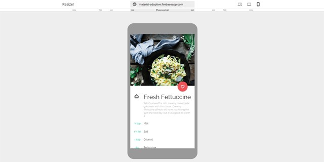 Display on a Smartphone
Apart from the screen in portrait mode, Google Resizer also offers the respective landscape mode. The largest available resolution is 1024 pixels wide, which is the resolution of a conventional tablet.
Display on a Smartphone
Apart from the screen in portrait mode, Google Resizer also offers the respective landscape mode. The largest available resolution is 1024 pixels wide, which is the resolution of a conventional tablet.
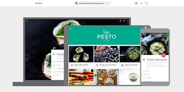
Enter Adress and Get Started
Using Google Resizer is as easy as it gets. Simply enter the address of the website that you want to test on responsitivity, and you'll instantly receive a display of your site on the three standard device classes desktop, tablet, and smartphone. Via Iframe, the website appears in the resolution fitting to the respective device. This means that you can navigate through your site as usual and appropriately test each page.
Display on Desktop, Tablet and Smartphone at One Glance
Google has developed this tool specifically for its Material Design. It's supposed to help web designers and developers test breakpoints, as well as responsive rosters on the different resolutions. But any other website, which is not based on Google's Material Design can be tested on various devices via Google Resizer.
Considering Different Desktop Resolutions
Besides the joint display of all three devices, there are different pages for desktop and mobile device, respectively. A ruler with common resolutions is displayed for the desktop page. There are seven different widths to choose from, ranging from 1600 pixels to 480 pixels. A click on the ruler changes the resolution and adjusts your website accordingly.
Display on the Desktop With Different Breakpoints
This way, you can quickly see how your website reacts when it appears on larger or smaller monitors or browser sizes. The sizes are obtained from the guidelines of Google's Material Design. There, seven breakpoints, which are named accordingly, are defined. Thus, there are different breakpoints between "Window xsmall" and "Window xlarge".
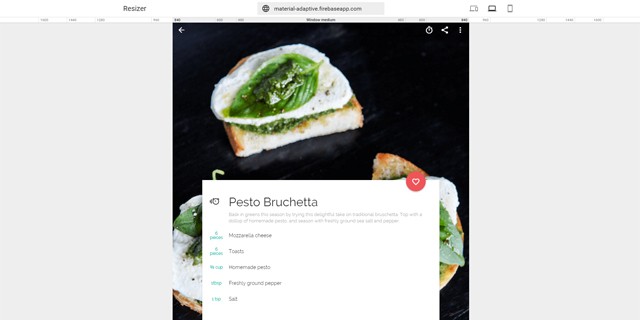
Testing for Mobile Devices
You can check how your website looks on smartphones and tablets on an own page. There, you'll find another ruler with typical resolutions, in this case however; they are specifically used for smartphones and tablets. This allows you to test your website on a standard smartphone with a resolution of 360 pixels in width.
Display on a Smartphone
Apart from the screen in portrait mode, Google Resizer also offers the respective landscape mode. The largest available resolution is 1024 pixels wide, which is the resolution of a conventional tablet.
That’s a wonderful tool. Designers should use it.
My website is responsive, but definitely a helpful tool that never heard of before, i’ll try it out, thanks!
Never use this tool…but..Yet some of my customers still prefer the version unresponsive because they have more pleasure personally to see the entire site. http://web2master.it