
How Does Google’s New Ranking Factor Mobile-Friendly Affect Your Website?
Google has been changing its search algorithm time and again to deliver better search results. Factors like keywords, link building, and loading performance play a key role in how Google ranks a website. On April 21st Google officially issued a new ranking factor: the mobile-friendliness of a website. How is this going to affect site operators and what does mobile-friendliness mean from Google's point of view?
 This website is mobile friendly ;-)
A while ago, Google started labeling websites that are optimized for mobile devices in its mobile search results. It makes no difference if a website provides a separate mobile version or a responsive design. If there's a separate mobile version, Google will only feature this in the search results and the desktop version will be omitted.
The mobile-friendly factor doesn't affect the desktop version of a Google search. Generally, Google doesn't consider tablets to be mobile devices, so it will list the "normal" websites in the search results.
This website is mobile friendly ;-)
A while ago, Google started labeling websites that are optimized for mobile devices in its mobile search results. It makes no difference if a website provides a separate mobile version or a responsive design. If there's a separate mobile version, Google will only feature this in the search results and the desktop version will be omitted.
The mobile-friendly factor doesn't affect the desktop version of a Google search. Generally, Google doesn't consider tablets to be mobile devices, so it will list the "normal" websites in the search results.
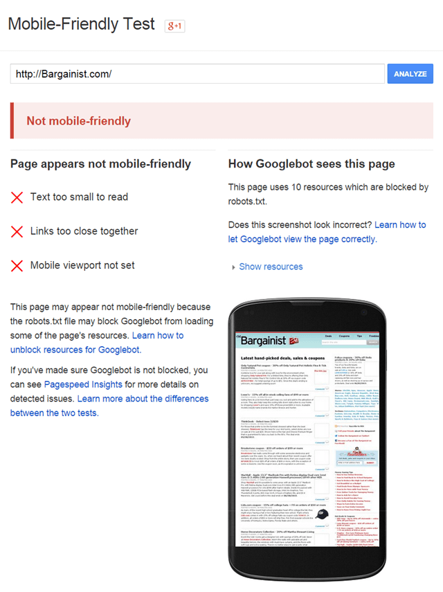 Failed mobile-friendliness test
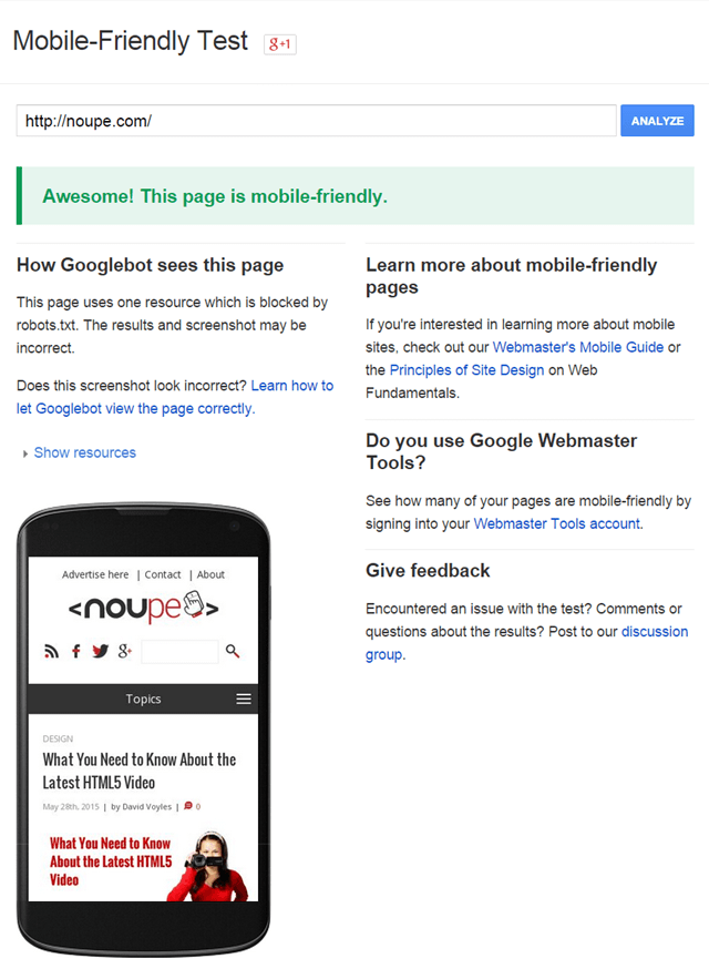
Google provides a tool to check if a website meets all criteria. This "Mobile-Friendly Test" only requires the URL of the website you want to analyze. In the best case, Google gives you the green light signalizing that the page is mobile friendly. In any other case, the tool notifies you about the factors the page doesn't meet.
In addition, Google references pages that will help you optimizing your website for mobile devices. The search engine gives advice for externally developed websites, so you'll know what to take care of when cooperating with developers on building a mobile-friendly website.
Failed mobile-friendliness test
Google provides a tool to check if a website meets all criteria. This "Mobile-Friendly Test" only requires the URL of the website you want to analyze. In the best case, Google gives you the green light signalizing that the page is mobile friendly. In any other case, the tool notifies you about the factors the page doesn't meet.
In addition, Google references pages that will help you optimizing your website for mobile devices. The search engine gives advice for externally developed websites, so you'll know what to take care of when cooperating with developers on building a mobile-friendly website.
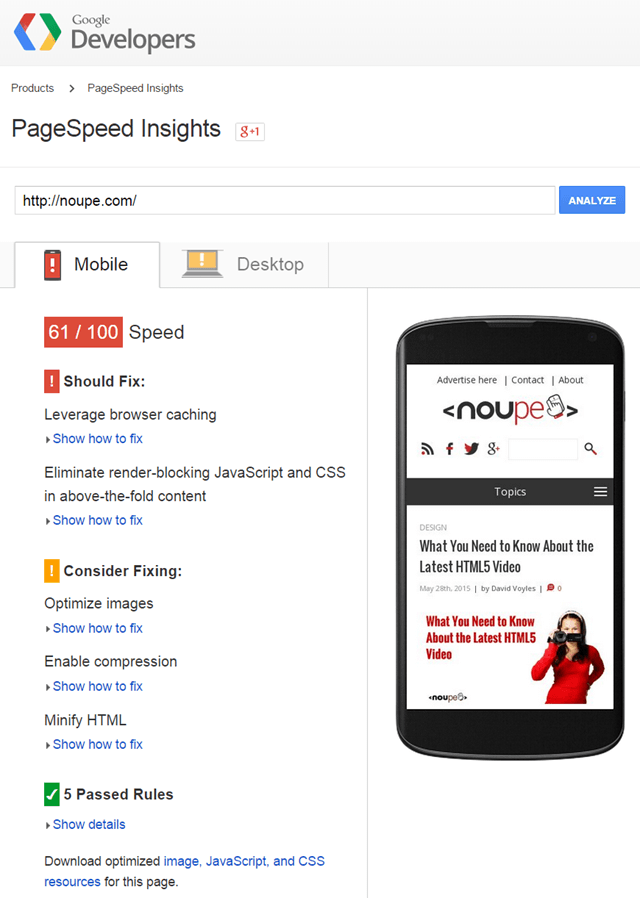 Google PageSpeed Insights rating (still work to do for Noupe's developers)
Google PageSpeed Insights analyzes the loading performance of a website. You can achieve a maximum score of 100 points, and it also reveals the weak spots. For example, too large or rather poorly compressed images or JavaScript that blocks or delays the content loading can be reasons for a bad ranking. Besides the performance, PageSpeed Insights rates the user behavior, also awarding 100 points in the best case.
Too small fonts and plugins have a negative impact on the score. PageSpeed Insights rates websites for mobile and desktop devices separately. Usually, the maximum score is easier to achieve for desktop devices because here loading performance is not as important as for mobile web.
Google PageSpeed Insights rating (still work to do for Noupe's developers)
Google PageSpeed Insights analyzes the loading performance of a website. You can achieve a maximum score of 100 points, and it also reveals the weak spots. For example, too large or rather poorly compressed images or JavaScript that blocks or delays the content loading can be reasons for a bad ranking. Besides the performance, PageSpeed Insights rates the user behavior, also awarding 100 points in the best case.
Too small fonts and plugins have a negative impact on the score. PageSpeed Insights rates websites for mobile and desktop devices separately. Usually, the maximum score is easier to achieve for desktop devices because here loading performance is not as important as for mobile web.
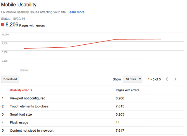 Mobile Usability in Google's Webmaster Tools
Increasing Importance of Mobile Web
It shouldn't come as a surprise that Google has now officially introduced this new ranking factor. We're using smartphones and tablets more frequently to search the web. Indeed, the same applies to the Google search. It is understandable that Google wants to prioritize websites for mobile devices that can be optimally displayed on them.
This website is mobile friendly ;-)
A while ago, Google started labeling websites that are optimized for mobile devices in its mobile search results. It makes no difference if a website provides a separate mobile version or a responsive design. If there's a separate mobile version, Google will only feature this in the search results and the desktop version will be omitted.
The mobile-friendly factor doesn't affect the desktop version of a Google search. Generally, Google doesn't consider tablets to be mobile devices, so it will list the "normal" websites in the search results.
Check If Your Website Is Mobile Friendly
Google has defined some criteria that must be met by a website to be considered mobile friendly such as using text that is readable without zooming, the website's width must not be wider than the viewport, so that you don't have to scroll horizontally. Also, links have to be placed far enough apart, so that they can be easily tapped - without running the danger of accidentally opening another link. It goes without saying that technology like Flash should be avoided. Flash often is not supported on smartphones and tablets anyway. For pages using Flash, Google points out in their mobile search results that they may not work on the device. It can't be ruled out in the future that Google will display a similar note for other mobile-friendly criteria that haven't been met.
Failed mobile-friendliness test
Google provides a tool to check if a website meets all criteria. This "Mobile-Friendly Test" only requires the URL of the website you want to analyze. In the best case, Google gives you the green light signalizing that the page is mobile friendly. In any other case, the tool notifies you about the factors the page doesn't meet.
In addition, Google references pages that will help you optimizing your website for mobile devices. The search engine gives advice for externally developed websites, so you'll know what to take care of when cooperating with developers on building a mobile-friendly website.
Tell Google How the Mobile Website Is Served
If the website doesn't have a responsive design, you should tell Google how the mobile website is served to be considered in the search results. Besides the responsive design, there are two other common ways to build a mobile website version. For one, you can provide two separate versions of a website that can be called by different URLs - for instance, www.example.com for the desktop version and "m.example.com" for the mobile version. Make sure you signal Google the relationship between the two URLs by adding to the desktop version a redirection to the mobile version for certain viewport widths.<link rel="alternate" media="only screen and (max-width: 320px)" href="http://m.example.com/" ><link rel="canonical" href="http://www.example.com/" >Vary: User-AgentPerformance Matters
Loading performance becomes more important especially for mobile web users because high bandwidth is not always provided. Also, data packages are often limited, so it should be in the interest of users to create only few data transfer. In the search results Google gives, or rather gave, some users a warning of websites with slow loading performance in form of a red-highlighted "Slow". So far, only few users of the mobile search experienced this warning. So, we don't know if this is going to be permanently integrated into the search. But what we do know is that performance plays an important role. Google makes higher demands on performance for the mobile search than for the standard search. Luckily, Google provides a tool to measure the performance: Google PageSpeed Insights.
Google PageSpeed Insights rating (still work to do for Noupe's developers)
Google PageSpeed Insights analyzes the loading performance of a website. You can achieve a maximum score of 100 points, and it also reveals the weak spots. For example, too large or rather poorly compressed images or JavaScript that blocks or delays the content loading can be reasons for a bad ranking. Besides the performance, PageSpeed Insights rates the user behavior, also awarding 100 points in the best case.
Too small fonts and plugins have a negative impact on the score. PageSpeed Insights rates websites for mobile and desktop devices separately. Usually, the maximum score is easier to achieve for desktop devices because here loading performance is not as important as for mobile web.
Users of Google's Webmaster Tools
Users of Google's Webmaster Tools are told if the listed websites are mobile friendly. You can find the information under Search Queries => Mobile Usability. There's an overview of the errors and the number of pages that are affected.
Mobile Usability in Google's Webmaster Tools
Conclusion and Related Links
Websites should be optimized for mobile devices - and not only since Google's mobile-friendly factor. But the new ranking factor is yet another reason for why websites should be optimally displayed on smartphones and tablets - ideally with the help of responsive design.Photo by Solen Feyissa on Unsplash
(dpe)
Really usefull information. We will follow for all of our website
Thanks Denis for sharing this. As the world is moving toward the portable devices its always a good practice to make your site device compatible. Let me check all of mine. LOL
Hey!I agree with you mobile friendly website is very important for google. Our website was not responsive so we have to suffer a lot from the google latest update. Now we are designing and developing our website again to make it google friendly.