Media queries allow websites to adjust their layout depending on the screen orientation of a smartphone or tablet. But sometimes you may want your website locked to a particular orientation, portrait or landscape. The format of native apps can be specified in such a case. The app will then only be displayed in the preset format – independently from the actual device orientation. By using the HTML5 Screen Orientation API, you can now define the screen orientation in JavaScript.
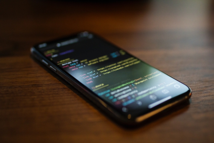
Define Screen Orientation for a Document
The screen orientation can be adjusted via the screen.orientation property and the lock() method. The method’s default value is “any”. This allows the device to apply any orientation depending on the physical orientation of the device. The value “natural” displays the website in the device’s natural orientation, which varies from device to device. Smartphones usually use the portrait mode, whereas tablets prefer the landscape mode.
screen.orientation.lock("natural");
In the above example, it’s set to the natural orientation of the device.
Of course, the Screen Orientation API also allows you to define an individual orientation. You can choose between four values, which cover all possible orientations of mobile devices. These are: “portrait-primary”, “portrait-secondary”, “landscape-primary”, and “landscape-secondary”.
All four values: “portrait-primary”, “portrait-secondary”, “landscape-primary”, and “landscape-secondary”
The value “portrait-primary” for smartphones is identical to the value “natural” and corresponds to the default orientation. The value “portrait-secondary” rotates the portrait mode 180°, so that the website is virtually upside down when holding the device in its natural orientation.
screen.orientation.lock("portrait-primary");
Similarly, “landscape-secondary” differs from “landscape-primary” in its 180° rotation.
You can also do without “primary” and “secondary”, and only use “portrait” or “landscape” as keywords. This allows the device to display both orientation modes.
If you want to remove the defined orientation, call the unlock() method.
screen.orientation.unlock();
For Full-Screen Mode Only
There are two requirements for defining the orientation via screen.orientation. First, locking via lock() only works if the browser has been switched to full-screen mode via requestFullscreen(). The second requirement is closely connected to the first one: As the full-screen mode requires a user request rather than starting automatically, this applies to the Screen Orientation API, too.
Thus, you should bind the call of both methods to a click event.
document.getElementById("button").addEventListener("click", function() {
document.documentElement.requestFullScreen();
screen.orientation.lock("portrait-primary");
}, false);
It’s important to start the full-screen mode before applying the lock() method, as shown in the example above. Ending the full-screen mode will release the locked orientation.
If you open a new document in the browser, for example, when calling a link, the defined orientation along with the full-screen mode will be ended. The Screen Orientation API only works for the current HTML document.
Read Orientation
You won’t always want to predefine the orientation. Sometimes you just want to know the orientation of a smartphone or tablet. In this case, you can let the Screen Orientation API read the orientation. The type property displays one of the orientation keywords.
alert(screen.orientation.type);
But you can also display the orientation angle by using the angle property.
alert(screen.orientation.angle);
An angle of 0° corresponds to the natural orientation, which is mostly “portrait-primary” for smartphones. 90° correspond to “landscape-primary”, 180° to “portrait-secondary”, and 270° to “landscape-secondary”. Depending on the device, the angles can stand for different keywords.
In order to query the orientation, the browser needs to be run in full-screen mode.
It’s also possible to respond to a change of the screen orientation via change event. Just add the addEventListener() and a function to the orientation property.
screen.orientation.addEventListener("change", function(e) {
alert(screen.orientation.type + " " + screen.orientation.angle);
}, false);
Each change of the orientation triggers an alert, which displays the current orientation as a keyword and angle.
Browser Support
The Screen Orientation API is supported in Chrome 38+ and Opera 25+ without vendor prefixes. Of course, the API only works on mobile devices. You can use an if statement to find out if a browser supports the API.
if ("orientation" in screen) {
…
}
Then you can display a notification for browsers that don’t support the API to bring the device into a certain orientation manually . Furthermore, desktop browsers that don’t support the API don’t show an error message if the API was called within this query.
The Screen Orientation API is relatively new. Early development stages of the API used some different method names. For example: lockOrientation() instead of lock() and unlockOrientation() instead of unlock(). You shouldn’t use the old names for Chrome and Opera.
These are supported in Internet Explorer 11+ and Firefox 33+; however, they require the appropriate prefix – ms for Internet Explorer and moz for Firefox.
screen.msLockOrientation.lock("portrait-primary");
screen.mozLockOrientation.lock("portrait-primary");
The event name for detecting an orientation change also differs from the current API name. Instead of using “change”, you’ll need to use “orientationchange” with the appropriate prefix.
If you want to cover all browsers, you have no option but using both, the old and new name, and minding the vendor prefixes for the old names.
One last thing you should keep in mind when using the Screen Orientation API: As it only works with the Fullscreen API, you shouldn’t use it for designing websites or something like that. It works better for browser games or other apps that require a full-screen mode.
Photo by Nangialai Stoman on Unsplash

















Send Comment:
4 Comments:
129 days ago
Awesome, i almost thought this was impossible!
More than a year ago
How should I write it
For example in html we write
But how should we write it here
More than a year ago
Great! Thank you very much! I love you! ?
More than a year ago
Great article ... i needed little help if you can guide me i implemented screen orientation api but i end up with this error can you help me to resolve this issue.
here is my javascript code and it runs onload function.
function myFunction() {
if ('orientation' in screen) {
alert("API supported, yeah!");
document.onclick = function (argument) {
var conf = confirm("Fullscreen mode?");
var docelem = document.documentElement;
if (conf == true) {
if (docelem.requestFullscreen) {
docelem.requestFullscreen();
}
else if (docelem.mozRequestFullScreen) {
docelem.mozRequestFullScreen();
}
else if (docelem.webkitRequestFullScreen) {
docelem.webkitRequestFullScreen();
}
else if (docelem.msRequestFullscreen) {
docelem.msRequestFullscreen();
}
}
}
screen.orientation.addEventListener("change", function(e) {
alert(screen.orientation.type + " " + screen.orientation.angle);
if(screen.orientation.type === "portrait-primary")
{
screen.orientation.lock('landscape');
}
}, false);
} else {
alert("API not supported !");
}
}
It gives the following error!
Uncaught (in promise) DOMException: lockOrientation() is not available on this device.
is there any way to resolve this issue i am trying to disable the portrait mode of mobile screen.
waiting for your quick reply