Immortal Technique: A Quick Look at Minimalism
There's a little bit of murmuring going on that the design technique, most affectionately referred to as minimalism, is dying and/or dead. I couldn't disagree more. I believe that minimalism is not dead, mainly because people don't quite realize what it is.
Unfortunately, it seems like people think of it more as a style or trend, rather than what I truly think it is--more of a technique or a loose rubric. The technique is able to conform to different situations--if we are talking web design, you can use minimalism in a portfolio, a webshop or whatever it is that you are designing.
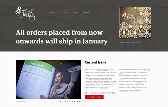 As you can see, here, there is a lot of focus put on the typography and making sure it is legible. Pictures aren't all over the place, but are neatly set up in their designated spaces.
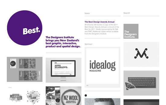 This site uses some flat color with nice splashes of purple and a great layout to draw your eyes to the most important parts of the website. I'd say this is a site that doesn't stray too far from the roots of minimalism, while throwing in some nicer, more designer elements.
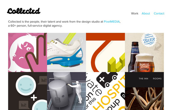 What you will notice in a lot of minimal sites is the usage of grids. This grid has no spacing between elements which kind of fills up space and makes it more than what it really is, nevertheless, it's a wonderful clean website.
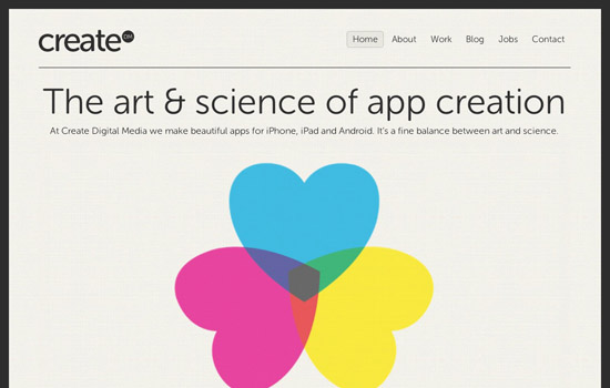 This is an example of another extremely clean, extremely focused website. There is absolutely no mistaking what this company produces and what they enjoy.
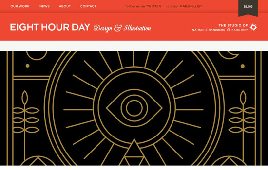 This site is a bit more intricate. There are a lot more design pieces and a lot more pictures, but they never stray from keeping things focused and fluff free.
 Without using flat colors, this site really delivers in cleanliness and focus. It seems as if the designer paid most attention to the layout and making precise design decisions within each element, rather than the whole site.
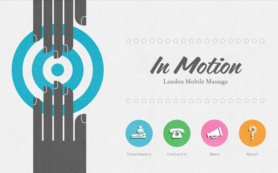 This is a website that is pretty close to the core values of minimalism, however there's a larger usage of color than most 'traditional' minimal sites. The layout works extremely well and again, there isn't a ton of fluff here.
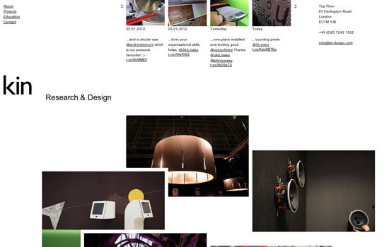 I would say this web design is really reminiscent of the idea of 'minimal art' as there is a grid but it's a bit abstract and extremely geometric. It feels like this designer meshed the idea of minimalism with the same idea used in fine art.
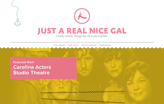 This website focuses a lot more on design and making things look good, but you can tell that it isn't the sole purpose of the site's design. It also makes sense and has a wonderful layout.
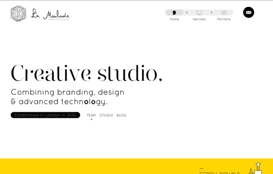 La Moulade is one of those super neat one page websites. This site uses a large bit of tricks and artistry on top of the clean minimalism to make their point clear. It's impossible not to know what the focus is here.
 What's becoming popular with a lot of brands is making mini-sites that help push one product or service. This seems like it could be a very cluttered site because of the information they are giving, but here the designers did a great job of making everything fluff-free and still presenting the information aesthetically.
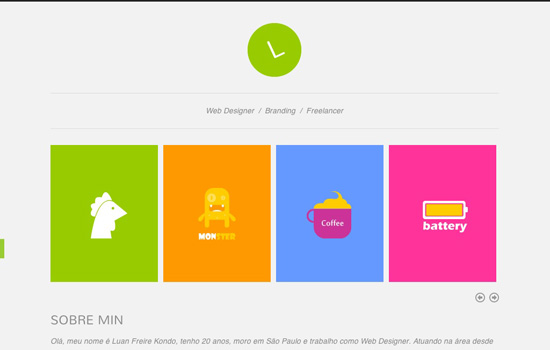 Another website that mimics the fine art qualities of minimalism; the flat color, abstract interpretations and some geometric shapes. This is an extremely simple and to the point portfolio.
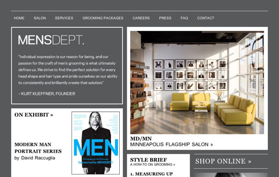 This site kind of uses minimalism more as a trend. When you scroll down there is a nice grid, but it is extremely content rich. However, I think this is a good example of how one can pick and choose how they want to present minimalism.
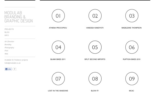 Modulab has a super clean, super minimalist website. There's not a ton of color (only when necessary) and there's absolutely no fluff. Great job here.
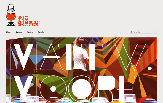 This is another site that meshes both ideas of minimalism (the art and the technique) to perfection. It's argued that sites that are 'minimalist' can't add features such as social media, but they definitely found a nice clean way to do so.
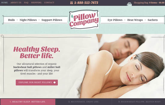 When you think about e-commerce sites, it's really easy to have a lot going on and for things to become to busy very quickly. This site actually does have a lot of content, but the designer made a really great effort to clean things up and create a focus for that which is most important.
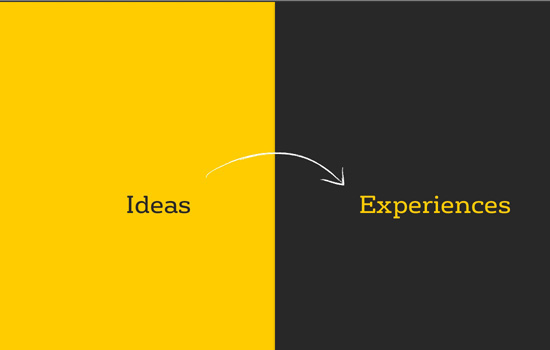 Here is another site that doesn't go overboard on the colors. There is a lot of interactivity, and it is presented in a manner that is intuitive to the user.
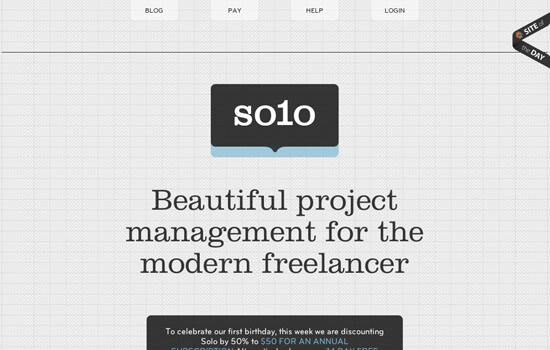 This is another very simple site, but the beauty of it comes in the form of it's intricate design elements. Everything seems to have a central theme so it works together and makes sense.
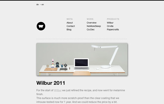 Though the site doesn't immediately speak for itself, the design does becomes more evident after some searching on what this company does. The use of gray and the layout really do a lot for this minimalistic design.
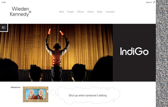 What I like about this site is it uses graphics and pictures in a way that typical minimalists would not use them. It's definitely pleasing to the eye, everything looks full but the layout and design ensure everything has its own space.
 This web design is probably what folks think about when discussing 'minimalism.' This is a barebones site with absolutely no fluff at all.
(rb)
What is Minimalism? What is Design?
The textbook definition of "minimalism" is "design or style in which the simplest and fewest elements are used to create the maximum effect." If you look up "minimal art", that is defined as "abstract painting or sculpture in which expressiveness and illusion are minimized by the use of simple geometric shapes, flat colour, and arrangements of ordinary objects." The latter definition is a bit more specific in talking about an actual style of art, but if we are talking about design, which is a bit of a science more than an art, the two actually go hand in hand. Design is what you use to order information in a way that is typically aesthetically pleasing. The best designs, are designs that have removed the excess or the fluff--that's minimalism. If you are designing to make things pretty, then you're not designing, you're just decorating. One of the greatest things I've ever heard about typography (which is closely linked to graphic design) is "If you can't read it, you've missed the point." Similarly, one of the best things I've heard about graphic design is, "You know when a design is done not by asking what else you can add, but by asking what can you take away."Minimalist Showcase
What people have to realize is there are different levels of minimalism. Of course there are the people who keep it as barebones as possible with only text and some pictures, while some folks just believe in making sure they have a really clean design on their hands. Either way, minimalism should be and is used for most as a basis for design. Whether you have a site dedicated to your thoughts, your work or your product, minimalism can work. Below are a handful of different sites that use a minimalistic attitude.8Faces
 As you can see, here, there is a lot of focus put on the typography and making sure it is legible. Pictures aren't all over the place, but are neatly set up in their designated spaces.
Best Awards
 This site uses some flat color with nice splashes of purple and a great layout to draw your eyes to the most important parts of the website. I'd say this is a site that doesn't stray too far from the roots of minimalism, while throwing in some nicer, more designer elements.
Collected
 What you will notice in a lot of minimal sites is the usage of grids. This grid has no spacing between elements which kind of fills up space and makes it more than what it really is, nevertheless, it's a wonderful clean website.
CreateDM
 This is an example of another extremely clean, extremely focused website. There is absolutely no mistaking what this company produces and what they enjoy.
Eight Hour Day
 This site is a bit more intricate. There are a lot more design pieces and a lot more pictures, but they never stray from keeping things focused and fluff free.
HatBox
 Without using flat colors, this site really delivers in cleanliness and focus. It seems as if the designer paid most attention to the layout and making precise design decisions within each element, rather than the whole site.
InMotion Massage
 This is a website that is pretty close to the core values of minimalism, however there's a larger usage of color than most 'traditional' minimal sites. The layout works extremely well and again, there isn't a ton of fluff here.
Kin Design
 I would say this web design is really reminiscent of the idea of 'minimal art' as there is a grid but it's a bit abstract and extremely geometric. It feels like this designer meshed the idea of minimalism with the same idea used in fine art.
Krista Duran
 This website focuses a lot more on design and making things look good, but you can tell that it isn't the sole purpose of the site's design. It also makes sense and has a wonderful layout.
La Moulade
 La Moulade is one of those super neat one page websites. This site uses a large bit of tricks and artistry on top of the clean minimalism to make their point clear. It's impossible not to know what the focus is here.
Learn CSS
 What's becoming popular with a lot of brands is making mini-sites that help push one product or service. This seems like it could be a very cluttered site because of the information they are giving, but here the designers did a great job of making everything fluff-free and still presenting the information aesthetically.
Luan Freire Kondo
 Another website that mimics the fine art qualities of minimalism; the flat color, abstract interpretations and some geometric shapes. This is an extremely simple and to the point portfolio.
Men's Dept.
 This site kind of uses minimalism more as a trend. When you scroll down there is a nice grid, but it is extremely content rich. However, I think this is a good example of how one can pick and choose how they want to present minimalism.
Modulab
 Modulab has a super clean, super minimalist website. There's not a ton of color (only when necessary) and there's absolutely no fluff. Great job here.
Pig Bimpin'
 This is another site that meshes both ideas of minimalism (the art and the technique) to perfection. It's argued that sites that are 'minimalist' can't add features such as social media, but they definitely found a nice clean way to do so.
Pillow Company
 When you think about e-commerce sites, it's really easy to have a lot going on and for things to become to busy very quickly. This site actually does have a lot of content, but the designer made a really great effort to clean things up and create a focus for that which is most important.
Shelton Fleming
 Here is another site that doesn't go overboard on the colors. There is a lot of interactivity, and it is presented in a manner that is intuitive to the user.
Solo
 This is another very simple site, but the beauty of it comes in the form of it's intricate design elements. Everything seems to have a central theme so it works together and makes sense.
Weltunit
 Though the site doesn't immediately speak for itself, the design does becomes more evident after some searching on what this company does. The use of gray and the layout really do a lot for this minimalistic design.
W+K
 What I like about this site is it uses graphics and pictures in a way that typical minimalists would not use them. It's definitely pleasing to the eye, everything looks full but the layout and design ensure everything has its own space.
Yoshiharu Ota
 This web design is probably what folks think about when discussing 'minimalism.' This is a barebones site with absolutely no fluff at all.
(rb)
I like Luan Freire Kondo and InMotion Massage websites, they look great!
Thanks for such a nice list. Minimalism was always the best choice.
A nice list!
A few years back I developed a food stockphoto website designed by maartjevannimwegen.com. Maartje who attended the Gerrit Rietveld Academy in Amsterdam often does very minimal designs but I like the one she did for http://www.lemonize.com a lot. It’s minimal, yet not ’empty’ like some minimal designs tend to look.
Thanks so much for featuring us, you rock! :D
Love from the team x
Minimalistic designs always appealed to me. These are some great examples!
Wow nice collection!
InMotion’s logo appears to be goatse at an angle.
Hey this is awesome.. i love minimal website… they have less but they say more! Gr8 post.. thanks :)
Thanks for this list. I’m just learning, myself and am always on the look out for minimal type designs. When I first started to design my mother’s (yes I said, mother) website, I wanted the minimalist type design and she kept saying that it looked like there was too much white space. So, I explained that it would be far easier for people to know what she wanted them to know if she didn’t have it filled with stuff that wasn’t important or relative to the products. Now, she loves it!