
Layouts With CSS: Flexbox or Grid?
The way we design websites has undergone some more and some less radical changes over the past years. With the introduction of CSS flexbox, a major change has taken place. Shortly after, a new layout model, CSS grid, joined the party. Which of them is the better choice for which job? Do I have to choose a model?
 Flexbox Model[/caption]
With the introduction of CSS, content and design were separeted, and the design via CSS started its triumph. Thanks to relative and absolute positioning, HTML elements could be placed wherever the user wanted to. The "float" attribute allowed for the display of elements next to each other. Although "float" was intended to be used to make texts glide along images, it turned out to be one of the most important attributes in layout design.
But due to different resolutions and orientations of devices, websites needed to be designed in an increasingly more flexible way. On the other hand, web layouts became increasingly more complex. In order to account for that, the flexbox model was created.
Flexbox Model[/caption]
With the introduction of CSS, content and design were separeted, and the design via CSS started its triumph. Thanks to relative and absolute positioning, HTML elements could be placed wherever the user wanted to. The "float" attribute allowed for the display of elements next to each other. Although "float" was intended to be used to make texts glide along images, it turned out to be one of the most important attributes in layout design.
But due to different resolutions and orientations of devices, websites needed to be designed in an increasingly more flexible way. On the other hand, web layouts became increasingly more complex. In order to account for that, the flexbox model was created.
 Grid Model[/caption]
But of course, there are significant differences, and advantages as well. Firstly, CSS grid is especially useful for the creation of complex layouts. First, a grid is defined, which consists of lines and columns. The attributes "grid-template-rows" and "grid-template-columns" allow you to define the number and sizes of grid elements. The widths and heights are defined with the new unit "fr", short for "fraction".
A value of "1fr" makes all columns and lines the same size, spreading them across the given space. If you want a column to be twice as large as the others, assign "2fr". Of course, it is also possible to use absolute units, like pixels.
Afterward, the individual HTML elements have to be paced in the grid. For that, it is important to define which areas of the grid an element should take up. To do so, use the four CSS attributes "grid-column-start", "grid-column-end", "grid-row-start", and "rid-row-end".
With "grid-gap", it is also possible to set up a gap between the individual grid areas.
Grid Model[/caption]
But of course, there are significant differences, and advantages as well. Firstly, CSS grid is especially useful for the creation of complex layouts. First, a grid is defined, which consists of lines and columns. The attributes "grid-template-rows" and "grid-template-columns" allow you to define the number and sizes of grid elements. The widths and heights are defined with the new unit "fr", short for "fraction".
A value of "1fr" makes all columns and lines the same size, spreading them across the given space. If you want a column to be twice as large as the others, assign "2fr". Of course, it is also possible to use absolute units, like pixels.
Afterward, the individual HTML elements have to be paced in the grid. For that, it is important to define which areas of the grid an element should take up. To do so, use the four CSS attributes "grid-column-start", "grid-column-end", "grid-row-start", and "rid-row-end".
With "grid-gap", it is also possible to set up a gap between the individual grid areas.
 Combination of Flexbox and Grid[/caption]
CSS flexbox is the right choice when it comes to sorting elements next to, or above each other. For example, when designing a gallery, or want to align links accordingly.
Generally, one can say: CSS flexbox serves the one-dimensional alignment of elements. These elements only run into one direction - either to the right or to the bottom, with a line- or column switch being a possible option. CSS grid is two-dimensional, as it gives you a grid area that lets you place elements freely.
Combination of Flexbox and Grid[/caption]
CSS flexbox is the right choice when it comes to sorting elements next to, or above each other. For example, when designing a gallery, or want to align links accordingly.
Generally, one can say: CSS flexbox serves the one-dimensional alignment of elements. These elements only run into one direction - either to the right or to the bottom, with a line- or column switch being a possible option. CSS grid is two-dimensional, as it gives you a grid area that lets you place elements freely.
From the Table Layout to CSS Flexbox
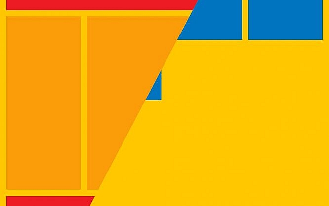
Those who have been dealing with web design for a while will remmeber the days of table layout. When there was no CSS, adventurously convoluted tables were built, and fonts and colors were marked up directly in the HTML. [caption id="attachment_104517" align="aligncenter" width="1024"] Flexbox Model[/caption]
With the introduction of CSS, content and design were separeted, and the design via CSS started its triumph. Thanks to relative and absolute positioning, HTML elements could be placed wherever the user wanted to. The "float" attribute allowed for the display of elements next to each other. Although "float" was intended to be used to make texts glide along images, it turned out to be one of the most important attributes in layout design.
But due to different resolutions and orientations of devices, websites needed to be designed in an increasingly more flexible way. On the other hand, web layouts became increasingly more complex. In order to account for that, the flexbox model was created.
More Flexible Layouts With Flexbox
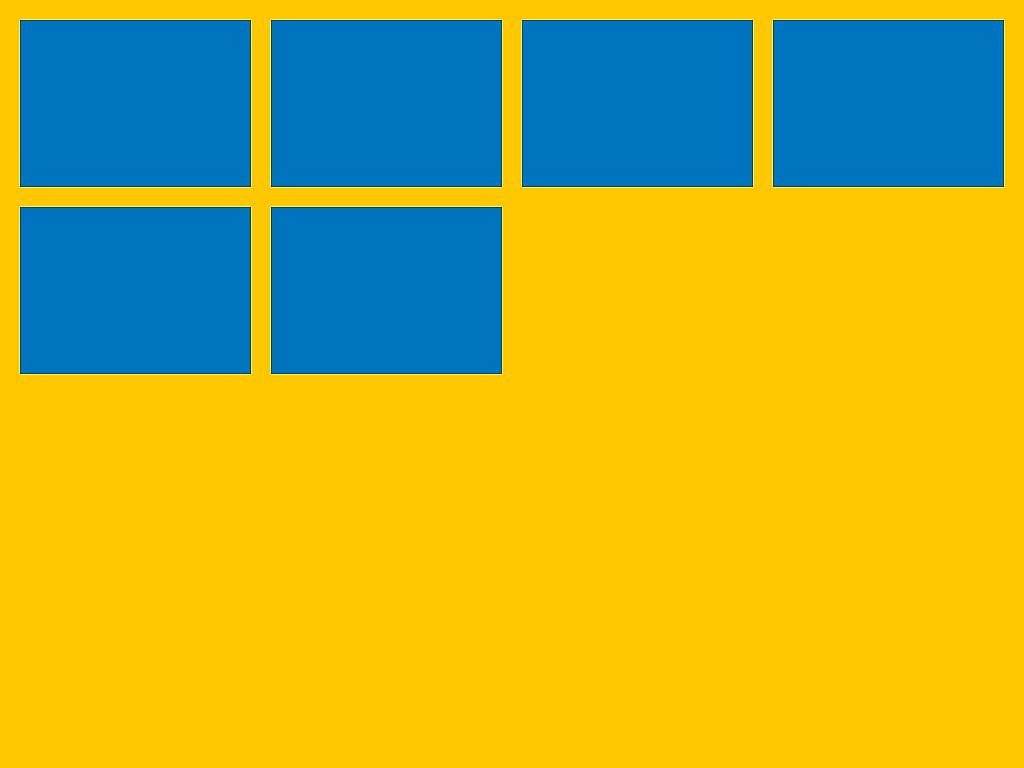
CSS Flexbox basically draws on the idea of float layouts. Elements oriented via flexbox can be aligned in a row. Here, there's the option to wrap the line at the end of the row. In contrast to the float layouts, the flexbox model delivers additional features. This way, the width of individual elements can be variably defined within a flexbox layout. Via "flex-basis", a default size for elements was defined. With "flex-grow" and "flex-shrink", it is determined how big or small an element can be. The orientation of the elements is easy and uncomplicated to determine. In addition, an orientation is not only possible horizontally, but vertically as well. Thus, CSS flexbox is an easy option for those who prefer a column layout over the typical line layout.Extensive Layouts With CSS-Grid
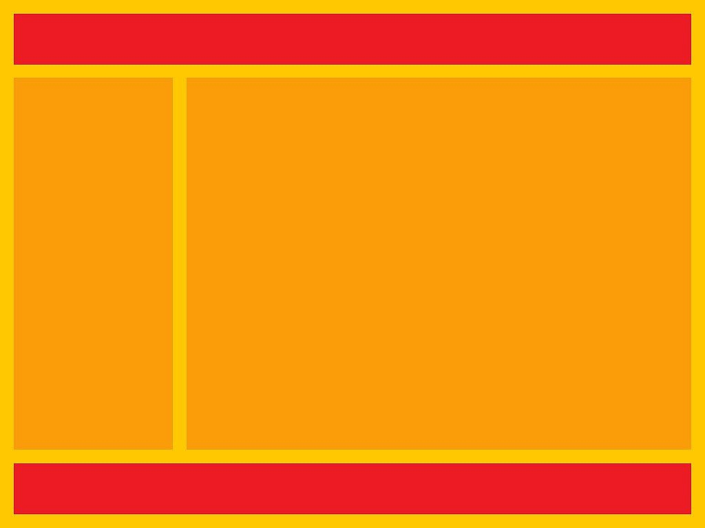
Shortly after the flexbox model came into circulation, CSS Grid, the second new layout model, was put into the world of the internet. While flexbox is more reminiscent of the float layouts, which were popular for quite some time, the grid model is more reminiscent of the good old grid layouts. [caption id="attachment_104518" align="aligncenter" width="1024"] Grid Model[/caption]
But of course, there are significant differences, and advantages as well. Firstly, CSS grid is especially useful for the creation of complex layouts. First, a grid is defined, which consists of lines and columns. The attributes "grid-template-rows" and "grid-template-columns" allow you to define the number and sizes of grid elements. The widths and heights are defined with the new unit "fr", short for "fraction".
A value of "1fr" makes all columns and lines the same size, spreading them across the given space. If you want a column to be twice as large as the others, assign "2fr". Of course, it is also possible to use absolute units, like pixels.
Afterward, the individual HTML elements have to be paced in the grid. For that, it is important to define which areas of the grid an element should take up. To do so, use the four CSS attributes "grid-column-start", "grid-column-end", "grid-row-start", and "rid-row-end".
With "grid-gap", it is also possible to set up a gap between the individual grid areas.
CSS-Flexbox or CSS-Grid?
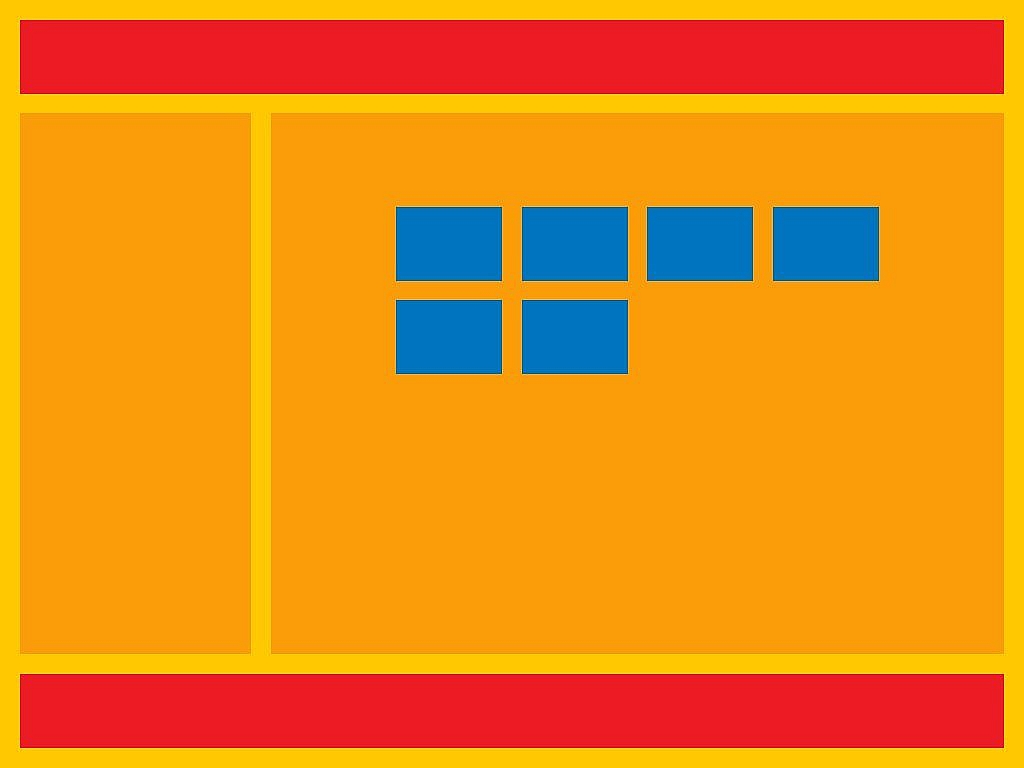
The question that remains is which layout model you should choose. This is not an either-or question, though. Both models have their validity and different application areas. Whenever it comes to developing a complex layout, CSS grid is a good choice. In the grid, define areas for the header, the navigation, the content, and the footer. Depending on the resolution, CSS also gives you the option to make the alignment for small displays look completely different. [caption id="attachment_104515" align="aligncenter" width="1024"] Combination of Flexbox and Grid[/caption]
CSS flexbox is the right choice when it comes to sorting elements next to, or above each other. For example, when designing a gallery, or want to align links accordingly.
Generally, one can say: CSS flexbox serves the one-dimensional alignment of elements. These elements only run into one direction - either to the right or to the bottom, with a line- or column switch being a possible option. CSS grid is two-dimensional, as it gives you a grid area that lets you place elements freely.
Oh! i like that Grid basically i mostly used Bootstrap to make this type of Grid.
Thank you
Thank you ,
excellent and important use full content ,,
I’m excited to find this page. I wanted to thank you for ones time due to this wonderful read!! I definitely savored every bit of it and I have you book marked to see new stuff in your web site.
I’m truly enjoying the design and layout of your blog. It’s a very easy on the eyes which makes it much more pleasant for me to come here and visit more often. Did you hire out a developer to create your theme? Exceptional work!
Very great post. I just stumbled upon your weblog and wanted to mention that I’ve really loved surfing around your weblog posts. In any case I’ll be subscribing on your feed and I’m hoping you write again soon!
This web site truly has all the info I needed about this subject and didn’t know who to ask.