
Navigation Design: Is the Vertical Menu the New Best Practice?

Before yelling "no", at least think about the new smartphone generation. The trend is increasing the device's height, but not the width. Don't you think that we need to make use of the viewport in a different way? Does this throw the horizontal menu off the map?
 (Website: Oxford House / Screenshot: D. Petereit)[/caption]
Until now, breaking down existing navigation concepts starting at a defined resolution was considered the best practice. This is where the hamburger icon established itself.
Now if we're forced to turn horizontal navigation into vertical navigation anyways, why wouldn't we use the vertical variants exclusively? It seems like an increasing number of creatives is asking that question. Realizations of this design approach can be found more and more often.
This is not even about turning the hamburger menu into the standard, but more to define the vertical menu as a standard. In modern desktop apps and some system tools, like Mail from Windows 10, you'll also find the vertical menu approach - at least in addition to the horizontal menu bar. Oftentimes, a vertical pictogram bar is used, which either triggers functions right away or opens to the right by clicking the respective icon.
[caption id="attachment_104151" align="aligncenter" width="1024"]
(Website: Oxford House / Screenshot: D. Petereit)[/caption]
Until now, breaking down existing navigation concepts starting at a defined resolution was considered the best practice. This is where the hamburger icon established itself.
Now if we're forced to turn horizontal navigation into vertical navigation anyways, why wouldn't we use the vertical variants exclusively? It seems like an increasing number of creatives is asking that question. Realizations of this design approach can be found more and more often.
This is not even about turning the hamburger menu into the standard, but more to define the vertical menu as a standard. In modern desktop apps and some system tools, like Mail from Windows 10, you'll also find the vertical menu approach - at least in addition to the horizontal menu bar. Oftentimes, a vertical pictogram bar is used, which either triggers functions right away or opens to the right by clicking the respective icon.
[caption id="attachment_104151" align="aligncenter" width="1024"]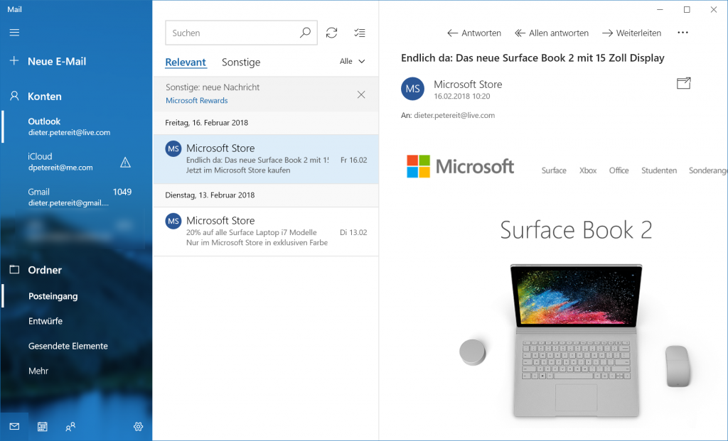 Mail from Windows 10 consistently uses vertical navigation, supported by a small horizontal icon menu on the bottom left. (Screenshot: D. Petereit)[/caption]
 (Website: European Music Incubator / Screenshot: D. Petereit)[/caption]
Vertical menus on the left side of the page come with several other advantages as well. The average reader first looks at the beginning of the page and then proceeds to scan the left section. This is called the F-pattern. Aside from the horizontal navigation, vertical menus also match this pattern. Thus, vertical menus definitely are not a worse choice than horizontal ones.
If the vertical menu is not hidden behind a hamburger icon, it stays visible at all times and does not require any cognitive processes by the user. The previously mentioned aspect of scanning allows for the fast absorption of the given navigation options.
Additionally, the length of a vertical menu can be near infinite, while horizontal ones are limited by the window width. Scrolling as a utilization scheme continues to assert itself. Why shouldn't we use this for navigation elements?
(Website: European Music Incubator / Screenshot: D. Petereit)[/caption]
Vertical menus on the left side of the page come with several other advantages as well. The average reader first looks at the beginning of the page and then proceeds to scan the left section. This is called the F-pattern. Aside from the horizontal navigation, vertical menus also match this pattern. Thus, vertical menus definitely are not a worse choice than horizontal ones.
If the vertical menu is not hidden behind a hamburger icon, it stays visible at all times and does not require any cognitive processes by the user. The previously mentioned aspect of scanning allows for the fast absorption of the given navigation options.
Additionally, the length of a vertical menu can be near infinite, while horizontal ones are limited by the window width. Scrolling as a utilization scheme continues to assert itself. Why shouldn't we use this for navigation elements?
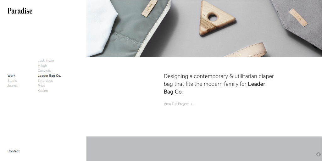 (Website: Studio Paradise / Screenshot: D. Petereit)[/caption]
Text-based navigation is difficult since the usage of as few words as possible is recommended, to avoid wasting too much space. Here, a compromise between legibility and font size is inevitable. This is a good reason for a flyout menu, which is a menu that places itself over the screen from left to right via an overlay. A compromise could be a permanently visible icon bar.
The near infinite space downward could make designers and their clients not focus on the display of the most important navigation paths, and just give an own navigation item to every single element, no matter how irrelevant it may be. In the end, this neither helps the client, nor the potential user.
From a design point of view, it is very important which type of website the vertical navigation is considered for. Online magazines won't be able to benefit from a vertical navigation on the desktop. Here, the sticky header with a horizontal navigation is far better. Portfolio websites, or other websites with rather low content volume, on the other hand, could definitely follow the trend.
[caption id="attachment_104149" align="aligncenter" width="1024"]
(Website: Studio Paradise / Screenshot: D. Petereit)[/caption]
Text-based navigation is difficult since the usage of as few words as possible is recommended, to avoid wasting too much space. Here, a compromise between legibility and font size is inevitable. This is a good reason for a flyout menu, which is a menu that places itself over the screen from left to right via an overlay. A compromise could be a permanently visible icon bar.
The near infinite space downward could make designers and their clients not focus on the display of the most important navigation paths, and just give an own navigation item to every single element, no matter how irrelevant it may be. In the end, this neither helps the client, nor the potential user.
From a design point of view, it is very important which type of website the vertical navigation is considered for. Online magazines won't be able to benefit from a vertical navigation on the desktop. Here, the sticky header with a horizontal navigation is far better. Portfolio websites, or other websites with rather low content volume, on the other hand, could definitely follow the trend.
[caption id="attachment_104149" align="aligncenter" width="1024"]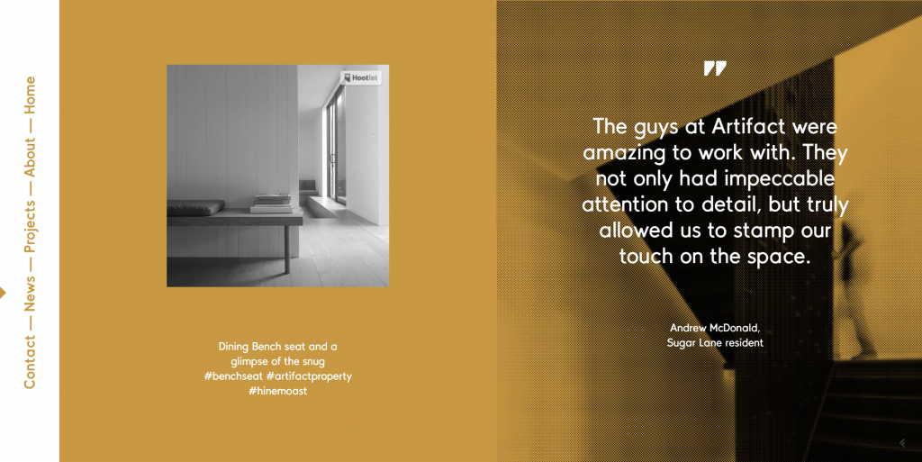 This menu style used to be popular in the nineties. (Website: Artifact Property / Screenshot: D. Petereit)[/caption]
Horizontal Navigation – an Old Standard Up For Suspension
Horizontal navigation has been considered a best practice for years. As long as the aspect ratio resulted in the width of the browser window being higher than its height, this didn't just make sense, there was more or less no other option. In conjunction with drop-down menus, as we know them from the design of desktop software, horizontal navigation seemed like the means of choice. The main advantage was the fact that the position and characteristics didn't force potential users to think. Those using Windows, macOS, or Linus, know the horizontal menu. A century ago, people were already experimenting with different placements. Left or right page border in the vertical ordinance, or horizontal at the bottom, sticky or not - it is not that easy to set limits to the creativity. Especially for the right-sided vertical, and bottom horizontal navigation, there are good identical reasons. The most important pro factor is the easy accessibility of the individual menu elements with the mouse, as long as you're right-handed. With touchscreen controls, the same thing applies for the accessibility with your right thumb. Thus, under iOS, you'll almost exclusively find bottom horizontal menus, which do have their own disadvantages, though (keyword: higher, not wider). Last but not least, many studies showed that the human is a creature of habit and that the upper horizontal position is unbeatable. Regarding that topic, also read our article on the best practices of page navigation.Smartphones Revert the Aspect Ratio
Now, we're in a different situation, though. We've been using smartphones for about ten years now. Their share when it comes to web usage continues to increase. And on devices with a reverted aspect ratio in comparison to a desktop device, other navigation concepts can make sense. [caption id="attachment_104152" align="aligncenter" width="1024"] (Website: Oxford House / Screenshot: D. Petereit)[/caption]
Until now, breaking down existing navigation concepts starting at a defined resolution was considered the best practice. This is where the hamburger icon established itself.
Now if we're forced to turn horizontal navigation into vertical navigation anyways, why wouldn't we use the vertical variants exclusively? It seems like an increasing number of creatives is asking that question. Realizations of this design approach can be found more and more often.
This is not even about turning the hamburger menu into the standard, but more to define the vertical menu as a standard. In modern desktop apps and some system tools, like Mail from Windows 10, you'll also find the vertical menu approach - at least in addition to the horizontal menu bar. Oftentimes, a vertical pictogram bar is used, which either triggers functions right away or opens to the right by clicking the respective icon.
[caption id="attachment_104151" align="aligncenter" width="1024"] Mail from Windows 10 consistently uses vertical navigation, supported by a small horizontal icon menu on the bottom left. (Screenshot: D. Petereit)[/caption]
Advantages of Vertical Navigation
But permanently visible page menus are becoming increasingly more common as well. This goes well with the material design trend or Microsoft's Fluent approach. Tiled grids look much better with navigation tiles. They attract more attention than the rather plain horizontal menus of the noughties. After all, attention is just what navigation needs. At least if your website is designed in a way that makes users go through your - planned - navigation patterns. [caption id="attachment_104150" align="aligncenter" width="1024"] (Website: European Music Incubator / Screenshot: D. Petereit)[/caption]
Vertical menus on the left side of the page come with several other advantages as well. The average reader first looks at the beginning of the page and then proceeds to scan the left section. This is called the F-pattern. Aside from the horizontal navigation, vertical menus also match this pattern. Thus, vertical menus definitely are not a worse choice than horizontal ones.
If the vertical menu is not hidden behind a hamburger icon, it stays visible at all times and does not require any cognitive processes by the user. The previously mentioned aspect of scanning allows for the fast absorption of the given navigation options.
Additionally, the length of a vertical menu can be near infinite, while horizontal ones are limited by the window width. Scrolling as a utilization scheme continues to assert itself. Why shouldn't we use this for navigation elements?
Disadvantages of Vertical Navigation
Of course, the vertical navigation is not free of downsides. The main one is a purely subjectively objective one. It's the tenacity of the users. This significant habit preference is the main reason as to why the vertical navigation has not established itself a lot earlier. Tenacity is hard to get rid of. From a technological point of view, we are right before a paradigm shift that may turn this argumentation on its head. [caption id="attachment_104153" align="aligncenter" width="1024"] (Website: Studio Paradise / Screenshot: D. Petereit)[/caption]
Text-based navigation is difficult since the usage of as few words as possible is recommended, to avoid wasting too much space. Here, a compromise between legibility and font size is inevitable. This is a good reason for a flyout menu, which is a menu that places itself over the screen from left to right via an overlay. A compromise could be a permanently visible icon bar.
The near infinite space downward could make designers and their clients not focus on the display of the most important navigation paths, and just give an own navigation item to every single element, no matter how irrelevant it may be. In the end, this neither helps the client, nor the potential user.
From a design point of view, it is very important which type of website the vertical navigation is considered for. Online magazines won't be able to benefit from a vertical navigation on the desktop. Here, the sticky header with a horizontal navigation is far better. Portfolio websites, or other websites with rather low content volume, on the other hand, could definitely follow the trend.
[caption id="attachment_104149" align="aligncenter" width="1024"] This menu style used to be popular in the nineties. (Website: Artifact Property / Screenshot: D. Petereit)[/caption]
What are your thoughts on how the different patterns affect web accessibility?
In my place I prefer the horizontal fixed menu and it becomes a hamburger menu just in the minor items. I would do for myself to make just a hamburger menu myself in large fabrics to reduce the space used, therefore, it is not just useful as an accessory for other pages but is also a design element that completes the site. O menu, para o meu sitio, é como un cabelo e seme o conteúdo na esquerda en na direita face o site parecer “bald”.
In my website I prefer the horizontal fixed menu and it becomes a hamburger menu just in the minor items. I would do for myself to make just a hamburger menu myself in large fabrics to reduce the space used, therefore, it is not just useful as an accessory for other pages but is also a design element that completes the site. The content on the left and right is where the menu looks and my website looks bald.