
Noupe Site Check: Bloomberg

News portals don't always seem to be receptive to contemporary design and the use of new technologies such as HTML5 or CSS3. Often, a fixed layout is used, only supporting the vintage banner advertisement. A notable exception is the website of the US-American news portal Bloomberg, which is internationally known for its economic news.
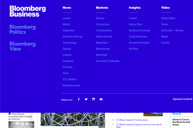 Unfolded Navigation
An arrow button shows you the detailed navigation pop-up. It allows you to directly access sub-pages of the respective main areas. The navigation also contains links to the other news pages „Politics“ and „View“. Bloomberg's navigation bridges the large gap between clarity and detail.
If needed, the navigation can simply be expanded. This way, the user does not instantly get confronted with a plethora of menu options and links and can access different content very comfortably.
On the mobile version, the navigation is restricted to the arrow button and the search box, so that the mobile navigation is very clear as well.
What is also nice is that Bloomberg forgoes an overloaded footer. This role model of a footer only contains a few links.
Unfolded Navigation
An arrow button shows you the detailed navigation pop-up. It allows you to directly access sub-pages of the respective main areas. The navigation also contains links to the other news pages „Politics“ and „View“. Bloomberg's navigation bridges the large gap between clarity and detail.
If needed, the navigation can simply be expanded. This way, the user does not instantly get confronted with a plethora of menu options and links and can access different content very comfortably.
On the mobile version, the navigation is restricted to the arrow button and the search box, so that the mobile navigation is very clear as well.
What is also nice is that Bloomberg forgoes an overloaded footer. This role model of a footer only contains a few links.
Responsive Layout and Clear Navigation
While many news websites have different versions for mobile and desktop users, Bloomberg uses only one responsive design. On the desktop, the clearly organized navigation is placed in the header. This is also true for menus. On the top of the page, there is a slim black bar that contains links to the company, its products and more. Below that, there is a larger area containing the actual navigation. Using few links, the user can quickly access the portal's main areas as well as the search functionality. A layer that shows additional links and teasers to recent articles, sensitive to the where the visitor just is, pops up on mouse-over.
Unfolded Navigation
An arrow button shows you the detailed navigation pop-up. It allows you to directly access sub-pages of the respective main areas. The navigation also contains links to the other news pages „Politics“ and „View“. Bloomberg's navigation bridges the large gap between clarity and detail.
If needed, the navigation can simply be expanded. This way, the user does not instantly get confronted with a plethora of menu options and links and can access different content very comfortably.
On the mobile version, the navigation is restricted to the arrow button and the search box, so that the mobile navigation is very clear as well.
What is also nice is that Bloomberg forgoes an overloaded footer. This role model of a footer only contains a few links.
Multi Columns that Self-adjust
One thing that Bloomberg has in common with many other news portals is multiple columns. In the desktop view, there are four columns with the content distributed over them. The two slimmer outer columns are used for top news, comments and opinions. In the two wider columns, there are teasers to other articles. As the left column is significantly longer than the other three, JavaScript makes sure that the left column is moving faster than the others when scrolling. This way, there is no unappealing space below the other columns. The number of columns shrinks with slimmer representation. First, the right column disappears and with even narrower representation, the left one disappears as well. In mobile view, there is only one column remaining. As it should be on a proper responsive layout, the columns don't just disappear but are reintegrated at the bottom of the remaining columns. As the areas for top news, comments and opinions are distinct in colours anyway, they can also be easily integrated into the remaining columns and still remain separate from the article teasers.HTML5 and CSS3 – but Flash-Videos
The source text and the use of HTML5 and CSS3 are also exemplary for the most part. Besides the „<main>“ element, certain elements are marked up with the „<section>“ element. Teaser and articles are enclosed via „<article>“ elements. Only the navigation is not enclosed with the fitting „<nav>“ element. Other HTML elements are used as well. For example, the „<time>“ element is used to declare the release date of an article. Concerning design modern CSS3 is used. However, there are only very few CSS3 animations. These are used for the insertion of social media links. While, on the desktop, the links fade in on mouseover, mobile users can make them pop-up by clicking a button. By default, the website's videos are provided via Flash. Only on mobile devices they are offered in HTML5. This is surprising as for the most part, HTML5 is used on the page.Prominent Colorful Design
Concerning design, the choice of color is adventurous considering the website's focus on economic and political news. The base color is a shining dark blue, which is complemented by other, more vibrant colours. Every section has its own colours. While the design of the landing page is rather timid and conservative, with the vibrant colours only used for lines and headlines, the overview pages of the different topics are much more colorful. This is where the accent colours are moved into the foreground and create a unique, strong design. This shows the significant difference between Bloomberg and other news portals. The layout of the overview pages differs from each other. Only the header's layout is always the same, even though its color changes with different topic sections.Discrete Advertisement and Accessibility
Free service can not work without advertisement. This is not any different for Bloomberg. However, the website stays away from huge banners. Most of the time, there is a banner in the top area and a few in between the columns. The banners are always placed discreetly and never hide any content of the actual site. As HTML5 elements are used, most content is labeled in a way that even screen readers can interpret it accordingly. The only thing that could be criticized is that additional ARIA traits could have created a better labeling of certain elements for visually impaired readers.Conclusion
Bloomberg's website is definitely one of the best practices for news portals in terms of design and technology. Responsivity and the use of HTML5 and CSS3 are why this site is an example of proper web development. Of course, there is room for optimization in some aspects. Still, Bloomberg does not need to fear comparison with its competition.Photo by Nathan da Silva on Unsplash
(dpe)