
Responsive SVG: What’s Possible, and What Isn’t?
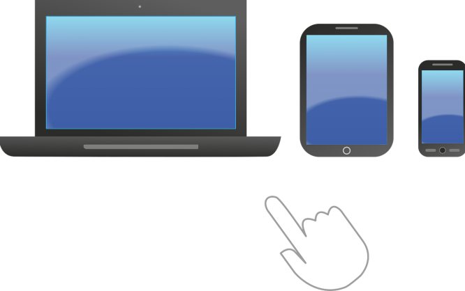
Responsive layouts are indispensable in web design. On the one hand, there are ever-shrinking displays on smartphones, and on the other hand, there's the size increase of desktop displays. Between that, there are phablets, tablets, as well as netbooks, notebooks, and what not. Thanks to CSS, technically optimizing a website for all the different resolutions is not a problem. But what about SVGs? Can these be designed responsively as well?
 SVG Without "viewBox" Attribute: The Circle's Size Always Remains the Same[/caption]
To cause a scaling, you have to use the "viewBox" attribute. This attribute is used to define an extract of the SVG drawing space, which always fills the entire drawing space of the "<svg>" element.
SVG Without "viewBox" Attribute: The Circle's Size Always Remains the Same[/caption]
To cause a scaling, you have to use the "viewBox" attribute. This attribute is used to define an extract of the SVG drawing space, which always fills the entire drawing space of the "<svg>" element.
 SVG Without "viewBox" Attributes: The Circle Scales According to the Drawing Space[/caption]
If there's no scaling, it could happen that the graphic does not fit into the drawing space anymore, making it disappear into the bottom right border. However, when scaling, you should check if all shapes and texts are recognizable. If need be, size and positions of the shapes should be altered.
Here's where you'll already encounter the first problem: the size and position of SVG graphics are not controlled via CSS, but rather via an attribute of the respective elements. This only gives you the option to influence size and position via "transform" attribute.
SVG Without "viewBox" Attributes: The Circle Scales According to the Drawing Space[/caption]
If there's no scaling, it could happen that the graphic does not fit into the drawing space anymore, making it disappear into the bottom right border. However, when scaling, you should check if all shapes and texts are recognizable. If need be, size and positions of the shapes should be altered.
Here's where you'll already encounter the first problem: the size and position of SVG graphics are not controlled via CSS, but rather via an attribute of the respective elements. This only gives you the option to influence size and position via "transform" attribute.
 Rectangle Placed on 50 Percent Each Via "x" and "y" Attributes[/caption]
In combination with the CSS function "translate()" also gives you the option to always place elements in the center. This way, you can place a shape in the center via "x" and "y," by defining the value "50%" for each. But now, only the top left corner is centered.
Rectangle Placed on 50 Percent Each Via "x" and "y" Attributes[/caption]
In combination with the CSS function "translate()" also gives you the option to always place elements in the center. This way, you can place a shape in the center via "x" and "y," by defining the value "50%" for each. But now, only the top left corner is centered.
 Relative Placement Via Additional "translate()"[/caption]
To Scale or Not to Scale?
The easiest way to display an SVG graphic on different screens and browser windows is, of course, scaling. Here, the graphic is shrunk or enhanced until it fits - more or less, at least. Although simple scaling comes with little effort, it obviously has its downsides too. Especially with complex graphics, details tend to get lost or become unrecognizable when it comes to massive reductions. Texts could become so small that they are not legible anymore. While simple scaling mostly works for photos, it's not always an option for vector based SVG formats. Here, with small displays, you should do some optimizations by enhancing small elements or hide expendable details.<svg width="100%" height="100%"> <rect x="50%" y="50%" width="150" height="150" style="transform: scale(0.5)" /> </svg>It's important that the SVG graphic is not implemented via "img," but marked up directly within the HTML source text. Only then, you'll have the option to change your SVG element's attribute using the stylesheet of the HTML documents.
Scaling With "viewBox"
Typically, the elements of an SVG drawing space don't scale when you change the size of the "<svg>" element. They keep their position and size. Only the drawing space is expanded or reduced to the right, and below. [caption id="attachment_84595" align="alignnone" width="640"] SVG Without "viewBox" Attribute: The Circle's Size Always Remains the Same[/caption]
To cause a scaling, you have to use the "viewBox" attribute. This attribute is used to define an extract of the SVG drawing space, which always fills the entire drawing space of the "<svg>" element.
<svg width="100%" height="100%" viewBox="0 0 300 300">
  <circle cx="150" cy="150" r="150" />
</svg>
If the size of the drawing space is changed, the entire content scales. This way, you can always choose how each SVG graphic is supposed to behave.
Using CSS to Alter Size and Placement Information
No matter if you decided for or against scaling: in any case, you should check if you need to optimize especially small displays. [caption id="attachment_84596" align="alignnone" width="640"] SVG Without "viewBox" Attributes: The Circle Scales According to the Drawing Space[/caption]
If there's no scaling, it could happen that the graphic does not fit into the drawing space anymore, making it disappear into the bottom right border. However, when scaling, you should check if all shapes and texts are recognizable. If need be, size and positions of the shapes should be altered.
Here's where you'll already encounter the first problem: the size and position of SVG graphics are not controlled via CSS, but rather via an attribute of the respective elements. This only gives you the option to influence size and position via "transform" attribute.
CSS Transformations For SVG Shapes
First of all, size and positions are defined as attributes via the SVG markup. Thus, you only have the CSS functions "translate()," and "scale()" to change an SVG's individual shapes. The downside to this option is that only relative changes are possible. However, this way at least gives you the option to make some optimizations. For example, you can adjust the size relations of individual shapes. Enhancing especially small shapes helps a lot with smaller displays.Adjusting Frame and Font
Adjusting the frame strength and font size is completely unproblematic. In the SVG format, this information is also defined via CSS. If an SVG graphic is downscaled on mobile devices, increasing the frame strength and font size may be beneficial. This way, you can prevent the frame from being too thin, or the font from being illegible.circle {
stroke-width: 3px;
}
text {
font-size: 20px;
}
Via CSS, information on fill and contour color is marked up in a way that these adjustments can be made without any issues. However, these adjustments should not be a significant factor when it comes to responsive layouts.
Making Relative Statements For Attributes
As placement information can't just be changed via CSS, it is potentially recommendable to place shapes with relative values, rather than absolute ones. Especially when it comes to distributing elements in a drawing space, this seems like the thing to do. When changing the width or height of an SVG graphic without "viewBox" information, elements can be distributed equally on the drawing space via relative designation. [caption id="attachment_84597" align="alignnone" width="640"] Rectangle Placed on 50 Percent Each Via "x" and "y" Attributes[/caption]
In combination with the CSS function "translate()" also gives you the option to always place elements in the center. This way, you can place a shape in the center via "x" and "y," by defining the value "50%" for each. But now, only the top left corner is centered.
<svg width="100%" height="100%" viewBoxx="0 0 300 300">
  <rect x="50%" y="50%" width="150" height="150" style="transform: translate(-75px, -75px)" />
</svg>
To center the shape itself, move the shape to the left, or right, by half its width and height using "translate()." Like that, a shape is always centered, even with relative designations. [caption id="attachment_84598" align="alignnone" width="640"]
Relative Placement Via Additional "translate()"[/caption]
If art direction is an issue with scaling SVGs, a much simpler method would be to use the tag and load an alternative SVG image for different screen sizes. Saves having to dive into editing SVG code or using CSS transforms, and allows you to create the scaled versions of your SVGs within your art package (Illustrator/Sketch/etc).
Not saying this method is better, just an alternative.
Thanks for the alternative, Phil. Are you designing for the use of web through WordPress?
Sorry, not really sure what you mean. I have built WordPress sites in the past, but work mostly on statically generates sites these days.