Splashes of Color: Effective Uses of Minimal Coloring in Web Design
Color is one of the most powerful elements that designers have for setting the mood and tone of a project. Even the imagery used can be given different connotations by the colors laid over the top of it. Designers do love playing with this element to ensure the most effective conveyance of their intended message. One route that some opt for is to use color in a very minimal way, and still they are able to do so in a way where that the impact is still felt.
That is what we are looking at today. Below is a collection of websites that have managed to walk this line of minimal color inclusion with flair, leaving impressive results in their wake. Not only should this showcase be inspiring, but you can also see some effective uses of minimal coloring web design and get some ideas for ways to do this on your next project.
 Dulla's design uses one big splash of red and several minor dabs of color against the otherwise somber backdrop giving the design a sense of playfulness that the imagery would otherwise work against.
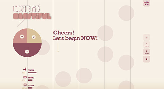
 Web is Beautiful has a very understated color palette that works nicely to establish a comfortable atmosphere through the website. Soft and appealing.
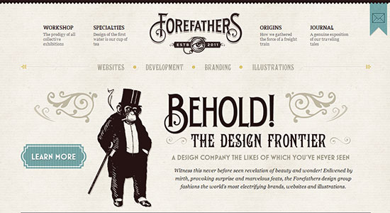
 Forefathers Group uses muted colors to give the site a classic sense of stability and professionalism. The splashes of green help balance that classic feel, giving it something of a modern edge.
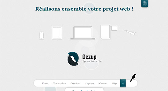
 Dezup also uses splashes of a deep teal to draw the users eyes, and in this case, to steer them towards the elements of focus in the design.
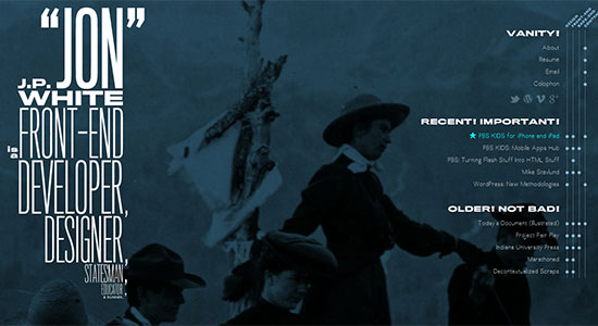
 Jon White's approach creates a stunning design of contrast with the deep blue offset with the large/bold white text elements. This gives the site a comfortable look that remains sharp and stands out at the same time.
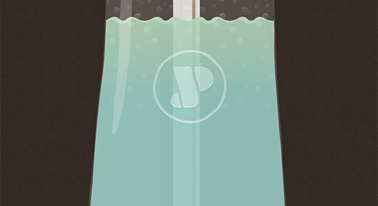
 Jan Ploch has a unique design that drains the color from the otherwise brown background as the user scrolls down through the page, like liquid draining from a bottle through the straw.
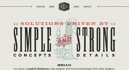
 Lyudmil Shoshorov employs a vintage style with just small splashes of color to really set the design off and bring in a completely retro feel to the site.
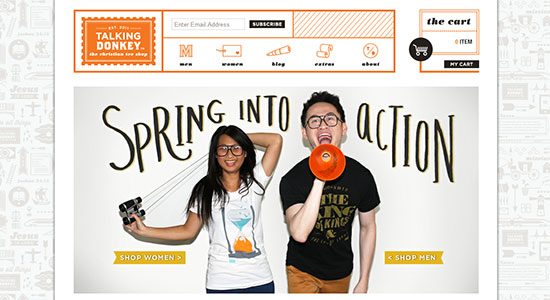
 Talking Donkey Shop uses a white background with soft blue, faded elements laid throughout it, which really makes the bright orange header and splashes of color in the content effectively grab the users attention.
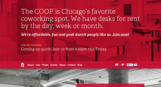
 COOP goes with a bold choice of red to stir users into action and send them calling on COOP for the space they need to get working in. It is easy to cross the line with red and have the site come off feeling visually uncomfortable, but here it is done well to instill a sense of solid reputation.
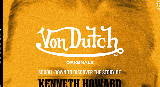
 VonDutch's design relies heavily on splashes of color throughout the site as you scroll down through it to lead the users and give them a sense of the brand's style
 The Mischief Co uses a familiar color palette and vintage style that we see quite a bit these days, but it works well. Hence the fact that we keep seeing it used.
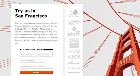
 Postmates uses the classic color and imagery of San Francisco's iconic Golden Gate bridge to give their website the just the splash of color it needs to impress on their visitors a sense of strength and stability.
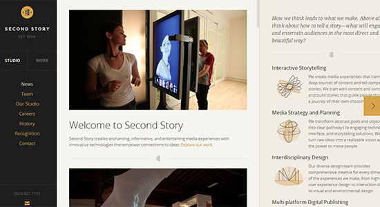
 Second Story Interactive Studios takes a very stylish design and breaks up the black and white color palette with soft bits of yellow. This takes the professional, sleek site design and adds a touch optimistic energy to the mix.
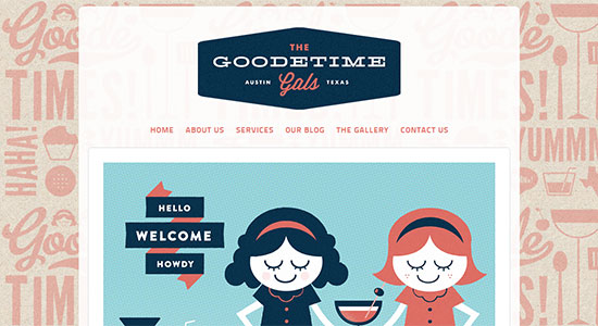
 The Goodtime Gals uses splashes of faded red throughout the background which really makes the deeper tones of blues and red stand out wonderfully against the white background of the content areas.
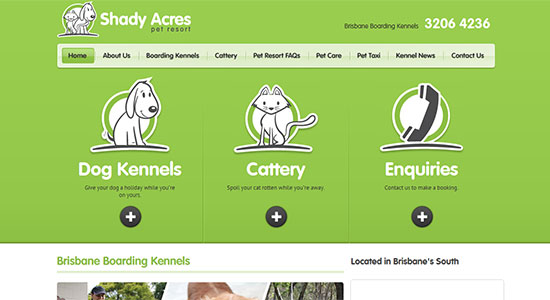
 Shady Acres' site has an over-sized header filled with green to greet the site's visitors, and the green repeats in splashes as you scroll down leaving you with that sense of peace as you move through the rest of the site.
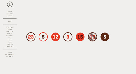
 Lisi Design has a very simple design that screams minimalism on all fronts, not just when it comes to color. The colors are so succinctly included that they don't in any way feel visually overwhelming or overstimulating.
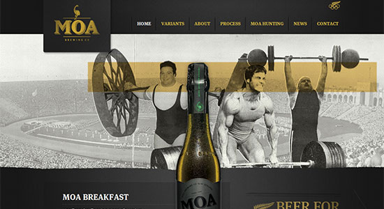
 Moa Beer plays off of the happiness that the color yellow tends to impart, as it is subtly poured throughout the design. Given that it also reflects the color of their product, the burnt hue plays well with the brand and design.
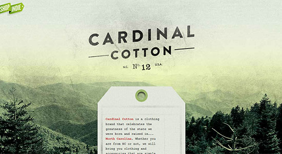
 Cardinal Cotton has multiple shades of green at play in the background, which is contrasted nicely by the red highlights that are scattered throughout the content drawing the readers' eyes, as intended.
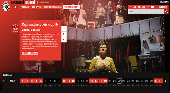
 Monument National draws on the color of passion for the site design, which given that their work is rooted in the passion of the entertainment industry, this use of such a bold color is perfectly chosen.
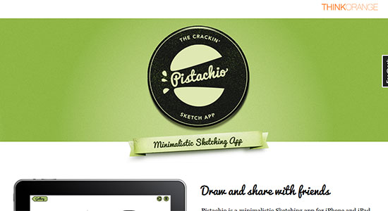
 Pistachio Sketching App keeps most of the color they splashed into their black and white theme to the header, but the light green shade, no doubt something in the pistachio color range, softly welcomes users to the site and the app.
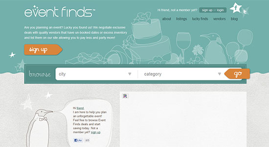
 Event Finds uses a warm color scheme to entice users to trust in their event planning services, blending green and blue for a trustworthy, peaceful introduction to their company.
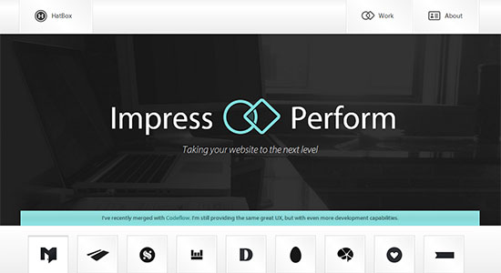
 HatBox has light blue accents added into their sleek design, to sell potential clients on their dependability as creative leaders in web design.
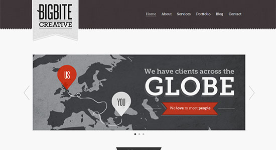
 Big Bite Creative uses the standard black and white color scheme with a retro edge, whilst the common red highlights again play into the design. There is a reason this color scheme comes up time and again, and it probably has something to do with the proven track record of this potent color scheme.
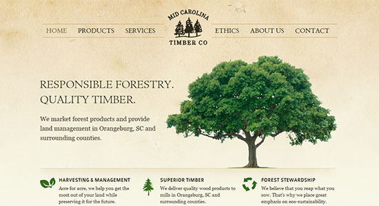
 Mid-Carolina Timber Company plays off of the eco-friendly nature of the color green to bring splashes of color to their design and further drive home their mission.
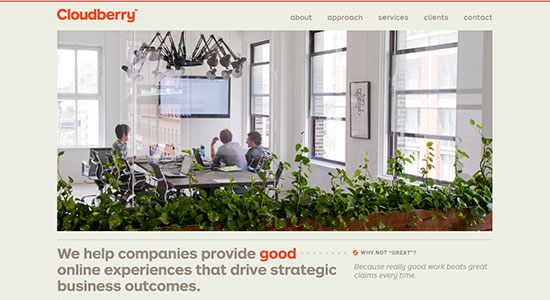
 Cloudberry takes the energy of the color orange and applies it in very strategic ways throughout the site's design. Highlighting and leading the reader's eyes along through the page.
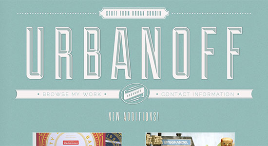
 Urbanoff uses a very soft and simple two-tone color scheme that is very welcoming, while still wearing an edge of reliability. Fashionably fantastic.
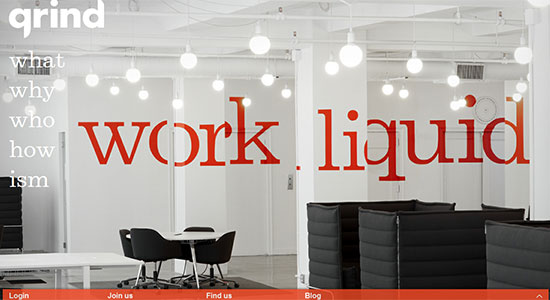
 Grind goes for the fun and energetic path as they splash orange throughout the design. The main site message further sells this idea with an imaginative twist.
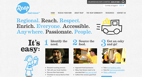
 Reap takes to the web with a design that is packed with blue highlights and splashes down through the page. Making sure that appealing, old standard is there to pass along that dependable quality.
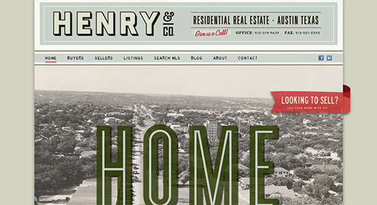
 Henry & Co. Real Estate goes for a vintage, old-school look, playing with a very light color scheme that helps sell the company as a friendly, solid business that is ready to take action.
Splashes of Color
Zwart/Wit Media uses a large black and white photograph background with a single stripe of green down the site that really makes the entire design pop. Dulla's design uses one big splash of red and several minor dabs of color against the otherwise somber backdrop giving the design a sense of playfulness that the imagery would otherwise work against.
 Web is Beautiful has a very understated color palette that works nicely to establish a comfortable atmosphere through the website. Soft and appealing.
 Forefathers Group uses muted colors to give the site a classic sense of stability and professionalism. The splashes of green help balance that classic feel, giving it something of a modern edge.
 Dezup also uses splashes of a deep teal to draw the users eyes, and in this case, to steer them towards the elements of focus in the design.
 Jon White's approach creates a stunning design of contrast with the deep blue offset with the large/bold white text elements. This gives the site a comfortable look that remains sharp and stands out at the same time.
 Jan Ploch has a unique design that drains the color from the otherwise brown background as the user scrolls down through the page, like liquid draining from a bottle through the straw.
 Lyudmil Shoshorov employs a vintage style with just small splashes of color to really set the design off and bring in a completely retro feel to the site.
 Talking Donkey Shop uses a white background with soft blue, faded elements laid throughout it, which really makes the bright orange header and splashes of color in the content effectively grab the users attention.
 COOP goes with a bold choice of red to stir users into action and send them calling on COOP for the space they need to get working in. It is easy to cross the line with red and have the site come off feeling visually uncomfortable, but here it is done well to instill a sense of solid reputation.
 VonDutch's design relies heavily on splashes of color throughout the site as you scroll down through it to lead the users and give them a sense of the brand's style
 The Mischief Co uses a familiar color palette and vintage style that we see quite a bit these days, but it works well. Hence the fact that we keep seeing it used.
 Postmates uses the classic color and imagery of San Francisco's iconic Golden Gate bridge to give their website the just the splash of color it needs to impress on their visitors a sense of strength and stability.
 Second Story Interactive Studios takes a very stylish design and breaks up the black and white color palette with soft bits of yellow. This takes the professional, sleek site design and adds a touch optimistic energy to the mix.
 The Goodtime Gals uses splashes of faded red throughout the background which really makes the deeper tones of blues and red stand out wonderfully against the white background of the content areas.
 Shady Acres' site has an over-sized header filled with green to greet the site's visitors, and the green repeats in splashes as you scroll down leaving you with that sense of peace as you move through the rest of the site.
 Lisi Design has a very simple design that screams minimalism on all fronts, not just when it comes to color. The colors are so succinctly included that they don't in any way feel visually overwhelming or overstimulating.
 Moa Beer plays off of the happiness that the color yellow tends to impart, as it is subtly poured throughout the design. Given that it also reflects the color of their product, the burnt hue plays well with the brand and design.
 Cardinal Cotton has multiple shades of green at play in the background, which is contrasted nicely by the red highlights that are scattered throughout the content drawing the readers' eyes, as intended.
 Monument National draws on the color of passion for the site design, which given that their work is rooted in the passion of the entertainment industry, this use of such a bold color is perfectly chosen.
 Pistachio Sketching App keeps most of the color they splashed into their black and white theme to the header, but the light green shade, no doubt something in the pistachio color range, softly welcomes users to the site and the app.
 Event Finds uses a warm color scheme to entice users to trust in their event planning services, blending green and blue for a trustworthy, peaceful introduction to their company.
 HatBox has light blue accents added into their sleek design, to sell potential clients on their dependability as creative leaders in web design.
 Big Bite Creative uses the standard black and white color scheme with a retro edge, whilst the common red highlights again play into the design. There is a reason this color scheme comes up time and again, and it probably has something to do with the proven track record of this potent color scheme.
 Mid-Carolina Timber Company plays off of the eco-friendly nature of the color green to bring splashes of color to their design and further drive home their mission.
 Cloudberry takes the energy of the color orange and applies it in very strategic ways throughout the site's design. Highlighting and leading the reader's eyes along through the page.
 Urbanoff uses a very soft and simple two-tone color scheme that is very welcoming, while still wearing an edge of reliability. Fashionably fantastic.
 Grind goes for the fun and energetic path as they splash orange throughout the design. The main site message further sells this idea with an imaginative twist.
 Reap takes to the web with a design that is packed with blue highlights and splashes down through the page. Making sure that appealing, old standard is there to pass along that dependable quality.
 Henry & Co. Real Estate goes for a vintage, old-school look, playing with a very light color scheme that helps sell the company as a friendly, solid business that is ready to take action.


This is a nice collection of simple and effective web designs.
My favorites are:
The Goodtime Gals, Moa Beer, Moa Beer, Jon White, Jan Ploch
Awesome collection!! Really like the effective use of colors in all the designs mentioned in the list. Thanks for sharing!
This is really amazing stuff! I am a very deep believer of the fact that simplicity is always the best policy, especially when it comes to web designing. Being a designer one should go for elegant designs that should appeal to the prospective client or the target audience effectively and the best way to do that today is by going for simple designs.
Nice Collection.