
Tablet Web Design Best Practices: Free Ebook Offers Loads of Useful Tips
Who would dare to not call the guys and girls of Canadian Mobify experts in mobile web design? They actually are. Though not everyone will find their cloud-based design concepts appealing. A short while ago the people at Mobify decided to publish an ebook on the best practices in tablet-focused web design. They titled the 25-pager "Tablet Web Design Best Practices: 30 Ways to Create Amazing Web Experiences on Tablets". Even more amazing, they give it away for free...
[caption id="attachment_78046" align="alignnone" width="550"] Downloadpage of the Ebook[/caption]
Tablet Web Design Best Practices: 30 Ways to Create Amazing Web Experiences on Tablets
Mobify's ebook is a compact read. Based on internal and external studies, its writers compiled a nifty list of the most essential tips in regard to mobile web design. Experience in designing mobile sites for large clients, such as Starbucks, went into the creation of the book as well as the experience of Mobify's client workforce of 75,000 designers and developers.
No wonder that some of the tips come naturally while you think about the matter, while others need more thought and would not have naturally come to me, at least not immediately.
Tablet Web Design Best Practices: Two Parts to Rule Them All
The ebook consists of two parts. The first part assumes that you got an existing desktop website and would like to make it as mobile as possible to not lose mobile clients. With the rise of mobile, this is growing more essential by the hour. If you drive a web-related or at least supported business, you should definitely work through that first part thoroughly.
[caption id="attachment_78044" align="alignnone" width="550"]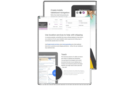 Outtakes[/caption]
Puzzled as to why I call this mandatory? In 2013 and 2014 sales of tablets will rise to an estimate of half a billion devices. Studies show, that tablet users spend an average of 20 % more while shopping online than their desktop counterparts. If you don't support tablet devices, you will lose this revenue, which is partly substituting desktop revenue, completely.
Puzzled as to why I say, you might lose that revenue? The answer is obvious. Desktop sites with fonts in sizes of 12 pixels, buttons too small to be touched and forms unusable on touch devices will drive off even the most patient web customer. If you are a tablet user, you will certainly agree: Most websites are no fun to be surfed via a tablet. On the other hand, web surfing is what tablet users do most. Can we agree somethings needs to be done?
In its part 1 the ebook gets straight to the point, shirt-sleeved even, to offer advice like this:
- Touch-targets should never be smaller than 44 px squared,
- all the areas of the site must be checked for touch usability,
- don't make users type on mobile devices,
- disable auto-correct and auto-capitalize in forms, enable contextual keyboards,
- raise font sizes and line heights,
- provide icons as fonts and images in high resolution,
- and lots more.
Part 2 changes the viewpoint. In this part the focus is not on how to make desktop sites acceptable for mobile surfers, instead part 2 focuses on how to build an optimized web app dedicated to tablet users, fully tailored to the special abilities and limitations a tablet offers:
- Let pictures in a page stay zoomable, while the page is not,
- make navigation sticky to have it persistent throughout the site,
- add location-based services to support logistics or whatever purpose your site has,
- let fonts and sizes be customized by your visitors,
- work with loads of images, build visual experiences,
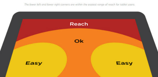
- obey hot zones, zones of the tablet most easily to be reached with fingers, put most of the functionality within their reach,
- and lots more.
Admitted, the authors work for Mobify, thus linking to resources and tutorials by that service to visualize the concepts explained in the book. Keep that in mind an don't let it limit you. The tips given are universally valid, no matter which tool you use. Overall, if you are an experienced mobile UI developer/designer, chances are the book won't teach you many new things. If you are the average online-shop maintainer or a self-educated learning-by-doing designer, chances are, this ebook will push your skill level more than just a little higher.
If you want to get hold of Tablet Web Design Best Practices: 30 Ways to Create Amazing Web Experiences on Tablets now, let's head over to the download page. As I mentioned, the whole process is straightforward and costs you nothing. You simply leave a syntactically correct email address, click "Get the Guide Now" and are immediately enabled to download. A link will be sent to the given email address additionally, yet is not necessary anymore - nice to know for the growing number of online-paranoids, whose paranoia gets topped by reality faster than they can raise it...
Now responsive web design solves many problem for tablet device too, because it creates website for all devices :)
finally a good info in simple language and can be understood by all
It’s important to use the same model of the navigation of the web design. some webmasters do a different design for the navigation in a different part in the website. Well, this is totally a big mistake because the user may think that he’s on another website which will make the user close the website … and now you lost a customer !!