
UI Jar Collects Useful Dribbble Designs

Dribbble is bigger than what you can oversee. One reason for that is that it contains a lot of crap. UI Jar separates the wheat from the chaff.
 One could call it some experimentational lab if it were moving forward. In reality, Dribbble contains a lot of junk that nobody should ever have considered using.
This is a bit unfortunate because this surreal junk is not all there is to see on Dribbble. If you look for long enough, you'll find some pretty good inspiration or even useful freebies. There are two catches. The first one is the sheer amount of content to go through. The second one is the high level of expertise required to tell apart the good from the bad. Just because something looks good, it doesn't have to be a good design.
[caption id="attachment_103671" align="aligncenter" width="1024"]
One could call it some experimentational lab if it were moving forward. In reality, Dribbble contains a lot of junk that nobody should ever have considered using.
This is a bit unfortunate because this surreal junk is not all there is to see on Dribbble. If you look for long enough, you'll find some pretty good inspiration or even useful freebies. There are two catches. The first one is the sheer amount of content to go through. The second one is the high level of expertise required to tell apart the good from the bad. Just because something looks good, it doesn't have to be a good design.
[caption id="attachment_103671" align="aligncenter" width="1024"]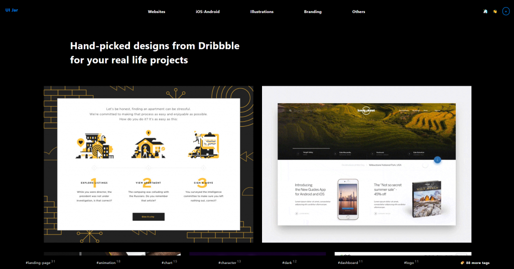 UI Jar: Website Designs. (Screenshot: Noupe)[/caption]
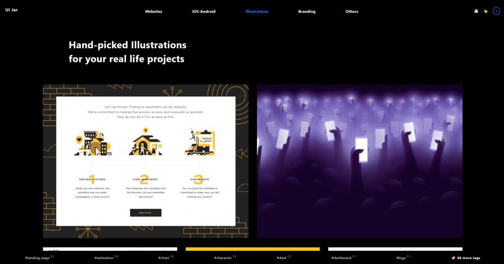 UI Jar: Illustrations (Screenshot: Noupe)[/caption]
UI Jar is the service that presents his search results. When selecting designs, he makes sure that the design is actually being used, or at least suitable for actual usage. The design of the UI Jar is rather dark. The focus is on the grid of designs that stand out of the black.
Aside from being sorted into five main categories, like websites, illustrations, and others, Oykun assigns keyword hashtags to each element. The content of each of the 95 hashtags that are available as of now can be displayed by clicking on them.
Clicking one of the designs featured in the grid opens a modal window with a bigger view of the preview. On the right, you can see the title, creator, and a link to the project on Dribbble, as well as the category and the assigned hashtags.
[caption id="attachment_103673" align="aligncenter" width="1024"]
UI Jar: Illustrations (Screenshot: Noupe)[/caption]
UI Jar is the service that presents his search results. When selecting designs, he makes sure that the design is actually being used, or at least suitable for actual usage. The design of the UI Jar is rather dark. The focus is on the grid of designs that stand out of the black.
Aside from being sorted into five main categories, like websites, illustrations, and others, Oykun assigns keyword hashtags to each element. The content of each of the 95 hashtags that are available as of now can be displayed by clicking on them.
Clicking one of the designs featured in the grid opens a modal window with a bigger view of the preview. On the right, you can see the title, creator, and a link to the project on Dribbble, as well as the category and the assigned hashtags.
[caption id="attachment_103673" align="aligncenter" width="1024"]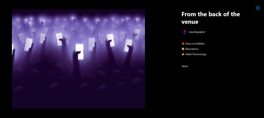 UI Jar: Detail View (Screenshot: Noupe)[/caption]
Dribbble, The Triple-Edged Sword
A few months ago, I voiced my opinion on Dribbble very clearly. I called it a self-adulation platform and recommended not using it. There is way too much hurray, and too little work that actually made it to a client.
One could call it some experimentational lab if it were moving forward. In reality, Dribbble contains a lot of junk that nobody should ever have considered using.
This is a bit unfortunate because this surreal junk is not all there is to see on Dribbble. If you look for long enough, you'll find some pretty good inspiration or even useful freebies. There are two catches. The first one is the sheer amount of content to go through. The second one is the high level of expertise required to tell apart the good from the bad. Just because something looks good, it doesn't have to be a good design.
[caption id="attachment_103671" align="aligncenter" width="1024"] UI Jar: Website Designs. (Screenshot: Noupe)[/caption]
UI Jar to the Rescue
What we need to save time, and to be sure that the suggestions are suitable for daily use, is an expert that does that task for us. Oykun is that expert. Oykun Yilmaz, an all-round designer from London, has fifteen years of professional experience in product design, and knows all the dos and don'ts. Just like me, he was annoyed by the fact that Dribbble was watering down more and more, so he decided to create a service that extracts and presents the usable designs from Dribbble. [caption id="attachment_103672" align="aligncenter" width="1024"] UI Jar: Illustrations (Screenshot: Noupe)[/caption]
UI Jar is the service that presents his search results. When selecting designs, he makes sure that the design is actually being used, or at least suitable for actual usage. The design of the UI Jar is rather dark. The focus is on the grid of designs that stand out of the black.
Aside from being sorted into five main categories, like websites, illustrations, and others, Oykun assigns keyword hashtags to each element. The content of each of the 95 hashtags that are available as of now can be displayed by clicking on them.
Clicking one of the designs featured in the grid opens a modal window with a bigger view of the preview. On the right, you can see the title, creator, and a link to the project on Dribbble, as well as the category and the assigned hashtags.
[caption id="attachment_103673" align="aligncenter" width="1024"] UI Jar: Detail View (Screenshot: Noupe)[/caption]
Thanks for the article! ? Appreciate it! It’s amazing to hear you are enjoying the concept. I can’t wait to share the V2 with you all ?