
Showcase Of Big Online Stores
The main task of any store is to sell its products, so there is an important usability and user experience factor, making conversion rates and selling figures a primary consideration. However, marketing objectives often tend to conflict with design goals which way too often results in clumsy, overcrowded and busy e-commerce websites.
For this article, we researched current design patterns among the biggest and most popular online stores as well lesser known but professional outfits. The showcase below may not be very pretty, and we do not know how effective in terms of conversion rates they are, but because they exist, it is very likely to assume that they work one way or another.
Below, you'll find 40+ online stores, with short observations on their design and usability. We hope this list helps you better understand the world of online shopping.
Content Sliders
Content sliders, also called slideshows or carousels, allow designers to squeeze more content into a block without cluttering space. They are also interactive.
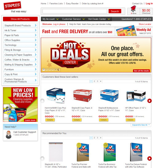
Staples
Staples has a lot of white space and red accents. This store stands out for the unusual location of its navigation: the menu for its main products is in the left sidebar.
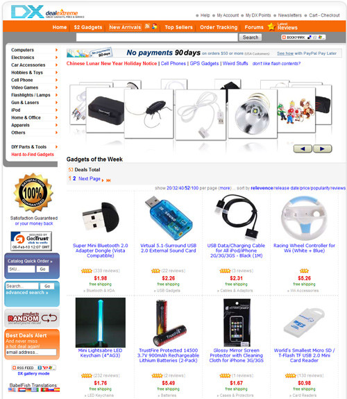
DealExtreme
DealExtreme uses mainly orange and blue in its design. All products appear with a short overview of the essential information.
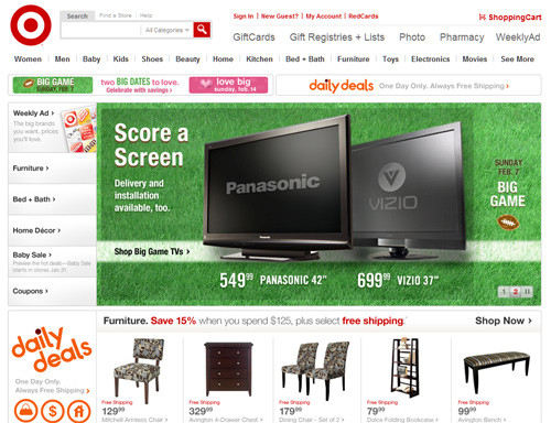
Target.com
Target is an American retail company founded in Minneapolis, Minnesota, in 1902 as the Dayton Dry Goods Company. Target is the second-largest discount retailer in the US behind Walmart. Its design is very minimalist: a lot of white space and emphasis on big pictures.
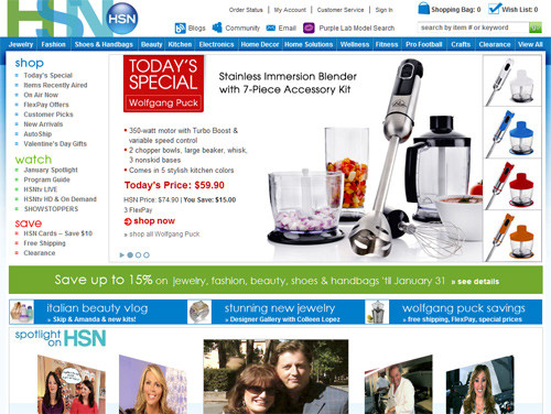
HSN.com
The Home Shopping Network is a 24-hour basic cable shopping network that is accessible on cable, satellite and some terrestrial channels in the US. The company also operates HSN.com, an e-commerce operation. Its design is simple and colorful. On the main page is a big slider with pictures and special offers. To help you find what you want, HSN offers horizontal drop-down navigation at the top.
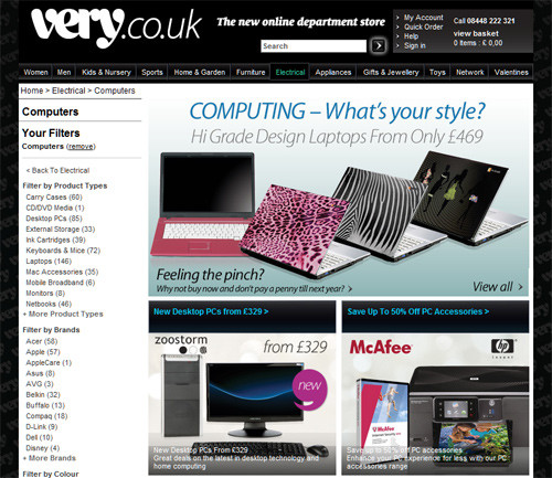
Very
Very.co.uk has a dark background with its logo repeated. We also get a big slider with the latest offers.
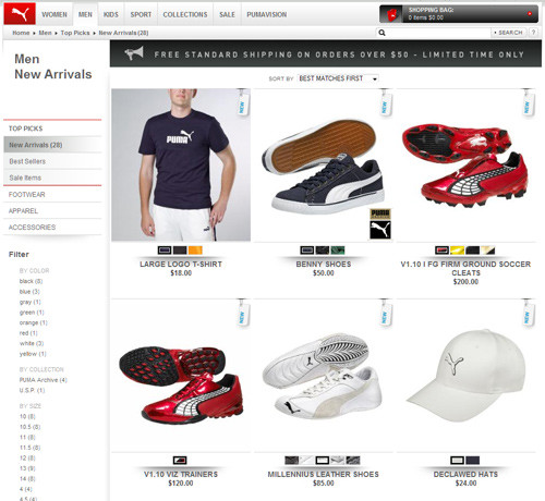
Puma Online Shop
Puma has some good design elements such as white space, large images and contrast. The modern drop-down navigation at the top makes it easy to find what you're looking for.
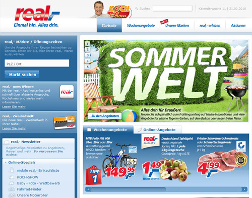
Real.de
Real.de looks refreshing and catchy with its variations of blue. The easy modern navigation at the top and the slider on the home page beckon the user to take action.
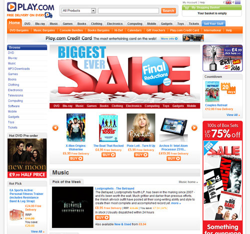
Play.com
Play.com is an online retailer of DVDs, CDs, books, gadgets, video games, DRM-free MP3 downloads and other electronic products, as well as clothes and accessories. It has a very colorful and playful layout. Two colors dominate: blue in the logo and horizontal navigation (on hover), and orange also in the logo and in the product names and top navigation. The "Shopping Basket" is set off in light green.
Simplicity
The philosophy less is more is also followed by online stores. Simplicity done well highlights products and make them more attractive. It also creates contrast between less important and more important products.
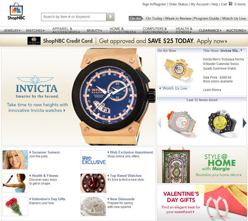
ShopNBC
ShopNBC uses white space and gray gradients to make its design simple and easy to navigate.
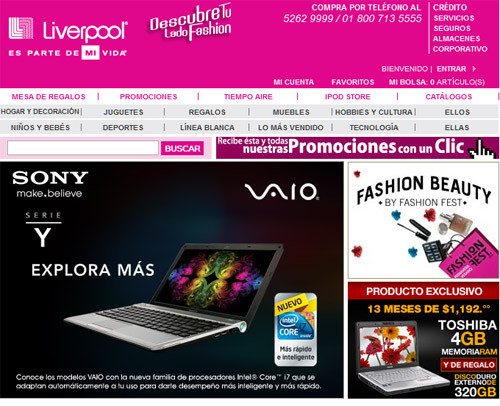
Liverpool
Liverpool uses an extremely slim layout and a playful pink and white combination. Liverpool demonstrates that less is more while remaining professional.
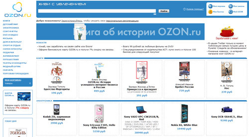
Ozon.ru
Ozon.ru is light and simple. Browsing products is easy, but the small font sizes make it a little confusing.
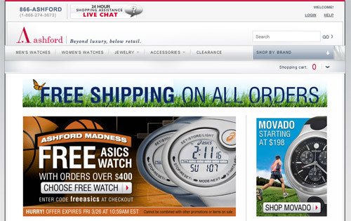
Ashford
Ashford looks elegant and projects a high-end image. The simple silver, white and red keep the design tasteful.
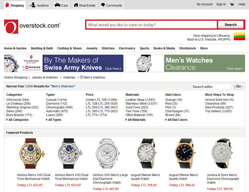
Overstock
Overstock has a clean and simple layout, similar to that of Tesco. At the top is a big search field that lets users easily find the search options.
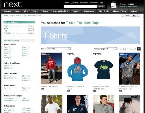
Next
Next has a dark layout with big pictures. For a fashion store, its layout is clean and elegant.
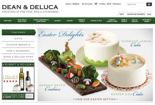
Dean & Deluca
Dean & Deluca is different than the other online stores here, with its unusual fonts and subtle dark-green and white combination.
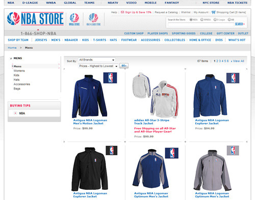
NBA Store
This layout retains the NBA's three essential colors: white, red and blue. One can find a lot of team logos. The store is easy to navigate, thanks to the drop-down navigation at the top and the useful menu on the left.
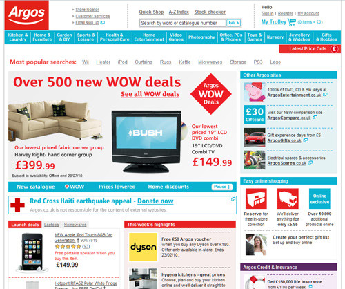
Argos
Argos is the largest general goods retailer in the UK, with 750 stores. It is unique among major retailers in the UK because it promotes goods to customers primarily through its catalogue.
Rounded Corners... Again
Good or bad: rounded corners are still popular and are used for an attractive and playful look. They are friendlier and less aggressive than sharp rectangles. Almost all stores use more than one color on rounded-corner elements.
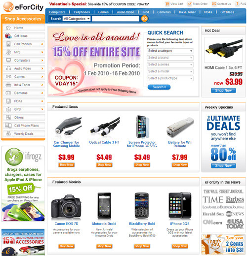
eForCity
eForCity has bright fresh colors—orange, light green and blue—which help customers easily find darker-colored products.
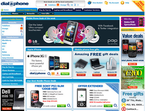
Dial a Phone
Dial a Phone's layout is colorful and confusing. A lot of offers are shown, and each of them is in a different color.
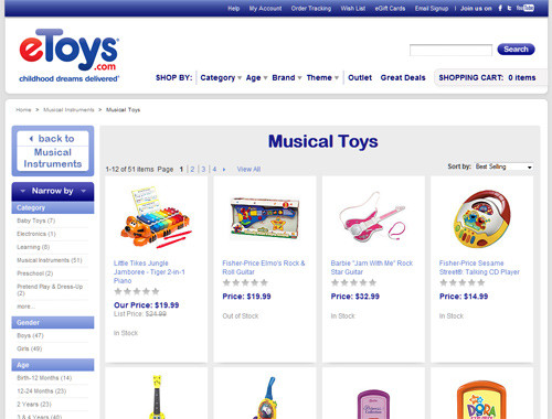
eToys.com
eToys' layout is playful and reminds one of childhood with its red and blue combination. Toys are shown without ads or special offers—just the essential information.
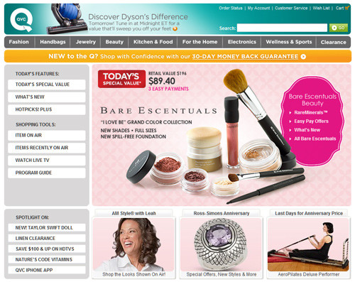
QVC.com
QVC is a multi-national corporation that specializes in television home shopping. Its name stands for quality, value and convenience, the three pillars of the company's vision. QVC uses big font size at the top for its navigation and a breadcrumb, helping users find what they want.
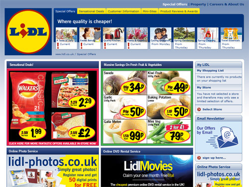
Lidl
Lidl is similar to ALDI (mentioned below) with its red, green and yellow combination. Lidl differs with its rounded corners and darker background.
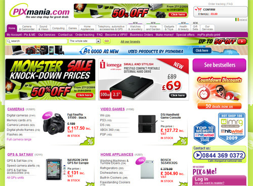
Pixmania
Pixmania is a pan-European e-tailer of digital photography and consumer electronic goods. Pixmania has a colorful layout and broad category list, to the point of looking a bit confusing.
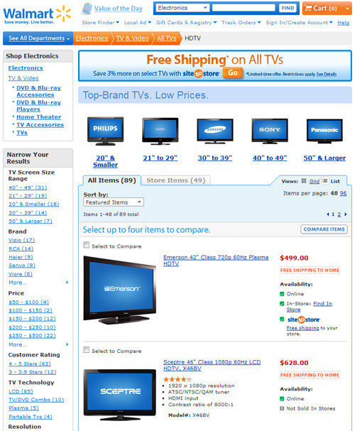
Walmart
Walmart is a US-based chain of large discount department stores. It is the world's largest publicly incorporated company by revenue, according to Fortune Global 500's 2008 report. Walmart's online layout is slim compared to that of the other big online stores, which is good if the user is on a lower-resolution browser. Walmart also has breadcrumbs at the top, helping users remember where they are.
Portals
E-commerce portals are the most common design trend among e-commerce websites today. Shops are using a two or more columns layout, colorful illustrations, sliders and big navigation menus to make shopping online more easier.
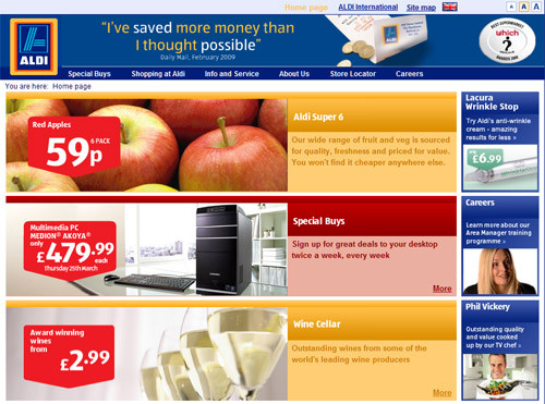
ALDI
ALDI has subtle gradients and a simple layout. Clients can easily find what they're looking for using the simple navigation at the top.
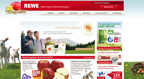
REWE
REWE stands out with its beautiful background and catchy product illustrations. The call-to-action buttons make this store really impressive.
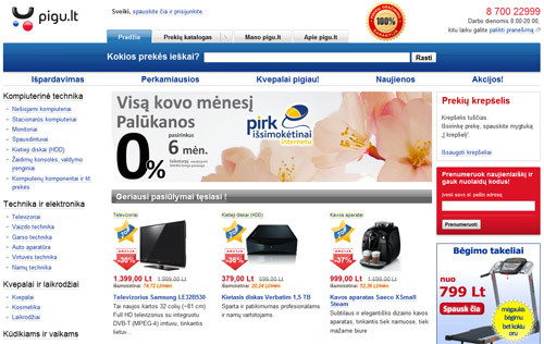
Pigu.lt
Pigu.lt is the biggest online store in Lithuania. The layout is in a Web 2.0 style, with a lot of white space. The left sidebar is a little confusing, and the information is bit too much.
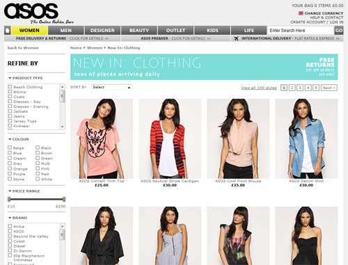
ASOS.com
ASOS is the UK's largest online-only fashion and beauty store. Aimed at 16 to 34 year olds, it offers over 19,500 own-label and branded fashion goods. The design is minimalist and clean.
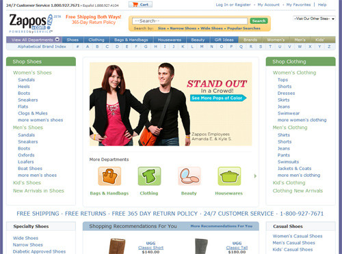
Zappos
Zappos is an online shoe and clothing store. It stands out with its "alphabetical brand index" navigation at the top and big footer.
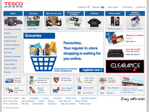
Tesco
Tesco stands out from other stores with its unusual navigation. The design is clean and easy to navigate. The images in the navigation help users find what they want fast.
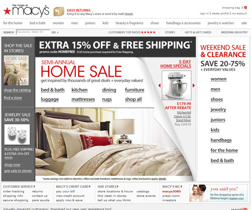
Macy's
Macy's design is minimalist. The small font size is risky because it takes longer to notice the links.
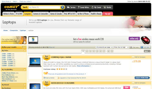
Comet
Comet's design is fresh because of the dominant yellow. The layout is wide, allowing the company to display more information about its products.
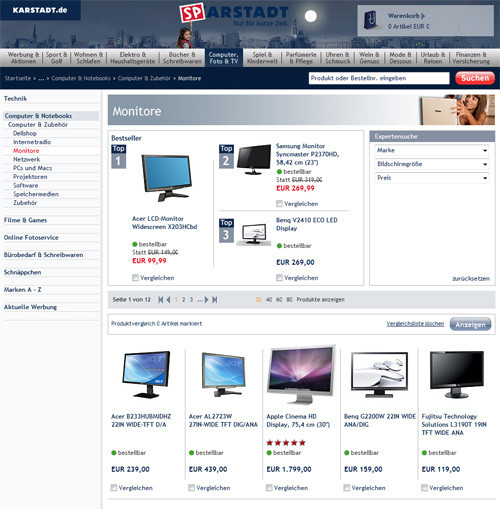
Karstadt
Arcandor AG (formerly KarstadtQuelle AG) is a holding company located in Essen, Germany that oversees companies involved in mail order and Internet shopping, department stores and tourism services. Arcandor has a big slider on its home page to display special offers. The header has a city landscape, making this store stand out from the crowd.
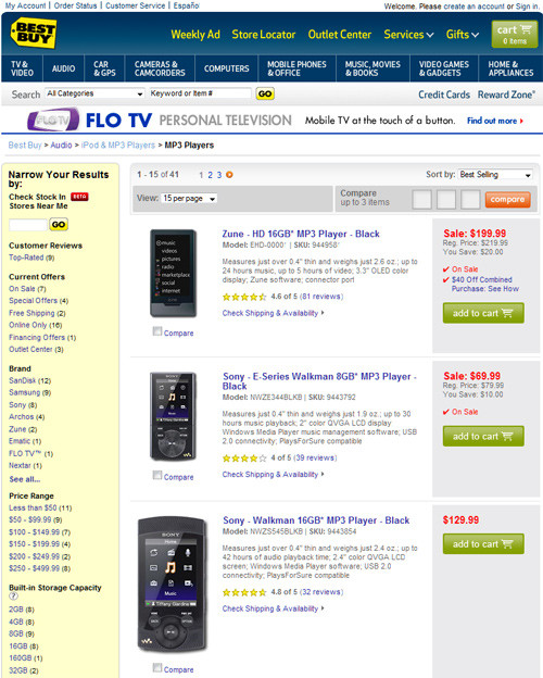
Best Buy
Best Buy's layout is slim and colorful. Everything looks good, except the sometimes annoying advertisement at the top.
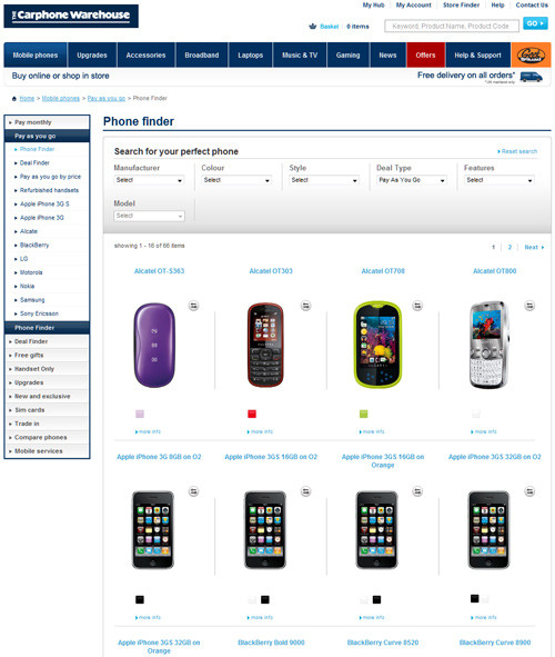
Carphone Warehouse
This layout is clean and has a lot of white space. The breadcrumb at the top lets users know where they are.
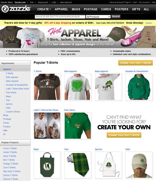
Zazzle
Zazzle has a dark header that highlights the navigation and creates contrast. Essential information is contained in the dark header, and products are shown against a light background to make them pop.
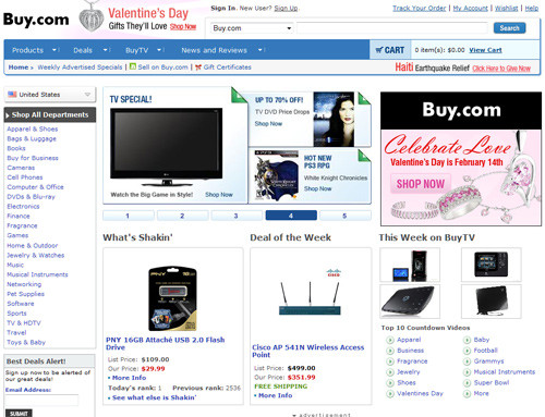
Buy.com
Buy.com's layout is simple and clean. Effective use of white space and good product pictures make for a simple and professional look.
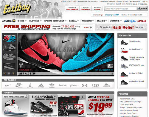
Eastbay
This layout looks a bit confusing with its small details and busy colors. Its strengths are the modern sliders and lightboxes.
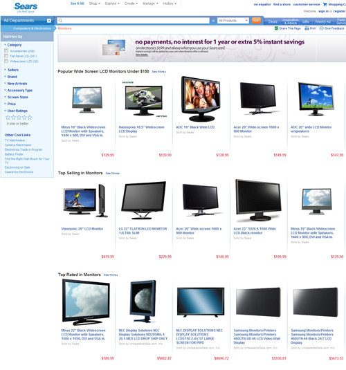
Sears
Sears looks fresh and clean. Web 2.0 colors, a wide layout and white space makes this store easy to navigate.
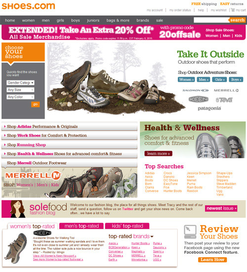
Shoes.com
Shoes.com effectively uses slab fonts and fresh colors like pink, light blue, orange and green. The simple and minimalist navigation at the top is functional and easy to use.
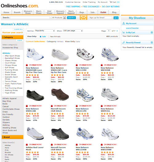
Onlineshoes.com
Compared to Shoes.com, the color scheme for Onlineshoes.com is similar, but with a dominant orange. The store stands out for its unusual left alignment.
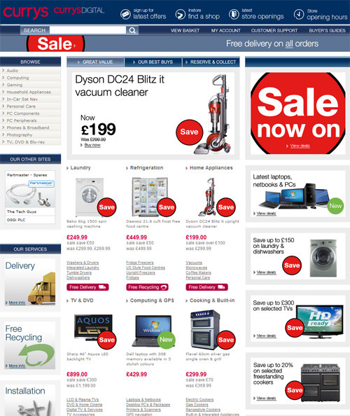
Currys
Red and blue dominate this design. Currys uses Web 2.0-style navigation at the top and various sliders.
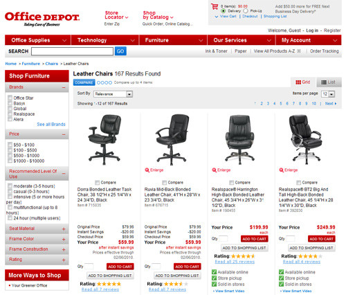
Office Depot
Office Depot is similar to Staples in its use of white and red, but different in its placement of the navigation and search field.
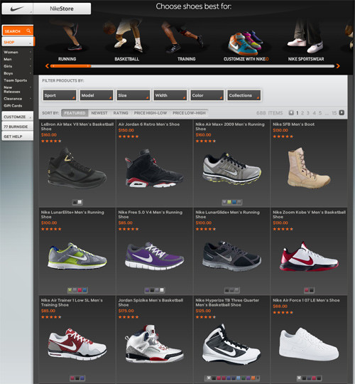
NikeStore
NikeStore is a leading online store. Subtle colors, contrast, beautiful typography and Flash elements make you feel that you're in right place.
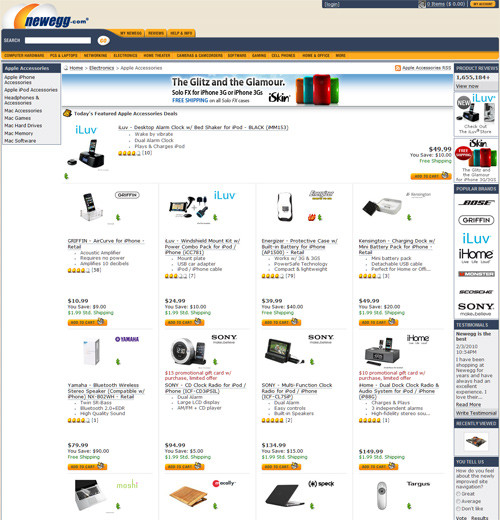
Newegg.com
Newegg uses blue and light orange as its main colors. The wide layout keeps the page from looking overloaded, letting users find products easily.
Further Resources
Here are some other articles and resources related to e-commerce:
- Beginner’s Guide to E-Commerce Solution
All the major players are included in this complete guide to e-commerce solutions, with many free high-quality commercial resources. - 30 Examples Of Well Designed Ecommerce Websites
A showcase of 30 well-designed e-commerce websites from a variety of different industries. - 50 Beautifully Crafted Corporate Ecommerce Web Designs
A showcase of beautiful e-commerce websites. - An Analysis of the Amazon Shopping Experience
A discussion of a number of features in the Amazon shopping experience that, either in principle or practice, offer a model worthy of emulation by other e-commerce developers today.
(al)
About the author
Tomas Laurinavicius is a design blogger from Lithuania. He's interested in web/graphic design, Photoshop, WordPress and social media. He runs a design blog called WebDesignFan. You can follow him on Twitter.
Day by day noupe providing a very useful collection of various things and now this this online stores, really love them. thanks for the share
Those are all very large eStores, I wonder what the percentage or break down of CMS?
As good as these are, there’s still something in the experience that makes my want to get in my car and shop in person…
And yoox.com ?
Nice round up! Really inspiring.
awesome collection… great inspiration for my next project
wow.Nice round up.thanks.
aliexpress.com deserves to be here listed.
Thanks for the post. Those case-studies are really beautiful in terms of design and usability. I will need to research how to apply them in Magento so I could teach people how to. Thanks again!
Great Collection, faved it :-)
What about http://www.crookedtongues.com – amazing site!!
I also like gohastings.com as their homepage is rather unique!
nice collection, i thinks buy.com design its similar as amazon
http://www.target.com should be removed. It’s nice but they’re running a script that keeps loading the homepage continuously. You even can’t cancel the loading.
That’s a great collection!I will need to research how to apply them in Magento so I could teach people how to.
This is a fantastic collection, congratulations.
Impressive job that you’ve gotten listed here. Don’t forget carry on the outstanding work.I will without doubt keep coming back to get learned.
Awesome list here, You do a great job at a nice quick review on the user friendliness of a customers site.
I like Staples’ striking creative and the menu on the left works well. Their home page can be busy, but it’s still easy to navigate. Anyway, nice list of sites!
I like tesco’s site. Very clean and simple with one big banner and many small boxes so ppl dont need many clicks before they find what they are looking for.
The first task of a search engine is to crawl the web to gather information about websites.
Well its hard the determine weather to shop in a department store or on the internet because
how ever you look at it your going to find deals in both option. Well personally some times i like the experience
of having the item right there in front of me so i can see and feel it as i make my decision of purchases. On the
other hand well surfing the well i some times ran in to unbelievable deals it also give me the ability to search more
that one place for what i’m looking for which save me some time as well. Really its for you to decide with works best for you.
thehomeofonlineshoppers.blogspot.com/
Great Collection,very valuable
Ive found if I search a bit I get better deals at smaller online stores.
really cool sites to find audio visual equipments to students.Pictures and menu design are attractive. Thanks
Online shopping may add other new experience of shopping for persons from the traditional way to shop.
I like DagangHalal website as it’s combine marketplace for many products with the latest Web 2.0 interface. You’ll discover many surprises as you explore more.
Really beaytiful site and nice template….
Excellent list! BTW, some of these online merchants have had a redesign. Play.com is one of them.
Great collection, Thanks!
I miss the Amazon store, but I suspect that there is a reason why you did not mention it.
Thanks to share, great collections
Great collection. My favorites ones are ASOS and Zappos. How come etsy.com is not in the list?
Interesting that the NBA store is included here. I would of never imagined that store was super large.
Hi, thanks for sharing this nice collection, i am going to send this to my friends…
Such a great article, people with online shops in need of a website redesign will sure find it helpfull