
15 Best Practices of Mobile App Landing Pages

No one likes to be overwhelmed by data (textual or multimedia) or graphics. Smart and compact arrangements in collaboration with an optimal balance between those two are what is needed to successfully win customers, especially when it comes to promoting upcoming digital products. Apps that are created to work on cell phones and tablets look great and consistent on various platforms and screens. To see this firsthand take a glance at our fresh collection of excellent examples of mobile app landing pages. Find some inspiration or derive a few design patterns for your next website.
 Conclusion
One landing page that consists of three to five main sections can be sufficient to present your upcoming product in the best possible light as well as give it a significant boost. It is a viable solution, whether you need to promote a game or a small weather forecast app. Vibrant screenshots and animated gif walkthroughs enrich the experience, convey an idea more correctly and bring the user closer to the product. The more so, creating only one page involves fewer effort.
(dpe)
Photo by Scott Graham on Unsplash
Conclusion
One landing page that consists of three to five main sections can be sufficient to present your upcoming product in the best possible light as well as give it a significant boost. It is a viable solution, whether you need to promote a game or a small weather forecast app. Vibrant screenshots and animated gif walkthroughs enrich the experience, convey an idea more correctly and bring the user closer to the product. The more so, creating only one page involves fewer effort.
(dpe)
Photo by Scott Graham on Unsplash
Mylo
Mylo's landing page exudes an image of purity, elegance, and fashion. Light coloring in collaboration with a vast amount of white space lets us quickly identify its first priorities. Thus, CTA buttons and vigilantly animated gif of an app routine enclosed in stylish highly realistic white iPhone mockup are natural eye catchers.
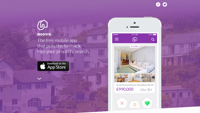
Moovris
The first thing that strikes the eye is a mobile device with a neatly incorporated dynamic walkthrough. Thanks to vibrant, simply beautiful coloring and flat style, the front page bolsters brand identity and has got a refined and sophisticated appearance.
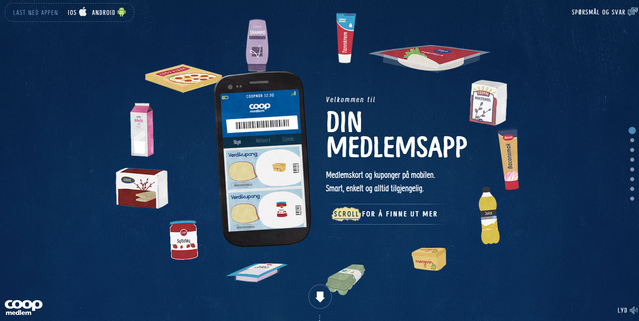
Coop
Coop goes for a professionally-crafted cartoonish style that gives the landing page a lovely playfulness and a bulk of positive emotions. Each section of this parallax-based project includes fantastic illustrations, complementary sketchy objects and soft and smooth hand-written typography that are highly absorbing.
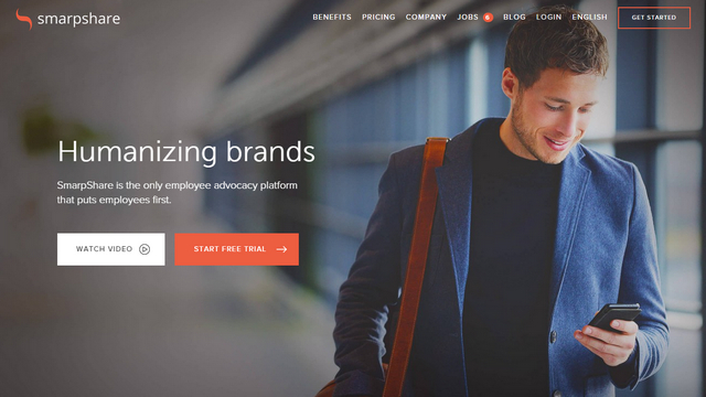
Smarpshare
Smarpshare tries to support its main tagline 'Humanizing Brands' with a clever photo background and a proper businesslike atmosphere and a strong human touch. Flat style in tandem with a modest coloring, smooth typography, and open feeling has aced this task without a hitch.
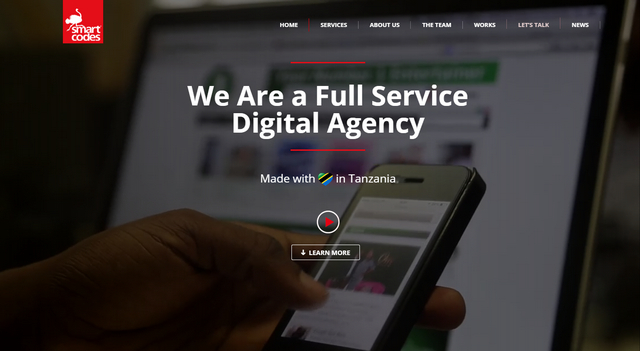
Smart Codes
Although Smart Codes is not an app, it is a professional team that is a dab hand at such sort of issues, yet its website is made in the best traditions of mobile app landing pages. It enables to support brand identity and instantly give a notion of a sphere of expertise, producing a powerful impression.
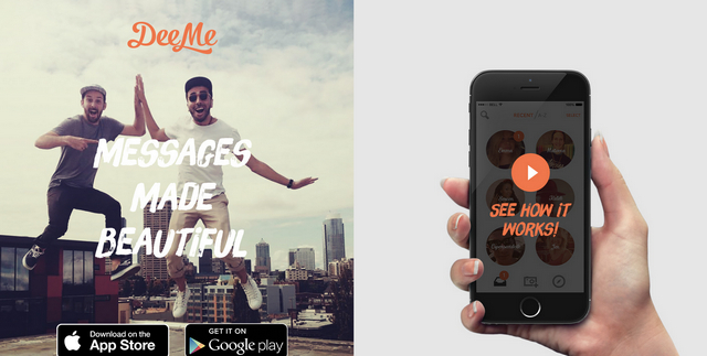
DeeMe
DeeMe has realized a magnificent urban vibe spiced up with some retro feeling that is hard to miss. Pastel coloring, typography with a grunge touch, flat graphics, modern layout, clean appearance and joyful mood separate this landing page from others.
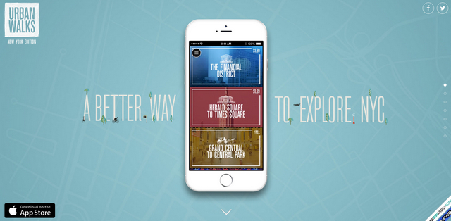
Urban Walks
Urban Walks looks simply gorgeous and attention-grabbing. Here the urban theme is realized through neatly crafted illustrations, the subtle ultra-narrow type that adds a particular charm, and nifty graphics. Animated walkthroughs that occur throughout the page convey the idea of the app and make it more straightforward to regular users.
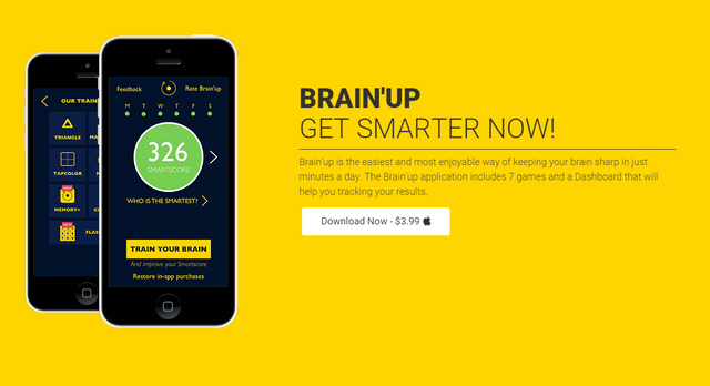
BrainUp
BrainUp charms with its bright, almost hot color scheme where saturated yellow sets the tone. The dark interface of an app that is enclosed within a realistic iPhone rendering is a focal point that naturally grabs the whole attention. What's more, here every aspect is clearly highlighted and energized with fancy lazy loading animations that greatly contribute to the visual experience.
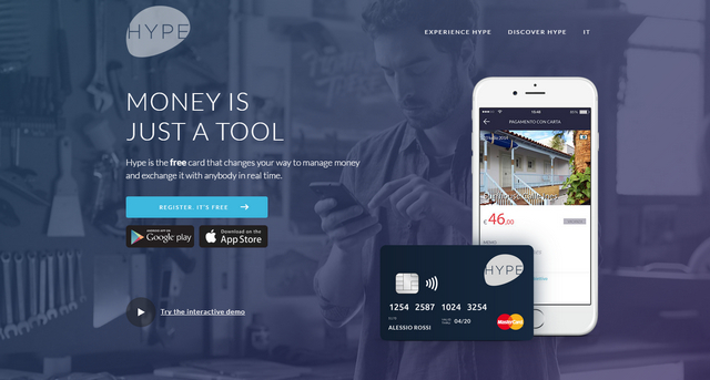
Hype
Hype utilizes a time-proven horizontal stripe layout that quite skillfully handle all data that should be presented to the user. There is nothing extraordinary or inventive: simple, modest color scheme, clean backdrops, flat graphics, and regular type; however, the general atmosphere is what makes it worthy of your attention.
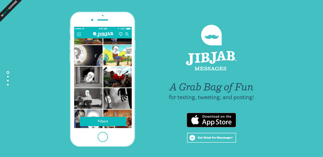
JibJab Messages
JibJab Messages is aimed to bring some fun to your messages so that it is not surprising that the promo website tries to establish a cheerful and positive mood to reflect the idea more properly. Several funny drawings and cursive type recreate the whole aesthetics.
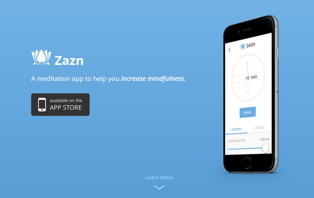
Zazn Meditation
Zazn Meditation goes for simplicity and open feeling that give the landing page a splendid general atmosphere. Much like an interface of an advertised product that is based on a robust, clean and pretty roomy layout, the website has plenty of white space to achieve consistency in design.
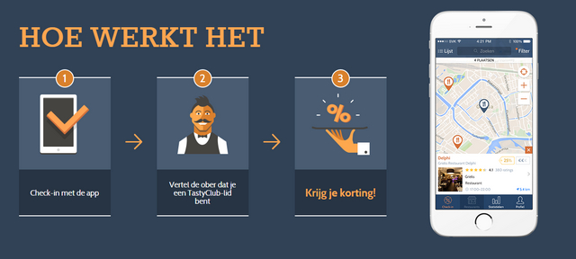
Tasty Club
Tasty Club relies on a harmonious symbiosis of an image background used for the header section and a fully illustrated design that is traced throughout the rest of the page.
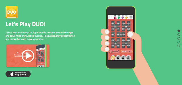
Duo
Utilization of fully illustrated layouts that have an artistic charisma is a popular approach, and Duo proves this once again. The landing page comprises of four main sections, each of which exhibits bright flat style drawings that are visually interesting. They perfectly dish up information and unobtrusively direct the attention to key points.
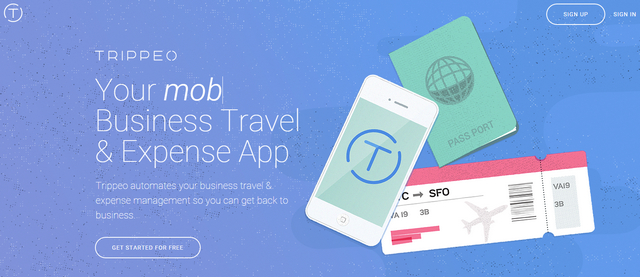
Trippeo
Much like the previous example, Trippeo heavily relies on an effect produced by vibrant and vivid illustrations. They give the page a lovely and friendly atmosphere, so necessary for establishing good relationships with online visitors. Subtle motion that can be found on almost each section adds a zest and dynamics.
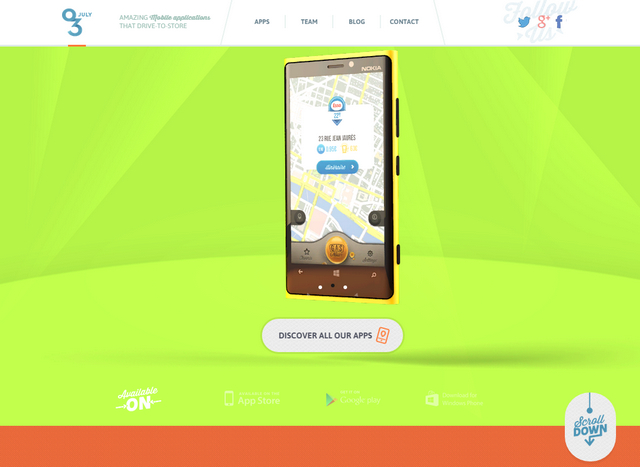
03 July
03 July meets current tendencies in various aspects. The landing page is responsive and features a bold coloring, retro-style decorative elements, ingenious typography and small animations that charge the web site with a sense of movement.
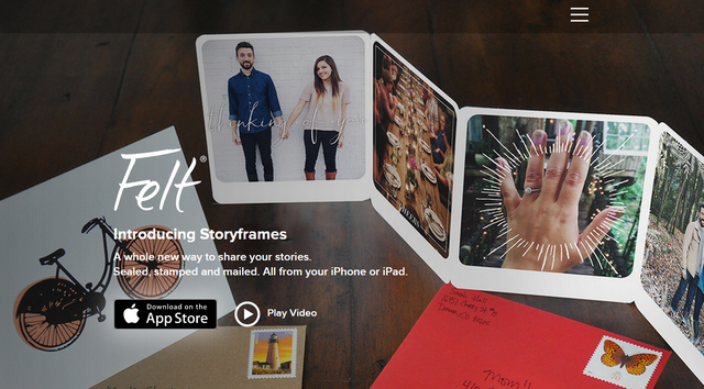
FeltApp
FeltApp demonstrates how to properly serve lots of images and not overwhelm users. The page looks clean, spacious and neat. Contour graphics and a generous amount of white space do their job perfectly well, providing users with a good readability and excellent user experience.
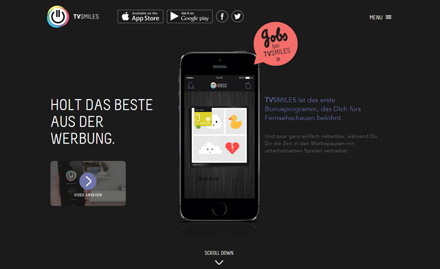
TVSmiles
TVSmiles is a great example of a dark colored design that naturally highlights key elements and kindles interest. It offers a high contrast between background and foreground that places the content above everything.
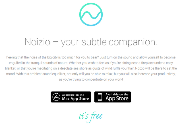
Noizio
Noizio looks sophisticated, stylish and exquisite with lots of fresh air. The elegant color gradient that marks some elements and parts of design diversifies the clean and pure whitish appearance of the website. Each content block is distinctive and clearly separated from a flow, so that page can be quickly scanned and read through.
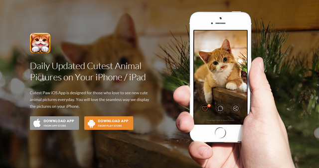
Cutest Paw
Cutest Paw is a multimedia-based app. There are plenty of screenshots, semi-realistic device mockups, helpful information, descriptions, and CTA buttons. The website is managed to embrace everything and provide users with a great experience.
Conclusion
One landing page that consists of three to five main sections can be sufficient to present your upcoming product in the best possible light as well as give it a significant boost. It is a viable solution, whether you need to promote a game or a small weather forecast app. Vibrant screenshots and animated gif walkthroughs enrich the experience, convey an idea more correctly and bring the user closer to the product. The more so, creating only one page involves fewer effort.
(dpe)
Photo by Scott Graham on Unsplash