
Choosing the Right Tools for Your Mobile Project
Mobile web browsing is the next big thing. At least that's what the pundits say. Recent data shows there are about 4 billion mobile users (almost half the planet) (source). In 2011, smartphone sales will surpass desktop/laptop computer sales, moving over 400 million units per year (source).
But haven't we heard this all before? Hasn't the mobile web been the "next big thing" for each of the last several years? What gives? It doesn't really matter that 4 billion people have mobile phones unless they are using them to browse the web.
In previous years, two big factors have prevented the mobile web from taking off like everyone thought: inferior hardware and sub-par web browsers. The iPhone changed both for the better in 2007. Smartphones have taken a giant leap forward in the last three years and mobile Safari has led to several WebKit-based mobile browsers being developed.
So thanks to the iPhone and several other mobile innovations that proceeded it, mobile is for real this time. 25% of those 4 billion people are using the web from their phone today. (source).
If you haven't built a mobile website before, the whole scene might seem a bit overwhelming. Today we're going to give you the information necessary to answer some of the tough questions that come up when designing a mobile experience:
 One clarification to be made is that iPhone and iPod Touch are treated separately above, but they are both the same browser from a web developer's point of view. So if their market share is combined appropriately, it comes in ahead of Opera by 3.34%, making it the market leader.
Opera is a big deal now because it's platform-independent, available on most smartphone operating systems including iOS, Blackberry, Android, Windows Mobile and Symbian. Opera Mobile v10+ and Opera Mini v5+ (different browsers) both have solid web standards support. Opera also provides excellent developer tools for testing.
Most modern mobile browsers are built on the open source WebKit framework, which debuted in a mobile capacity on the iPhone. iOS, Android, Symbian (Nokia), webOS (Palm) and Blackberry v6+ devices all have WebKit browsers by default. WebKit's javascript and web standards support is excellent, so the only real thing to worry about is optimizing for various device resolutions.
A few other browsers are not big players at the moment, but are worth keeping an eye on. SkyFire tops the list, available on Android and iOS devices. It recently made headlines for generating over $1 million after only three days on the app store, forcing Apple to temporarily disable sales for a short time because of the demand. SkyFire is known for it's social media integration and ability to convert flash video to a native format that can be seen on the iPhone.
Firefox Mobile is another up-and-comer. It's available for Nokia N900 phones or any Android 2+ phones and is based on the same technology as Firefox 4 for the desktop. It boasts great video support (including flash), social sharing features and even user agent switching for more advanced users.
Even Microsoft's Windows Phone 7 is holding it's own alongside iOS and Android browsers. So even a browser with the infamous "Internet Explorer" name gets a fresh start in the mobile space.
One clarification to be made is that iPhone and iPod Touch are treated separately above, but they are both the same browser from a web developer's point of view. So if their market share is combined appropriately, it comes in ahead of Opera by 3.34%, making it the market leader.
Opera is a big deal now because it's platform-independent, available on most smartphone operating systems including iOS, Blackberry, Android, Windows Mobile and Symbian. Opera Mobile v10+ and Opera Mini v5+ (different browsers) both have solid web standards support. Opera also provides excellent developer tools for testing.
Most modern mobile browsers are built on the open source WebKit framework, which debuted in a mobile capacity on the iPhone. iOS, Android, Symbian (Nokia), webOS (Palm) and Blackberry v6+ devices all have WebKit browsers by default. WebKit's javascript and web standards support is excellent, so the only real thing to worry about is optimizing for various device resolutions.
A few other browsers are not big players at the moment, but are worth keeping an eye on. SkyFire tops the list, available on Android and iOS devices. It recently made headlines for generating over $1 million after only three days on the app store, forcing Apple to temporarily disable sales for a short time because of the demand. SkyFire is known for it's social media integration and ability to convert flash video to a native format that can be seen on the iPhone.
Firefox Mobile is another up-and-comer. It's available for Nokia N900 phones or any Android 2+ phones and is based on the same technology as Firefox 4 for the desktop. It boasts great video support (including flash), social sharing features and even user agent switching for more advanced users.
Even Microsoft's Windows Phone 7 is holding it's own alongside iOS and Android browsers. So even a browser with the infamous "Internet Explorer" name gets a fresh start in the mobile space.
 This framework is primarily focused on optimizing websites for the iOS operating system, although it can be easily adjusted to work well for other WebKit-based browsers as well. It's very flexible and has a solid community of developers working to improve it. (http://jqtouch.com/)
Pros
This framework is primarily focused on optimizing websites for the iOS operating system, although it can be easily adjusted to work well for other WebKit-based browsers as well. It's very flexible and has a solid community of developers working to improve it. (http://jqtouch.com/)
Pros
 jQuery is the big player we all know and love on the desktop. They have recently released an Alpha of their mobile framework, which brings a lot of the same goodness to mobile devices. What's most impressive about this framework is it's adaptability across all the most popular browsers and operating systems. Their graded browser support chart clearly outlines the support across all platforms. (http://jquerymobile.com)
Pros
jQuery is the big player we all know and love on the desktop. They have recently released an Alpha of their mobile framework, which brings a lot of the same goodness to mobile devices. What's most impressive about this framework is it's adaptability across all the most popular browsers and operating systems. Their graded browser support chart clearly outlines the support across all platforms. (http://jquerymobile.com)
Pros
 Zepto, created by Thomas Fuchs (script.aculo.us author), is the perfect mobile framework for jQuery pros. It's less than 3 kb minified, enables jQuery-compatible syntax (most of it) and is optimized for mobile WebKit browsers. There are no default UI controls, so it's definitely for the more minimalist coders that are interested in a custom design. The fun chalk iPad project from 37signals was created with Zepto. (http://zeptojs.com/)
Pros
Zepto, created by Thomas Fuchs (script.aculo.us author), is the perfect mobile framework for jQuery pros. It's less than 3 kb minified, enables jQuery-compatible syntax (most of it) and is optimized for mobile WebKit browsers. There are no default UI controls, so it's definitely for the more minimalist coders that are interested in a custom design. The fun chalk iPad project from 37signals was created with Zepto. (http://zeptojs.com/)
Pros
 Sencha (includes EXT JS desktop framework) touch is a very impressive javascript framework specifically geared for mobile web apps. It's probably the best all-in-one framework right now. However, it's not for beginners. All of the front-end syntax is javascript, so you need javascript chops and experience with the library to make the most of it. Right now it is compatible with iOS and Android devices. (http://www.sencha.com/products/touch/)
Pros
Sencha (includes EXT JS desktop framework) touch is a very impressive javascript framework specifically geared for mobile web apps. It's probably the best all-in-one framework right now. However, it's not for beginners. All of the front-end syntax is javascript, so you need javascript chops and experience with the library to make the most of it. Right now it is compatible with iOS and Android devices. (http://www.sencha.com/products/touch/)
Pros
 Blueprint is a robust framework meant to optimize for literally thousands of different devices. It takes raw XML, communicates with Yahoo!'s web services to generate the pages, then renders the content optimized for the device. The SDK is for more advanced users, but for anyone that has experienced the mobile Yahoo! properties, you know it is very powerful. (http://mobile.yahoo.com/devcenter)
Pros
Blueprint is a robust framework meant to optimize for literally thousands of different devices. It takes raw XML, communicates with Yahoo!'s web services to generate the pages, then renders the content optimized for the device. The SDK is for more advanced users, but for anyone that has experienced the mobile Yahoo! properties, you know it is very powerful. (http://mobile.yahoo.com/devcenter)
Pros
 SproutCore is a popular javascript framework for desktop browsers that gives web apps a native look and feel. It's best known for running Apple's MobileMe and iWork web services. SproutCore Touch basically adds touch support to the existing framework. It's still one codebase as I understand it. So if you already have a SproutCore app, it's pretty easy to optimize it for something like the iPad. (http://blog.sproutcore.com/post/531215199/introducing-sproutcore-touch)
Pros
SproutCore is a popular javascript framework for desktop browsers that gives web apps a native look and feel. It's best known for running Apple's MobileMe and iWork web services. SproutCore Touch basically adds touch support to the existing framework. It's still one codebase as I understand it. So if you already have a SproutCore app, it's pretty easy to optimize it for something like the iPad. (http://blog.sproutcore.com/post/531215199/introducing-sproutcore-touch)
Pros
 This newer framework is lightweight (8k) and has some really nice elements to it. Compatible with webOS, iOS, Android and Symbian, it's probably a great fit for smaller sites that don't have a lot of UI demands. Jo is still new, but it will be really interesting to see how the open source community builds on this solid foundation. (http://joapp.com/)
Pros
This newer framework is lightweight (8k) and has some really nice elements to it. Compatible with webOS, iOS, Android and Symbian, it's probably a great fit for smaller sites that don't have a lot of UI demands. Jo is still new, but it will be really interesting to see how the open source community builds on this solid foundation. (http://joapp.com/)
Pros
 This framework is much like Sencha and SproutCore in that it's all javascript syntax on the front-end and the code is derived from a desktop framework. With that comes an arsenal of robust UI elements and functionality. The touch framework just came out in December of 2010, but look for it to be a player moving forward. (http://dhtmlx.com/touch/)
Pros
This framework is much like Sencha and SproutCore in that it's all javascript syntax on the front-end and the code is derived from a desktop framework. With that comes an arsenal of robust UI elements and functionality. The touch framework just came out in December of 2010, but look for it to be a player moving forward. (http://dhtmlx.com/touch/)
Pros
- Do we need a dedicated mobile site or just a mobile-optimized one?
- What browsers do we optimize for? How can we test them?
- Should we use a mobile framework? If so, are we depending on it for the UI?
- Which mobile framework is the best fit for my project?
- Which frameworks work best for building a native app?
The Browser Landscape
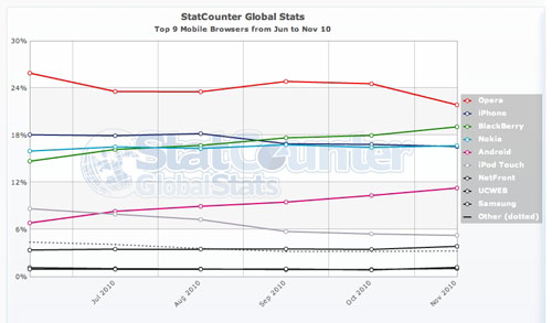
Prior to diving into your text editor and starting your first mobile site, it's important to understand the lay of the land. Here are the worldwide browser leaders measured between July and December, 2010 according to StatCounter:
One clarification to be made is that iPhone and iPod Touch are treated separately above, but they are both the same browser from a web developer's point of view. So if their market share is combined appropriately, it comes in ahead of Opera by 3.34%, making it the market leader.
Opera is a big deal now because it's platform-independent, available on most smartphone operating systems including iOS, Blackberry, Android, Windows Mobile and Symbian. Opera Mobile v10+ and Opera Mini v5+ (different browsers) both have solid web standards support. Opera also provides excellent developer tools for testing.
Most modern mobile browsers are built on the open source WebKit framework, which debuted in a mobile capacity on the iPhone. iOS, Android, Symbian (Nokia), webOS (Palm) and Blackberry v6+ devices all have WebKit browsers by default. WebKit's javascript and web standards support is excellent, so the only real thing to worry about is optimizing for various device resolutions.
A few other browsers are not big players at the moment, but are worth keeping an eye on. SkyFire tops the list, available on Android and iOS devices. It recently made headlines for generating over $1 million after only three days on the app store, forcing Apple to temporarily disable sales for a short time because of the demand. SkyFire is known for it's social media integration and ability to convert flash video to a native format that can be seen on the iPhone.
Firefox Mobile is another up-and-comer. It's available for Nokia N900 phones or any Android 2+ phones and is based on the same technology as Firefox 4 for the desktop. It boasts great video support (including flash), social sharing features and even user agent switching for more advanced users.
Even Microsoft's Windows Phone 7 is holding it's own alongside iOS and Android browsers. So even a browser with the infamous "Internet Explorer" name gets a fresh start in the mobile space.
Mobile First
Luke Wroblewski was the first to boldly proclaim that we should design websites for the Mobile First. Luke argues that designing for mobile first helps you focus on the most important elements since you have such limited screen space. He also says that mobile phones are now capable of more than desktop browsers, such as location-aware features and multi-touch gestures. So why not have the full arsenal of capabilities available to you when designing? Perhaps the most compelling reason to consider designing for mobile first revolves around media queries. Media queries are part of the CSS3 specification that allow you to specify certain styles based on device parameters, most notably width or height. With either of the following lines of code, I can show styles for a device no wider than 480px:<link rel="stylesheet" type="text/css"
media="screen and (max-device-width: 480px)" href="styles.css" />
@media screen and (max-device-width: 480px) {
.column {
float: none;
}
}
For a great run-down about media queries, check out "Responsive Web Design", an article by Ethan Marcotte.
The problem with media queries is that they don't resolve properly on many mobile devices (source: Rethinking the Mobile Web). They are, however supported well on modern desktop browsers and even enabled in not-so-modern browsers with help from a javascript file. So if we start with mobile and use media queries to progressively enhance the layout for the desktop, everything works out! By using media queries to optimize a desktop site for mobile, you run the risk of the mobile browser not rendering it properly.
Meta Tags
Mobile meta tags aren't nearly as important as they used to be, but there are still three mobile-specific tags worth understanding:<meta name="viewport" content="width=240, height=320, user-scalable=yes, initial-scale=2.5, maximum-scale=5.0, minimum-scale=1.0" />The viewport meta tag is the newest and most powerful when it comes to mobile, allowing developers to share the width/height of their content with the browser and control how the content is allowed to be zoomed/scaled by the user. Most modern mobile browsers support this tag. Apple gives a nice overview of what the viewport tag is capable of and also details a few iOS-specific tags in their HTML reference library.
<meta name="HandheldFriendly" content="true" />
<meta name="MobileOptimized" content="width" />When the viewport tag is not supported by the phone, it can fall back on one of two older meta tags. Both should become more obsolete in the coming years, but are a good fallback presently. "HandheldFriendly" simply identifies your site as "mobile friendly" to the phone, but doesn't let you set any additional parameters. "MobileOptimized" is a proprietary Microsoft tag, which does allow you to specify a width, but isn't flexible as to zooming or scaling. (source: http://davidbcalhoun.com/tag/mobileoptimized)
Use a Mobile Framework
While it's not required, most great mobile experiences start with a framework. They help developers create rich, interactive mobile sites with minimal code and are optimized for several platforms out of the box. Popular frameworks also have growing communities, dedicated to improving the product across different browsers as the technology rapidly evolves.jQTouch
This framework is primarily focused on optimizing websites for the iOS operating system, although it can be easily adjusted to work well for other WebKit-based browsers as well. It's very flexible and has a solid community of developers working to improve it. (http://jqtouch.com/)
Pros
- Very popular framework with an active community
- Optimized for WebKit, especially iOS
- Great native-like animations and themes
- Good for javascript novices
- Nearly 70k minified, includes desktop version of jQuery
- It takes some research to find good tutorials
- Meant for smaller sites, probably not web applications
jQuery Mobile
jQuery is the big player we all know and love on the desktop. They have recently released an Alpha of their mobile framework, which brings a lot of the same goodness to mobile devices. What's most impressive about this framework is it's adaptability across all the most popular browsers and operating systems. Their graded browser support chart clearly outlines the support across all platforms. (http://jquerymobile.com)
Pros
- Built on the world's most popular javascript framework
- Huge community
- Supports virtually every modern mobile browser
- Only 13k minified
- Great UI tools, better for cross-device consistency
- Great documentation, novices can pick it up easily
- Only in Alpha 2 phase, still has a little ways to go
- Doesn't really look "native" on any device because it supports so many browsers
Zepto
Zepto, created by Thomas Fuchs (script.aculo.us author), is the perfect mobile framework for jQuery pros. It's less than 3 kb minified, enables jQuery-compatible syntax (most of it) and is optimized for mobile WebKit browsers. There are no default UI controls, so it's definitely for the more minimalist coders that are interested in a custom design. The fun chalk iPad project from 37signals was created with Zepto. (http://zeptojs.com/)
Pros
- Only 3.3k minified!
- Active community led by someone with serious javascript chops
- Designed with jQuery-compatible syntax
- No UI tools, only the basics
- Documentation is good, but demos are lacking
- Geared towards more experienced jQuery developers
Sencha Touch
Sencha (includes EXT JS desktop framework) touch is a very impressive javascript framework specifically geared for mobile web apps. It's probably the best all-in-one framework right now. However, it's not for beginners. All of the front-end syntax is javascript, so you need javascript chops and experience with the library to make the most of it. Right now it is compatible with iOS and Android devices. (http://www.sencha.com/products/touch/)
Pros
- It's beautiful
- Great documentation and (paid) support
- Scalable, built for serious web apps
- Has all the UI tools you would need
- Only optimized for iPhone and Android so far
- Steep learning curve, must be experienced with EXT JS
- All javascript front-end syntax
- Runs fast, but framework is 369k
Yahoo! Blueprint
Blueprint is a robust framework meant to optimize for literally thousands of different devices. It takes raw XML, communicates with Yahoo!'s web services to generate the pages, then renders the content optimized for the device. The SDK is for more advanced users, but for anyone that has experienced the mobile Yahoo! properties, you know it is very powerful. (http://mobile.yahoo.com/devcenter)
Pros
- Comprehensive device support
- Robust features and APIs
- As mobile browsers evolve, this might be overkill
- Requires Yahoo! web services to work
- Steep learning curve
- Developer site and documentation is confusing
SproutCore Touch
SproutCore is a popular javascript framework for desktop browsers that gives web apps a native look and feel. It's best known for running Apple's MobileMe and iWork web services. SproutCore Touch basically adds touch support to the existing framework. It's still one codebase as I understand it. So if you already have a SproutCore app, it's pretty easy to optimize it for something like the iPad. (http://blog.sproutcore.com/post/531215199/introducing-sproutcore-touch)
Pros
- Gives almost instant touch support to existing SproutCore apps
- Mature codebase with some big supporters, like Apple
- UI tools are beautiful on the desktop and mobile devices
- All javascript front-end syntax
- Steep learning curve
Jo
This newer framework is lightweight (8k) and has some really nice elements to it. Compatible with webOS, iOS, Android and Symbian, it's probably a great fit for smaller sites that don't have a lot of UI demands. Jo is still new, but it will be really interesting to see how the open source community builds on this solid foundation. (http://joapp.com/)
Pros
- Lightweight (8k), still has nice UI tools out of the box
- Compatible with several operating systems
- Community is not as active as with other frameworks
- UI doesn't really feel native on any device
- Codebase still needs more work to be considered with the top-tier frameworks
DHTMLX Touch
This framework is much like Sencha and SproutCore in that it's all javascript syntax on the front-end and the code is derived from a desktop framework. With that comes an arsenal of robust UI elements and functionality. The touch framework just came out in December of 2010, but look for it to be a player moving forward. (http://dhtmlx.com/touch/)
Pros
- Comprehensive UI tools to fit any need
- Built to do heavy lifting for web applications
- Cool drag & drop visual designer tool (see video)
- Rich feature set based on desktop framework, lots of potential as the framework grows
- All javascript front-end syntax
- Steep learning curve
- Still in Alpha at the time of writing, documentation is evolving
CSS Grid Framework
The CSS Grid framework is completely different from the above-mentioned tools because it doesn't include any javascript or UI tools. Technically, it's not a mobile framework. It's a fluid, 12-column grid that scales from 1140px wide down to 430px beautifully. You can build with a Mobile First mentality and use media queries to scale your site all the way up to 1140px. The days of fixed-width websites are numbered as mobile becomes more of a focus for designers and their clients. The CSS Grid framework gives designers the ability to design for one flexible grid and optimize for devices across the entire spectrum. Pros- Same HTML/CSS works for your desktop and mobile site
- Progressive enhancement at it's best thanks to media queries
- No javascript dependencies to render on mobile devices
- Not all designs can work with this framework; you have to design for it.
- No native or touch-friendly controls
- Best with smaller sites, probably wouldn't scale for a web application
Great article Nick, really appreciate the useful resources you provided. Although I’m not currently planning to use them, they will seriously come in handy later on.
Very good and extensive write-up Nick!
” the Android SDK is available for Windows, OSX and Linux, which includes an excellent device simulator.”
The android simulator is terrible. It is so unbelievably slow and buggy, I can’t see how people can actually develop with it (I know no one who does, most people just push straight to device).
Hey Joe,
I’ve only talked with some developer friends that don’t seem to mind it. I don’t have first-hand experience with it because it’s quite hard to install. Thanks for the tidbit :-).
Great round-up, at my next project will really consider mobile first as it make sense.
that stats are completely rubbish. there are several versions of BB os and its browsers (BB is not a browser!) and there is HUGE difference between bb os4 and bb os6.
same for nokia. nokia is not a browser! nokia is mobile manufacturer.
@gondo – correct, Blackberry, Nokia, iPhone, etc. are not browsers in themselves, but they are operating systems which all have default browsers installed. It is implied in the chart that the default browser from that OS is what is being used.
Blackberry v4 and v6 browsers are entirely different as you say, v6 being based on WebKit and much better. However, that’s not what is being measured. Just like desktop browser share is often measured by IE as a whole instead of IE 6, IE7 and IE8, for this measurement it makes more sense not to fragment the data with version numbers.
StatCounter’s stats are reputable and referenced industry-wide. I feel the graph presented still provides great insights into what mobile browsers are most used. Thanks for the comment!
thanks for this great research! it is exactly what i have to put together at work, haha.
Such an important roundup. We’ve just released our own web apps into mobile using JQuery Mobile, and found it to be a truly useful alternative while we develop our native apps in-house.
Thanks for the article. I cant find a good framework for specially blackberry devices. I was using Jqtouch but it crashes in blackberry even using the 6.0 browser. My app works great on iphone, works 80% on android and it only 10% on blackberry ( i can see the initial screen, then i put password and it crashes, i assume that is xmlrequest problem as you know jqtouch uses ajax). I need urgently for BB tech some framework for developing web apps, maybe you can tell me some