Create a St. Patrick’s Day Postcard in Adobe Illustrator
Today we will be creating a design fit for any number of St. Patrick's Day uses. In this tutorial you will find useful information on how to create a pile of golden coins and a Pilgrim hat. There is one very convenient way to create a hat in Adobe Illustrator. It includes 3D effect Revolve. Revolve is a very handy tool which will create 3D objects in just a few steps. However, it has one flaw. It creates too many anchor points that can be an obstacle in the printing process. We will try to avoid that and to create our illustration with simple tools, such as the Pen Tool ( Creating the Hat
Let's break the creation process into a few parts. First, we’ll create the Crown. So, grab the Pen Tool (
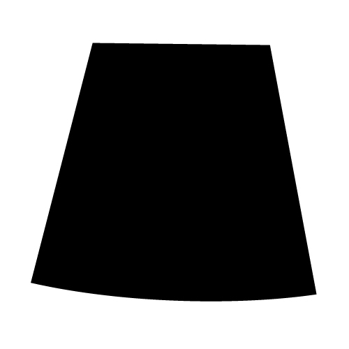 As you can see, the right side of the shape is a little bit longer than the left side. Besides that, the new shape looks a little bit deformed. The reason for drawing a shape like this is the perspective. When you are using 3D effects you don't have to think about perspective. Software will think about that and perspective will be included automatically. Sometimes, drawing the illustration manually can be tricky. You have to be aware of the existence of the perspective, which will give your illustration a realistic look. This is something we should keep in mind.
Next part of the hat is the Brim. Grab the Ellipse Tool (
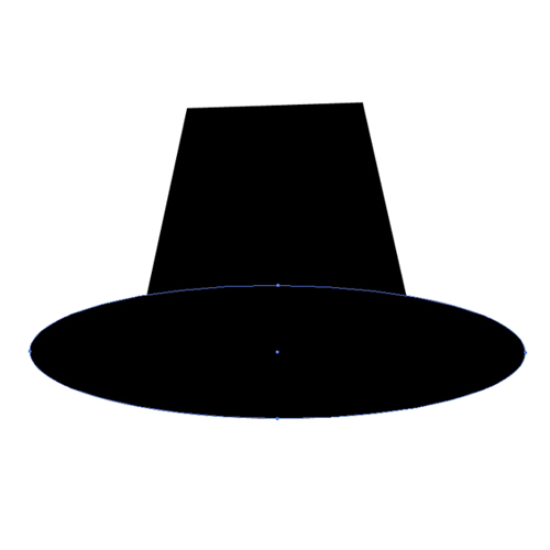 and, one smaller one for the top of the hat.
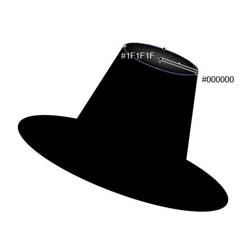
 This is the basic shape of the hat. Select all the elements and rotate the hat as it shown on the picture below.
 We will apply a radial gradient to the top of the hat.
 Creating Details
You'll probably agree that the Brim is too thin. Let's create the thickness.
Select the larger ellipse and duplicate it (
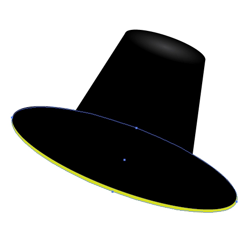 Apply the linear gradient as it's shown on the picture below.
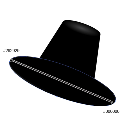 Let's create some edge highlights.
Duplicate the smaller ellipse on the top of the hat twice (
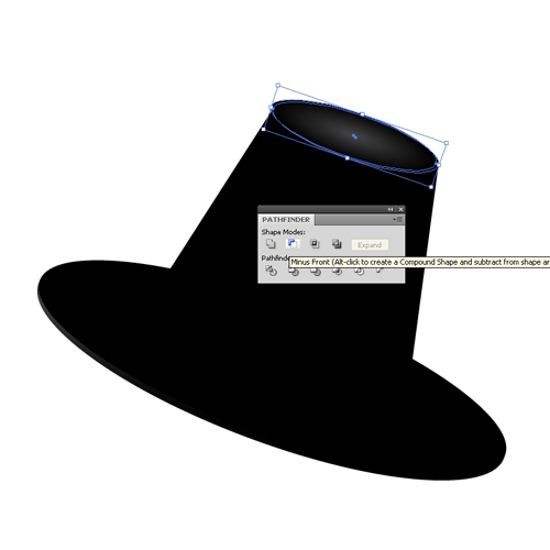 Set the Fill color to
 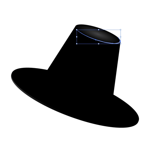 Repeat the previous step for the larger ellipse.
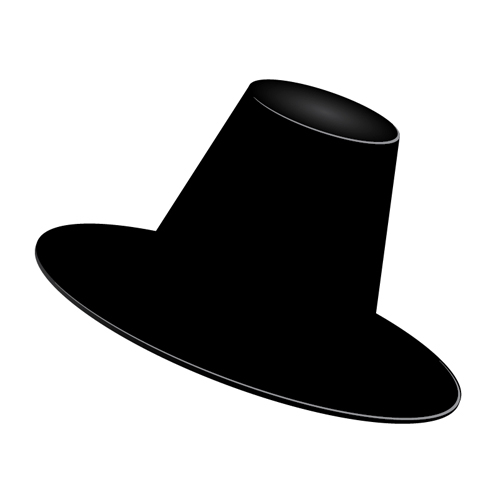 Creating a Hatband
It is time to create a ribbon with a buckle. This is the final detail that will complete our hat construction.
Grab the Pen Tool (
 Make sure to create the bold sides of the ribbon. This way it looks like the ribbon is going around the Crown.
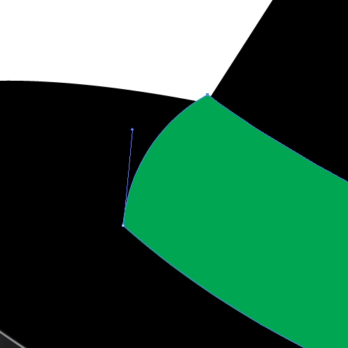 Apply a nice linear gradient. Make sure to create a small highlight on the left side of the ribbon, as a result of the influence of light.
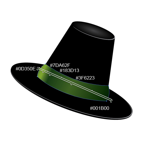 We have to create an edge for the ribbon as well. It will give the illustration a certain depth.
Duplicate the green ribbon (
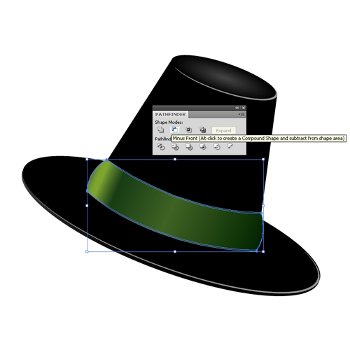 You will end up with something like this.
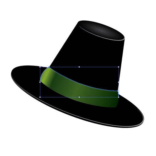 We have to adjust the new shape a little bit. There are some anchor points that spoil the shape we have just created. Just grab the Delete Anchor Points Tool (
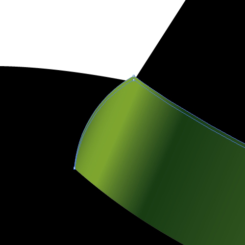
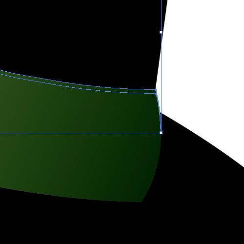 With the Direct Selection Tool (

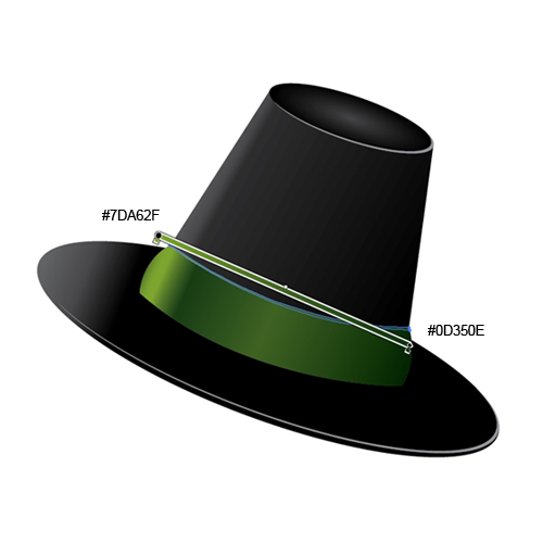
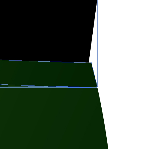 A linear gradient will help us to emphasize the thickness of the ribbon.
 For creating the buckle we will need the Rounded Rectangle Tool. Create a rounded rectangle like below.
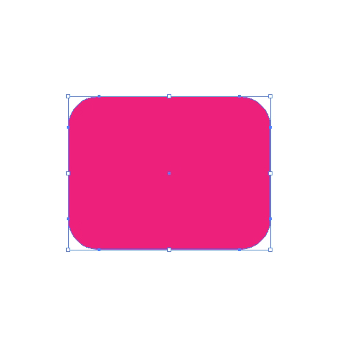 Under the Object select Path > Offset Path. Set the value for the Offset to
 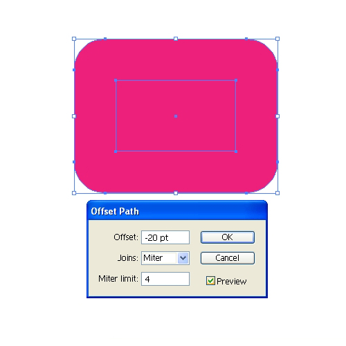 As you can see, we have created a smaller rectangle with sharp corners, but we need a rectangle with rounded corners. Under the Effect select Stylize > Round Corners. Set the value for Radius to
 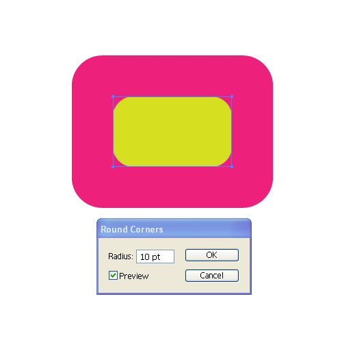 In order to be able to use the new rounded rectangle we have to expand the shape (Object > Expand Appearance).
Select both rectangles and under the Pathfinder Panel hit the Minus Front button. You should end up with something like this.
 This is the basic shape of the buckle. Let's do some adjustment for creating the necessary depth.
Duplicate (
 Let's apply nice linear gradients.
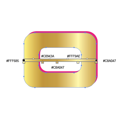
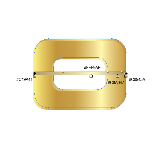 To make it more realistic we will create nice edge highlights, just like we did for the hat.
Select the front shape of the buckle, duplicate it twice (
 Group (
 A small shadow that the buckle is casting on the ribbon will benefit the semi-realistic look we are trying to achieve.
Just duplicate the buckle (
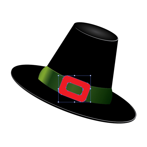 Make sure to place the new shape underneath the buckle and nudge it for few pixels to the right.
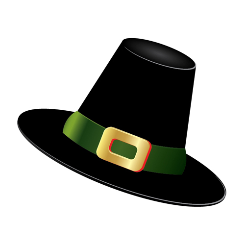 Duplicate the green ribbon (
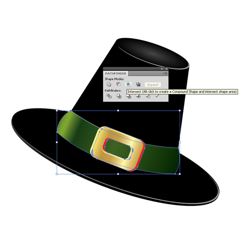 Set the Fill color of the new shape to
  With some light reflections our hat is complete.
Grab the Pen Tool (
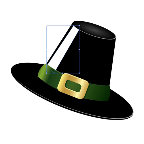 ...and apply a linear gradient.
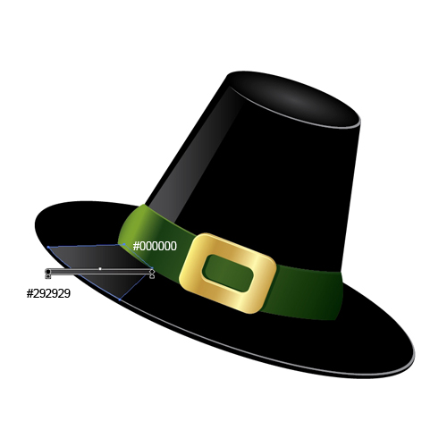
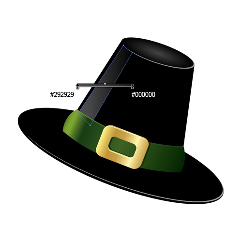 Do the same for the brim.
 Creating the Golden Coins
It is time to make a "fortune". We will create a shiny pile of coins.
Grab the Ellipse Tool (
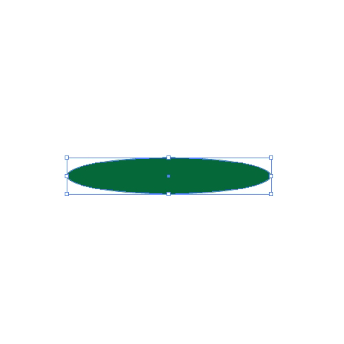 Holding the Alt / Opt key on the keyboard click on the ellipse and drag it upwards (don't forget to hold the Shift key for straight dragging). This way we are making a copy of the ellipse.
 Grab the Rectangle Tool (
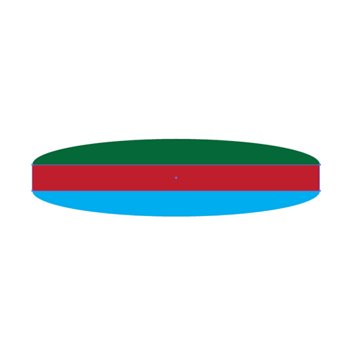 Make sure to match endpoints properly.
 When you are done adjusting the position of the anchor points, select the red rectangle and the blue ellipse and under the Pathfinder Panel hit the Unite button. It will convert these two shapes into one.
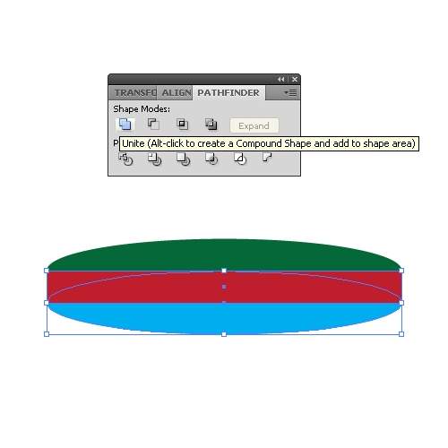 Bring to front (
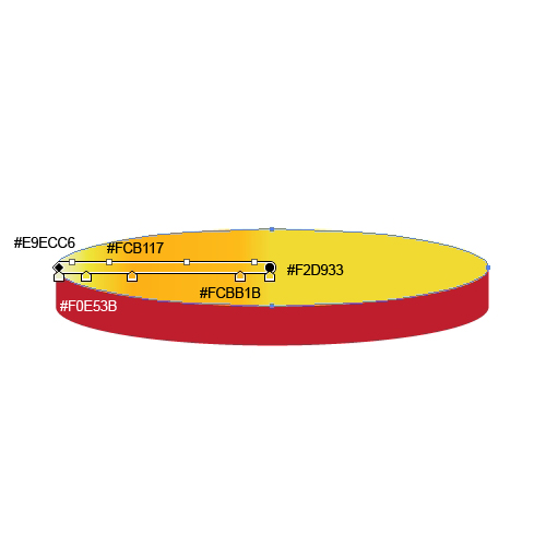
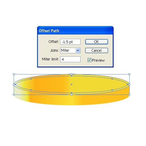
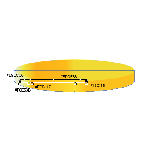 Select the ellipse and under Object select Path > Offset Path. Set the value for Offset to
  Apply a linear gradient.
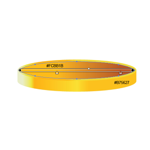 Duplicate (
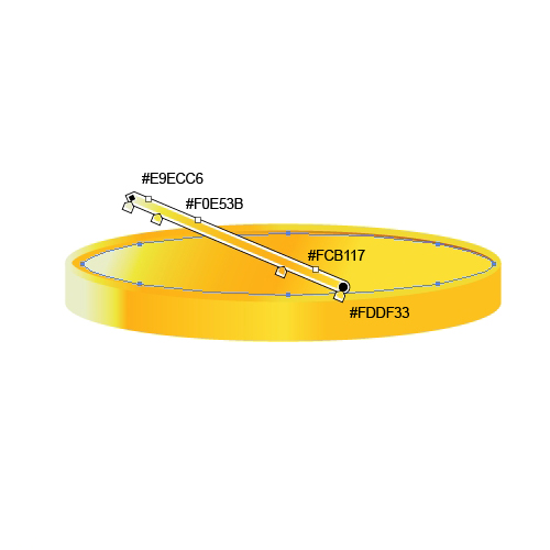 Group (
 Place the hat on the top of the pile, as shown.
 Apply a green radial gradient to the background.
 As you can see, something is missing. We can't leave the illustration like this. It looks like the hat and the coins are floating in the air. Some shadows will fix that.
We will have to create a shadow for each coin.
Choose one coin and duplicate it (
 Repeat the previous step for each coin that is touching the surface.
 We have to create a shadow for the hat as well. Grab the Ellipse Tool (
 Select the pile of coins and duplicate it (
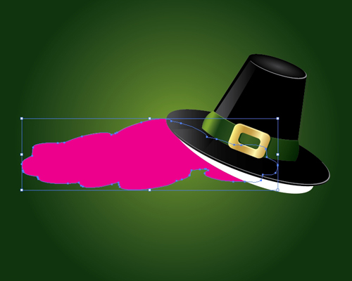 Select the white ellipse and the pink shape and under the Pathfinder Panel hit the Intersect button. Set the Fill color to
 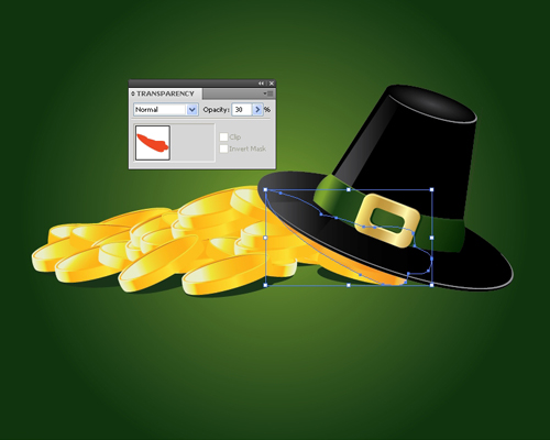 For the other part of the shadow we will once again need the Pen Tool (
 We will create a tiny border in order to give the illustration a postcard feel. Select the background and under the Object select Path > Offset Path. Set the value for Offset to
  Under Object hit the Expand button. It will turn the closed path into the editable path. Apply a linear gradient like the one below.
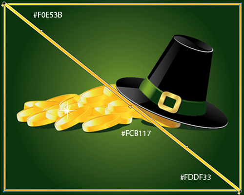 And...voila! Our illustration is finished.
 Conclusion
There are many ways to realize a good idea, but sometimes it is not that simple to choose the right technique to create a great looking illustration. Adobe Illustrator is not the type of software which will automatically generate the effect based on given instructions. Most of the things you have to plan well, to find a way to create the illusion of something that actually does not exist. It includes turning flat shapes into a 3D illustration just by using the right color gradients or a wised placed shadow. With a creative idea and the right technique a good result will be guaranteed.
Thank you for following along.
(rb)
P), Ellipse Tool (L) and Rectangle Tool (M).
So let’s get this started!
This is what we will be creating.
 Creating the Hat
Let's break the creation process into a few parts. First, we’ll create the Crown. So, grab the Pen Tool (
Creating the Hat
Let's break the creation process into a few parts. First, we’ll create the Crown. So, grab the Pen Tool (P) from the Tool Panel and create the shape as it is shown in the picture below.
 As you can see, the right side of the shape is a little bit longer than the left side. Besides that, the new shape looks a little bit deformed. The reason for drawing a shape like this is the perspective. When you are using 3D effects you don't have to think about perspective. Software will think about that and perspective will be included automatically. Sometimes, drawing the illustration manually can be tricky. You have to be aware of the existence of the perspective, which will give your illustration a realistic look. This is something we should keep in mind.
Next part of the hat is the Brim. Grab the Ellipse Tool (
As you can see, the right side of the shape is a little bit longer than the left side. Besides that, the new shape looks a little bit deformed. The reason for drawing a shape like this is the perspective. When you are using 3D effects you don't have to think about perspective. Software will think about that and perspective will be included automatically. Sometimes, drawing the illustration manually can be tricky. You have to be aware of the existence of the perspective, which will give your illustration a realistic look. This is something we should keep in mind.
Next part of the hat is the Brim. Grab the Ellipse Tool (L) and create one larger ellipse for the Brim,
 and, one smaller one for the top of the hat.
 This is the basic shape of the hat. Select all the elements and rotate the hat as it shown on the picture below.
 We will apply a radial gradient to the top of the hat.
 Creating Details
You'll probably agree that the Brim is too thin. Let's create the thickness.
Select the larger ellipse and duplicate it (
Creating Details
You'll probably agree that the Brim is too thin. Let's create the thickness.
Select the larger ellipse and duplicate it (Ctrl / Cmd + C, Ctrl / Cmd + F). Nudge the copy downwards for 2 - 3 pixels. Feel free to adjust the anchor points until you make a perfect match.
 Apply the linear gradient as it's shown on the picture below.
 Let's create some edge highlights.
Duplicate the smaller ellipse on the top of the hat twice (
Let's create some edge highlights.
Duplicate the smaller ellipse on the top of the hat twice (Ctrl / Cmd + C, Ctrl / Cmd + F). Nudge one of the copies upwards, select both copies and under the Pathfinder Panel hit the Minus Front button.
 Set the Fill color to
 #939598.
 Repeat the previous step for the larger ellipse.
 Creating a Hatband
It is time to create a ribbon with a buckle. This is the final detail that will complete our hat construction.
Grab the Pen Tool (
Creating a Hatband
It is time to create a ribbon with a buckle. This is the final detail that will complete our hat construction.
Grab the Pen Tool (P) from the Tool Panel and create a shape as it is shown below.
 Make sure to create the bold sides of the ribbon. This way it looks like the ribbon is going around the Crown.
 Apply a nice linear gradient. Make sure to create a small highlight on the left side of the ribbon, as a result of the influence of light.
 We have to create an edge for the ribbon as well. It will give the illustration a certain depth.
Duplicate the green ribbon (
We have to create an edge for the ribbon as well. It will give the illustration a certain depth.
Duplicate the green ribbon (Ctrl / Cmd + C, Ctrl / Cmd + F) twice. Nudge one of the copies downwards for 1 pixel. Select both of the copies and under the Pathfinder Panel hit the Minus Front button.
 You will end up with something like this.
 We have to adjust the new shape a little bit. There are some anchor points that spoil the shape we have just created. Just grab the Delete Anchor Points Tool (
-) and remove the excess anchor points.

 With the Direct Selection Tool (
A) adjust the handler of the anchor points to perfect the shape.

 A linear gradient will help us to emphasize the thickness of the ribbon.
 For creating the buckle we will need the Rounded Rectangle Tool. Create a rounded rectangle like below.
 Under the Object select Path > Offset Path. Set the value for the Offset to
 -20.
 As you can see, we have created a smaller rectangle with sharp corners, but we need a rectangle with rounded corners. Under the Effect select Stylize > Round Corners. Set the value for Radius to
 10 pt.
 In order to be able to use the new rounded rectangle we have to expand the shape (Object > Expand Appearance).
Select both rectangles and under the Pathfinder Panel hit the Minus Front button. You should end up with something like this.
 This is the basic shape of the buckle. Let's do some adjustment for creating the necessary depth.
Duplicate (
This is the basic shape of the buckle. Let's do some adjustment for creating the necessary depth.
Duplicate (Ctrl / Cmd + C, Ctrl / Cmd + F) the pink shape and change the color to blue (for easier manipulation). Nudge the copy downwards for 1 -2 pixels.
 Let's apply nice linear gradients.

 To make it more realistic we will create nice edge highlights, just like we did for the hat.
Select the front shape of the buckle, duplicate it twice (
To make it more realistic we will create nice edge highlights, just like we did for the hat.
Select the front shape of the buckle, duplicate it twice (Ctrl / Cmd + C, Ctrl / Cmd + F) and nudge one of the copies for 1 pixel downwards and for 1 pixel to the right. Select both copies we have just created and under the Pathfinder Panel hit the Minus Front button. Set the Fill color of the highlight to #FFF9AE.
 Group (
Ctrl / Cmd + G) all the elements, rotate the buckle and place it on the hat.
 A small shadow that the buckle is casting on the ribbon will benefit the semi-realistic look we are trying to achieve.
Just duplicate the buckle (
A small shadow that the buckle is casting on the ribbon will benefit the semi-realistic look we are trying to achieve.
Just duplicate the buckle (Ctrl / Cmd + C, Ctrl / Cmd + F), Ungroup it (Shift + Ctrl / Cmd + G) and under the Pathfinder Panel hit the Unite button.
 Make sure to place the new shape underneath the buckle and nudge it for few pixels to the right.
 Duplicate the green ribbon (
Ctrl / Cmd + C, Ctrl / Cmd + F). Select both new shapes and under the Pathfinder Panel hit the Intersect button.
 Set the Fill color of the new shape to
 #0D350E.
 With some light reflections our hat is complete.
Grab the Pen Tool (
With some light reflections our hat is complete.
Grab the Pen Tool (P) from the Tool Panel and create a shape like the one shown in the picture...
 ...and apply a linear gradient.
 Do the same for the brim.
 Creating the Golden Coins
It is time to make a "fortune". We will create a shiny pile of coins.
Grab the Ellipse Tool (
Creating the Golden Coins
It is time to make a "fortune". We will create a shiny pile of coins.
Grab the Ellipse Tool (L) from the Tool Panel and create an ellipse.
 Holding the Alt / Opt key on the keyboard click on the ellipse and drag it upwards (don't forget to hold the Shift key for straight dragging). This way we are making a copy of the ellipse.
 Grab the Rectangle Tool (
M) from the Tool Panel and create a rectangle as it shown on the picture below.
 Make sure to match endpoints properly.
 When you are done adjusting the position of the anchor points, select the red rectangle and the blue ellipse and under the Pathfinder Panel hit the Unite button. It will convert these two shapes into one.
 Bring to front (
Shift + Ctrl / Cmd + ]) the green ellipse and start to apply some nice gradients.

 Select the ellipse and under Object select Path > Offset Path. Set the value for Offset to
 -1.5 pt.
 Apply a linear gradient.
 Duplicate (
Ctrl /Cmd + C, Ctrl / Cmd + F) the smaller ellipse. Grab the the left middle point of the selection box and move it just a little bit to the right side (so-calling non-uniform scale). Apply a linear gradient to this ellipse too.
 Group (
Ctrl / Cmd + G) all the elements. Duplicate (Ctrl / Cmd + C, Ctrl / Cmd + F) the coin many times and place the copies in a big pile.
 Place the hat on the top of the pile, as shown.
 Apply a green radial gradient to the background.
 As you can see, something is missing. We can't leave the illustration like this. It looks like the hat and the coins are floating in the air. Some shadows will fix that.
We will have to create a shadow for each coin.
Choose one coin and duplicate it (
As you can see, something is missing. We can't leave the illustration like this. It looks like the hat and the coins are floating in the air. Some shadows will fix that.
We will have to create a shadow for each coin.
Choose one coin and duplicate it (Ctrl / Cmd + C, Ctrl / Cmd + F). Ungroup the copy (Shift + Ctrl / Cmd + G) and under the Pathfinder Panel hit the Unite button. Set the Fill color of the new shape to #10340D. Send it behind the coin (Ctrl / Cmd + [) and rotate to look as it shown on the picture below.
 Repeat the previous step for each coin that is touching the surface.
 We have to create a shadow for the hat as well. Grab the Ellipse Tool (
L) and create an ellipse like pictured. Make it sure to set the hat on the top of the ellipse. This way you'll be able to find the right angle and position for the new shadow.
 Select the pile of coins and duplicate it (
Ctrl / Cmd + C, Ctrl / Cmd + F). Ungroup (Shift + Ctrl / Cmd + G) the copy we have just made and under the Pathfinder Panel hit the Unite button. You should end up with something like this.
 Select the white ellipse and the pink shape and under the Pathfinder Panel hit the Intersect button. Set the Fill color to
 #FF4200 and lower the Opacity to 30%.
 For the other part of the shadow we will once again need the Pen Tool (
P). Create a shape as it's shown on the picture below. Set the Fill color to #1A3219.
 We will create a tiny border in order to give the illustration a postcard feel. Select the background and under the Object select Path > Offset Path. Set the value for Offset to
 -10. Remove the Fill color and set the Stroke to 5 pt.
 Under Object hit the Expand button. It will turn the closed path into the editable path. Apply a linear gradient like the one below.
 And...voila! Our illustration is finished.
 Conclusion
There are many ways to realize a good idea, but sometimes it is not that simple to choose the right technique to create a great looking illustration. Adobe Illustrator is not the type of software which will automatically generate the effect based on given instructions. Most of the things you have to plan well, to find a way to create the illusion of something that actually does not exist. It includes turning flat shapes into a 3D illustration just by using the right color gradients or a wised placed shadow. With a creative idea and the right technique a good result will be guaranteed.
Thank you for following along.
(rb)
What an fantastic and step by step tutorial Jasmina. You did great work in explaining the tutorial step by step. Thanks for sharing.
I agree, it was very easy-to-follow! The coins look great :)
Great tutorial but its missing one thing. Alcohol :P
Interesting. Could be helpful for next ST. Pattys. Maybe I could re-do this for halloween? I think YES!
Very nice tutorial, thanks so much!
But I can’t put a negative value on the “offset path”.
I’m using Illustrator CS 5.5, can you tell me what’s wrong?
Cheers from Brazil!
Kaio,
Thank you.
You can contact me (my email address is on my portfolio page) so we can see what is wrong with the Offset Path function. I hope I didn’t answer too late.