
15 CSS Habits to Develop for Frustration-Free Coding
By Jeremy Davis
It’s been said that the key to a civilization's success is mastery of the food system. Unless a group of people can effectively control the basic needs for survival, they will never achieve greatness. Likewise, before CSS skills can be expanded to an advanced level, the basics must become instinct to any CSS coder. Develop these habits and you lay a solid foundation to apply advanced CSS techniques.
1. Use a Reset Stylesheet
This habit (along with a few others) is one frequently mentioned as a CSS best practice. The goal of a reset stylesheet is to reduce inconsistencies among browsers by explicitly setting styles to most of the HTML elements. This ensures that things like font sizes and line heights all render the same on different browsers. Also, the reset clears the default paddings/margins that some browsers have.
Not only does having a reset stylesheet account for browser inconsistencies, it's good to use them to give each site a known foundation when coding. Keeping the foundation the same for all sites will speed along the development.
The reset from Eric Meyer and the Yahoo reset are the most comment resets used. Futher customizing one of those resets might be needed to accomodate for specific website needs.
2. Use CSS Shorthand
Using shorthand CSS declarations will lead to quicker coding and debugging. It might also save some errors from mistyping multiple declarations.
When a rule has multiple similiar declarations for a single selector, such as
border-top: 5px;
border-right: 10px;
border-bottom: 15px;
border-left: 20px;
they can be combined into one line, such as
border: 5px 10px 15px 20px;
The trick to remember which position controls which direction is TRouBLe: Top, Right, Bottom, Left.
The main declarations that use shorthand for are border, margin, padding and background.
Bonus: Hex Shortcut
Six hexidecimal digits used for CSS colors can be condensed down to three if they are grouped in identical pairs.
For example, #FFFFFF can be written #FFF, or #990055 can be written #905, but #F091A4 cannot be shortened since the pairs aren’t identical.
3. Document Your CSS … As You Go
Going back and commenting code is one of those quixotic things that most fool themselves into thinking they will do. Get in the habit of making good commenting practices while writing styles.
To add a comment in CSS it’s as simple as putting /* Your Comment Here */
Things to comment
Stylesheet Header
This comment briefly states what the stylesheet is for, who wrote it and when. A table of contents might also be needed for larger stylesheets.
Code sections
Put a comment header above large portions of code for things like global styles, headers, sidebars, main content and footer to help delineate them.
For example,
/****************************************/
/*             Sidebar                  */
/****************************************/
Problem declarations
Put comments next to declarations that have know issues in certain browsers, such as
input[type=textbox] /* IE6 Problem */
Dependent declarations
Put comments next to things that are dependant on other areas. So if there is a fixed height on a declaration that might need to be adjusted if the content changes, put a small comment next to it, stating what conditions must happen before it will need to adjust.
4. Add a Color Legend
When working on smaller CSS files, keeping track of color hex values isn't too hard. But as stylesheets start getting 2000+ lines it becomes significantly harder to keep track of which value is for which color. Adding a color legend helps ensure that the wrong colors don't get used.
The best place for the legend is up in the stylesheet header, underneath all of the other documention.
For example,
/*
/* light blue: #4595be
/* dark blue: #367595
/* special link red: #9F1212
********************************/
5. Remember Where Absolutely Positioned Elements are Relative To
Positioning elements absolutely is something that tends to frighten some CSS beginners, but there is one principle to remember with this declaration that solves most of the trouble.
When a selector has a postition: absolute declaration the webpage is treated like a xy grid. By default, the 0,0 position of the grid is at the very top and left position on the webpage. So by moving the absolutely positioned element to the left 10 pixels and from the top 20 pixels, it’s starting from the top left of the webpage, regardless of where the element sits in the HTML.
That is not usually the desired functionality. What usually is desired is to have the element positioned relative to the selector's parent or another containing element. To do that simply add position: relative to the desired relative container element. Doing that remaps the 0,0 position on the xy grid from the top of the webpage to the top left of the containing element.
The example below demonstrates how the red box gets positioned differenlty depending on whether the blue container has position: relative or not.
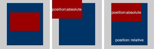
Remembering position: relative should ease most frustrations caused by basic absolute positioning.
6. Avoid Using CSS Hacks
Unfortunately for web designers, there are bugs in some browsers, mainly IE6 and IE7, that cause some styles not to display as they are supposed to in accordance with CSS specifications. In order to combate these inconsistencies, some people write erroneous declarations, hacks, that take advantage of these browser flaws in order to do things, such as hide styles from particular browsers
There are many fancifully named hacks for all the equally fancifully named CSS bugs, but using them can cause problems. Not only do hacks clutter the stylesheet with oddball declarations, it also keeps the stylesheet from validating.
Also, hacks tend to introduce more problems overtime as new browsers are released.
Instead, use conditional stylesheets to target specific browsers.
7. Use Margins When Styling Layouts
Although this habit isn’t one often mentioned, it's one that helps maintain a consistent layout among different browsers without having to add more declarations to get them all in sync.
The main idea is that instead of adding padding to a container element, add margin to the container’s children to get the same result.
So, instead of
#main-content { padding-left: 10px }
add
#main-content { }
#main-content #left-column { margin-left: 10px }
Although there is nothing particularly wrong with using padding, in my years of building websites I have had consistenly fewer cross-browser problems when I stick with styling layouts with margin.
8. Contain Floats
When floating an element, add overflow: hidden to its containing element.
A common example is,
ul {
	overflow: hidden;
}

ul li {
	float: left;
}
If the container didn't have overflow:hidden issues arise when setting margins or borders to it. This also clears the float so that elements below it can flow properly in the HTML structure.
Some suggest doing the clear in HTML by adding
<div style="clear:both"></div>
below the floated element, but doing that defeats the purpose of separating a webpage's style and structure.
It's also more time consuming than adding overflow: hidden.
9. Add display: inline To Floated Elements
This habit is one that fixes a IE6 problem called the double-margin bug without having to use a CSS hack. On floated elements, IE6 doubles the margin of the element. So a margin of 10px becomes 20px.
It's easy to imagine the havoc an error like this can cause to a layout. Some of the floated items either become hidden or they push everything below it down.
Even though IE6 is on its way out and a majority of designers aren't taking the time to get sites looking perfect in IE6, this is a quick habit to learn to make a site better viewed for those poor people still on IE6.
Just get in the habit of adding
display: inline /* IE6 Problem */
every time something is floated.
10. Get Comfortable with Sprites
Sprites mask the viewable space of a larger image, then when an event occurs, typically a :hover event, the viewable space of the image changes to show another portion of the image.
Not only are sprites more efficient by requiring fewer HTTP calls for images, but they add more polish to website designs. Most often sprites are used to create stylish navigation menus.
Using sprites in a design might take a bit of trial and error to get the hang of it, but it's such a valuable skill to have that it's worth the effort required to get the concept down
Further Reading
11. Have a Consistent File Structure
Take the time to create and organize all of the typical files used for a typcial website development project. Create one master template file structure and copy/paste it every time a website needs to be built.
My organization is as follows:
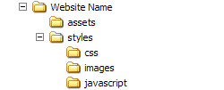
The 'Website Name' folder gets renamed to the website name that I'm about to begin work on. That folder contains all of my HTML files for the site, along with the 'assets' and 'styles' folders.
The 'assets' folder typically holds larger document files like PDFs that might need to be downloaded from the site. I also keep editible versions of images I'm using, such as PSDs or Fireworks PNGs, in case I need to modify something.
The 'styles' folder is broken into the three subfolders: css, images, javascript.
- css - holds all the css files, such as reset.css, layout.css and main.css
- images - holds all the images for the site
- javascript - holds javascript libraries, plugins and main.js
I use this file structure for most of my webpages and because I’m consistent I know exactly what paths to use when needing to do things, such as put a background image in my CSS.
Some might disagree with my structure, such as having javascript under 'styles', but the main point is find a file organization that works for you and get in the habit of consistently using it to make coding faster and more accurate.
12. Indent Your Styles
Adding indentation to a stylesheet can keep complicated stylesheets looking clean and make finding areas of code easier. Add indents to show a parent/child hierarchy.
13. Use Pixels for Font Sizes, Not Ems
This habit is usually a hot button topic with most people having a strong opinion for either fixed font sizes or relative ones.
In hopes to curtail a probably backlack, let me plainly state, "Using a fixed font size, like pixels, leads to fewer CSS frustrations than using a relative font size, such as ems or %."
In his article Coding Like It's 1999, Cameron Moll petitions for pixels and says,
The burden of calculating relative units throughout a CSS document is replaced by the convenience of absolute units
Relative font sizes were a good idea a few years ago so that people with different browser font sizes could have a site's content adjust to their browser’s font size. But now most browsers can zoom and adjust more intelligently so a relative measurement isn’t neeed for that purpose anymore.
Relative measurement becomes a problem because the font sizes inherit the parent's measurement as it cascades down.
For example, body { font-size: 62.5% } makes a font-size: 1em declaration equal to 10px.
If #blog-content needs to be 14px, the rule is
#blog-content { font-size: 1.4em; }
Now the if the H3 tag inside of #blog-content needs to be 20 pixels, one might assume
#blog-content { font-size: 1.4em; }
#blog-content h3 { font-size: 2.0em }
would be right, but that's where the relativity problem occurs. Because that 2.0em is now relative to the 1.4em specified on #blog-content, so it is actually font size of 28px.
Keeping up with relative font sizing can get confusing. Stick to using a fixed unit of measure for font sizes to prevent undue troubles.
14. Limit Pseudo Classes to Anchor Tags
Most modern browsers don't struggle with this problem, but it is an important one to remember if a website still needs to be viewable on older browsers, such as IE6.
The problem is that older browsers only recognize pseduo classes, like :hover, on the anchor tag element, a.
So something like
#header ul li:hover { background-color: #900 }
won't work in IE6.
This issue could cause real functionality problems, if things like dropdown menus are to appear based on the li:hover event. People viewing the site on IE6 would never see the dropdown and thus, might have a hard time navigating the site.
A solution is to use jQuery for those types of effects.
15. Avoid Selector Issues
Be sure selectors have enough weight to prevent unwanted cascades.
The way the browser determines what style is to be applied to an element with multiple declarations is determined by its specificity
The more specified a CSS selector is the more weight that rule carries. The rule with the heaviest weight is the one that gets applied to the element
If some rules are being applied as desired, check to see if the problem is with its specificity. It might be as simple of a solution as adding an #id-name to the beginning of the selector.
Use element selectors when possible.
Instead of
main-content .main-header
use
#main-content h1
Be careful when grouping selectors.
Grouping selectors can be a time-saving method when dealing with non-relative declarations, like
.main-content div, .main-content p {
	color: #000;
}
But it can cause trouble when using a relative declaration, such as
.main-content div, .main-content p {
	line-height: 1.3em;
}
Because now all of the text within the div gets a 1.3em line-height applied to it, but now any p elements within a div get an additional 1.3em added to them.
Also, sometimes grouping multiple selectors can add more weight to them than is desired, which in turns causes other desired styles not to take place.
* Write Better HTML
Bonus Tip! A great way to become a better CSS coder is to improve your HTML coding.
Avoid div-itis by wrapping divs around everything. Learn to style the elements with element selectors, such as h1, ul and p.
Use a proper DOCTYPE to avoid sending browsers into quirks mode.
Try to code as much HTML as possible before adding any styles. Doing this brings more thought to the overall structure of the webpage and causes syntax problems to be spotted and fixed instead of covering them up with styles.
Further Resources
Here are some articles that further explain some of the basics CSS principles mentioned here.- 7 Principles of Clean and Optimized CSS Code
- The Mystery of CSS Sprites: Techniques, Tools and Tutorials
- Mastering CSS Coding: Getting Started
- Powerful CSS Techniques for Effective Coding
- 53 CSS Techniques You Couldn't Live Without
About the author
Jeremy Davis is a recent college graduate working as a designer and front-end developer for a public school system. He (in)frequently blogs about web design, web development and technology on his personal blog. He is also *currently accepting more Twitter followers.
*offer ends soon, act fast.
From #6:
“Not only do hacks clutter the stylesheet with oddball declarations, it also keeps the stylesheet from validating”
Why is it important that your stylesheet validates?
It’s more of an added bonus. Some people do go crazy if the stylesheets don’t validate.
Because it helps prevent browser issues, bugs and sticks to a standard. Why follow the instructions when replacing the engine on your car? Why not just guess?
Although, I don’t mind a stylesheet not validating if it’s using progressive enhancements such as CSS3, since browsers that don’t support them will ignore them.
@Amber What makes a CSS hack that isn’t recognized by a browser any different from CSS3 that isn’t recognized by the browser?
can you link to specific examples where CSS hacks cause browser issue and bugs?
thx
It was pretty much a given, point 13 will create discussion…
My personal approach is creating a “base” font size in pixels, and then making all other measures relative in ems. That way I can update the font size for the whole document.
I like to see text as a dynamic block in the layout, so I think is for the best to left text as fluid as possible.
#8:
If you use overflow: auto instead of overflow: hidden, your element will grow in height as necessary AND you can use margins/padding. Just don’t set a height or you’ll get scrollbars.
For containing floated children, I don’t like using overflow at all. It works in most situations, but not all. The most consistent fix to containing floated children is this: http://net.tutsplus.com/tutorials/html-css-techniques/css-fudamentals-containing-children/
It’s more CSS yes, but I haven’t found a situation that it doesn’t work in, and it’s cross-browser, including IE6+.
I’ve used overflow:hidden quite a bit the main problem I have with it is that that to trigger the hasLayout in Opera or IE you’ll need to specify a width or height. For newer versions it works with width:auto but for IE6 you’ll need a px or % width which can be a pain (but using a separate conditional IE6 stylesheet will negate the problem).
The other issue with overflow:hidden is that you may sometimes want certain elements to actually overflow. E.g. hover effects, custom tool-tips etc. in which case you’ll need use an alternative solution.
The “new” .clearfix:after works in most cases as a replacement for but if you have multiple floated elements on the same page it can sometime “clear too much” and expand down past a parallel floated element.
I’m using both the “overflow” and “clearfix” solution. I’ve read a nice post at SmashingMagazine that the overflow works, but not in all situations. The clearfix is better, and works in almost browsers, even IE.
I stopped using the overflow in most cases as I use a lot of popup windows and hidden layers. When combining these with with the overflow set to hidden, the results are not good.
I agree with nearly all of these, the exceptions being number 7 and number 13.
I completely disagree that margins are more appropriate for layout than padding. Padding is, simply, applied more consistently than margins. Margins have 2 major layout issues: the double margin issue and inconsistent collapsing margins.
For the first, you applied another “rule” just to fix (number 9). When you float a block level element and apply a margin, IE6 will double it, like you stated. But this can be avoided just by using padding instead. I would think CSS best practices should not be IE6 specific, considering the browser will be dead in less than 2 years, while this article will live on forever (as long as this site exists) for new developers to find years after the browser is dead. So, consider that this problem can be avoided entirely by using padding, I would go that route.
The second issue is with how margins, specifically top and bottom margins, collapse cross-browser. You can read about those topics here: http://reference.sitepoint.com/css/collapsingmargins and here: http://www.complexspiral.com/publications/uncollapsing-margins/ or just look at this example: http://jsbin.com/uziso3/edit in FF/Chrome/Safari as compared to any version of IE.
And I have to say, I feel number 13 is a bit absurd. Even the quote, the “convenience”? Whose convenience? Certainly not the end user’s. If you’re coding something a certain way because it makes your job easier and not because it provides the best, most consistent user experience, you’re not doing your job.
Now I’m not saying “use em’s all the time”, whether you use em’s, percentages, or pixels should depend on the project. If your target audience is 18 – 21 year old people, who typically have excellent vision, go ahead and use a set font size. But if your audience includes a large range of people, some of which may have bad vision and need larger fonts, then using a set pixel size would be bad.
Ultimately, setting pixel size takes away control from the user to size the font they need it to be to make the site legible to them. This provides a bad experience of the site. I can’t see any argument of developer convenience overriding the user being able to use the site.
Regarding point 13, I think you need to read the post again. The author made it plain that the reason he recommends using pixels is that all modern browsers allow the user to zoom entire pages, thus making the use of ems or other non-pixel units redundant.
So, your claim that “setting pixel size takes away control from the user to size the font they need it to be to make the site legible to them” is false.
I believe that the newest browser this limitation still applies to is IE6, which no-one should be coding for any more.
I agree with RussellUresti on #13
The author might have made it clear that modern browsers zoom, but the author is also misguided.
You *can* increase the text size in modern browsers (IE7 view -> text-size -> largest) and users with visual impairments will do that, rather than zoom. Zoom can create a horizontal scrollbar, which makes it more difficult to navigate a page, when all you want is larger text to read because you can’t see it well.
Fabulous article in other respects though!
I tend to use ems, but I’m mixed. Like Russell said, whichever one to go with ultimately depends on the project. I usually try to set my font sizes at as high in the cascade as I can to avoid running into problems further down, but I realize that’s not always possible, especially on larger projects.
Regarding IE6 – ZigPress, your claim that “no-one should be coding” for it anymore is unrealistic. 99% of the people in my company have no choice but to use IE6 as long as they’re in our offices. And a large portion of the visitors to our website are using IE6 because they’re also in corporate environments stuck using IE6. If I ignored it that would alienate a huge number of our visitors, my bosses constantly be asking why our website looks screwed up. Yes it sucks, and I can’t wait for it to go away, but I can’t ignore it. I don’t bend over backwards to cater to it, but I still have to code for it.
I concur with the above, but for a different reason. If you specify pixels, you’re tying those elements to the device the page is being viewed on. On a 96 DPI screen, text using a font sized in pixels will be shrunk to near unreadability when viewed on a 120 DPI screen. When printed to a device with DPIs in the thousands, the text would be tiny dots on the page.
However, I do not like using em because now those same elements are tied to the font being used. I would prefer using the generic names (small, medium, large, etc.) or points if absolutely necessary.
I totally agree with you on #7. Paddings are more consistent and help avoid the double margin bug.
When using the negative margin technique overflow:hidden will not work.Use instead clear:both or other similar techniques that don’t hide the content.
Nice article and +1 for using px instead of em
This is so clear and useful – thank you! I love your code tutorials,
very well written article…thnx for sharing such great information with us..
Nice article. Learned a few new things from that. It’s also nice to know that I already do a number of those!
Excellent read – thank you for the refresh!
7. Use Margins When Styling Layouts – from my experience with IE6 debugging it seams that working with padding instead of margins is doing a better job. Anyway there is great chance using display: inline (as you say on .9) to fix the problem not only for floated elements though.
Thanks buddy!
I agree, I never use margins, only when i have to, since IE6 will almost double any margin, and padding has always been the same for me across browsers.
Thank you so much for compiling this list! I hope to inspire some high quality CSS from myself and my team using this list as a starting point!
One small thing to add to the margins section: Never use negative margins (which I’ve noticed often!)
Negative margins can be very useful. You just need to be careful with how you employ them. The same is true with padding, etc. You have to watch out for the box model, and all will go smoothly.
Amazing article! I would just add to it as a last point: ignore IE6.
Agreed
Which is easy as long as you don’t actually work for a living. :) In a business environment, where PCs are locked down and IE6 is still the corporate standard, I’m afraid you’ll have to keep it in mind. That is unless you’re doing porn sites which would be blocked at corporate firewalls anyway. :)
Personally, I like getting a paycheck, so I just leave the evangelism to the preachers on TV. :)
I disagree with number 13. Yes, ems are complicated, but they can be very useful when designing flexible layouts. Things like floated navigation that must be positioned absolutely works ten times better using ems than pixels. If font size changes, the ems you use for positioning correspond to the ems you use for font sizes. It depends on the site. I usually use pixels throughout the site, then use ems for positioning text in special cases like this. And I’ll set a base font size in pixels, so I know exactly where I’m working. I’ll set base font size to 10px then branch from there.
@cancel bubble – I don’t think it’s so important that your CSS validates, but I don’t like using hacks for other reason. They’re unreliable, and they’re not future-proof. An IE-targeting hack may work in 6, or 8 but may not work in 9. Code defensively and use progressive enhancement/enrichment and you’ll be fine.
Maybe ems are good for flexible layouts but I haven’t seen a liquid layout in a while. Almost everybody is using 960 grid. I might be wrong on this one so I welcome all the opinions.
After *years* of sizing all my fonts with percentages/ems, I’ve started sizing fonts using pixels again – actually quite refreshing.
I’m sure it will be trendy to size in ems for a while yet, but 99.9% of people using modern browsers will never notice + there are far better things to spend time on (imo anyway).
Nice article anyway – not sure about points 6 and 9 (#6: saying don’t use hacks, then suggesting in #9 the ‘display:inline float hack’ for IE6 :)
‘display: inline’ is valid CSS so not a hack, whereas ‘voice-family: “\”}\””;’ isn’t valid.
I guess it depends on how you define the term ‘hack’ – In my opinion if you’re adding styles to fix a rendering issue in a particular browser (in this case IE6) I would class as a hack, regardless of whether it validates.
Perhaps ‘workaround’ would be a better term for stuff like this, but you’re probably best putting these in a conditional style sheet if, rather than polluting your primary CSS.
Very well written and some good pointer!
Nice article Jeremy.
I agree with most of the tips. I’m not 100% convinced about CSS sprites anymore. See this article: http://www.smashingmagazine.com/2010/03/26/css-sprites-useful-technique-or-potential-nuisance/ I’m finding that we’re using them less and less lately.
— Chris
Great article, especially item #13. I’ve been learning the best practice (or methodology, as you wish) to avoid confusions around correct use of font sizes. % and ems are tricky and hard to implement when your work in a team with different levels of knowledge. I pretend to use this article in a meeting with my directors and collegues to try the best way to implement more productivity. Tks!
Hi!, great article!, I was wondering what do you think about CSS compression?, for reducing the weight of the site.
Oh, and one tip/hint or whatever, display:table; for images in IE 8 won’t work, doing this will prevent the image for displaying at all.
I wrote this article about Optimizing a WordPress Blog and explained what I do for CSS compression.
These are great tips for anyone new to css.. As a CSS master, I have one key bit of wisdom… The absolutely best thing you should strive for is to use the smallest amount of css possible. I’m talking bare minimum. Rely on specificity and inheritance as much as you can.
My blog is a bad example, but you can see the bestpractices in action at w3.org, httpd.apache.org, and quickly see why this is my best advice.
P.S. Jeremy I love your “limited time Twitter offer” that’s great!
Good tip and thanks.
Very nice list. The Color Legend is really a time saver.
Very great article ! Thanks a lot, I love it !!!
yep, all good stuff. I used ems for years but I’ve junked them now for px, since the whole text enlargement issue is moot (given that all modern browsers can now zoom properly), and ems completely screw with a baseline grid. Design integrity is important to me, and I think ems are sloppy.
As for IE6 I dropped support a year ago, so am happily forgetting my arsenal of hacks and haslayout fixes.
Recommendations I’d add:
1) Lay out css rules alphabetically.
2) Keep global rules at the top of the sheet, followed by sectional rules (header / nav / content / main content / sidebar / footer etc) followed by special cases. Arranging the sheet that way makes for quick dev, and also pays dividends when it comes down to combining the cascade with the math of specificity calculations.
Good post.
#1. Too OCD for my tastes.
#2. Good point for the cascades and one I do already without thinking.
I was under the impression that converting hex codes into “triplets” (as shown above) was considered bad form with Today’s coders.
That being said, I never understood why, unless it had something to do with future-proofing for a form of alpha-enabled hex codes, if it ever is standardized.
Thanks nice info about CSS
Great list! Funny how timing wored on this…I just busted out an old Eric Myer n CSS book for some tricks. This was right up my alley!
Just 2 objections..
“Use a Reset Stylesheet”
No.
These really piss off the next person who works on the site. People use all kinds of different reset style sheets which each reset completely different things. They also make you write a lot more. Most resets remove all padding, margin, display etc.
When I add a H1 tag it should have certain styles already on it it should not just be normal text like so many reset sheets make it. So now I have to go write more CSS to fix it.
This means the default was removed and then I added something very close right back. More work for me and its redundant.
============
“Use Margins When Styling Layouts”
Just understand the box model and you will be fine using paddings or margins..
Cory,
Why not just have your own ‘default’ styles? I find that most people overwrite the existing browser default with their own ‘defaults’ anyways. Its much easier to work with a well done reset/default in my opinion.
I disagree here. I prefer resets over other options (like sensible defaults). The fact that the browser applies its own (and often varied depending on the browser) styles is incorrect behavior. It’s something left over from the days before CSS was supported. HTML is markup, content only. A tag should only describe the content contained within it. Therefore, it should not set how those elements are displayed, that’s presentation, and should be controlled by CSS (even default margins, padding, and list-item displays).
Very Useful Tips, thanks!!
I guess there is a typo error in the 1st point ..
The reset from Eric Meyer and the Yahoo reset are the most comment resets used….. ( I guess you mean Common)
I’m contractually agreed that no matter how many times I proof an article there has to always be at least one typo.
Don’t use conditional statements like that, there is no reason to conditionally include a document, instead use a conditional comment to include a class in your body tag and then target that in your regular css file.
This is old hat, Paul Irish has a good article on it here:
http://paulirish.com/2008/conditional-stylesheets-vs-css-hacks-answer-neither/
While I typically agree with Mr. Irish, I don’t think this is the best solution.
All his points are valid, it does create an additional HTTP request, and it can become a bit cumbersome to have styles divided among different stylesheets. However, I don’t like the idea of including IE-specific styles into a CSS file that servers all browsers. It creates additional bloat that firefox or chrome or safari just doesn’t need.
I prefer to keep my sites and stylesheets optimized for the best browsers, and if someone using IE has to take a hit with an additional HTTP request, so be it.
I mean, by this logic, what would we do for HTML5? The shiv JS file is only needed for IE, but if we shouldn’t use IE conditional comments to pull in files, does that mean we should pull it in for all browsers? And that we should redefine the display styles for those elements for all browsers, even the ones that already understand them?
I understand the intent with this, but I disagree that it’s the optimal solution.
Fantastic, as always. Simple yet effective tips
Nice summary, but I disagree with #8. You can simply use clear:both in the next element on the page rather than adding an extra div and keep markup and style separated that way.
I don’t agree with tabbing CSS personally, it makes it a lot harder for me to read, because my eyes have to move back and forth when looking for a class…but that’s just a personal preference :)
The ems v px v pts v % debate has been going on since 99. But there is an authoritative answer. Checkout any of the source code for mozilla browsers, including fennec, FireFox, and SeaMonkey and unjar the Chrome.jar file.. You can see the so-called “browser default styles” and they overwhelmingly use ems over px.
The same is true for opera, which IMHO has the best default css styles. That’s because unlike IE6 and most MS software, those projects comply with the w3 groups international specs to a t.
For mobile/handheld useragents pts and mm and % and ems are predominantly used.. in that order.
Ill take ems and % over px any day, and use separate media types for other medium like print and mobile. My site is fluid on all browsers, iphones, blackberries, droids, and text-based browsers like lynx, so ems does work, and IMHO its much better than px. If I’m being lazy or don’t have time, I also use 900+ pixel layouts, which always look great but not in every browser.
My 2c
nice tips for css
You certainly spend some time on this article. Being an advanced developer myself it was good to see that I can still learn every day. Had never heard of the overflow:hidden trick when using floats so I’ll sure give that a try. I also finally understand the double margin in IE6.
Thanks for all the research and for sharing, Jeremy!
Some great tips in there Jeremy.
I think commenting your css (tip 3) is the way to go and for me this makes indenting the css (tip 12) unnecessary.
I personally use px for font sizes, browser zoom FTW.
Cheers for the article :)
Please, please, please ignore IE6!!!
We MUST start now to ignore this crap, we are directly responsible for having IE6 still around by continuing to talk about it.
Please stop! My nerves can’t stand anymore!
It is really good, But point 7 needs more check.
Shabir Gilkar
Srinagar, Kashmir, Asia
What’s your favourite reference to the px vs. em debate? I know I could use Google but I’d like to hear it from you.
Cool post, and I agree with the people above who said to ignore ie6. If YouTube and others are completely dropping support for IE6 I think we should send a message also and only develop for functional browsers.
Very enjoyable read, I really like the idea of the colour legend!
Not sure about your point against using padding; padding’s incredibly useful for ensuring that all of a parent’s child elements are spaced correctly. My rule is to use padding on the top and left, and margin on the bottom and right. This seems to work well in keeping a hierarchy going.
Limiting pseudo classes to anchors seems a little like limiting ourselves? Assuming the hover style isn’t absolutely necessary for ie6, then absolutely use it! Fr a step up, you could use a javascript snippet to allow for the pseudo classes to work in ie6.
Cheers Jeremy!
I have been looking into creating the css file with php to increase the page load time, comments are critical with placement of selectors.
I don’t agree with everything here.
Browser specific hacks shouldn’t go into a separate style sheet according to Yahoo performance guidelines due to an additional HTTP request.
Font sizes should be done in ems for scaling purposes in older browsers.
Overflow hidden on parent elements doesn’t work all the time as one commenter posted on some more advanced designs.
Resets are also quite over hyped for most part.
Over commenting CSS files makes the file harder to work with over longer period of time because of scrolling.
overdoing anything will make files harder to work with. but i’ve never heard of anyone over-documenting code. you’ll be scrolling regardless, what does it matter if it’s below the fold?
I agree with everything on this apart from number 13. Sometimes it makes sense to use em or % when handling things like Font Sizers etc.
I disagree with #1. There is an ongoing discussion online whether or not resets are good. I find myself using them less and less. I’m more about setting styles, rather then resetting them. A lot of the time you end up overwriting then anyway, making the initial reset obsolete.
On #10 It’s worth noting to avoid so called super sprites, although it might seem a good idea to put everything in one big sprite, they tend to cause al of headaches and fiddling with background positions.
Also #13 is debatable, ems do have their benefits in a some situations. Although I prefer to set a base size and use % on the rest. That also fixes scaling issues in older browsers.
Great article,
personally, I ignore IE6 now, we have more things to worry a bout now rather than worrying about a stupid browser right?, even Microsoft confessed in their MIX and asked the developers and web authors to help killing IE6 , so move it on :)
thanks for the post. my vote for #6 avoid using hacks & #12 using indents in css :) indentation will make the document flow more visible. i’ll be doing this onwards. cheers!
I LOVE that you mentioned indenting in css. Because this is something I’ve started doing and thought I was the only one :) its so much more organized that way!
It took me a solid year of trial and error before I really came to the same conclusions that these helpful tips offer. If I know anyone just getting started with web design I’ll make sure to refer them to this article and then explain to them how it will save them hours if not days of headaches if they follow these guidelines. Thanks for putting this together and well done.
Excellent tips. I hadn’t considered some of these before, like adding inline to floated elements. Thanks!
Color legend is a great habit, thanks for the suggestion…
but i have to say, when will we stop supporting IE6? we have to stop and say hey we won’t take your crap anymore, there are alternatives, better, lighter and faster…
I like number 12, makes sense kind of like a sites folder structure. Not sure if it will work for me but willing to try it out. Thanks for putting all these items together.
My personal approach to resets is about 3 lines in my css file, I arrived at this from a combination of meyers resets and my own experience. Meyers resets are about 10 years old and address issues from theancients, but he and css-tricks.com are the worlds best at css.
The yui resets are brilliant but outrageously unnecessary and supremely bloated. The best thing is always strive for simplicity.
Always validate your css, nuff said.
Conditional statements should never ever be used. Always use javascript instead, for several reasons.
A third trick to padding and margins is to set a border with the same color as the background… That works for every browser every time.
awesome read!
thanks
Thank you…
really useful post
Some nice tips, I think the best message here is to get a good filing, styling and coding structure and stick to it…all within reason of course as your system needs to evolve with the web…
Great stuff – but careful with point 8. Using this method caused all sorts of hard to fix issues with IE6. Mainly vanishing text in the child containers.
In the end I had no choice but to drop the overflow:hidden method and use the clearfix hack instead (which i still use today).
Great article Jeremy. Some good tips in there I shall be using. Thanks Ted.
Overflow:hidden for floats works fine for me. But ie6 needs additionally
height: 1px;
overflow: auto;
Maybe author forgot about that or i’m using this techique wrong? :)
Great post very enlightening.
i find that trying o organize css is a lost cause…
i just check firebug for the line number!
Great Article! Thanks a lot!
Very nice article, in most of the designs i do. i follow most of them. But i have not heard of some points given here. I think this will reduce still my time to design a website….
Thanks you for writing this article…
such a great read.
Very well written article with excellent advice. I think we all need to be a little more anal… er… detail oriented with our code.
Very awesome article, I quite enjoyed it.
It’s always good to have more insight into CSS when you’re tackling massive problems, I find there’s always something new to be learned!
I’ve tried using indentation on my CSS files to indicate hierarchy but found it much more difficult to read and get an overview of the CSS. The idea is good in theory but in practice I found it made it more difficult to quickly scan through the styles than if they were all left aligned. I ended up reverting back to using left-aligned style declarations in my next project.
Awesome stuff, thanks for that
I liked the article, good points. However I cannot agree on number 1 and 13.
1. The differences in todays browsers (even IE6) when coding strict are so minor that adding allot of unnecessary code is just bad and not to say ugly.
13. The problem width inheritance is not really a problem if you plan your structure. Although you may encounter occasions where you must consider this “problem” it still is a better solution because browsers still have the ability to scale just the text and allot of users (myself included) still likes this feature better than zooming the whole site.
Am I the only one that thinks this is scraping the bottom of the barrel for content? There’s nothing new in any of these points that haven’t already been covered numerous times on other blogs? Shouldn’t we be more focused on HTML 5 and upcoming CSS3 that can be implemented today? This article beats a dead horse if you ask me…
Yes, you’re the only one because you’re obviously too selfish to realize that there might be noobs out there who can use info like this. Just because you know these tips doesn’t mean the next guy will know them. Not to mention, not everyone reads the same blogs as you. Keep in mind, there was once a time where you were clueless too. I’m willing to bet your not far from that point if your making these kinds of comments.
And if you’re tired of dead horses, feel free to write up some “cutting edge” blog posts and let us all read those instead of this “old” stuff. These kind of posts come up all the time because noobs clutter up comments sections of more advanced articles. In an effort to please the experienced as well as the clueless, sometimes you need to dredge up the old stuff.
I consider myself to be fairly advanced when it comes to CSS but I keep my mind open to these kinds of posts to both keep me sharp and enlighten me to new developments that might be posted by the authors or commenting readers. Nothing shows true in-experience like someone who has to brag about how “experienced” they are.
Using the box model, margin and padding will always have each one its own place… Consider making a button with CSS3: There’s a need for padding on the element, but there’s also a need to get it spaced out without having to add more code to it than simply style.
Think of it like this: margin around, padding between then contents inside :).
For menus, use A tags inside of LI. Why? A tags can be href=”#” if they are there just to open the menu and applying display:block to them plus setting a padding will make it far more usable (since hover will extend to the full width or height of your padded A tag).
nice article , just add – use or develop your own css framework
Nice article but I disagree with your use of pixels over ems. Calculating em font size isn’t really that hard. You wouldn’t blindly just assume 2em is 20px, you’d look at your sizing on screen and figure it out.
In the long run, em is better than pixel size! So there…
Great tip on the overflow:hidden; instead of using Div’s for clears!
Thanks!
a great article — really helpful for myself and future designers.
Nice little article, the only point I would slightly differ on would be the point on using margin rather than padding.
From testing sites with both methods across Firefox 2/3, IE6/7/8, Chrome and Safari I have found that margin-left and margin-right actually differ from browser to browser. margin-top and margin-bottom do not seem to suffer from the same problem. This is also true when it comes to padding-top and padding-bottom, they differ across the browsers.
Therefore where I can in my css I will always using padding-left/padding-right for horizontal axis and margin-top/margin-bottom for the vertical axis.
Great little post, overflow:hidden is very useful for solving floating div problems in ie6.
great tutorial, covered all css basics
I asked all trainees to go through this..
thanks a lot.
Addressing item #6…
Definitely agree with not using css hacks, as you cannot compress your style sheets without breaking the hacks.
However, there is a different method other than calling several http requests for different conditional stylesheets.
Use javascript to determine the browser onload and add a class defining the browser to your body tag. You can call to the class in your css. ie… “” .ie6 .class { float:left; margin:20px 10px; display:inline; } “”
We often start out using margins, then when browser testing in IE6 and IE7, switch whatever is getting collapsed to use padding. It seems like when either margin or padding can be used, IE prefers padding.
When using overflow:hidden, we always add width:100% for IE6. It seems like the overflow isn’t enough to get the container around the floating elements. We were using overflow:auto until the scrollbar would appear randomly.
Interesting take on the Ems vs. Pixels issue. We went from Pixels to Ems a couple years ago. We prefer the tiny variation you can create with Ems. If you know how to use them correctly, then it’s not so frustrating to go around adjusting your font sizes. Sometimes clients will ask that the entire site font size be increased slightly. That’s a simple fix with Ems, not so much with Pixels.
Great article.
Great to see all this discussion on sensible topics in one place …
People will argue about em vs. px until they’re all dead and gone; not much anyone can do to sway them one way or another, unless W3C decides to deprecate and eventually eliminate one of them, which is unlikely.
IE6 has always been a designers’ bane, and until that too is completely eliminated in corporate and other environments (it has not been as of not today), it will continue to swallow developers’ time and require its own “hacks”.
And lastly, and perhaps most importantly: I have never, _ever_, seen a case where _any_ code, CSS or otherwise, was actually _over_-documented, so it would be silly in almost any case to use that as an excuse for not including docs in commented code. Nobody knows your code better than you, and we all forget things, move on, etc.
Cool basics of CSS. I wish everyone followed these rules. Thanks
Not too bad of a read, mainly common sense applies.
This will be an exceptionally large resourcefulness that you are furnishing and you reach it away for free. I bask seeing websites that begin to see the value of rendering a prime resource for free. I truly enjoyed reading your Wiley Post. Thanks!
I think I have used all the CSS techniques listed here except for the (12. Indent Your Styles). I used this kind of techniques and it’s more readable and clean.
#main-container {}
#main-container .content-area {}
#main-container .content-area h1 {}
#main-container .content-area h1 span {}
#main-container .content-area h2 {}
#main-container .content-area h3 {}
The bracket didn’t display what I wanted, the bracket should aligned in right.
The bracket didn’t display what I expect, the bracket should be tabbed and aligned to the right.
hi
I’m terrible at not documenting my CSS and breaking it up into sections.
I know some people will go as far as creating a kind of ‘contents’ at the start of the CSS file that lets you know how everything is broken down in the file. I know that it’s good practice, but I just never seem to have the time to do that on a client project!
Something I need to work on I’m sure!
There are some simple and good CSS techniques worth reading.
Great article; I’m going to hold onto ems over px until my stats get rid of the older browsers :)
#15, its not true. I have tried it and I am using it.
It does not create addition line-height for the tag content.
The most important one here is rule number 1, just don’t forget to do it. I used to code for about 3 – 6 months without knowing about this, and used to encounter lots of problems. With a reset stylesheet, you would solve 90% of the problems.
One could use * { position: relative } which is quite intuitive. And it fixes some hasLayout problems in ie6 and 7.
When styling buttons, I go with button tag. It works cross browser if done right. One of the most important things I figured out with buttons is that never use line-height on button tag because it’s overwritten by Firefoxes own css. So add line-height to span inside button tag.
Made an example here: http://jsfiddle.net/hkirsman/fmpg2/
I’m happy after reading this post. I follow most of the points listed in the post. But I’ll try to follow all the points. Thanks for reminder.
If some one desires to be updated with most recent technologies after that
he must be pay a quick visit this web site and be up to date everyday.
It’s useful tutorial about CSS coding. Thanks for sharing :)