
A Crash Course in Typography: Paragraphs and Special Characters
Body copy makes up the majority of many websites. Headlines and other bits of typography are often considered more fun to design, or more artistic, but without a good design for your body copy, your overall project will suffer.
[fblike]
Body copy design requires you to consider two separate parts: character styles, and paragraph styles. Proper use of special characters can greatly increase the level of professionalism in your designs. And good paragraph styling can make a huge difference in readability, and therefore the amount of time someone is willing to spend reading your copy.
 En-dashes should be used when showing a range (such as January–March) or when creating an open compound word (South Carolina–Georgia border). To create an en-dash, just use
 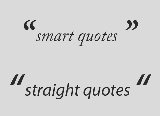 Smart quotes (sometimes also called "curly quotes") are quotation marks that turn in toward the text they surround. There are both double and single smart quotes, and each requires a different html code. Smart quotes are often created automatically in word processing programs, but can be a huge pain for web typography.
Some CMSs, like WordPress, automatically convert quotes to smart quotes. While this is good in most cases, it can also cause problems, especially if you post code snippets on your blog (as you don't want code snippets to contain curly quotes). In general text, though, you'll want to use smart quotes for a more polished look in your body text.
Smart quotes (sometimes also called "curly quotes") are quotation marks that turn in toward the text they surround. There are both double and single smart quotes, and each requires a different html code. Smart quotes are often created automatically in word processing programs, but can be a huge pain for web typography.
Some CMSs, like WordPress, automatically convert quotes to smart quotes. While this is good in most cases, it can also cause problems, especially if you post code snippets on your blog (as you don't want code snippets to contain curly quotes). In general text, though, you'll want to use smart quotes for a more polished look in your body text.
 Ampersands are appropriate for use artistically, or in instances where space is limited (like in a table). Don't use an ampersand just as an abbreviation for the word "and". If using an ampersand artistically, you may find that ampersands in italic fonts are more attractive than their regular counterparts. Italic ampersands tend to follow the older style, and closely resemble the letters "e" and "t", which make up the Latin word "et" (which translates to "and").
 Other special typographic characters include things like trademark (™), registered ('®'), and copyright ('©') symbols, tildes ('˜'), and pilcrows ('¶'), among others.
If you use any of the above characters, make sure you use the proper entity codes for a professional and polished final result.
An additional note about pilcrows: using these rather than actual paragraph breaks can be an interesting technique for article intros that consist of multiple short paragraphs. Just make sure that you don't use them throughout a long document, as they convert the entire document into one long text block, which is harder to read, especially onscreen.
Other special typographic characters include things like trademark (™), registered ('®'), and copyright ('©') symbols, tildes ('˜'), and pilcrows ('¶'), among others.
If you use any of the above characters, make sure you use the proper entity codes for a professional and polished final result.
An additional note about pilcrows: using these rather than actual paragraph breaks can be an interesting technique for article intros that consist of multiple short paragraphs. Just make sure that you don't use them throughout a long document, as they convert the entire document into one long text block, which is harder to read, especially onscreen.
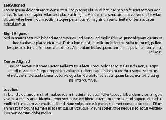 There are four basic alignment types: left, right, center, and justified. As a general rule, centered type is harder to read. It's fine for headlines or things like photo captions. But for paragraphs, it's not suitable. This is due to the fact that ragged edges on the left-hand side of a paragraph reduce legibility (because readers have to search for the beginning of each line).
Right-aligned text presents the same problem as centered text for paragraphs. As a general rule, stick to either left-aligned or justified alignment for long blocks of text.
There are four basic alignment types: left, right, center, and justified. As a general rule, centered type is harder to read. It's fine for headlines or things like photo captions. But for paragraphs, it's not suitable. This is due to the fact that ragged edges on the left-hand side of a paragraph reduce legibility (because readers have to search for the beginning of each line).
Right-aligned text presents the same problem as centered text for paragraphs. As a general rule, stick to either left-aligned or justified alignment for long blocks of text.
 You can see here how much easier text is to read at a taller line height.
 The typography used in the paragraphs on the Vogue Magazine site has an obvious focus on readability. Generous line heights and a 14px font make reading even long blocks of text a breeze onscreen. In addition to the type size and spacing, using a very dark gray also makes the type more readable.
The basic code for this paragraph style is:
The typography used in the paragraphs on the Vogue Magazine site has an obvious focus on readability. Generous line heights and a 14px font make reading even long blocks of text a breeze onscreen. In addition to the type size and spacing, using a very dark gray also makes the type more readable.
The basic code for this paragraph style is:
 Sleepover applies a number of excellent attributes to their paragraph styling. First of all, headings are the same size as the body copy, but capitalized, with proper letter spacing:
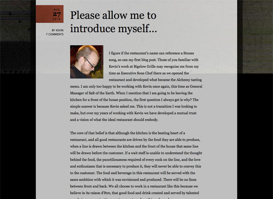 Salt of the Earth uses a larger font than is commonly seen for body copy. They also use very generous line heights. Rather than lowering the contrast of the type by lightening the font, they've opted to use a darker background and a black font. It still results in easier-to-read text than black on white would be. Ample spacing between paragraphs is also used, which adds to scanability and breaks up long blocks of text.
The basic styles for this paragraph are:
Salt of the Earth uses a larger font than is commonly seen for body copy. They also use very generous line heights. Rather than lowering the contrast of the type by lightening the font, they've opted to use a darker background and a black font. It still results in easier-to-read text than black on white would be. Ample spacing between paragraphs is also used, which adds to scanability and breaks up long blocks of text.
The basic styles for this paragraph are:
 The Design Cubicle uses what looks like a smaller font than any of the other examples here, and yet maintains similar readability. The other main difference here is that they use a sans-serif typeface (and an
Using Special Characters
There are a number of special characters you can use in your typography designs that add a level of polish and sophistication that is lacking from many designs. Incorporating these characters takes some extra time on the part of the designer, but the end result is almost always worth it.Ligatures
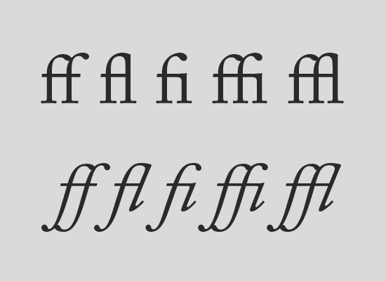
Ligatures are sometimes considered antiquated, and don't show up often in web type. They're not seen much more often in print design, either. But if your goal is to create a typographic design that has an antique, traditional, or very formal look, adding ligatures can be a fantastic way to reinforce that design style. Ligatures can also improve readability among certain characters, in certain fonts (especially italics and obliques). If you want to use ligatures in your designs, there's a great CSS declaration you can use to implement it in Safari, Webkit-based browsers, and Chrome:text-rendering: optimizeLegibility;. Firefox is already using this rendering setting for font sizes over 20px.
Ligatures are most commonly used for the following character pairs (shown regular and italic):
Hyphens and Dashes
Hyphens and dashes are two of the most improperly used characters in typography. Hyphens should only be used when hyphenating words. There are two different kinds of dashes: the en-dash and the em-dash. An en-dash is shorter, roughly the width of the letter "n" in a particular font (hence, the name). An em-dash is wider, roughly the width of the letter "m".
En-dashes should be used when showing a range (such as January–March) or when creating an open compound word (South Carolina–Georgia border). To create an en-dash, just use –. The em-dash is used mostly in informal writing, and can replace commas, semicolons, colons, and parentheses. They're often used instead of commas to set apart independent clauses or an abrupt change of thought. To create an em-dash, use —.
Smart Quotes
Smart quotes (sometimes also called "curly quotes") are quotation marks that turn in toward the text they surround. There are both double and single smart quotes, and each requires a different html code. Smart quotes are often created automatically in word processing programs, but can be a huge pain for web typography.
Some CMSs, like WordPress, automatically convert quotes to smart quotes. While this is good in most cases, it can also cause problems, especially if you post code snippets on your blog (as you don't want code snippets to contain curly quotes). In general text, though, you'll want to use smart quotes for a more polished look in your body text.
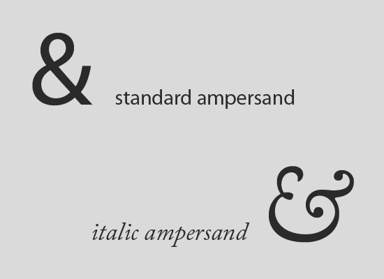
Ampersands
Ampersands ('&') are another special character that are sometimes used in typographic designs. To create an ampersand, just use&. They work well in headlines and similar short blocks of text, but aren't really appropriate for body text (despite the fact that many people seem to use them that way).
Ampersands are appropriate for use artistically, or in instances where space is limited (like in a table). Don't use an ampersand just as an abbreviation for the word "and". If using an ampersand artistically, you may find that ampersands in italic fonts are more attractive than their regular counterparts. Italic ampersands tend to follow the older style, and closely resemble the letters "e" and "t", which make up the Latin word "et" (which translates to "and").
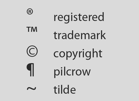
Other Special Characters
Other special typographic characters include things like trademark (™), registered ('®'), and copyright ('©') symbols, tildes ('˜'), and pilcrows ('¶'), among others.
If you use any of the above characters, make sure you use the proper entity codes for a professional and polished final result.
An additional note about pilcrows: using these rather than actual paragraph breaks can be an interesting technique for article intros that consist of multiple short paragraphs. Just make sure that you don't use them throughout a long document, as they convert the entire document into one long text block, which is harder to read, especially onscreen.
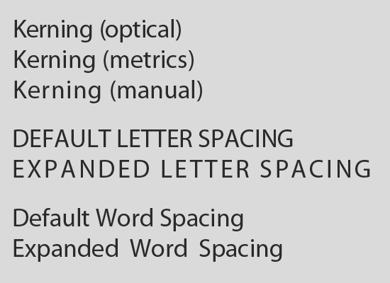
Character and Word Spacing
The space between characters and words can be broken down into a few different areas. The basics are kerning, tracking, and word spacing. Kerning, which is the space around specific characters, is generally done automatically within individual font files. Programs like Photoshop or InDesign give you some control over kerning between individual characters, but on the web it's mostly impractical. Tracking is similar to kerning, but isn't character-specific. The tracking can be adjusted easily with CSS, usingletter-spacing. For the most part, adjusting the tracking of your text shouldn't be overdone. But it can be used to great effect in small blocks of text. It's most often seen in headlines or menus. Overdoing it can result in text that is difficult to read.
One place you'll always want to use letter spacing is between strings of capital letters (includings small caps) and strings of numbers. Set a letter spacing of around .1em between capital letters, small caps, or numbers to improve legibility.
Word spacing can greatly improve readability if done correctly, as it makes word recognition easier. People often read words just by recognizing their shapes, and increasing the space slightly around each word can speed up this process. Word spacing is accomplished in CSS with word-spacing. Word spacing, by default, is .25 ems. It should be specified in ems, so that it adjusts according to text size. Also, word-spacing adjustments are made in relation to the default spacing. So if you specify a word spacing of 0.25 em, you're actually getting a space of .5 em between words.
Paragraph Formatting
The paragraph is often referred to as the most basic unit of language that has meaning. Paragraphs are the building blocks of text content, and yet all too often, designers do little more than specify the font face and size. There's a host of other formatting options we should be considering when we format our paragraphs. There are a few things to take into consideration beyond the choice of typeface. The goal of typography at the paragraph level is to create text that is highly readable. To that end, we need to consider the alignment of our text, as well as the line spacing and line width.Alignment
There are four basic alignment types: left, right, center, and justified. As a general rule, centered type is harder to read. It's fine for headlines or things like photo captions. But for paragraphs, it's not suitable. This is due to the fact that ragged edges on the left-hand side of a paragraph reduce legibility (because readers have to search for the beginning of each line).
Right-aligned text presents the same problem as centered text for paragraphs. As a general rule, stick to either left-aligned or justified alignment for long blocks of text.
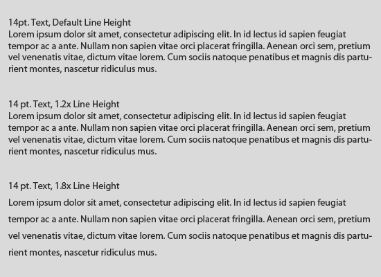
Line Height and Leading
In the days of hand-set print type, leading referred to the space between lines. The term comes from the literal strips of lead that were used to put extra space between lines of letters. Line height is similar to leading, except it refers to the overall height of lines, including the letters and space above and below them. In CSS, you can adjust the line height to whatever you want. Line heights that are anywhere from 1.2x to 1.8x as tall as the text itself are generally the most readable. For example, if your text is 12px high, then your optimal line height would be between roughtly 14px and 22px. Play around with line heights until you find something that looks good for your particular project.
You can see here how much easier text is to read at a taller line height.
Line Width
There are a few different theories regarding the perfect line length. Of course, the specifics between each vary. There are three basic ideas, though:- Line widths of roughly twelve words.
- Line widths of roughly 39 characters (alphabet-and-a-half rule).
- The points-times-two rule (which requires some math to convert it to work for the web).
Great Paragraph Typography in Practice
Vogue Magazine
The typography used in the paragraphs on the Vogue Magazine site has an obvious focus on readability. Generous line heights and a 14px font make reading even long blocks of text a breeze onscreen. In addition to the type size and spacing, using a very dark gray also makes the type more readable.
The basic code for this paragraph style is:
p {color: #333333; font-size: 14px; line-height: 24px; text-align: justify; font-family: Georgia,"Times New Roman",Times,serif;}
Sleepover, San Francisco
Sleepover applies a number of excellent attributes to their paragraph styling. First of all, headings are the same size as the body copy, but capitalized, with proper letter spacing:
{letter-spacing: 2px; text-transform: uppercase;}
The paragraphs themselves are also well-formatted. Font size is kept to 1 em, with a 1.85em line height (slightly larger than "normal"). The gray letter color is very easy on the eyes, though it might be too light for the taste of some. The added line height is extra important in cases like this, where there are other stylistic choices that might decrease readability. Here's the basic paragraph code:
p {font-size: 1em; line-height: 1.85; color: #666666; text-align: justify; font-family: "Century Schoolbook",Century,Georgia,serif;}
Salt of the Earth
Salt of the Earth uses a larger font than is commonly seen for body copy. They also use very generous line heights. Rather than lowering the contrast of the type by lightening the font, they've opted to use a darker background and a black font. It still results in easier-to-read text than black on white would be. Ample spacing between paragraphs is also used, which adds to scanability and breaks up long blocks of text.
The basic styles for this paragraph are:
p {font-family: Georgia,"Times New Roman",Times,serif; font-size: 16px; line-height: 30px; margin-bottom: 30px;}<
The Design Cubicle
The Design Cubicle uses what looks like a smaller font than any of the other examples here, and yet maintains similar readability. The other main difference here is that they use a sans-serif typeface (and an @font-face font, rather than a web-safe font), which is arguably more readable onscreen (the reverse is usually considered true with print typography). Contrast is good, with a medium gray background and a dark gray font.
Here's the basic code for this paragraph style:
p {margin-bottom: 1.5em; font-size: 14px; line-height: 21px; font-family: "ff-dagny-web-pro-1","ff-dagny-web-pro-2",Verdana,sans-serif; font-weight: 400; color: #232D32;}
In Part 3...
We'll talk about how to combine different typefaces, based on sound typographic design principles like weight and contrast, building on what we've covered here and in part 1.Additional Resources
- The Elements of Typographic Style Applied to the Web A very comprehensive guide to typography, that has plenty of information about spacing, rhythm, vertical motion, and more.
- The Paragraph in Web Typography & Design A fantastic article on various paragraph styles from Jon Tan.
- Top Ten Web Typography Sins Our own article on some of the pitfalls of web typography, including plenty of information on using special characters.
Great article – some helpful points in here!
Among different elements of graphic design, typography is one of the most important elements and the most tricky one.
Nice and so useful post. Thanks a lot.
Thanks for the article Cameron!
Can you please tell me if the correct use of n-dash or m-dash inserts a space between the dash and before/after letter?
i.e. dum de dum — dum de dum, or
dum de dum—dum de dum
John
Robert Bringhurst prefers an en-dash and a space before and after. Chicago style prefers an em-dash, no spaces. Kind of a Bringhurst fan, myself.
In my world of newspapers — hot metal typesetting — we never used the en dash. When printed on newsprint, it was near impossible, even for us, to tell it from a common hyphen.
We used spaces on either side of the em dash because on newspaper lines of 12 picas, we needed every space we could find to get reasonable word spacing. The last thing we wanted was a line with only one space. The only time we would close it up was on a double-column line where we wanted to put an
extra character or two for better justification. Then we’d take the spacebands out.
Thanks again for this great article!
Enjoyed it and looking forward to the next one :)
Very nice article! I enjoy reading it :) Thank you for posting.
So cool suggestions.. I really like these articles.. Thanks ;)
I still have an awful lot to learn about web typography (I mainly come from the Print domain), but is there a way to include fine and extra-fine spaces in web copy? Those are vastly used in french typography, especially when high punctuation is involved.
Great article Cameron. Not often I see someone that knows typography. My father was a Linotype operator and trained me in cold type before desktop publishing arrived.
I’ve now been a web developer for 10 years. In the beginning, I had to abandon much of what I knew about typography because the web was antiquated compared to print. I mostly missed using a large font library so I am going to follow up on your reference to @font-face.
Even with advances, I still avoided curly apostrophes on the web because a search for “Mike’s” (typewriter apostrophe) in Google when the site used a curly apostrophe, “Mike’s”, would result it it not being found. I just did a test and Google has now wised up. Yeah! Back to the much better looking curly quotes.
I really love this series, I’m sharing wherever I can.
Thanks for this series of articles!
Could you link from old articles to new ones and vice versa? Or enumerate the series in the first part and link to it from all other articles? You can also give this series its own tag, e.g. “typo crash course”.
I have a very strong preference for left-aligned type over justified for body copy. Justified type can develop rivers of white space in the text that flow from line to line. To see what I mean, blur your vision until you see a block of text as a grey blob.
Those rivers will show up as long white vertical cracks running through the grey, and they make the eye jump across the line unnaturally. We can get fewer of those rivers if we use smaller type, but then we’ve traded one readability problem for another, more serious one – especially if our audience includes anyone over 40.
And guess who has the most money to buy stuff? People over 40 – and in my experience, some men over 40 either will not put on their reading glasses or aren’t buying them strong enough in the first place. (For the record, I used to be able to see a yellow dot 1/2 pt across. Now I can’t read 14 pt Helvetica Bold without MY reading glasses. So when they say they can’t read the type, I know they really can’t. But they could if they put on their glasses . . .)
Granted, if we let those guys govern our design decisions completely, we’d set all our printed type in 14-point Helvetica Bold and online type in 18px Arial Bold with tracking of +10. And I’m not willing to do that.
But at least, let’s save the justified type for old-school print publications that still require it.
Great article I needed something like this. Please post more interesting stuff like this.
Interesting article, but rather spoiled by giving examples of the ‘correct entity’ to use each time, but not properly escaped, so all that appears is the single character not the raw sequence.
Thank you for the interesting article.
The first link in additional resources (http://webtypography.net/toc/) seems to be broken. It was suggested on many sites. Can anyone suggest any other place I can find it.
Thank you, karthik. We cannot see any problems with the link you mention. Perhaps it was a temporary glitch? Things like that happen. We sincerely apologize for any inconvenience caused.
hi!……………..
your site really pain my eyes…………. almost every time…………… but for article only i stay…… otherwise no way……………
i don’t really understand why you use background image…. do you think that your background image make you site attractive……….
thank you
hi……… admin so sorry about my previous comment……….. actually due to my slow connection…….
your site not properly loaded………. hope you not mind….