
The 10 Most Common Mistakes Web Designers Make
There are plenty of mistakes web designers (especially new ones) make when designing websites. Everything from poor design to simple oversight happen every day. But with a little diligence, they can easily be avoided.
Below are ten of the most common mistakes web designers make, along with examples of sites who do things right. Some of these are easy to correct if you're aware of, others might take a bit more time. But all are fixable and worth the time and effort to correct. While this is by no means a comprehensive list of common errors, it is a good starting point.

1. Busy, crowded pages.
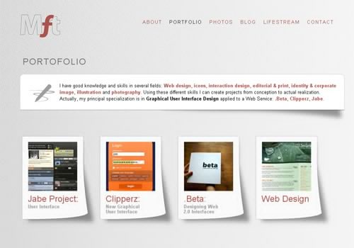
"White space" or "negative space", space that is empty of elements other than your background design, is an incredibly important design element. It's an important design element that affects how your visitors perceive the importance of different elements. Sufficient white space should be used between your columns, different page elements, and even between individual characters, lines, and paragraphs. Consider both the "macro" white space, the negative space around columns, page elements, and even the whole design; and micro white space, the negative space between individual lines, paragraphs, and sub-elements. In addition to white space, don't try to put too much on a single page. Visitors will likely visit pages looking for something specific. Including only related information and necessary navigation and site-wide elements on each page. It's better in many cases to have multiple short pages than only a handful of very long ones, espeically if those long ones include a ton of unrelated content.

2. Hard-to-Find New Content
Unless the sites you're designing are completely static, somehow showcasing new information and content is vital to good design. Returning visitors are likely going to be interested in what's changed since they last visited. Generally, this is done automatically on blogs, with posts appearing in descending order based on date. But what about on other types of websites? There are a few ways to approach this. You can devote an entire section to new content. This could be a page linking to the newest content (say, the ten most recent updates). Or this could be a section within the home page or another page that links to the newest updates. Making this prominent is important, whether it's directly within the home page or on its own page. The goal is to make it easy for returning visitors to find it.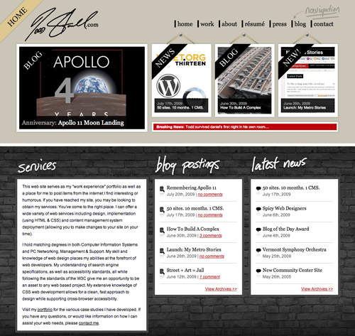
3. Hard-to-Find Links
Links are one of the most important parts of a website. Arguably, they could be the most important element. In any case, you need to make sure your links are easy to distinguish from other text elements. There are two things to keep in mind here. First, make sure your links are distinguished in some way from the rest of your text. This can be done with a different color, an underline, or some other text attribute (anything but blinking text). The second thing to keep in mind is not to make text that isn't linked look like a link. This means that under no circumstances should any text on your site be underlined if it isn't a link. It also means that if you use other elements to style your links, don't apply them to non-linked text.


4. Incorrect Image Formats
Using the correct image format for the different images on your site is vital. Using the wrong image file format can either make your image files larger than they need to be or effect the quality of the final image. The three image formats to concern yourself with for online graphics are JPEG, GIF, and PNG. JPEG format is great for photos or images with a lot of different colors and shades because it's capable of 24 bit color. The downside to using JPEG is that it uses lossy compression. In other words, the smaller you make the file size, the more quality loss you get. Using lower compression minimizes this but it can still be an issue, especially in larger images or images where the original was very sharp. You can't use transparency in JPEGs either. GIF format is great for images that use a limited color palette. GIF is only capable of 8 bit color (256 colors total). That means it's not appropriate for photographs or most gradient images. GIF uses lossless compression, though, which means if you have an image that uses only a limited color palette it can result in really small file sizes with no quality loss. GIF is also capable of transparency for a single color within the palette. PNG format is suitable for photos and other graphics. PNG images are capable of alpha transparency (in browsers that support it), which gives them an advantage of GIFs. They also use lossless compression, which gives them an advantage over JPEGs. And they're capable of 8 or 24 bit color, so are suitable for images that previously would have been saved as GIFs or JPEGs. PNG images aren't quite as good at JPEGs for photos, but are considerably better than GIFs.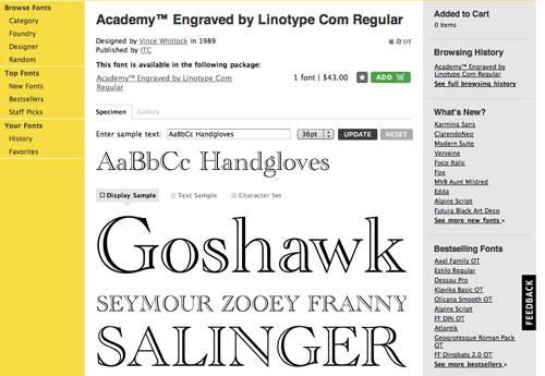

5. Leaving the Default Page Title
The default page title in Dreamweaver is "Untitled Document". If you search for it in Google, you'll come up with almost 30 million results. There's really no excuse for this. It's literally a two-second fix. Make sure before you upload that you've changed the default page title to something other than the default. Really, though, you should take it a step beyond that. Many CMSs use the website or blog name as the default page title for every page within the site. Some will add on the title of the particular page, but some don't. You should make sure that not only is the page title for each page unique, but that the specific page title shows up before the site title. It's a big help with SEO, both in terms of showing up higher in results and in having those results look more relevant to potential visitors.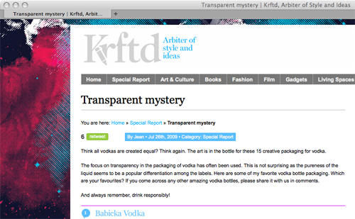
6. Hard-to-Use or Hard-to-Find Navigation
Navigation should be immediatley apparent to visitors, both in terms of locating it and using it. There was a trend in web design for awhile to hide navigation, to integrate it seamlessly into an image or other content on the home page. And while artistically this is interesting, functionally it's very user-unfriendly. Even using things like drop down menus for navigation can make your pages less user-friendly. You want users to be able to find exactly what they're looking for with the least amount of effort. Always keep that in mind when you're designing.


7. Fixed Font Size
This is a very important one. Make sure users can resize the fonts on your pages based on their own preferences. This is done using EM sizing for fonts rather than pixel-based sizes. Again, it's a relatively simple thing to implement but greatly improves the usability and accessibility of your site.
8. An Unclear Site Purpose
Visitors should immediately know what a site is about, no matter what page they land on. This can be done through the use of tag lines or similar indications, through page titles, or through headings on individual pages. However you choose to do it, make sure that it's apparent within the first few seconds after a visitor lands on a given page.

9. Using Harsh Colors
Harsh colors, and especially the use of harsh contrasting colors, can quickly make your sites a chore to view. You don't want to do anything that makes a visitor want to leave your site. Eye strain is one thing that will get most visitors to leave post haste. Your site should showcase your content and avoid anything that detracts from the goal of the site.


10. Advertising Blended Into Content
Advertising should be set apart from the content of your site. With banner ads this is relatively easy; most Internet users know what a banner ad looks like. It's a bit trickier with text links, though. Labeling your advertising for what it is make sense to your visitors and sets your site up to be considered more trustworthy. This is especially important with in-text advertising, where hovering over a linke will bring up a modal window with an ad. Make sure these links are differentiated from your normal links.

Author: Cameron Chapman
Cameron Chapman is a writer, blogger, copyeditor, and social media addict. She's been designing for more than six years and writing her whole life. If you’d like to connect with her, you can follow her on Twitter or at her Personal Website.Write for Us! We are looking for exciting and creative articles, if you want to contribute, just send us an email.
That was a very well written and informative article. I hope my WordPress-based http://artsyhands.com/ site lives up to everyone’s expectations! (And I instinctively did not make those mistakes most people do)
Very useful. Thanks!
Useful points, I’ll be sure to bookmark this when I start new designs in future – particularly blogs.
I hope you remedy the irony here, Noura. Noupe’s own design has an ugly sandwich of header, ads, content title, Google AdSense and then the actual content.
It says SPONSORS and Ads by Google. How are they blending in?
I think #5 (leaving default page titles) and #8 (unclear site purpose) are the worst! These are both basic and crucial pieces of content; and great for SEO as well as for the user.
Also, not seeing Sumesh’s “irony” point in the previous comment. I think the Noupe site looks pretty nice and I don’t see any Google ads. Am I missing something?
My bad. The FF add-on “Adblock Plus” was working so well that I didn’t even realize…yea, remove some ads…
lol. I was looking at your first comment and wondering if we were looking at the same site.
I concur with all of these points but think there is one that is missing. I find spelling is something which is almost always overlooked, and one which can make an immediate difference to a site. Unfortunately this was placed foremost in my mind when reading the second sentence of this post – oversight being spelled incorrectly. Otherwise, a very good article :)
Hey there. Just a heads up about your RSS feed – it seems to mess up the images referenced in your posts, at least in Google Reader :-(
Hi Cameron,
Thanks for such a nice article. I agree with all the points you have mentioned here. You have put all this in nice flowing language. Some of the other common mistakes, web designers make, I think are, Using too much animation (This includes overuse of flash) and use of mailto links which end up opening default email client (Not configured Outlook Express in most of the cases).
Anyways, Congrats again for nice article. Keep Writing :)
Hahahaha @ #10, a bit hypocritical w/ the Google Ads matching your theme DIRECTLY below that point, don’t you think?
Are the images examples of good web design decisions or bad?
I am left wondering the same thing. The intro states both are exampled but none of the images are captioned. I guess we’re left to make our own conclusions.
Yes, I think the image examples are the good ones.
Good list overall, especially for beginners.
Concerning #7 though, there is a small debate over whether em vs px is still the preferred choice. The arguments hinge on the fact that modern browsers now default to page zooming rather than text scaling.
Cameron Moll has written about it here: http://www.cameronmoll.com/archives/2009/06/coding_like_its_1999/
Isn’t #7 obsolete with the current browsers? All current browsers including IE7+ use browser zooming instead of the old text zoom so even pixel font sizes zoom with the content.
I expected many of your comments guys, so much sarcasm over here :)
Our new design is coming soon and i will make sure the ten points mentioned here will be taken care of.
Thanks Cameron for writing useful content here at Noupe :)
@Jason Hale and @ Kramer
No. Common web design mistakes include assuming all your readers / users have the latest browser.
#7 is bull, rest is nice :)
Good post, I have seen lots of “Top 10 Web Design Mistakes”, but you made some unique/up-to-date points.
How about sounds. I find web sites with sounds for everthing, especially for pressing buttons or even hovering over menus to be extraordinarily annoying. I recall a local artist who had a little popup video of herself on her web site. Cute except she popped up on EVERY PAGE of her web site.
I can deal with music that you can mute but sometimes there you have to mute on each page. I say, use music or audio sparingly.
Here is another one, posting mistakes and using screenshots of websites that work. By just flying over your sub titles and the screenshots you automaticaly associate those websites with the mistakes you mention, although some do a great job. So maybe it helps to be a little bit clearer in the future.
By the way the “Fixed Font Size” issue will solve itself with the zooming abilitys of the new browser generations. So fixed or not fixed wont matter that much in the future.
However i really enjoyed this article!
Mistake 11: Putting up a database-driven website that doesn’t work properly. It took me five tries to before I could finally connect to your server. The other four times, I received an error message: “Error establishing a database connection”. Nice.
great article, thanks for points..
Great list but point #7 is no longer really valid. As all modern browsers now use zooming instead of text resizing px sizes work great for resizing.
thats exactly how i see it as well.
True. If your crowd is using IE6 then use EM, but every other browser will either increase the font size (ignoring the px set) or scale up the entire page
Excellent post Cameron!
I think the overuse of Flash is another mistake. It is a great tool in moderation. But some sites (especially agency sites it seems) use so much Flash, the site becomes confusing and essentially useless.
te?ekkürler
Very useful. Thanks!
The debate is still out for fixed font sizes vs em-based (#7). One of the issues is page zoom versus text enlarging. I believe modern browsers are able to do both, but default now to zooming, which gives cause to use fixed font-sizes.
But there are some development benefits in using ems, such as resizing all text elements that fall within a certain container by the same amount (e.g. if you want all the text in a side bar to be based on 12px instead of 14px, etc).
Agree. Back in the days of IE6 domination, em-based fonts were essential. But now? I see no point, but in some situation like Kyle said.
Oooh stop that “you should use em instead of px” crap please. All modern browsers zoom the whole page. You can code with fixed sizes in fonts, images, divs, whatever. No need to use em’s and dozends of hacks and workarounds to get it all in shape.
It’s really more a question of your audience. Someone trying to target users with older browsers will still run into the text zoom problem, and given that older browsers and older users (with their older eyesight) tend to correlate, it’s an issue. Like you said, though, for most folks it’s not a problem.
Perfect. I hope the images shown are examples of good practice, because they really seem so to me.
The first piece of advice about page layout I ever received was “don’t be afraid of the whites”
If I am a customer and want to advertise, maybe that #10 won’t be good for me, what you say?
nice little refresher course on mistakes you can make.
the title “most 10 common mistakes” is a mistake.
you can’t have something more “10” than something else.
I personally see #4 as the biggest problem on the web today. I don’t personally use GIF since PNG of the same image is typically smaller anyway.
Here is a few more though(optimization wise):
11: Use of far too many external CSS/JS. Dramatically lowers page init rate without any true benefit (comments work folks)
12: Using CSS background images when a html/xhtml img tag would suffice. Again a huge init hit.
As far as #7 goes, I believe anyone who is in need of text resizing, has access to a newer browser. While you can in fact switch over with little to no cost design wise, I don’t see it as a crucial step anymore. The argument that says we “can’t forget older browsers” doesn’t apply here either.
Also going to agree with your lack of information regarding images. Some appear to be bad examples, some great. However since design is often a matter of opinion it’s best that you left the comments out anyway :)
what do you mean?
web designers never make mistakes ;)
I assume the screenshots you provided are supposed to show how things should be done rather than how they shouldn’t. If that is the case, I would expect to see examples of pages where these common mistakes have been made.
That is the exact case with me, i guess you made a mistake (hope i am not being rude). The screenshots should have been related to the title, by telling us visually what not to do. Right now its hard to differentiate. Please do mention some sites, those have made these mistakes.
nice post, but one question. Screenshots are good examples or bad? Need more explanation about each, because now it looks more like the advertisements. :)
good material. i like what you wrote.
Great insight. I think we all have made 1 or 2 of them over time.
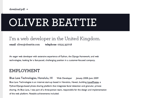
Thanks for the http://www.modalinc.com mention for good use of whitespace. We are in great company with many other well executed designs. Thanks again!
Using the article title as the alt text for every image in that article? Maybe that’s number 11… ;)
Otherwise, not bad :)
Nice post. Thanks for lesson :)
“Most 10 Common”.
Is grammar-checking included? :-)
Nice tips as it is a constant reminder that we should follow guidelines. It is nice to see the industry whip itself into shape with some standard practices particularly from print.
I can only hope more browsers become more compliant so we are able to code/design with more consistency.
A lot of these points, especially #5, just scream sloppy. Certainly not the message a business wants to give.
That’s a very true list. #1 mistake is rightly placed in the first spot, because “busy pages” are really the biggest mistake in usable web design.
Thanks for the list, I particularly like number one and number four. I think too many people cannot grasp the concept of negative space. CSS line-height and letter-spacing also help a lot when trying to dial in the amount of ‘density’ on your page.
Thank you! Your post is versy interesting! I wish to became a professional blogger but I think I’m a very little blogger! :) Good life!
#11 Not proofreading their copy.
Great article, but perhaps it should be called “The 10 Most Common Mistakes Web Designers Make”.
=)
I have to disagree with #10. If you want to increase your ROI on ads, pushing them into a corner with a bright, flashy sign that says “Advertisements” probably isn’t the best idea.
However, I do realize some programs require a clear separation between ads and your content.
That being said, I don’t see integrating ads into your content as a “mistake”. In my opinion it’s a mistake not to.
cool! THANKS.
Hey ya nice tips,
however I would like to point out that this is not necessarily all true for everyone. I have been extensively studying web design for the Chinese market over the last few months and certainly some of the design conventions (like #1 or #9 for example) do no apply when designing for a Chinese audience. This has to do with culture largely, we as Westerners do not value (and are less capable of digesting) a large amount of information on a page, but Chinese on the other hand are much more comfortable with high information density and are actually fond of visual stimulation that we as Westerners would find overbearing. I will try and do a response post to yours on my blog http://www.thechinaproject.co.nz in the following weeks, you may get some good ideas from that.
Cheers
Some interesting points. To err is human. Sometimes it is good to run through a list of do’s and don’ts such as this one, with an objective eye and ask ourselves which ones we are doing or not doing.
Thank you.
These are some really useful tips. I agree with #6, it is important to make your navigation clear so it is user friendly, having navigation that is hard to find may result in people leaving your site. Another good point to add to the list would be to check the spelling and grammar on your website, I have seen so many websites where words are spelt incorrectly and sentences don’t make sense.
Are the example images supposed to be good examples or bad examples?
I love these do’s and dont’s type article, always great to test your own metal against them.
Thanks!
Rob
Interesting; the examples are a little confusing as to what you’re trying to illustrate.
Nice article, but I think it would have been better if you showed bad designs next to bad so you can really see the differences.
Oops. *Bad designs next to good*
Thanks! I learn a lot from you guys!
I wish someone would mention to you younger designers to remember that not all of us are as young as you are. Not all of us have perfect vision. Not all of us are enamored with a solid black blackground. And I don’t care if fonts are adjustible, I hate a font that couldn’t intimidate a flea.
Thanks again,
Janelle Meraz Hooper, author
This is a pretty good checklist to go through before we publish any site :)
Well done. Its good to be reminded every once and a while about these things.
Nice topic but your examples are very difficult to parse through. Good job but please get better.
This is very use full tips for all designer
Thanks
really useful, thanks :)
Very useful. Thanks!
That was great – lots of common sense, but sometimes we all need to be reminded of that stuff. Nice examples for each mistake, too.
Very nice article, thank you for sharing :)
The first piece of advice about page layout I ever received was “don’t be afraid of the whites”
well written and very useful
:)
not only well written…there were mistakes in my blog and I have correct them after reading this post…thank you
Thanks for the useful info, Want to read an article on EM font size
If every web designer keep this points in mind and design there sites then they will be on the top of mount Everest. I would design my site carefully by keeping this in mind and then post my design in a contest running by grafikguru.com
Thanks for a nice article,
I learned a lot from you.
Please do mention some sites, those have made these mistakes.
Thank God, most of them already fit with me…
Great article. Can’t say that I’m perfect, probably guilty of a few of these sins myself! Thanks for sharing.
Great post! Thanks!
Hey,great channel and information you have here, keep it coming, best of luck- James
Just what I needed. Thank you!
A very well written & useful article. You have put all this in nice way. Thanks for sharing.