Tribbon ‘Layered’ Font – Exclusive Free Download
By Graham Smith
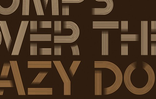
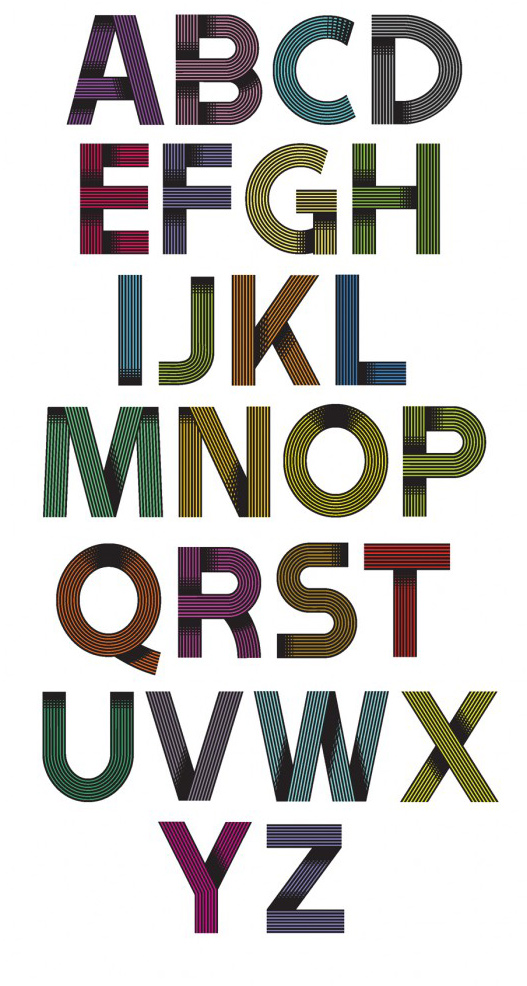
In another free font exclusive on Noupe, we present Tribbon, a tasty layered 'ribbon' style font created by Dominic Le-Hair. It has taken a few weeks of communications with Dominic to finally arrive with a interesting concept in font design. Tribbon is a working 'ribbon' style font, that consists of several layers and is available as a free download below. Tribbon is available in both TTF and OTF font formats.
 Dominic also designed the popular 'Clipper' font.
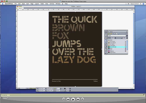 Dominic has also kindly created a brief video on how to best use the Tribbon font. 'How to use the Tribbon Font'
 Dominic also designed the popular 'Clipper' font.
Tribbon Layer 1

Tribbon Layer 2

Tribbon Layer 3

Tribbon Layer 4 - Complete

Designer's Profile
Dominic Le-Hair
I am a 32 year old Graphic Designer living and working in Peterborough, UK. I left Teesside University in 2001 with a BA Honours in Graphic Design. I like to work on personal projects in my spare time as there are less restrictions than with most of the client briefs in my job. I try to be as original as possible with my work and like to occasionally combine hands-on media with digital techniques. I am inspired by designers who experiment with type, such as Craig Ward, Autobahn and Handmade Font.How To Use The Font
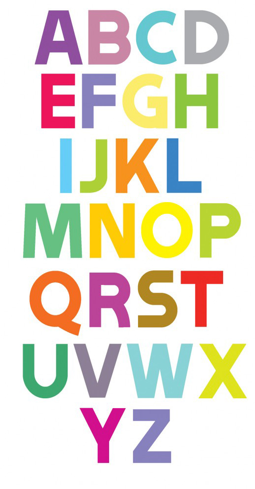
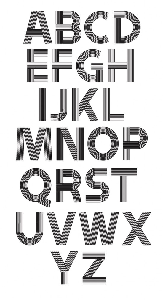
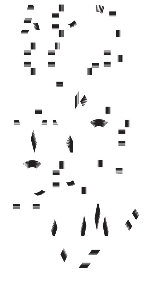
The Tribbon font started as an experiment in Illustrator working with a simple custom brush I created. I used Myriad Pro Black as a loose basis for each character. The shadows were then added using a gradient overlay. I was contacted by Graham who asked if I would be interested in creating a working font from my original work called Ribbon Alphabet on my Behance portfolio. I knew it would be a challenge to simplify it without losing too much detail. My solution was to break it up into three separate fonts (Tribbon A, Tribbon B and Tribbon C). These can be layered on top of one another to maintain the depth of the original. The fonts can be used this way in Photoshop, Illustrator, Indesign and QuarkXPress. Tribbon B can also be used on it’s own for a more simplified, 2D version of the original. I named the font Tribbon as there are three fonts that resemble ribbons when combined (Tri + Ribbon). Dominic has also kindly created a brief video on how to best use the Tribbon font. 'How to use the Tribbon Font'

Beautiful font! Thank you, it’s such an inspiration.
thanks a lot for this amazing font – i really appreciate!
very nice great font. Thanks share!
Is nice! I like!
Thanky Spanky
Thanks for this. You are doing gr8 job. Need to experiment things out of this :)
Love the “layer philosopy”. Nice idea!
Nice tribbon font with free download… I really liked it.. Thanks for share.. :)
Great work. Thanks for sharing.
Very beautiful and imaginative font. I will create a good reason to use the font =)
Woow ,Awesome font amazing thank you
This is a really inspiring concept and outcome. When I saw it described as a ‘layered’ font, I thought it was just a gratuitous use of the familiar term – not that it was made from real multiple layers!!!
I think you may have stumbled upon something big here. I can forsee several ways in which this idea could evolve…
I love the Tribbon Layer 4 – Complete, really colorful. It seems will be fun to mix and match the font, thanks for the sharing :)
setting first layer as a mask and using nebula in the background looks just amazing!
http://since1985.de/bg_nebula.png
Great font! It looks most advantageous on the black background, I really love it!
Nice to see someone also from Teesside! Thanks for the font.
This font is really amazing!
thanks!
I have a problem uncompressing the archives. I get an error that says Winrar is unable to create the files.
Waouh ! Won’t say more…
Great collection of sites.
thanks for sharing
Amazing font, thanks for the share.
Download for future usage, love it, thanks.
Awesome font… and thanks for sharing the case study. A lot to learn and explore….
I have downloaded the font. Its really nice. I have used it in a fashion magazine website. Thanks Noupe
Awesome! Thanks a lot! A perfect match for my new project.
Beautiful Font. Thankyou.
Nicely done! Thank you for making it available! :)
beautiful thanks!
Just wanted throw some appreciation your way for the hard work put into this, and for putting it out here for free. Nice work, and thanks!
Tribbon Layer 4 — so cool i will make afew website by your font and link back to here.
Great Work and thanks for sharing.
Your fonts are such a great one,,love it!
Thanks for making it free for us to use
I wanna ask a permission, If I may, I think I’ll use your font for a print ad in a magz in Indonesia,,
May I? thanks before :) I appreciate Ur answer
..ciao..
Beautiful font, thank you!
I purpose a notice in French to use your nice font.
Les polices graphiques sont des polices qui nécessitent un petit travail pour obtenir le résultat final.
La police tribbon (tri ribbon -> trois rubans) se compose de 3 fichiers de police qu’il faut superposer pour obtenir le résultat final.
– Mettez votre texte en place avec la police “Tribbon A.ttf” pour définir sa taille et l’espace que vous réservez au texte.
– Puis, dans un logiciel graphique ou gérant les calques
– Ressaisissez votre texte ou faites un copier/coller en appliquant la police “Tribbon A.ttf” avec la taille correspondant à votre essais dans le texte.
– Choisissez la couleur de votre police
– Copier ce calque et collez-le au-dessus du précédent.
– Appliquez la police “Tribbon B.ttf” et ajustez la couleur (généralement plus foncée ou plus claire)
– Enfin, faites une nouvelle copie de votre calque et appliquez-lui la police “Tribbon C.ttf”. En principe il ne devrait pas y avoir d’ajustement de couleur à faire à moins que vous ne le souhaitiez.
Si vous avez fait ces manipulations dans un logiciel comme GIMP, exportez au format PNG pour l’incorporer dans votre document. Dans ce cas faites attention à bien régler la résolution à 90 dpi au minimum ou à 300 dpi maximum.
Si vous avez utilisé Inskape, vous pouvez sauvegarder au format SVG pour l’incorporer dans votre texte.
Si vous travaillez avec Scribus, vous devriez pouvoir faire tout cela en même temps que votre texte.
Merci à Dominic Le-Hair (http://www.behance.net/DominicLe-Hair) pour cette police qui permet de varier et personnaliser les effets.
Cette notice est réalisée par un contributeur anonyme que vous pouvez essayer de joindre à k6dedijon free.fr
K6
GREAT… THANKS A LOT FOR SHARING
Hello!
I love your font, and would love to use it in my design work for web, print, etc… I generally do commercial design for others. So I wanted to ask permission to use your font for these purposes.
Thanks!
Nate Morris
Thank you from the Antipodes,
OzzieTonto
Thank you!
Very nice font indeed!
X
thank u …that’s cool font
Great font! love it. Thxs!
AWESOOOMMEE! Thanks for sharing . Very inspirational!!
Awesome!
Rafo from Brazil!
WOW,very nice ,thank you for sharing !
A courageous, yet successful project. Congrats & thanks for dl! Kevin
Wow! I just started making a blog…. and this font will be perfect! Thank you so much! I can’t wait to play around with this. Absolutely beautiful! Thank you for making this free. Woot!
I really Apreciate!
Thanks!
I really Apreciate this font
Thanks!
Nice Especially for blog Thank you.
Thanks
This is a great place to find and know about fonts.
Such a fun font! One of the best i’ve seen in awhile
Thanks man!
Hi Dominic, would you allow me to use this awesome font for my company logo? Thanks either way,
James
It’s very beautiful font. Thanks a lot
This font is the DOPENESS. I’m using it for my personal design company (with proper attribution).
Live filters to come, and better ui.
MUCH LOVE!
very attractive
WoooOooow!
Thank you!
i love it!
Beautiful type :)
Thank you!
Amazing font. Great idea to use multiple layers to create it.
Hi,
Is it possible to use this font for a music band?
Thanks
Really beautiful work. Thanks for sharing :)
Dominic Le-Hair did a wonderful job. I like his multi-layered font. I think it’s brilliant the way you build it up like a sandwich, choosing colors and filters. It’s also great fun to experiment with multiple layers amnd transparencies. i wish other fonts would be designed this way, giving people room for new experiments.
Thank you for sharing this beautiful type.
Carlo
I am interested in possibly using this font for an advertising campaign at an ad firm I intern at, in Milwaukee, Wisconsin, USA. Please let me know as soon as possible about rights and prices, etc, if applicable.
must be nice to be GAP’s “Be Bright” font selection! Love your font!
Hello, I downloaded the font but it prompts me that there’s a password. May I know what the password is?