
Preparing Photoshop Files for Web Developers
By Brian Rhinehart
Whether you’re a freelance web designer or part of a team at an agency, handing off Photoshop files to a client, developer, development team or even another designer is part of the process of building websites.
Whereas the development process is generally more structured, by contrast, the design process is quite often spontaneous and full of experimentation. This can lead to a host of unused and unnamed layers that don’t end up as part of the final approved design. For developers, sifting through a quagmire of unnamed layers (Layer 1, Layer 1 copy, etc.) can be confusing and time consuming.
Designers can help their counterparts or clients before the design hand-off by taking 10 to 15 minutes to prepare files in a consistent and organized manner that can potentially save developers hours of production time. As an added bonus, an organized Photoshop file will save designers time by minimizing development questions after the file has been handed off for coding.
1. Prepping the File
First and foremost, make a copy of the Photoshop file that contains the approved design and add the suffix -prod to the file name. This way you can recognize a production file immediately and know that this file type is for development use only and not for further design refinements.
Guides and layout
Properly align and remove any unnecessary guides in the document. Keep guides to a minimum and only section off the major regions of the layout by outlining blocks of page content such as the masthead, content area, sidebar and footer so that the developer understands what basic structure the page should follow. Keeping the number of guides to a minimum also allows the developer to then add guides where needed to aid them in visually mapping out layout details in the code such as nested divs and navigation menus.
Include a color palette
Create a layer group with its visibility turned off at the top of the Layers panel named “Palette.” Populate this group with layers using Layer > New Fill Layer > Solid Color... which are named to correspond to elements that will be colored using CSS. This allows developers to simply Double+click the layer thumbnail to get the color values they need from the Color Picker while coding.
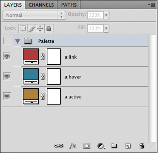
The added “Palette” Layer Group.
2. Navigation and Button States
During the design process, it’s easy to overlook that navigation graphics should have at least three states of user interaction that will need to be defined in a stylesheet. Place each state on its own layer and name that layer to correspond to its function. As an example, using the following for the layer names of a top navigation element (topnav, topnav:hover, topnav:active) will help to establish a common naming convention and language that both the designer and developer mutually understand and recognize.
Create sprite groups of navigation or button layers or layer groups to ensure that what you envisioned as a designer will get executed in the code. Position the default state as the topmost layer within the group with the hover and active states below.
When creating sprite groups, it is also recommended that a consistent height be used for all of the states so that it is easier for the developer to calculate the background-position of the elements while coding the CSS.
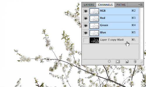
![]()
Sprite groups showing the different navigation states.
3. Flattening Artwork
The purpose of flattening artwork is to preserve the approved design and to combine multiple layered elements into single layers that are more readily digested. Examples of this would be a base layer which is being used as a clipping mask and the secondary layers that are being clipped by that base layer, photomontages or a group of layers that comprise the background of a site.
Merging layers
Merge (Command+E) layers and layer groups that won’t require further editing by the developer. This not only reduces the visual impact of the Layers panel, providing a clearer road map for the developer, but also removes the chance of design elements getting accidentally altered during image slicing.
Fonts
Web safe fonts that are used for headings and copy should be left as editable text. This allows developers to easily check the Character panel to see what values need to be applied to font properties in the stylesheet.
In cases where image substitution is to be used for items such as navigation or stylized text treatments, flatten the type layers just in case the developer doesn't have a specific font available to them. Another method of preserving the appearance of a font would be to use Layer > Type > Convert to Shape in cases where the developer may need to resize a type treatment.
Smart objects
Smart objects are invaluable during the design process. They allow for resizing and styling with Smart Filters while remaining completely editable. However, once a design is approved these layer types should be rasterized or merged with other layers to reduce the overall file size as smart objects can often contain photos or other artwork that have a higher resolution (e.g. 300dpi) than is required for the final output of 72dpi. Another reason to flatten smart objects is to prevent a “File Not Found” error message should the developer Double+click the smart object layer thumbnail.
4. Organizing the Layers Panel
First things first, clean house. This means deleting any layers that are empty or are not going to be used in the final design, especially all the duplicated layers that were used to test ideas during the creative process. By doing a little housekeeping you have already made the file easier to read.
Name all layers
Once you have flattened and merged all the layers that will not require editing, go through and name all of the layers and layer groups. Use a naming convention that is not only well recognized, but also common to your work environment. One example would be to assign layers names that correspond to the CSS that would be used for that layer such as “button:hover.” The point is to establish and maintain the nonverbal communication between the designer and developer through common practices and language.
Use layer groups
Group like elements into consistent layer groups. For example, when designing a Wordpress theme, it would be logical to have layer groups with the names “Header,” “Content,” “Sidebar” and “Footer.” It’s also good practice to group like items that constitute a navigational element or other design elements that have multiple states such as icons, buttons and menus.
Mirror the layout
Start from the top of the page layout and work your way to the bottom, arranging the layers and layer groups in descending order to correspond with their position in the design. In this manner a developer can quickly scan through the layer names to identify where a particular design element is located within the Layers panel based on its visual location in the design. This is especially helpful should they need to isolate it for editing or slicing.
Use nested layer groups that reflect the hierarchical structure of the layout. A layer group called “Sidebar” might contain layer groups “search” and “advertising.” Nested layer groups can also illustrate to the developer how elements are arranged structurally within the HTML.
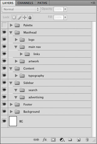
An example of a hierarchically structured Layers panel.
5. Handing off the PSD
When the file has been prepared, don’t just send the file in an e-mail or upload it to the development server. Schedule a hand-off meeting and take the time to go over the file(s) with the developer to ensure that they have a firm understanding of how the end product is supposed to not only look, but behave in terms of user interaction. In the end, both designers and developers will save valuable time.
About the author
Brian Rhinehart is a freelance designer, illustrator who has been working in the media and design industry for the past sixteen years. When he’s not working for clients, he spends his time illustrating or maintaining Illustration Toolbox, an inspiration gallery and blog dedicated to all forms of illustration.
No mention of a style guide?
I found this post is very useful as I’m a web developer too. But I’m not using Photoshop to design for my clients. Just redesign from Premium Template (WordPress n Joomla).
Anyway, your tips I can use for my jobs as Graphic Designer.
Cheers from Malaysia Web Developer. :)
Many thanks Brian, I’m a developer who occasionally designs and my PS files are always very messy (my own worst enemy I guess) but have been meaning to take steps to tidy them up.
I think I’ll find the palette tip especially useful!
There’s one major thing I miss: Also send the (non-standard) fonts which are used with the .psd.
As a developer I don’t have all the fancy fonts which are needed (and aproved by the client) for the design. And since it will happen that the content of a button has to be changed, I shouldn’t have to send the whole design back and wait for a minor fix, while I can do it myself in seconds (unless it requires a complete redesign).
This is also usefull for attached files in Flash and Illustrator.
great tutorial, very handy.
Make sure to deal with any blend modes too. I’ve received several PSDs where half of the layers had blend modes of multiply, screen, etc. That doesn’t exist in the programming world. Flatten those babies out.
Nice tips.
A couple suggestions I have is to use Layer Comps since most sites have rich functionality. The Layer Comps will make it easier for the developer to see what the desired functionality is for different user actions.
Also, I find it best to have my font size measured in px instead of pt since most developers size fonts px if they’re using absolute font sizes. Edit >> Preferences >> Units & Rulers if you need to change it.
Yeah, Layer Comps is very handy, especially when showing different pages/states for the web site in one PSD. Changing all the rulers and units to pixels is application independent, but yeah ‘we’ should have it set up already :).
GREAT suggestions and post. Thanks for the info and feedback from everyone.
Yes, including the pallete with comments will be so helpful for the developer.
I must say, handling over the font file as well, in case the font used are not web-standard fonts.
Very nice post.
Thanks for all the feedback, and good points on blend modes and Layer Comps.
Regarding: Passing fonts around, that probably falls into the shady area of a bad if the fonts are the property of a foundry and were purchased for your use only or were part of an installed application package.
Nice tutorial.. Thanks for sharing, this is really helpful.
As a developer all I can say is thank you! If I received PSD files with even half the stuff you recommend my development time would be halved.
Wow, the post is awesome, thanks so much!
Developers often ask for any non standard fonts. What they don’t know is that even with some free fonts it’s against the law, and falls under software piracy.
Font designers have their rights, too :-)
Yes, but SOMETHING has to be done. And paying $5,000.00 for a team of 3 to all buy separate licenses of a font family isn’t a valid suggestion. Not to mention the possible client.
Normally (you’d have to check, obviously) transfer of license is allowed. The designer and developer can work something out in that regard. Designer removes from his computer, puts fonts in package for developer, developer removes when he is done, designer reinstalls.
And within a business, the business should ensure that everyone who needs licensed copies has them. Which never seems to happen. Smart businesses.
Or we can all suck it up and realize the developer needs copies of the fonts temporarily for the project and violate stupid licenses to that degree.
I have a lot of respect for copyright, but not when it a license ignores the everyday real world uses. Font licenses are one thing I am slowly losing more and more tolerance for.
* I can embed a font in a PDF under the circumstances outlined in a license, but I cannot apply the same general rules to the analogous area of web embedding?
* I can use a font over and over and over on millions of copies of flyers for dozens of clients for one fee, but web embedding has to be purchased as a service?
* I have a font on my computer that came with it, that I didn’t ask for and know nothing about, but I can get in trouble for using it in a certain way that I never knew wasn’t allowed?
* InDesign Pre-Flight is OK, but including the font with the PSD for a developer ISN’T?
It’s exploitative, not reasonable. Come back to me when the license allows a team to work on one project temporarily with the same font, then release that font to the client at the end (getting rid of it themselves). Then I’ll stop getting irritated about comments like these.
I dont know about flattening artwork or merging layers? You can always lock layers. This would be better just incase there are design changes later on down the road. =) I like all other ideas.
I think all of these ideas are great for both designers and developers to read and personalize to their teams.
I understand the desire as a designer to only lock the layers, but in my experience with developers they prefer to have the files flattened. This reduces file sizes and if changes do occur, they don’t have to have to edit the PSD. Most developers I encounter prefer the designer changes the PSD and hands them the flattened version of the file.
Thanks again for the great post!
Personally (as a developer) I hate flattened files. This because a lot of design is covered behind other elements, which (in case of a flat file) can be very hard to extract. e.g. gradients at the background.
In case I need something flat I can use CTRL+SHIFT+C instead of CTRL+C to copy the part(s) I need.
I do understand that some developers would like to have flat files, but I guess that’s only because they have no idea how to work with PS (which isn’t their job anyway).
I agree with Johan. I would gladly have to shuffle a few more layers and keep the flexibility of a fully-layered file than risk having the designer flatten a layer that I need.
If you’ve built report with a specific developer and know his/her approach to slicing, flattening elements may be okay. As a general rule though, leave them layered (or better, ask!)
I think that an experienced designer should know exactly which parts of the PSD file he should flatted and which parts he shouldn’t…
Great tips! I’ll be sure to take this with me on my next project.
But my greatest frustration hasn’t even been mentioned. Many designers have no clue about color management/profiles. Thus I’ve had complaints about the colors in my web project not being the same as in the PSD files. But that was due to the faulty color profiles many designers use for their web projects. They simply stick to print profiles instead of color monitor profiles. Colors look totally different in Adobe RGB and sRGB.
My frustration has led me to writing this blog post about color management in Photoshop for the web. Still, since hardly anybody understands this material thoroughly, I doubt if this issue will ever really be resolved.
So to all the designers out there: use sRGB ffs! :-)
Well, put. I have had a couple of frustrating experiences working with people who refuse to use monitor color profiles.
Also, great article! I especially liked the bit about including a color palette. That has saved me time on more than one occasion.
This is such a great point as we just had this issue with a recent external design at work. Another valid point that no-one has mentioned is that the final output is 72ppi and not dpi. Dpi is for print and not screen. Screens work off of pixels per inch and not dots per inch (as a printer does).
Great article though, with a few points that I look forward to incorporating into my next design.
I am a graphic designer (background in print design) and have just recently been asked for help on some website designs. I am working on gathering as much information as I can on setting up my files for the developers. I saw your post about setting the colors to sRGB in Photoshop, and wanted some more information on that. I have CS 5, and I only see where you can specify RGB, CMYK, Lab Color, Multichannel as color modes? Can you please give more direction on how to specify the color mode that you suggest?
Whoops, this is the blog post i was referring to: http://www.rumblingskies.com/blog/?p=46
Sorry – just saw your link to the blog that goes into detail about color settings. Thanks!
Parabéns pelas sugestões, muito útil por sinal.
Abraços
Very useful article. Thanx!
Yes – another fine article :-)
thanks for this,
really useful ;D
I am going to send this to my designers…the only thing I like different is to not have the files flatten. Great article!
Really awesome post man, I love it! Keep sharing these great resources, I’ll be checking out the site constantly.
I would say that flattening is not always a good idea, because many times the designer and developer have different ideas about how certain areas should be sliced. The designer might think that one section should be a JPG and the developer would rather make it a PNG. That type of thing.
I also save out a spreadsheet page with developer notes. Rather than keeping a color palette in the PSD that the dev have to double click just to get the colors, fill out hover states text colors, etc. right in the spreadsheet so the dev just has to look at it to see what to type in. Saves a lot of time for them.
I like the idea of a spreadsheet when handing off the designs, but I have one question. What happens if the designer makes a typo inputing the color values? The developer will simply code the color with the values the designer has provided without knowing that they are incorrect as they have no visual comparison. I’m not saying that the method I proposed is the only way to convey color values, but at least with this method, designers will know with certainty that the colors they want to be used in the design will get passed on as intended.
No, because the designer is the one that copies the hex value directly from the PSD.
EXCELLENT article. Having just finished converting a PSD to a CSS design…if all your tips had been applied to the PSD I got, it would’ve saved a lot of time.
will definitely link to this. thanks.
Nice explanation of handling Photoshop files… This will be useful for the new designers..
Nice post! I’m a web designer and do all the layout in Adobe Fireworks so I have to export to Photoshop first. More developers should try out Fireworks, superior for web graphics.
I tried Fireworks CS4 to build one website because its features looked awesome. Styles that actually update when you change them and text styles! I wish Photoshop would add these features (maybe in CS5? Yeah, right). Unfortunately, I was dismayed at how slow the performance is in Fireworks on a Mac. I got to creating my fifth page in a site comp and it slowed to a crawl – like, not even usable it was so slow. And I have 8GB of memory. I exported it to Photoshop and continued to work at a normal pace.
Adobe has ruined every piece of Macromedia software they’ve gotten their greedy hands on. And canceled my favorite program of all time, Freehand.
A program of infinite vectors, alas poor Freehand, I knew it well.
Thanks for this informative article
Thanks for sharing. Structuring my pdfs is something I need to become better at.
Great tips!! thanks…
Thanks for sharing nice tutorial.
you rock great tips
I would love to get Photoshop files. I work at an agency where I usually get InDesign files as screendesigns. They just don’t get that InDesign is for Print and Photoshop or Fireworks is for Screen. What can I do? I have to deal with it.
Love the debate over whether to flatten artwork or not. It really comes down to what works best within your workflow for your team.
Great post!
I’m going to incorporate your color palette layers into my workflow. Though I do my own development, I’m always frustrated by how goofy setting up palettes can be.
I use Coda and Photoshop. Coda lets me grab colors and get a hex# from PSD, but when going the other way, it includes the #, so I can’t just copy/paste a hex # into the PSD color editor to tweak. Makes me crazy!
How many times do I have to say this.
Photoshop is NOT…
– A layout package
Photoshop IS…
– A great photo editing package
That’s it, rant over again. For now.
If it’s not for layout then why are there guides? And I would have to disagree having used it since version 2 for a multitude of interactive design projects. So by your argument I should have been using Quark to design websites in the mid 90’s?
@Brain. First off I should have said in my last comment, well done on righting a great article. Anything that sets out to educate is a good thing, however Photoshop IS made to be a photo editing piece of software, and to answer @paul comments (below) photoshop does indeed come with an assortment of tools and options that do go beyond photo editing, but some of these things are just bloating the software (like @J has said below) and are not needed, and as long as people keep using it for layout, Adobe will no doubt keep adding more features to keep you happy, as at the end of the day you are buying their product, which makes them happy. others tools are complimenting its core use.
In answer to the points you raised above.
For your first point:
Guides are used for a multitude of photo editing tasks, simplest of which is making sure vertical lines are vertical and the horizon in your photos are horizontal.
For your second point:
That fact you have used it since version 2, is great. However it doesn’t necessarily mean that it is the right tool for the job now. I know that Microsoft’s word can be used to produce websites. This doesn’t mean that it is the right tool for the job.
I know you & many others will continue to use photoshop in the same way you have done for many years.
Thanks Ash and great points. But having used PS for so long now it’s become like an old favorite tool. Sure, it’s all busted up and you can’t tell whether it used to be a claw or Ballpeen hammer anymore and the handle is all fat and bloated with duct tape because it’s been broken so many times, but it works for me because of it’s familiarity. I’m not to saying it’s the right tool or not, but I haven’t found one that works as well for me yet.
Happy hunting :)
Great article and thank you for the tips.I have to say Yes, Photoshop can be a used for web design with some great results. But it is mainly used for photo editing. I’m a magazine picture editor and the guides are mainly used to line up facial proportions, distance of eyes to mastheads, printer bleed and crop marks ect. I also use Adobe Indesign for layout and it is in this respect much much easier than using Photoshop.Production is much faster using both of these programmes for their unique and different qualities.
Then why does Photoshop come packaged with an assortment of tools and options that go beyond photo editing?
What would you suggest I and others like Brian switch to?
Personally Photoshop has been the staple design tool for any interface work where ever I have worked. It’s not the first step in interface layout but it certainly is where the final polished artwork is produced.
Cheers,
P.
Agreed, 100%.
I would actually say that it has become more of a layout package and worse at editing photos because Adobe keeps adding all this other bloated cr@p to the program.
I found this posting very helpful for myself and the designers I work with. I’m not always working on a project solo so this will be forwarded! Thanks for the break down.
Nice, but I use Gimp instead!!!
Great article. And good to know, that I’ve been doing it pretty much the right way, yay!
As for the commenter above, making a package from InDesign with the fonts within the package, is no different from sending the font files to the developer. I guess one should rasterize/make paths out of the fancy fonts. And if a change is needed, the designer, with the correct license, can make the changes. And send a new file.
I do agree that it’s sometimes silly, how one can make a lot of print stuff with the font, but using it embedded in a web page is more restricted. It’s such a new area, but I hope it’ll get better.
And thankfully, there’s a ton of great fonts, that are completely free :)
Great article, thanks!
I had to chime in as another developer who vastly prefers *NOT* to have layers merged/flattened. When I go into a PSD to slice it up for the web, transparent GIFs or PNGs are often the most appropriate choice for the layout. Flattened layers can make creating these difficult or impossible.
I’d also prefer to have all text left in its original font, not flattened. Even if I don’t have the font myself, I like to know what is being used and flattened text doesn’t retain that information.
One thing that frequently bothers me when getting PSDs to develop, is subpixel vector aliasing. You know, say the right side of a rectangular shape isn’t exactly on a specific pixel and you get a semi-transparent edge?
C’mon designers, if you want me to make a pixel perfect version of your design, at least give me one with perfect pixels.
This statement implies that Smart Objects link to external or “placed” files such as you would use in Indesign or Illustrator. This is a common misconception with Smart Objects — they are not linked externally, they’re embedded within your PSD file. There is no way a “file not found” error could occur.
Has happened, it’s a bug.
Photoshop will still render the smart object as a rasterized image within the document if it can’t find the original. I’ve seen that error come up and my file still opened fine.
Nice tutorial, I share it with my designer friends
I follow almost all of the tips listed. Some additional ones I add are:
1. Always include a flattened version as a support/reference files in case of any shifting
2. High level call out for dynamic content and areas that are fluid/flexible
3.Pixel specs – similar to old school print specs – a file with:
– hex color call outs
– font stack, type size, line height, hex colors, style, – weight, letter spacing etc
– border widths, hex colors
– container heights/widths
– padding
Some may wonder why so detailed – if I can provide that to my dev he/she can produce the CSS in half the time. The other reason is it leaves little doubt for color shifting since I’ve spec’d it out.
cool ideas in this article, very informative stuff you sharing. thanks
Great tutorial! Not a fan of Photoshop only love to edit my pics with it but will obviously try some of these tips. Thx.
Great post although I think that as CSS3 becomes the standard designers will need to reconsider the way design elements are applied.
For example multiple backgrounds, gradients, and border radius will make flattened files a hindrance to the developer who needs to extract much less of the actual design.
I already knew all this, but one thing that I have not thought of was to add a color palette in layers. I have always given the developers a single picture with the colors, hexcodes, rgbcodes and what the colors are used for (and of course the logo of my company, he-he!).
Thanks for the tip! :-) I really enjoy reading this blog. ;-)
Great post and comments!
Thanks!
Glad to see people writing instructive posts like this. I’ll never forget the time I was working with my one of my favorite interactive agencies and a PSD came down the pipe so messy it made my skin crawl. :)
Great post & Nice tutorial.. Thankyou for sharing, this is really helpful for me.
Very nice tutorial :)
Wow, its so great when you come a tutorial like this!
Looks like I’m not the only one who thinks so ^^
-Thank you
Great tutorial! This should help me make life easier for my developers going forward. I never knew what it was that these guys were looking for when they asked for a more organized .psd . . . it all makes sense now.
Thank you!
hi thanks for sharing your tips after this tutorial i will designed my complete website in photoshop + notepad becouse nice tutorial watch my website balochyouth.webs.com this design are my own in photoshop not a webs templete make html mode account in webs.com and upload your slice’s image’s on your account put all
and take all none navigation image in table background <td background="normal.gif" ooooh ooooh thanks youooooo
This is a really helpful tutorial. Thanks for sharing.
Great suggestions and post. Thanks…
Lifesaver! Thanks :)
I have been looking for a guide like this for a long while – many thanks!
What do you mean by Sprite Groups in Section 2: Navigation and Button States? I googled the term but only got gaming-related articles, and doing a dictionary search yielded “fairy” or “elf” as definitions. Please help! :)
Thanks, this is very helpful as a designer. I’m curious whether developers accept fireworks files in place of photoshop? Is photoshop better?